Your reception area is the first impression your business makes, yet most offices settle for forgettable artwork that does nothing to communicate professional standards or brand identity. Generic hotel-art landscapes, faded motivational posters, or worse—bare walls—signal to every visitor that quality isn’t a priority. This matters because potential clients, partners, and top-tier talent form lasting opinions about your organisation within seconds of walking through your door.
The truth is, art in your reception area should work as hard as every other element of your business strategy. It should communicate your values, establish credibility, and create an environment that people want to engage with. If your current reception artwork wouldn’t make you pause and look twice in a gallery, it’s not earning its place on your wall.
The Hidden Cost of Forgettable Reception Art
Every piece of mediocre art hanging in your reception area represents a missed opportunity. When a potential client walks in and sees uninspired prints that could belong to any office anywhere, you’ve already communicated something powerful: you accept average. This subliminal message contradicts every claim you’ll make about excellence, attention to detail, or innovative thinking. The disconnect creates cognitive dissonance that undermines trust before your team has even said hello.
Consider a specific scenario. A prospective client arrives fifteen minutes early for a meeting. They sit in your reception area, surrounded by bland beach photographs or generic abstracts that evoke nothing. During those fifteen minutes, they’re forming conclusions about your company’s creativity, financial health, and cultural values. Meanwhile, your competitor down the street invested in striking, carefully curated abstract art that sparks conversation and signals confidence.
Environmental aesthetics demonstrably influence decision-making. When your space feels uninspired, meetings that happen there carry that energy. Conversely, a reception area with compelling visual interest creates positive associations that subtly influence how people perceive your proposals, your pricing, and your capabilities. This isn’t about manipulation—it’s about ensuring your physical space doesn’t work against your business objectives.
Art in professional spaces isn’t decoration—it’s strategic communication that operates whether you intend it to or not.
Why Generic Art Undermines Your Professional Image
Mass-produced prints from furniture stores or online marketplaces carry a specific aesthetic that people recognise instantly. These pieces are designed to offend no one, which means they also inspire no one. They occupy wall space without adding value, functioning more like wallpaper than art. When visitors can tell you’ve defaulted to whatever was convenient rather than making intentional choices, it raises questions about where else you might be cutting corners.
The problem compounds when your reception artwork contradicts your brand positioning. If your company promotes itself as innovative but displays safe, traditional landscapes, the message splits. If you emphasise Australian heritage and local values but hang anonymous international stock images, you’re missing an opportunity to reinforce your identity. Art should amplify your brand narrative, not muddy it.


Timid art choices also signal timid decision-making. Small frames scattered randomly, pieces that barely register from across the room—these suggest tentative leadership. Bold, well-executed installations demonstrate confidence and willingness to make statements. The reception area of a thriving business should feel curated, intentional, and distinctive.
The Dated Artwork Problem
Many reception areas suffer from artwork that hasn’t been updated in a decade or more. Styles change, and what felt contemporary in 2010 now looks distinctly dated. This creates the impression that your business isn’t evolving, isn’t current, isn’t paying attention to shifts in culture and aesthetics. Visitors may wonder if your services and thinking are equally stuck in the past.
What Professional Reception Art Actually Looks Like
Professional-grade reception art distinguishes itself through several key characteristics. First, it commands attention without overwhelming the space. Pieces should be large enough to register impact but proportionate to the wall and room dimensions. Second, the colour palette either complements your existing interior design or provides deliberate contrast that energises the space. Third, the style aligns with your brand personality—whether that’s minimalist sophistication, energetic creativity, or refined traditionalism.
Quality matters tremendously. Fine art prints produced using archival inks and premium papers have a presence that cheap alternatives simply lack. The depth of colour, sharpness of detail, and overall finish communicate quality in ways that visitors register subconsciously. When you invest in properly executed pieces, people notice—even if they can’t articulate exactly what makes the difference.
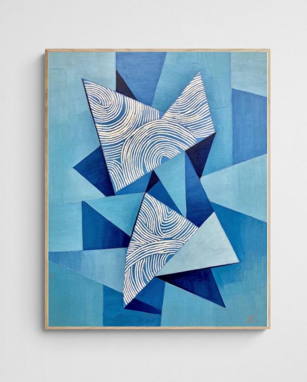


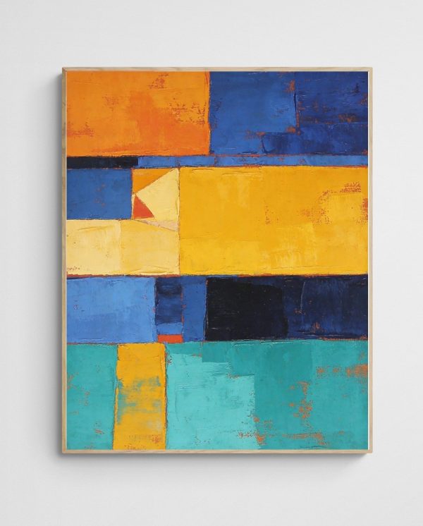
Abstract art offers particular advantages in professional environments because it invites interpretation without imposing specific narratives. A bold geometric abstract can energise a space and signal modernity without alienating anyone. Pieces incorporating Australian coastal themes can ground your business in place while maintaining visual sophistication. The “Mediterranean Origami – Blue Geometric Abstract Wall Art Print” exemplifies this balance—it’s striking enough to merit attention while remaining versatile enough to complement various design schemes.
The Role of Originality
Choosing pieces that visitors are unlikely to encounter in other offices creates memorable distinctiveness. When someone comments on your reception artwork, you’ve created an engagement opportunity that generic pieces never provide. Moreover, supporting Australian abstract artists adds authenticity to your space that mass-market alternatives cannot match.
The Psychology Behind Effective Reception Artwork
Colour psychology plays a documented role in how people experience environments. Blues typically evoke calm, trust, and stability—qualities that financial services, healthcare providers, and legal practices often want to communicate. Warm tones like gold and coral suggest energy, optimism, and creativity—appropriate for agencies, startups, and innovation-focused businesses. Understanding these associations allows you to use art strategically rather than decoratively.
Visual complexity—interesting patterns, varied textures, dynamic compositions—stimulates cognitive engagement and improves mood. A reception area that provides visual interest gives waiting visitors something productive to focus on rather than anxiety about upcoming meetings. Reducing pre-meeting tension creates more open, positive interactions once the meeting begins.


The concept of prospect-refuge theory from environmental aesthetics suggests that people feel most comfortable in spaces that provide both openness and enclosure. Artwork contributes to this balance by defining walls and creating visual anchors that help people orient themselves in space. A well-placed, substantial piece makes a large reception area feel more human-scaled and approachable.
The Waiting Experience
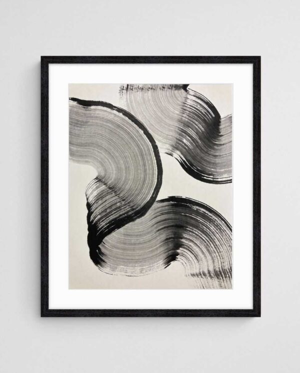
People perceive wait times differently depending on their environment. Engaging artwork makes waiting feel shorter and less frustrating. In practical terms, this means fewer complaints about delayed appointments and more relaxed visitors entering meetings. The “Chaos of Colour – Vibrant Abstract Action Painting Print” offers the kind of visual complexity that rewards extended viewing, turning wait time into discovery time rather than dead time.
Choosing Art That Reflects Your Industry Without Clichés
Every industry has its visual clichés. Law firms default to classical architecture or leather-bound books. Medical practices lean toward serene nature photography. Tech companies often choose impossibly minimal abstracts that feel sterile rather than innovative. Breaking these patterns while remaining appropriate requires thought, but the payoff is an identity that stands apart from competitors.
A common mistake is selecting art that’s too literal. If you’re an environmental consultancy, you don’t need obvious tree photographs—in fact, abstract landscape prints might communicate your connection to nature with more sophistication. If you work in finance, geometric abstracts can suggest precision and structure without resorting to predictable stock market imagery. The goal is resonance, not replication.
Consider also the cultural composition of your clientele. International businesses benefit from artwork that transcends specific cultural references. Abstract pieces work particularly well in these contexts because they communicate through colour, form, and composition rather than culturally specific symbols or narratives. This inclusive approach ensures your reception area welcomes everyone equally.


Balancing Professionalism With Personality
The most effective reception areas reveal something authentic about the organisation while maintaining appropriate boundaries. This might mean featuring work by local artists if community engagement matters to your brand. It might mean choosing bold, colourful abstracts if innovation and creative problem-solving define your approach. Whatever you choose should feel like an honest extension of your values rather than calculated image management.
Size, Scale, and Placement: Getting the Fundamentals Right
Too many reception areas suffer from artwork that’s dramatically undersized for the available wall space. Your primary reception piece should occupy roughly 60-75% of the wall width. Anything smaller looks tentative and fails to anchor the space. When you have a large wall, use it—either with a substantial single piece or a deliberately arranged grouping that functions as a cohesive installation.
Hanging height matters more than most people realise. The centre of your artwork should sit at approximately 145-150 centimetres from the floor—slightly lower than the standard 160 centimetres recommended for residential spaces because reception seating positions viewers lower. When people spend significant time seated, you want the art positioned for optimal viewing from that perspective, not just for standing visitors at the check-in desk.
Lighting transforms how artwork appears. Natural light works beautifully but changes throughout the day, so test how your chosen pieces look in morning and afternoon conditions. If your reception lacks natural light, invest in proper picture lighting or adjustable spotlights. Poorly lit artwork won’t create the impact you’re paying for.


Creating Visual Hierarchy
Your reception area should have a clear focal point, and artwork typically serves this role. Everything else—furniture arrangement, lighting, even plant placement—should support rather than compete with this focal artwork. This doesn’t mean other walls must remain bare, but secondary pieces should be noticeably smaller or positioned in transition spaces rather than the main waiting area.
Making the Investment That Actually Pays Off
Treating reception artwork as an afterthought means allocating whatever budget remains after furniture and technology. This backwards approach consistently produces disappointing results. Instead, budget for art early in any fit-out or renovation project. Quality pieces appropriate for commercial reception areas typically represent 3-5% of your total interior budget—a fraction that delivers disproportionate impact on how visitors perceive your entire operation.
The value proposition becomes clear with basic arithmetic. A piece that costs $500 and is viewed by 2,000 visitors annually costs just 25 cents per viewing in its first year alone. Over a five-year lifespan, that’s 5 cents per impression—far more cost-effective than almost any other marketing initiative. Quality artwork holds or appreciates in value rather than disappearing the moment you stop paying for it.
Professional reception art isn’t an expense—it’s infrastructure that works continuously to shape perception and support your brand positioning.
Many businesses discover that investing in distinctive reception artwork generates unexpected returns. Pieces become conversation starters that ease awkward pre-meeting moments. Striking visuals give visitors natural content for social media posts, extending your brand reach organically. Employees develop pride in working somewhere that demonstrates aesthetic ambition. These benefits resist precise quantification but accumulate meaningfully over time.
Working With Professional Curators
Attempting to select reception artwork without guidance often produces expensive mistakes. Professional art curation services understand how to balance aesthetic considerations with practical constraints like budget, installation timelines, and maintenance requirements. This expertise typically pays for itself by avoiding costly decisions that need correction later.
The Path Forward
Your reception art doesn’t need to follow trends or copy competitors. It needs to honestly reflect your organisation’s values. When you settle for forgettable artwork, you’re communicating that aesthetics, first impressions, and environmental quality rank low in your priorities. That message contradicts almost everything else you’re trying to achieve in business development and brand building.
The businesses that understand this invest appropriately. They recognise that their reception area functions as a stage set for every important first meeting, every potential partnership conversation, every recruitment interview with top talent. The artwork on those walls either supports the performance or undermines it.


The argument that “our clients don’t care about art” misses the point entirely. Clients might not consciously evaluate your reception artwork, but they absolutely register the overall impression your space creates. Professional environments that feel considered, coherent, and confident inspire different reactions than spaces that feel generic or neglected. This operates at the level of gut feeling rather than rational analysis—which makes it more powerful, not less.
Start with your single most important wall—typically the one facing visitors as they enter or sit down. Invest in one substantial, well-executed piece for that position. Observe how it changes the energy of your reception area and how visitors respond. Once you experience the difference quality artwork makes, expanding the investment to other areas becomes straightforward.
Your reception walls represent some of the highest-leverage real estate your business controls. Every visitor will experience whatever you choose to display. That guaranteed exposure makes them invaluable for differentiation. Professional abstract art prints offer an accessible entry point that balances sophistication with budget realities. From there, the transformation happens wall by wall, piece by piece, until your reception area finally matches the standards you maintain everywhere else in your business.
 | Joseph Russell Joseph is an Australian abstract artists and curator of the Inomaly art collection. |