
Walk into most Western galleries and the rules are clear: white walls, strict hierarchy, a polite distance between viewer and work. Australian art has never followed that script comfortably. It grew from a continent where the land itself rejects European conventions, and where the oldest continuing art tradition on earth predates the gallery by tens of thousands of years.
Australian art defies Western gallery rules because it begins with country, not with the frame. It treats colour, space and subject as lived experience rather than as categories to be curated, and that is precisely why it suits the home better than the institution.
Key Takeaways
- Australian art treats land as a living subject, not a scenic backdrop.
- Saturated, sun-driven colour is a legitimate language, not a lapse in taste.
- Native flora and coastal abstraction deserve the same respect as portraiture.
- Prints let you hang these ideas at home without gallery pretension.
- Choose work that carries a sense of place, then hang it boldly.
Rule One: Landscape Is a Backdrop
European landscape painting traditionally frames nature as a view. The viewer stands outside, looking in, and the horizon sits neatly where the composition needs it. Australian work often refuses that distance. Country, in Aboriginal and Torres Strait Islander thinking, is a relationship rather than a scene.
The influence reaches well beyond Indigenous practice. Contemporary painters working in abstraction borrow that sense of immersion, flattening perspective and layering marks until the land surrounds you. If you want to trace this shift, our piece on redefining modern Australian art beyond the outback goes deeper into how artists moved past the red-dirt cliché.
Why the horizon line keeps disappearing
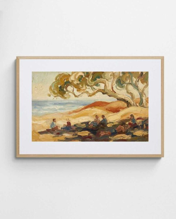
Look at a work such as the “Australian Uluru Landscape Art Print – Red Rock 2”. It treats the monolith as mass and colour rather than as a postcard. The rock fills the sense of space instead of sitting politely within it. Similarly, many coastal abstractions dissolve the shoreline entirely. Sand, shade and water become bands of tone. In practice, these works read as memory of a place rather than documentation of it, and that is a far more honest description of how Australians experience the coast.


Rule Two: Colour Must Be Restrained
Western taste, shaped by northern light, has long favoured muted palettes. Grey skies produce grey-green logic. Australian light is different. It is hard, high and unforgiving, and it saturates everything it touches. Ochres turn incandescent and blues become almost electric.
An artist working here who reaches for hot orange or deep coral is not being garish. They are being accurate. The critic who calls such work “too much” is measuring it against a light that does not exist in Broome, Bondi or Alice Springs.
Calling Australian colour excessive is like calling Australian sunlight rude.
Coral, reef and the colour of the coast
The “Deep Colour 1 Abstract Coral Art Print” is a good example of this confidence. Its saturated reef tones refuse the beige safety that so many interiors default to. The wider Deep Colour series follows the same logic across different compositions.


If bold colour makes you nervous, start with a guide. Our guide to artwork and room colour matching explains how to anchor a vivid print within a calm room. Alternatively, browse the colourful abstract art collection to see how far the palette can stretch.
Rule Three: Art Belongs on Gallery Walls
The white cube assumes art is an event to be visited. Australian artists have repeatedly challenged that idea. Indigenous art has always lived in ceremony, on bodies, on ground and in daily life. The nation’s strong print tradition, from lino cuts to lithographs, made art affordable and portable from the start. A well-made giclée print places a serious composition in a kitchen, hallway or bedroom, where it gets seen every day rather than once a year. That daily exposure is a better relationship with art than a quiet Sunday visit.
Print as a democratic medium
Works such as “Melbourne Town” draw on the lino cut and lithograph lineage, with graphic edges and flat colour. These techniques were never precious, yet they produce images with real authority and sit comfortably beside larger originals.


For practical advice, our guide to framing and hanging giclée prints covers mounts, glazing and placement. The art prints range shows how varied the format can be.
Rule Four: Fine Art Cannot Be Botanical
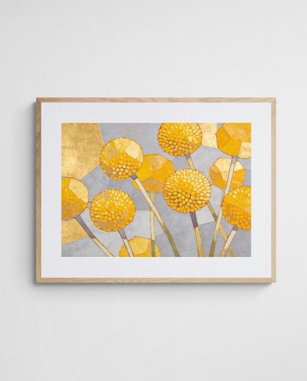
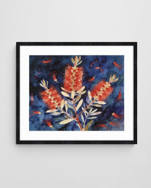
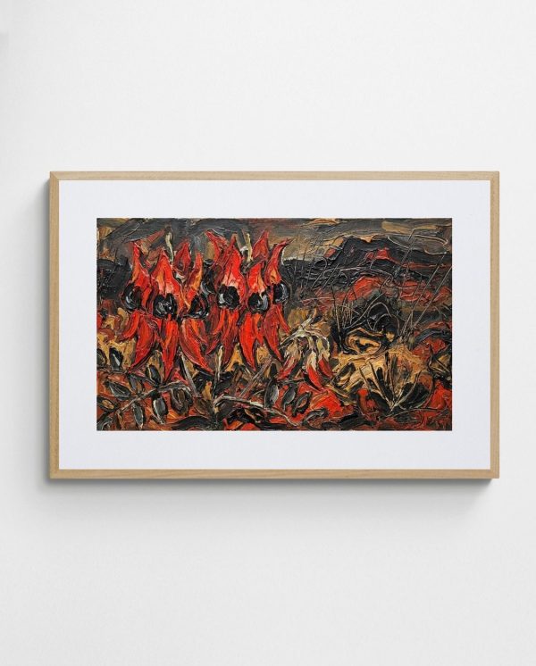
In the Western canon, flowers are often a lesser subject, relegated to still life or decoration. Australian art disagrees. Waratah, banksia, eucalyptus and Sturt’s desert pea carry cultural weight, seasonal meaning and a wild structural beauty that European blooms rarely match. Native plants invite abstraction: a gum leaf is a repeating, rhythmic form, and a bottlebrush is almost a gestural brushstroke already. Our article on native Australian flora inspiring modern abstract art looks at this connection in detail.
Flora as gesture, not decoration
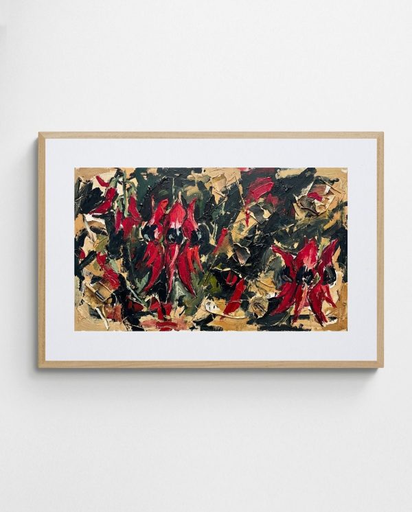
Consider “Desert Pea Chaos – Bold Abstract Floral Art Print”. The title alone signals intent. It treats a famously striking wildflower as an expressive force, close to abstract expressionism, rather than as a pretty specimen. That is a clear break from botanical illustration conventions.
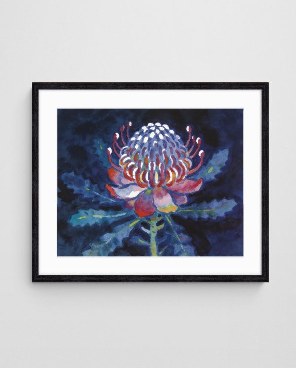

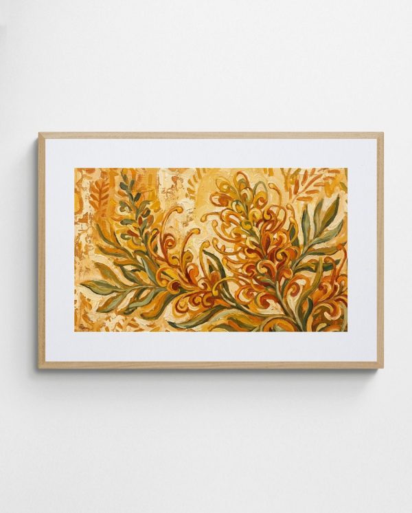
For a wider selection, the Eucalyptus High collection and the Australian botanical prints page are good starting points. Pieces like “Gum Joy” and “Speckled Eucalyptus” work especially well in neutral rooms.


Rule Five: The City Is Not Subject Matter
Another unwritten rule says serious Australian art must be about the bush. That was always a narrow reading. Most Australians live in cities, and artists have increasingly turned to markets, laneways and trams as legitimate material. Melbourne in particular has nurtured a lively urban abstraction. Interpreting a market in loose, energetic marks captures something photographs cannot: noise, smell and movement. Melbourne-style art prints reflect that spirit of sophistication without stiffness.
Where the bush meets the street
Artists such as those profiled in our look at Australian artists who redefine art move fluidly between both worlds. A market scene and a desert garden may share a palette and a gesture. The subject changes, but the attitude does not.


For authoritative background on the broader tradition, the Australian art overview on Wikipedia offers a useful timeline from rock art to contemporary practice.
Living With Rule-Breaking Art
Admiring unruly art is easy. Hanging it well takes a few decisions. Let one piece lead and keep the surrounding room calm.
- Choose a work with a clear sense of place, whether coast, desert or city.
- Pick one dominant colour from the print and repeat it once in a cushion or throw.
- Hang at eye level, roughly 145 cm from the floor to the centre.
- Go larger than feels comfortable; small prints on big walls look timid.
A common mistake is buying cautiously, then wondering why the room feels flat. Our advice on bold rooms starting with oversized art addresses that directly. For black and white schemes, the black and white art prints are a strong option.
A final argument for breaking the rules
Australian art does not need Western approval to be valid. It has its own light, its own subjects and its own long history. Start by choosing one print that feels like a place you know, then browse the Australian abstract art collection and hang it with confidence. Rules, after all, were written for other landscapes.


Frequently Asked Questions
What makes Australian art different from European art?
It is shaped by a distinct light, landscape and the world’s oldest continuing art tradition. Many works treat land as a relationship rather than a view, and use saturated colour that reflects local conditions.
Are art prints a legitimate way to collect Australian art?
Yes. Printmaking has a long Australian history, and quality giclée prints reproduce colour and texture faithfully. Limited editions add collectability, while open editions keep costs accessible.
How do I hang bold abstract art in a neutral room?
Let the artwork be the single focal point. Repeat one of its colours in a small accessory, and choose a simple frame so the print leads.
Which Australian subjects suit abstract wall art best?
Native flora, coastlines and desert landscapes translate especially well, because their forms and colours lend themselves to gesture and pattern. Urban scenes such as markets also work in lively, expressive compositions.
 | Joseph Russell Joseph is an Australian abstract artists and curator of the Inomaly art collection. |