
Your office wall is working whether you plan it or not. A tired beige expanse quietly drains energy, while the right colour in the right place can sharpen attention and steady the mind. Choosing the best colours for productivity art is less about following fads and more about matching hue, intensity and placement to the work you actually do.
The short answer: use blue and green tones for sustained concentration, add small hits of yellow or coral for energy, and keep red and high-contrast black as accents. Choose muted, balanced compositions for focus-heavy desks and bolder palettes for collaborative areas. The steps below show you how to apply this, wall by wall.
Step 1: Define the Work Your Wall Supports
Before you look at a single swatch, write down what happens in the room. An accountant reconciling figures needs a different atmosphere from a design team brainstorming. Our guide to abstract art for accounting offices shows how detail-focused work favours calm, ordered imagery.
A common mistake is choosing art for the visitor rather than the person who sits there eight hours a day. Reception can be bold. The desk wall in your line of sight should be restful.
Sort your spaces into three zones
- Focus zones: private offices, home desks and quiet rooms where deep work happens.
- Collaboration zones: meeting rooms, breakout areas and open-plan clusters.
- Transition zones: reception, corridors and kitchens where first impressions matter.
Each zone gets its own colour strategy. For home workspaces, home office art that boosts productivity covers the same principle on a smaller scale.
Step 2: Match Colour to the Mental State You Need
A 2009 study by Mehta and Zhu published in Science found that blue supported creative tasks while red improved attention to detail. This distinction—blue for broad thinking, red for fine focus—holds up across most office settings. You can read broader background on colour psychology (Wikipedia).
Blues and greens for concentration
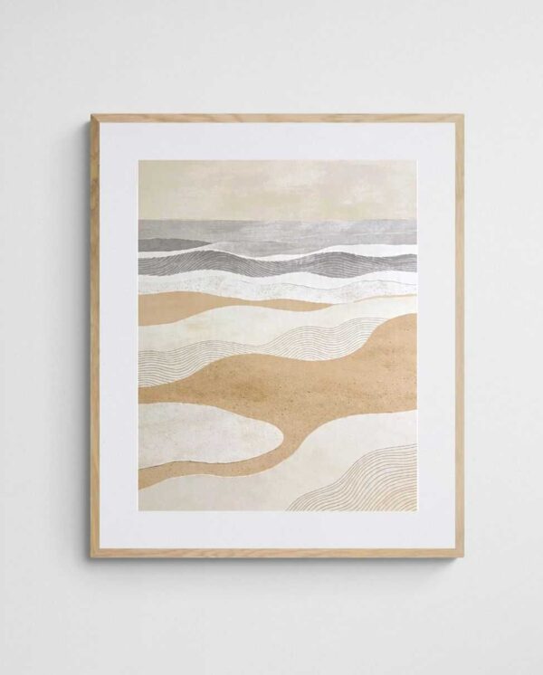
Cool blues lower visual noise, and soft greens echo nature, which eases eye strain. Prints with coastal palettes work especially well here. “Scandi Tide Pools – Modern Abstract Coastal Art Print” pairs calm aqua tones with open, uncluttered shapes, making it a sound choice above a monitor. For more cool-toned ideas, see these cool colour palettes.


Yellows, corals and warm tones for energy
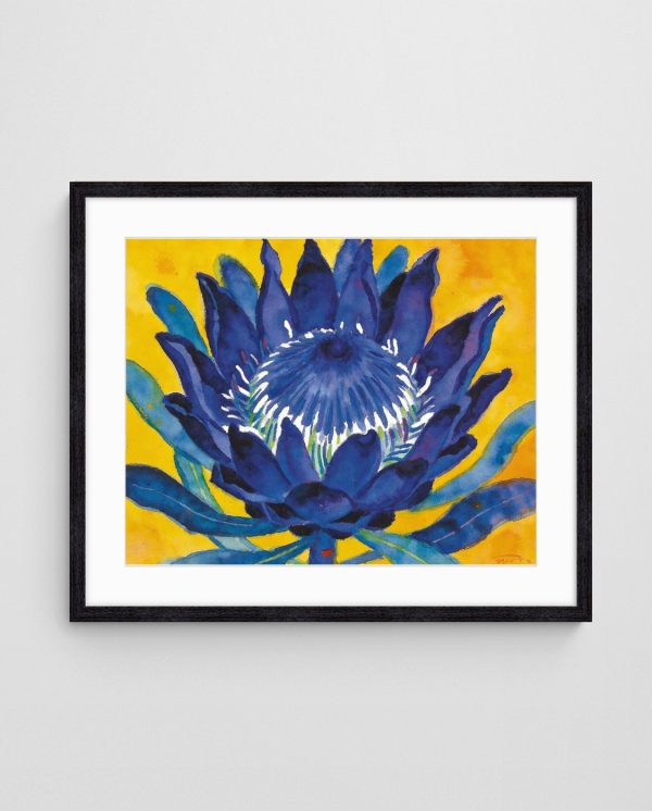
Warm hues stimulate conversation and optimism. Use them where people gather rather than where they concentrate. “Deep Colour 2 Abstract Coral Art Print” delivers that lift without the intensity of pure red, which suits a breakout space or a mid-afternoon slump zone. Our article on yellow art as a mood booster explains why a little goes a long way.


Step 3: Balance Intensity and Composition
Hue is only half the equation. Saturation and composition decide whether a piece soothes or overwhelms. A saturated orange print can feel energising in a meeting room yet exhausting above a desk.
The 70/20/10 approach works well: let calm tones dominate the artwork, support with a secondary colour, and keep one accent small. Our piece on colour balance in modern interiors expands on this.
Choose composition to suit the task
- Soft colourfield or layered washes: ideal for deep focus because there is no focal point to chase.
- Geometric patterns: suit analytical roles, as ordered shapes mirror structured thinking.
- Loose, gestural work: better for creative teams who need stimulation.
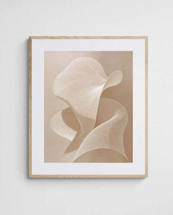
“Sand Wave – Neutral Abstract Art Print in Beige and Cream” is a good example of the first category. Its gentle rhythm gives the eye somewhere to rest. If you favour quieter palettes, browse our muted abstract art range.


Step 4: Test Against Your Existing Room
Even the most productive palette fails if it fights the carpet, furniture or paint. Start by identifying the dominant colour in the room, then pick art that either harmonises with it or provides a controlled contrast. The artwork and room colour matching guide walks through this in detail.
Order a sample or print a screen preview at actual size and tape it to the wall for three days. Natural light changes everything. A cool grey that looks serene at 10am can turn cold by late afternoon.
Use the room’s own palette as a guide
- Photograph the wall at morning, midday and late afternoon.
- Pull two or three dominant colours from the photos.
- Select art that repeats one of them and introduces one new colour.
- Check the result on a white background and on the wall itself.
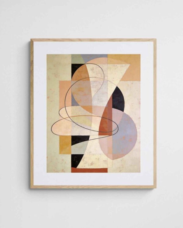
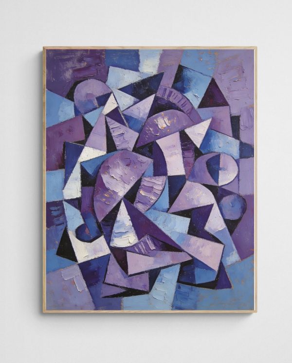
Neutral rooms offer the most freedom. Bold geometric pieces such as “Lavender Chaos – Abstract Purple Geometric Art Print” add a considered pop of colour without overwhelming a grey or white scheme. Purple also sits well with creative work, as covered in abstract prints that spark creative flow.

Step 5: Size, Hang and Light the Art
Correct placement amplifies colour. Hang the centre of the piece at about 145 cm from the floor, which suits standing eye level. For a desk wall, shift it slightly lower so it sits in your peripheral vision when seated.
Scale matters too. A small print floating on a large wall looks timid and loses its colour impact. Aim for artwork covering roughly two-thirds of the width of the furniture beneath it, or consider a grouping. For sizing advice, read large art prints that fit your walls.
Lighting and framing details
- Use neutral-white bulbs (around 3500K to 4000K) so colours read accurately.
- Avoid direct sun on prints, which fades pigments over time.
- Choose matte or non-reflective glazing to reduce glare near screens.
- Keep frames simple so the colour does the work.
For practical hanging steps, our guide to framing and hanging giclée prints is worth bookmarking. Larger offices can also browse abstract art for office walls, or enquire about trade pricing for multi-room fit-outs.


Quick Answers on Colour and Productivity
Which colour is best for focus?
Soft blues and greens are the safest choice for sustained concentration. They reduce visual stress and pair well with most office furniture.
Can bold colours hurt productivity?
Only when overused. Keep saturated reds and oranges as accents or place them in collaborative areas rather than directly in your sightline.
Pick one wall, apply the five steps, and trial a single print for a fortnight. If you need a second opinion, the free room design service can help you shortlist pieces. You can also explore the full abstract art prints range, including the recommended selections below.


 | Joseph Russell Joseph is an Australian abstract artists and curator of the Inomaly art collection. |