Hallways are often the most overlooked spaces in Australian homes, yet they’re the arteries connecting every room—spaces you pass through dozens of times each day. Rather than leaving these transitional zones as bland afterthoughts, decorating hallways with prints transforms them into captivating gallery-style corridors that elevate your entire home’s aesthetic. A thoughtfully curated hallway gallery doesn’t just fill blank walls; it creates visual rhythm, reflects your personality, and makes even the narrowest passage feel intentional and inviting.
The key to successful hallway art lies in understanding these unique spaces. Unlike living rooms or bedrooms where you linger, hallways are dynamic—you move through them, experiencing the artwork in sequence rather than all at once. This presents an opportunity to create a visual narrative that unfolds as you walk, using prints to guide the eye, establish mood, and connect disparate rooms with a cohesive design thread. Whether your hallway is a long, narrow corridor or a short connecting passage, the right arrangement of prints can dramatically alter how the space feels and functions.
Assess Your Hallway’s Unique Characteristics
Before selecting a single print, measure your hallway’s dimensions carefully. Width matters tremendously—narrow corridors under 1.2 metres require a different approach than spacious passages. In tight spaces, avoid overwhelming the walls with oversized prints or dense arrangements. Instead, consider a single vertical line of medium-sized prints that draws the eye upward, creating an illusion of height without crowding the space.
Natural lighting conditions will dictate much of your print selection. Hallways with abundant natural light can handle darker, more saturated colours and complex compositions, while dim corridors benefit from lighter tones and high-contrast pieces that remain visible even in lower light. Walk through your hallway at different times of day to observe how natural and artificial light interact with the walls. This exercise reveals which sections receive consistent illumination and which might need brighter, more reflective prints to compensate for shadows.


Consider your hallway’s architectural features as well. Existing elements like doorways, light switches, heating vents, and electrical panels create natural breaks in your wall space. Rather than fighting these interruptions, incorporate them into your gallery design. A symmetrical arrangement might work beautifully between two evenly spaced doorways, whilst an asymmetrical collection can elegantly navigate around an off-centre light switch. The goal is harmony between your prints and the hallway’s existing structure.
Traffic flow patterns also influence your design choices. High-traffic hallways in family homes with young children might warrant hanging prints slightly higher than standard to prevent accidental bumps. Additionally, consider sightlines from both directions—your gallery should look intentional whether approaching from the living room or bedroom. Understanding proper display techniques ensures your gallery wall functions beautifully from every angle.
Select Prints That Create Visual Continuity
Colour coordination establishes the foundation for a cohesive hallway gallery. Choose a unifying colour palette that either complements your adjoining rooms or creates a distinct identity for the corridor itself. A common approach involves selecting 2-3 dominant colours that appear across all prints, with occasional accent hues for visual interest. This doesn’t mean every print must be identical in colouration, but rather that they share a common chromatic language.
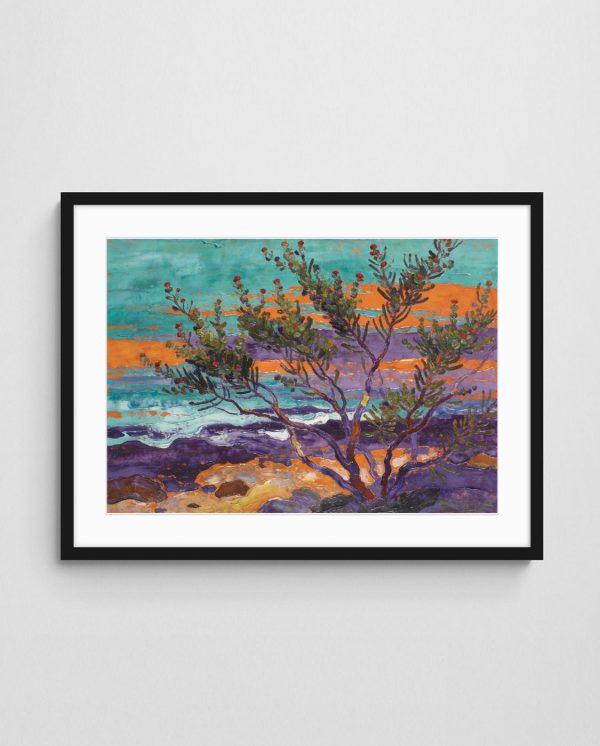
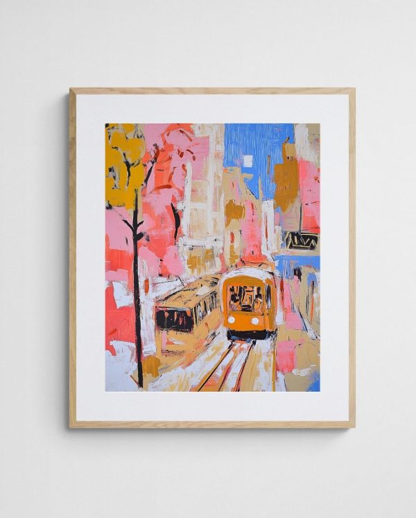
Thematic consistency strengthens the narrative quality of your hallway gallery. You might focus on Australian landscapes, coastal abstracts, or native botanical prints—whatever resonates with your aesthetic preferences. The “One Summer Abroad 7 – Mediterranean Coastal Abstract Artwork” exemplifies how themed collections work brilliantly in hallways, offering a sun-drenched coastal vibe that transports viewers even in narrow passages. Similarly, pieces from coastal art collections create a relaxed, flowing atmosphere perfect for transitional spaces.


Stylistic unity matters as much as theme. Mixing wildly different art styles—say, photorealistic landscapes with geometric minimalism—often creates visual chaos in the confined space of a hallway. However, variations within a style work beautifully. An all-abstract collection might include gestural expressionism, geometric forms, and colour field pieces, provided they share some unifying elements like scale, framing, or colour temperature.
Frame selection deserves careful consideration. Matching frames create a clean, gallery-like appearance and work especially well with varied print styles, providing visual cohesion through uniform borders. Alternatively, complementary frames in the same colour family but different profiles add subtle visual interest without fragmentation. For a more eclectic approach, mix frame finishes thoughtfully—perhaps oak frames with occasional black metal frames—ensuring the variation feels intentional rather than haphazard.
Balancing Print Sizes and Orientations
Varying your print sizes prevents monotony whilst maintaining visual rhythm. A classic approach combines one or two larger anchor pieces (around 60x90cm) with several medium prints (40x50cm) and a few smaller accent pieces (30x40cm). This size variation creates focal points and allows your eye to travel naturally along the wall.
Portrait and landscape orientations each offer distinct advantages in hallway spaces. Portrait-oriented prints emphasise vertical lines, making ceilings appear higher—ideal for narrow corridors. Landscape prints encourage horizontal eye movement, which can make shorter hallways feel more expansive. Mixing both orientations adds dynamism, though maintaining a slight bias toward one direction typically yields more harmonious results.


Consider the viewing distance inherent to hallways. Unlike art in living rooms where viewers might stand several metres back, hallway prints are often viewed from just a metre or two away. This proximity means fine details and subtle textures become visible, making high-quality art prints with excellent reproduction fidelity particularly important. Conversely, it also means overly complex compositions can feel overwhelming at close range.
Plan Your Gallery Wall Layout
The salon-style hang remains one of the most popular approaches for hallway galleries. This dense, organic arrangement covers substantial wall area with prints of varying sizes, creating an eclectic, collected-over-time aesthetic. Start with your largest print as an anchor, positioned at eye level (approximately 145-150cm from floor to centre), then build outward, maintaining relatively consistent spacing of 5-8cm between frames. The beauty of salon hangs lies in their forgiving nature—slight irregularities add to the curated charm.
Grid layouts offer the opposite aesthetic: clean, contemporary, and highly structured. This approach works brilliantly with same-size prints in identical frames, creating a bold graphic statement. For a 2.4-metre hallway section, you might arrange six 40x50cm prints in two rows of three, or nine 30x40cm prints in a 3×3 grid. The precision required demands careful measuring, but the result is a sophisticated, museum-quality presentation that suits modern interiors beautifully.

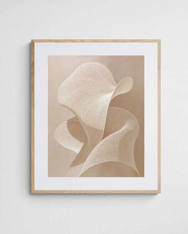
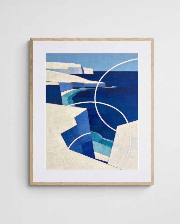
Linear arrangements prove ideal for narrow hallways where depth is limited. A single horizontal line of three to five same-size prints creates a streamlined gallery feel without overwhelming the space. Alternatively, a vertical stack draws the eye upward, emphasising ceiling height. The “Coastal Whispers in Wax – Lush Native Abstract Landscape Wall Art” works beautifully in linear arrangements, its expansive composition lending itself to cohesive groupings that feel connected yet distinct.
Asymmetrical balance creates visual interest through carefully orchestrated imbalance. This advanced approach might position a large print on one side with several smaller prints clustered opposite, creating equilibrium through visual weight rather than mirror symmetry. It requires a good eye for composition but yields dynamic, contemporary results. Practice your layout on the floor first, photographing arrangements from various angles to assess their effectiveness before committing to the wall.
Creating Templates for Precise Placement
Professional gallery installers rarely measure and hang in real-time. Instead, they create paper templates cut to each frame’s exact dimensions, using painter’s tape to position them on the wall. This method allows endless experimentation without leaving holes. Once satisfied with the arrangement, mark nail positions through the paper, remove the templates, and install hanging hardware with confidence. This approach saves countless headaches and unnecessary wall damage.
For particularly complex arrangements, consider creating a scale diagram on graph paper or using digital gallery wall planning tools. Some smartphone apps allow you to photograph your wall and virtually arrange prints, providing a preview of the final result. This pre-planning proves especially valuable in hallways where space constraints make improvisation risky. Transforming spaces into gallery environments requires this kind of methodical preparation.


Master the Technical Aspects of Hanging
Proper hanging height elevates amateur installations to professional quality. The museum standard positions artwork so its centre sits at 145-150cm from the floor—approximately adult eye level. In hallways, this rule still applies, though you might adjust slightly lower (140-145cm) if household members skew shorter, or if you want a more intimate, grounded feel. What matters most is consistency; maintaining uniform height across your gallery creates visual cohesion even with varied print sizes.
Wall construction dictates your hanging approach. Plasterboard walls require wall anchors or toggle bolts for anything heavier than a kilogram or two. Locate studs using an electronic stud finder and hang heavier pieces directly into structural timber for maximum security. Brick or concrete walls need masonry anchors and a hammer drill. Never underestimate weight—even lightweight prints in glass frames can exceed 3kg when mounted, and inadequate hanging hardware leads to damaged walls and broken frames.
D-rings and wire hanging systems each offer distinct advantages. D-rings provide precise positioning—once you mark your nail location, the print hangs exactly where intended. Picture wire offers more forgiveness, allowing minor adjustments left or right without rehinging, though it can result in frames hanging slightly askew. For gallery walls with multiple pieces, D-rings typically yield more professional results, whilst wire works well for single statement pieces where precise vertical alignment matters less.
Level lines aren’t optional—they’re essential. Even a one-degree tilt becomes glaringly obvious once installed. Use a quality spirit level for every single print, checking both horizontal top edge and vertical sides. For multi-print arrangements, establish level reference lines using painter’s tape or a laser level, ensuring all prints align to the same baseline. This attention to detail separates amateur efforts from professional-looking installations that elevate your entire space.
Securing Frames Against Vibration and Movement
Hallways experience more vibration than other rooms due to foot traffic, especially in homes with children or pets. Over time, this movement causes frames to shift, creating gaps in carefully planned arrangements. Small adhesive bumpers or tabs on the bottom frame corners prevent this drift, gripping the wall gently whilst still allowing easy removal. These inexpensive additions maintain your gallery’s pristine alignment for years rather than weeks.
Consider earthquake or vibration-resistant hanging methods if your area experiences seismic activity or if you’ve noticed frames shifting frequently. Museum putty, gallery wire with minimum slack, or specialised hanging systems with locking mechanisms provide additional security. According to professional framing standards, proper securing prevents both frame damage and potential injury from falling artwork.
Enhance Your Gallery with Strategic Lighting
Natural light enhances artwork but requires management to prevent damage. Direct sunlight fades prints over time, particularly those using dye-based inks. If your hallway receives strong direct sun, consider UV-filtering glazing on frames or window films that block harmful rays whilst preserving light quality. Alternatively, position your most fade-resistant prints in sunny spots and reserve shade-dwelling positions for more delicate pieces.
Artificial lighting transforms hallway galleries from pleasant to spectacular. Picture lights mounted above individual frames create gallery-standard illumination, though they require electrical installation. Battery-operated LED picture lights offer similar effects without wiring, making them ideal for rental properties. Track lighting provides flexible positioning, allowing you to highlight specific pieces whilst washing others in ambient glow. The goal is eliminating shadows and glare whilst creating gentle, even illumination that makes colours pop.

Colour temperature affects how your prints appear. Warm white bulbs (2700-3000K) create cosy, intimate atmospheres but can skew colours yellowish, particularly problematic for blue and green abstracts. Cool white or daylight bulbs (4000-5000K) render colours more accurately, though they sometimes feel clinical. A middle ground around 3500K often works best, providing reasonable colour accuracy whilst maintaining warmth. Test different temperatures to find what best complements your specific prints and hallway aesthetic.
Hallway lighting serves dual purposes—illuminating artwork whilst providing safe passage. Ensure your gallery lighting scheme doesn’t create dark spots or tripping hazards. Combining dedicated art lighting with general overhead illumination offers both functionality and aesthetic appeal. Dimmer switches allow you to adjust intensity based on time of day and mood, transforming your hallway gallery from bright daytime showcase to softly lit evening promenade.
Addressing Glare and Reflections
Glass and acrylic glazing create reflection issues, particularly in narrow hallways where lighting angles are limited. Anti-reflective or museum glass significantly reduces glare whilst maintaining clarity, though at premium prices. Standard glass can be tilted slightly forward (just a degree or two) using adjustable frame bumpers, angling reflections toward the floor rather than eye level. Alternatively, non-glare acrylic offers a budget-friendly middle ground, though it can slightly soften image sharpness.
The placement of light sources relative to artwork determines reflection severity. Side lighting from sconces positioned beside frames typically creates less glare than overhead lighting hitting glass perpendicularly. Experiment with lighting angles before finalising installation, viewing your arrangement from multiple positions along the hallway to identify problematic reflections. Strategic adjustments now prevent frustration later when your carefully curated gallery becomes difficult to actually see and enjoy.
Maintain and Evolve Your Gallery Wall
Regular cleaning prevents dust accumulation that dulls prints and frames over time. Microfibre cloths remove surface dust from glass and frames without scratching. For deeper cleaning, slightly dampen the cloth with water (never spray liquid directly on frames), wiping gently in consistent strokes. Clean frames quarterly at minimum, more frequently in high-traffic hallways or dusty environments. This simple maintenance preserves your gallery’s crisp, professional appearance.
Monitor prints for signs of fading, particularly in areas receiving natural light. Subtle colour shifts occur gradually, making them easy to miss until comparing against unfaded sections. Photograph your gallery wall periodically using consistent lighting and camera settings, creating a reference archive that reveals changes over time. If fading occurs, relocate affected prints to shadier spots and adjust your UV protection strategies accordingly.

Gallery walls benefit from periodic refreshes to prevent visual staleness. Rather than overhauling your entire collection, swap out 2-3 prints seasonally or annually, introducing new pieces whilst maintaining core elements. This evolution keeps your hallway feeling current without requiring complete redesign. Consider rotating prints between rooms as well—pieces that spent summer in your hallway might move to the bedroom for winter, replaced by different selections that shift your corridor’s mood and energy.
Hardware inspection prevents disasters. Every six months, check that hanging nails, hooks, and wall anchors remain secure. Tighten any loose hanging wire and replace corroded or stressed hardware before failure occurs. This proactive approach takes minutes but prevents the heartbreak of finding shattered glass and damaged prints. Particularly important for pieces above stairs or in narrow passages where falling frames pose safety risks, regular maintenance protects both your investment and your household.
Documenting Your Collection
Maintain a simple inventory of your hallway gallery, noting print titles, dimensions, purchase dates, and positions. This documentation proves invaluable for insurance purposes, helps plan future additions, and creates a reference when rearranging or rotating pieces. Digital photos of your complete arrangement from multiple angles serve both as proud records of your design achievement and practical references if you need to recreate the layout after moving or renovating.
Consider how your hallway gallery connects to the broader design narrative in your home. Coordinating art with your existing furniture and decor creates visual harmony that flows seamlessly from room to corridor to room. Your hallway shouldn’t exist in isolation but rather serve as a transitional gallery that bridges and enhances adjacent spaces, creating a cohesive design story throughout your entire home.

Decorating hallways with prints transforms overlooked passages into purposeful gallery corridors that showcase your aesthetic sensibilities whilst adding genuine value to your home. The process requires thoughtful planning, from initial space assessment through print selection, layout design, proper installation, and ongoing maintenance. However, the investment of time and attention yields rewards far exceeding the effort—every passage through your hallway becomes an opportunity to engage with art you love, elevating mundane transitions into moments of visual delight. Whether you favour coastal abstracts, native botanical prints, or bold geometric compositions, your hallway gallery reflects your unique personality whilst demonstrating that every wall space, no matter how narrow or transitional, deserves beautiful, intentional design.
 | Joseph Russell Joseph is an Australian abstract artists and curator of the Inomaly art collection. |