
Staring at expansive blank walls can feel overwhelming, yet these spaces represent your home’s greatest decorating opportunity. The key to transforming these vast canvases lies in maximising wall space with art—a strategic approach that turns empty vertical real estate into captivating visual narratives. Rather than leaving walls bare or cluttering them with mismatched pieces, thoughtful art placement creates depth, character, and sophistication throughout your home.
When you approach wall decoration strategically, you’re not simply filling voids. You’re orchestrating focal points, establishing room flow, and expressing personal style through curated visual stories. The difference between amateur decoration and professional-looking interiors often comes down to understanding how to leverage every inch of available wall space without overcrowding or underwhelming the eye.
Assess Your Wall Dimensions and Architecture
Before purchasing a single print, measure your wall space accurately. Walk through each room with a tape measure, noting ceiling heights, wall widths, and any architectural features like windows, doors, or built-in furniture. These measurements form the foundation of successful art placement.
Document obstacles that might interrupt your display area. Air conditioning vents, light switches, and electrical outlets all influence where art can hang comfortably. Additionally, consider furniture placement—sofas, beds, and dining tables create natural anchoring points below wall art.
Create a simple floor plan sketch marking these elements. This visual reference helps you identify prime real estate for statement pieces versus areas better suited for smaller works or grouped arrangements. In practice, the walls above your sofa, bed headboard, and dining buffet typically offer the most impactful display opportunities.

Natural light patterns throughout the day also deserve consideration. South-facing walls receive intense sunlight that may fade certain prints over time, whilst north-facing walls offer consistent, gentle illumination ideal for showcasing colour-sensitive artwork. Furthermore, track how artificial lighting interacts with your walls during evening hours when you’ll likely spend the most time enjoying your art.
Master Scale and Proportions for Maximum Impact
Calculate the Two-Thirds Rule
Professional designers often employ the two-thirds rule for maximising visual balance. Your artwork or gallery arrangement should occupy approximately two-thirds the width of the furniture piece below it. For a 180cm sofa, aim for art spanning roughly 120cm across—whether that’s a single large piece or multiple works grouped together.
Consider Vertical Scale
Height matters as much as width. In rooms with standard 2.4-metre ceilings, hanging art so its centre sits at eye level (approximately 145-150cm from the floor) creates comfortable viewing. However, in rooms with soaring ceilings, you can afford to hang pieces higher or stack multiple works vertically to draw the eye upward and emphasise architectural grandeur.
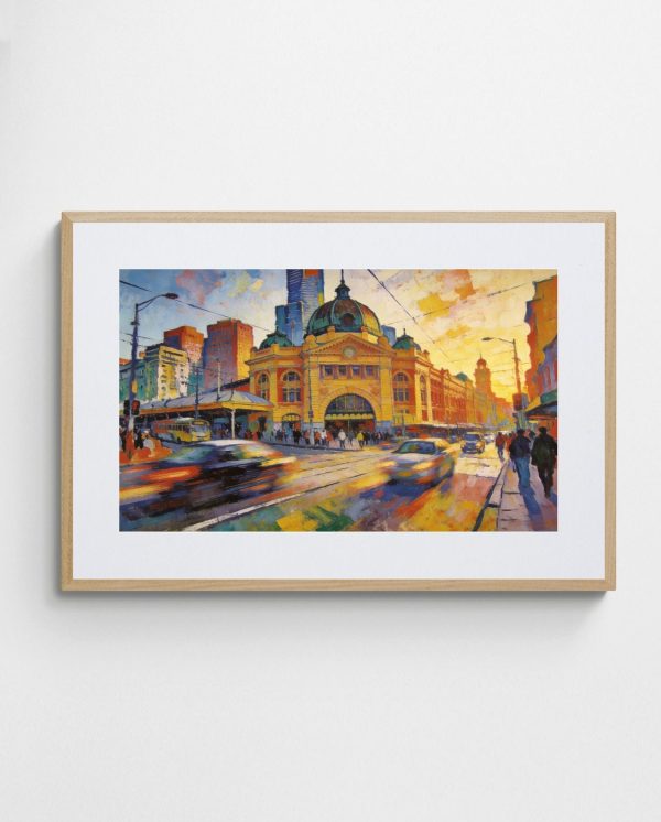
The “Morning at Flinders Street Station – Abstract Melbourne Art Print” exemplifies how bold, vibrant pieces can command attention in larger spaces, its energetic composition filling substantial wall areas without overwhelming the room. Pieces like this work particularly well in living rooms that need a strong focal point.

Conversely, smaller walls benefit from appropriately scaled artwork. A powder room or narrow hallway calls for more intimate pieces that complement rather than dominate the space. When working with limited square footage, multiple small prints arranged thoughtfully often achieve better results than a single undersized piece looking lost on the wall.
Gallery Wall Strategies That Actually Work
Gallery walls maximise vertical space whilst showcasing diverse artworks in cohesive arrangements. The secret lies in planning before hammering a single nail. Start by arranging your prints on the floor, experimenting with configurations until you find a layout that balances visual weight and creates pleasing negative space between pieces.
Grid Layout for Clean Minimalism
Grid arrangements deliver contemporary sophistication through uniform spacing and alignment. Select prints of identical or complementary sizes, then hang them in symmetrical rows and columns. This approach suits modern interiors and creates a gallery-like atmosphere reminiscent of professional exhibitions.
Maintain consistent spacing between frames—typically 5-8cm works well for most arrangements. Use a laser level to ensure perfect alignment, as even slight deviations become glaringly obvious in grid configurations. Moreover, limiting your colour palette across the collection strengthens visual cohesion.


Salon-Style Arrangements for Eclectic Energy
Salon walls embrace intentional asymmetry, mixing various sizes and frame styles for dynamic visual interest. Begin with your largest piece as an anchor, then build outward, filling spaces with progressively smaller works. The key is maintaining relatively consistent spacing between all frames, typically 3-5cm, which unifies the disparate elements.
This organic approach works beautifully in hallways and staircases, where the irregular arrangement complements the transitional nature of these spaces. Test your layout by cutting paper templates matching each frame size and taping them to the wall before committing to nail holes.
Vertical Versus Horizontal Placement Techniques
Orientation profoundly influences how art interacts with architecture and furniture. Horizontal pieces naturally complement low-slung furniture like sofas and console tables, their width echoing the furniture’s linear form. This arrangement creates visual harmony and makes rooms feel wider—particularly valuable in narrow spaces.
Vertical orientations serve different purposes. They draw the eye upward, making rooms with standard ceilings feel taller and more spacious. Consider vertical arrangements in entryways, beside tall bookcases, or flanking windows to emphasise height. Stacking two or three vertical pieces creates a dramatic column of art that commands attention without requiring excessive wall width.

In practice, combining both orientations within a gallery wall often yields the most dynamic results. A large horizontal piece anchoring the centre, with vertical works on either side, creates balanced asymmetry. This mixed approach prevents monotony whilst maintaining visual coherence through coordinated colour schemes.
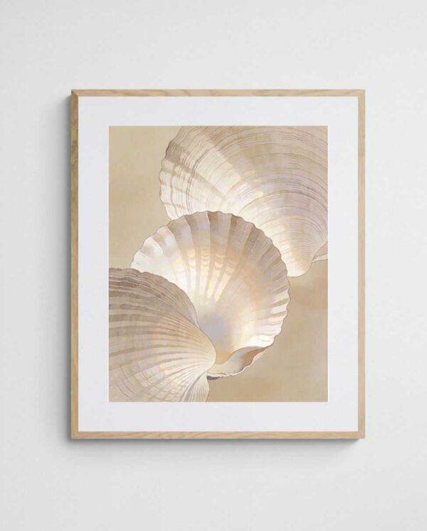
The “Shining Shells – Neutral Coastal Abstract Art Print” demonstrates how horizontal compositions can create serene, expansive feelings in bedrooms or living areas, its calming tones and wide format promoting visual relaxation.
Colour Coordination for Cohesive Spaces
Strategic colour selection transforms disparate wall art into a cohesive collection that elevates your entire interior scheme. Rather than matching artwork exactly to your sofa or curtains, identify a signature colour palette that appears throughout your space, then select prints featuring those hues in varying intensities.
Establishing Your Core Palette
Begin by identifying three to five colours already present in your room—perhaps the warm terracotta of your cushions, the navy in your rug, and the cream of your walls. Search for abstract prints that incorporate these tones, even if they include additional colours. This approach ensures visual harmony without creating boring, overly matchy interiors.


Alternatively, use artwork to introduce accent colours sparingly present elsewhere. A predominantly neutral room gains energy from vibrant prints featuring bold oranges, yellows, or blues, especially when you echo those colours in small decorative objects like vases or throw pillows. This technique allows you to experiment with trends without committing to major furniture purchases.
Balancing Warm and Cool Tones
Understanding colour temperature helps create emotionally appropriate spaces. Warm tones—reds, oranges, yellows—energise and create intimacy, making them ideal for social spaces like dining rooms and living areas. Cool tones—blues, greens, purples—promote calm and concentration, suiting bedrooms and home offices.
Nevertheless, mixing temperatures prevents spaces from feeling one-dimensional. A predominantly cool-toned room benefits from warm accents in artwork, whilst warm spaces gain sophistication from cool counterpoints. According to colour theory principles, complementary colours create vibrant contrast, whilst analogous colours offer harmonious subtlety.
Lighting Considerations for Art Display
Even the most spectacular artwork loses impact in poor lighting. Natural light remains ideal for viewing art, but you’ll need supplementary lighting for evening appreciation and in darker rooms. Picture lights mounted above frames provide focused illumination, though they require electrical work and suit traditional interiors best.
Track lighting offers flexibility, allowing you to adjust beam direction as you rearrange artwork. Position tracks approximately 90-120cm from the wall, angling lights at 30 degrees to minimise glare on glazed frames. LED bulbs prove most suitable, as they emit minimal UV radiation and heat, protecting your prints from fading and warping.
Addressing Glare and Reflections
Glass-fronted frames create beautiful protection for prints but can produce annoying reflections. Museum glass or anti-reflective acrylic eliminates this issue, though at premium cost. Alternatively, position artwork perpendicular to windows rather than directly opposite them, which reduces direct light reflection whilst maintaining adequate illumination.


For hallways and staircases lacking natural light, install wall-washing fixtures that bathe entire surfaces in even illumination. This technique suits gallery wall arrangements particularly well, as it eliminates harsh shadows between frames whilst creating inviting ambience throughout transitional spaces.
Special Spaces: Hallways, Staircases and Awkward Corners
Challenging architectural features often harbour the greatest decorating potential. Hallways, frequently overlooked, transform into private galleries when lined with carefully curated artwork. The confined space allows for bold experimentation—try saturated colours or dramatic abstracts that might overwhelm larger rooms.
Staircase Strategies
Stairwells present unique hanging challenges due to sloped ceilings and varying sightlines. A common mistake involves hanging all pieces at the same height, creating an awkward ascending line. Instead, maintain consistent spacing from the stair’s diagonal line, positioning each piece’s centre approximately 150-165cm above its respective step tread.
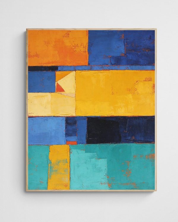
Alternatively, install a gallery wall at the landing, creating a visual destination that draws the eye upward. Mix frame sizes and orientations for dynamic interest, ensuring the arrangement’s centre point aligns with eye level when standing on the landing. The “Deep Colour 6 Abstract Coral Art Print” brings vibrant energy to such transitional spaces, its bold palette enlivening areas often relegated to afterthought status.
Conquering Awkward Corners
Interior corners create tricky display challenges, as artwork positioned too close to the angle becomes difficult to view properly. Rather than centering a piece in the corner, offset it by at least 30cm to one side, allowing comfortable viewing angles. Corner gallery shelves offer another solution, supporting small leaning prints you can easily rearrange without additional nail holes.
Exterior corners beside doorways or protruding fireplaces work beautifully with diptychs or triptychs—matched sets of two or three panels that wrap around the corner, creating visual continuity whilst acknowledging the architectural feature. This technique particularly suits landscape abstracts, where flowing compositions extend naturally across multiple panels.


Maximising Narrow Wall Segments
Slim wall sections between windows or doors often go unused, yet they offer perfect opportunities for vertical drama. Stack two or three small square prints vertically, or select a single tall, narrow piece that emphasises the space’s natural proportions. These interventions prevent walls from appearing choppy or fragmented, instead creating intentional design moments that demonstrate thoughtful planning.
Similarly, the wall space above doorways—typically ignored—accommodates horizontal prints beautifully. This unexpected placement surprises guests whilst maximising every available surface. Ensure adequate clearance above the door frame (at least 10-15cm) to avoid a cramped appearance, and select lightweight pieces to simplify secure mounting.
Creating Cohesion in Open-Plan Layouts
Open-plan living presents coordination challenges, as multiple functional zones share visual space. Establish a unifying art theme or colour palette that flows throughout, whilst varying scale and style to define distinct areas. Your dining zone might feature bold, energetic pieces that stimulate conversation, whilst the adjacent lounge area showcases calming abstracts promoting relaxation.
Nevertheless, avoid creating completely disparate looks that fragment the space. If your living area features vibrant colourful abstracts, echo those hues in dining area artwork, perhaps in more subdued intensities. This approach maintains visual flow whilst acknowledging each zone’s unique purpose and character.


Practical Installation Tips
Professional-looking installations require proper hardware and techniques. For prints under 5kg, standard picture hooks suffice, but heavier framed works demand wall anchors or stud mounting. Always locate studs with an electronic finder before hanging substantial pieces—the extra effort prevents damaged walls and fallen artwork.
Create paper templates matching your frames’ exact dimensions, then tape them to walls for visualisation before committing to holes. This simple step prevents costly mistakes and allows experimentation with arrangements. Once satisfied, mark hook positions through the paper, remove templates, and install hardware precisely where indicated.
When hanging multiple pieces, work from the centre outward. Install your largest or most important work first, establishing an anchor point, then build the arrangement around it. This method proves particularly valuable for salon walls, where organic growth from a central focal point creates natural, balanced compositions that feel intentional rather than random.


Transform your blank walls into purposeful design statements through strategic art placement that honours both your space’s architecture and your personal aesthetic. The journey from empty surfaces to curated gallery walls requires patience and planning, yet the resulting transformation proves well worth the investment. By understanding scale, colour coordination, lighting, and installation techniques, you’ll maximise every centimetre of available wall space whilst creating interiors that genuinely reflect your unique style and elevate everyday living experiences into something extraordinary.
 | Joseph Russell Joseph is an Australian abstract artists and curator of the Inomaly art collection. |