You’re standing in a gallery, surrounded by abstract works that seem utterly different until you realise they share certain DNA. How do you actually tell geometric abstraction from lyrical abstraction? What makes a cubist piece instantly recognisable? Understanding the visual signatures, techniques, and principles behind each abstract style transforms confusion into genuine confidence. This guide breaks down what to look for in geometric abstraction, lyrical abstraction, cubism, colour field painting, and minimalism—giving you practical tools to recognise each at a glance.
The key to identifying abstract styles lies in observing specific visual elements: the use of line, colour, shape, texture, and composition. Geometric abstraction features precise shapes, clean lines, and mathematical compositions, often with flat colour fields. Lyrical abstraction emphasises fluid, organic forms with expressive brushwork and emotional resonance. Cubist works fragment objects into angular planes viewed from multiple perspectives simultaneously. Colour field painting prioritises large areas of solid colour with minimal detail. Minimalism strips art down to essential forms, often using monochrome palettes and simple repetition. By learning to spot these defining characteristics, you’ll develop an eye for distinguishing one abstract movement from another, whether you’re selecting pieces for your home or simply deepening your appreciation of modern art.
Geometric Abstraction: Precision and Mathematical Beauty
Geometric abstraction emerged in the early 20th century as artists sought to create visual harmony through mathematical principles and pure form. This style is immediately recognisable by its use of precise shapes—circles, squares, triangles, and rectangles—arranged in carefully balanced compositions. The colours are typically flat and unmodulated, applied in distinct blocks without gradients or shading. Piet Mondrian’s grid compositions and Kazimir Malevich’s suprematist works are canonical examples.
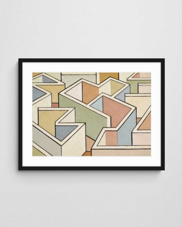
When examining a piece for geometric qualities, look for crisp edges, symmetry or deliberate asymmetry, and a sense of architectural structure. The “Pastel Maze – Geometric Abstract Art Print with Neutral Tones” exemplifies this approach with its maze-like linear patterns and restrained colour palette, whilst “Circles of Civilisation 4 – Mid Century Geometric Abstract Circle Art Print” demonstrates how geometric forms can create rhythm and movement through repetition.
The intellectual rigour behind geometric abstraction appeals to viewers who appreciate order and clarity. In practice, these works function beautifully in modern and contemporary interiors where clean lines and minimalist aesthetics dominate. The style originated partly from constructivism and neo-plasticism, movements that believed art should reflect the machine age and universal truths rather than personal emotion.
Identifying Key Features of Geometric Works
To quickly spot geometric abstraction, scan for these characteristics:
- Hard-edged shapes with ruler-straight lines or compass-perfect curves
- Limited colour palettes often featuring primary colours or complementary pairs
- Mathematical proportions and grid-based compositions
- Absence of recognisable imagery or natural forms
- Flat picture plane with no illusion of depth or perspective
Geometric abstraction rarely shows visible brushstrokes—the application is smooth and impersonal. This contrasts sharply with more expressive abstract styles where the artist’s hand is evident in every mark. The absence of texture and the emphasis on optical relationships between forms are hallmarks that distinguish this movement from others.
Lyrical Abstraction: Emotion Through Fluid Forms
Lyrical abstraction stands in direct opposition to geometric precision, favouring spontaneity, emotional expression, and organic forms. This movement gained prominence in the 1940s and 1950s as artists rejected rigid formalism in favour of intuitive mark-making. The style is characterised by flowing lines, expressive brushwork, and compositions that evoke natural phenomena like water, clouds, or landscapes without directly depicting them.
When you encounter lyrical abstraction, you’ll notice softer edges, gradual colour transitions, and a painterly quality that reveals the artist’s gestures. The works often feel atmospheric and poetic, inviting contemplation rather than analysis. This approach stems from lyrical abstraction’s emphasis on personal expression and the subconscious creative process.
Works in this category might feature calligraphic marks, staining techniques where thin paint soaks into canvas, or layered transparent washes. The overall effect is one of movement and vitality, as if the painting captures a moment of transformation. Unlike geometric abstraction’s static equilibrium, lyrical works pulse with energy and suggest narrative without telling a specific story.
Recognising Lyrical Characteristics
Look for these indicators when identifying lyrical abstraction:
- Visible brushstrokes and evidence of the artist’s hand
- Organic, biomorphic shapes rather than geometric forms
- Layered, translucent colour applications
- Sense of depth created through overlapping forms
- Evocative titles that suggest emotional states or natural imagery
The emotional resonance of lyrical abstraction makes it particularly suitable for living spaces where personal expression matters. These works invite viewers to project their own interpretations, creating intimate connections between art and observer. Joan Mitchell’s vigorous gestural paintings and Helen Frankenthaler’s delicate colour-stained canvases represent different approaches within this style.
Cubism and Abstract Fragmentation
Cubism, pioneered by Pablo Picasso and Georges Braque around 1907, revolutionised how artists represented reality by breaking objects into geometric fragments and showing multiple viewpoints simultaneously. Whilst early cubism retained recognisable subjects, the movement evolved toward greater abstraction, influencing countless artists to fragment, facet, and reconfigure visual information.
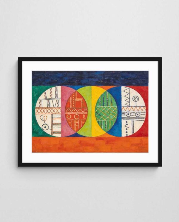
To identify cubist influence in abstract work, look for angular planes that intersect and overlap, creating a fractured picture space. Colours often shift between adjacent facets, and forms appear to be viewed from several angles at once—you might see the profile and frontal view of a face simultaneously. “Cubist Abstract Portrait – Wearing Many Hats” demonstrates this multi-perspective approach, whilst “Profile Geometric Abstract Portrait” shows how cubist principles can simplify and abstract the human form.


The intellectual breakthrough of cubism lay in rejecting Renaissance perspective, which had dominated Western art for centuries. By acknowledging the flat surface of the canvas and depicting time as well as space, cubists created a new visual language. Cubism’s revolutionary approach influenced not just painting but sculpture, architecture, and design throughout the 20th century.
Spotting Cubist Elements
Key features that reveal cubist influence include:
- Fragmented forms broken into geometric facets
- Monochromatic or limited colour schemes, especially in analytical cubism
- Simultaneous multiple viewpoints within a single composition
- Flattened space that rejects traditional perspective
- Letter forms or collage elements incorporated into paintings
Later synthetic cubism introduced brighter colours, decorative patterns, and collage techniques, making the style more accessible and decorative. Many contemporary abstract artists draw on cubist principles without creating overtly cubist works, using fragmentation and multiple perspectives as compositional tools. This makes cubism one of the most influential movements for understanding modern abstract art.
| Abstract Style | Key Visual Elements | Colour Approach | Best For |
|---|---|---|---|
| Geometric Abstraction | Precise shapes, clean lines, mathematical composition | Flat colour blocks, limited palettes | Modern, minimalist interiors |
| Lyrical Abstraction | Fluid forms, visible brushwork, organic shapes | Layered, translucent washes | Emotional, contemplative spaces |
| Cubism | Fragmented planes, multiple viewpoints, angular facets | Monochromatic or limited (analytical); brighter (synthetic) | Intellectual, gallery-style settings |
| Colour Field | Large areas of solid colour, minimal detail | Saturated hues or subtle variations | Meditative, spacious environments |
| Minimalism | Essential forms, simple repetition, restraint | Monochrome or extremely limited | Contemporary, sophisticated spaces |
Colour Field Painting: Immersive Hue Experiences
Colour field painting emerged in the 1950s and 1960s as artists like Mark Rothko, Barnett Newman, and Helen Frankenthaler explored colour’s emotional and optical power. This style features large expanses of unmodulated or subtly modulated colour that dominate the canvas, creating immersive visual experiences. The approach differs fundamentally from gestural abstraction—there are no dramatic brushstrokes or compositional complexity, just colour itself as subject.
When identifying colour field works, look for compositions where colour takes precedence over form or line. The paintings often feature soft edges where colours bleed into one another, or in Rothko’s case, stacked horizontal rectangles that seem to float. The scale is frequently monumental, encouraging viewers to lose themselves in contemplation of pure chromatic sensation.
This style creates powerful atmospheric effects in residential and commercial settings. The transformative power of colour in interiors is amplified when using colour field-inspired works, as their simplicity allows hues to interact directly with surrounding space and light. Contemporary artists continue exploring this approach, sometimes incorporating digital techniques or new materials whilst maintaining the focus on colour as primary content.
Characteristics of Colour Field Works
Identifying features include:
- Large areas of relatively flat colour dominating the composition
- Soft or hard edges between colour zones
- Minimal representational content or symbolic imagery
- Emphasis on the viewer’s optical and emotional response to colour
- Often large-scale works meant to envelope the viewer’s field of vision
The contemplative quality of colour field painting makes it particularly effective in spaces designed for relaxation or focus. The style invites meditation on subtle variations within seemingly uniform colour areas. Many viewers report profound emotional responses to colour field works, experiencing shifts in mood and perception as they spend time with the pieces.
Minimalism: Less is Profoundly More
Minimalism stripped abstract art down to its essential elements, rejecting the emotional expressionism that had dominated earlier movements. Emerging in the 1960s, minimalist artists like Donald Judd, Agnes Martin, and Frank Stella embraced industrial materials, precise execution, and reductive compositions. The philosophy: eliminate everything unnecessary to reveal the inherent qualities of materials, form, and space.
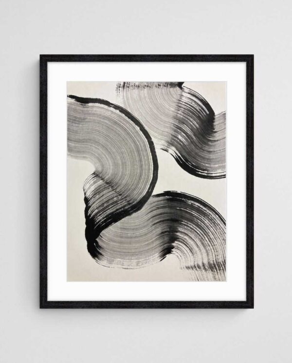
To identify minimalist works, look for extreme simplicity, repetitive elements, and an almost anti-expressive quality. Compositions might feature simple grids, single colours, or basic geometric forms repeated with slight variations. “Ink Ribbons 2 – Minimalist Abstract Art Print in Monochrome” captures this reductive approach, whilst “Seaborn – Neutral Coastal Abstract Art Print” demonstrates how minimalism can evoke specific environments with maximum restraint.
The power of minimalism lies in what it doesn’t include. By stripping away decorative elements and emotional gestures, minimalist works direct attention to fundamental aesthetic experiences: the quality of a line, the interaction of a form with surrounding space, the subtle modulation of a neutral tone. This approach resonates strongly with contemporary interior design’s embrace of neutral palettes and uncluttered spaces.
Recognising Minimalist Art
Key indicators of minimalism include:
- Extreme reduction of compositional elements
- Monochromatic or very limited colour schemes
- Precise, impersonal execution without visible artist’s hand
- Use of industrial materials or techniques
- Repetition of simple forms or modules
- Emphasis on the artwork as object rather than window or illusion
Minimalism extends beyond visual characteristics to embody a philosophical stance about art’s purpose. By rejecting representation, symbolism, and emotional expression, minimalist artists insisted viewers engage with the work on purely formal terms. This intellectual rigour initially alienated audiences but has since become hugely influential in both art and design, shaping how we understand visual communication.
Practical Tips for Quick Style Identification
Developing fluency in abstract styles requires practice, but several strategies accelerate the learning process. Start by training your eye to notice fundamental distinctions: Is the work predominantly geometric or organic? Is colour or line the dominant element? Does it feel emotionally expressive or intellectually rigorous? These basic questions immediately narrow the field.
Consider the historical context if known. Abstract styles evolved chronologically, with later movements often reacting against earlier ones. Cubism preceded geometric abstraction, which influenced minimalism. Understanding these relationships helps identify influences even when styles blend. Contemporary artists frequently combine elements from multiple movements, creating hybrid works that reference several traditions.
Building Your Visual Vocabulary
To accelerate your ability to identify abstract styles, try these practical exercises:
- Visit galleries displaying Australian abstract art to see diverse approaches in person
- Create a visual reference library by photographing or collecting images of works from each movement
- Practice describing artworks using formal terms: line, colour, shape, texture, composition
- Research key artists associated with each movement to understand their innovations
- Compare works side by side to identify distinguishing characteristics
Reading artist statements and exhibition catalogues provides insights into intentions and processes. What artists say about their work often illuminates aspects not immediately visible, helping you develop a more nuanced understanding. Many contemporary artists draw on multiple abstract traditions simultaneously, creating rich layers of reference.
Context Matters: Installation and Environment
How abstract art is displayed also offers identification clues. Minimalist works often require generous space and careful lighting to emphasise their formal qualities. Colour field paintings benefit from being viewed at close range where their immersive qualities dominate peripheral vision. Geometric abstraction works well in architectural settings where its structural qualities complement built environments.
Pay attention to framing and presentation choices as well. Minimalist works might be unframed or use simple metal frames that emphasise objecthood. Lyrical abstractions often feature more traditional framing that honours their painterly qualities. These contextual elements aren’t definitive, but they provide supporting evidence when identifying styles. Considering how abstract paintings are displayed can reveal much about their stylistic lineage.
Start with one style and study works closely—visit galleries, spend time with books or catalogues, compare pieces. As you develop that foundation, add another style. The distinctions become clearer when you move between examples rather than trying to learn everything at once. The most reliable approach is to look, compare, and look again.
 | Joseph Russell Joseph is an Australian abstract artists and curator of the Inomaly art collection. |