Working from home or running a small business often means dedicating a compact space to your professional life. While these smaller environments are practical, they can feel uninspiring without the right design touches. That’s where abstract art becomes invaluable—transforming limited square footage into a visually engaging workspace that stimulates creativity and productivity. Rather than viewing your small office as a constraint, consider it an opportunity to make every design choice count. Strategic art placement can redefine how you experience your work environment daily, creating an atmosphere that feels both professional and personally meaningful.
When you’re working with limited wall space, each piece of artwork needs to earn its place. Abstract prints offer distinct advantages in compact offices: they add visual interest without overwhelming the eye, they can bridge multiple colour schemes as your decor evolves, and they create focal points that make small spaces feel intentionally designed rather than cramped. The key is understanding how to select and position abstract art so it enhances rather than clutters your workspace. This guide walks you through the fundamentals of choosing abstract art for small offices, covering everything from scale and colour psychology to practical hanging techniques and common mistakes to avoid.
Understanding Abstract Art for Workspaces
Abstract art differs fundamentally from representational artwork by prioritising form, colour, and composition over recognisable subjects. This characteristic makes it particularly valuable in professional settings where you want visual stimulation without distraction. A landscape painting might draw your eye into imagining yourself elsewhere, while a well-chosen abstract piece provides aesthetic pleasure without pulling your attention away from work tasks.
In practice, abstract art functions as a sophisticated design element that can subtly influence mood and energy levels throughout your workday. Different abstract styles communicate distinct atmospheres—geometric abstracts project order and precision, organic abstracts suggest creativity and flexibility, while minimalist pieces promote calm and focus. Understanding these associations helps you select artwork that reinforces the work you’re doing rather than conflicting with it.
The beauty of abstract prints lies in their interpretive nature. Where figurative art presents a specific narrative, abstract works allow viewers to project their own meaning and emotional response. This quality prevents visual fatigue in spaces where you spend extended periods. Additionally, abstract art tends to age well aesthetically, remaining relevant as design trends shift over years.
Types of Abstract Art Suitable for Small Offices
When selecting abstract art for compact workspaces, you’ll encounter several broad categories worth considering:
- Geometric abstracts: Feature clean lines, shapes, and mathematical precision that complement modern office aesthetics
- Expressionist abstracts: Emphasise gestural brushwork and emotional energy, adding dynamism to static environments
- Colour field abstracts: Focus on large areas of colour with minimal detail, creating calm focal points
- Minimalist abstracts: Strip compositions to essential elements, ideal for avoiding visual clutter
- Organic abstracts: Incorporate flowing forms and natural references, softening hard-edged office environments
Each category serves different purposes depending on your work style and the atmosphere you’re cultivating. A graphic designer might gravitate toward bold geometric prints that celebrate visual structure, while a therapist’s office might benefit from softer organic abstracts that promote calm. There’s no universally “correct” choice—effectiveness depends on alignment between the artwork and your specific professional context.


Getting Scale and Proportion Right
One of the most common mistakes in small office design is choosing artwork that’s either too small to make an impact or too large for the available wall space. The relationship between your artwork dimensions and wall size directly affects how spacious or cramped your office feels. As a general guideline, a single piece of art should occupy approximately 60-75% of the wall width it’s positioned on. Artwork that’s too small creates a disconnected, floating appearance, while oversized pieces can make walls feel crowded.
Consider the viewing distance when selecting print sizes. If your desk faces a wall from two metres away, a 40x50cm or 50x70cm print typically provides sufficient visual presence without dominating the space. For walls you view from closer distances—such as directly beside your desk—smaller prints around 30x40cm often work better, preventing the artwork from feeling overwhelming in your peripheral vision.
Vertical versus horizontal orientation also impacts spatial perception. Vertical prints draw the eye upward, making ceilings feel higher and rooms more spacious—particularly valuable in small offices with standard ceiling heights. Horizontal prints emphasise width, which can make narrow offices feel more balanced. If you’re working with an awkwardly proportioned space, strategic orientation choices help counteract those limitations.
Multi-Piece Arrangements for Maximum Impact
When a single large print isn’t practical, consider a diptych or triptych arrangement. Two or three coordinating abstract prints hung in sequence create the visual weight of a larger piece while offering installation flexibility. This approach works especially well above credenzas, filing cabinets, or along narrow wall sections where a single large print wouldn’t fit proportionally.
The spacing between pieces in multi-print arrangements matters significantly. As a working guideline, maintain 5-10cm gaps between prints in a set. Closer spacing creates unity, making the arrangement read as a single compositional element. Wider spacing breaks the visual connection, which can make small walls feel fragmented. When hanging multiple prints, ensure they’re perfectly level and evenly spaced—even minor misalignments become obvious in compact spaces where you’ll see them daily.


Colour Psychology in Small Office Design
Colour profoundly affects psychological states, influencing everything from stress levels to creative thinking. In small office environments where you spend focused time working, colour choices in your abstract art can either support or undermine your productivity. Blue tones, for instance, are extensively researched for their calming effects and association with focus, making blue-dominant abstract prints excellent choices for analytical work requiring sustained concentration.
Warm colours like reds, oranges, and yellows stimulate energy and creativity but can become overwhelming in excess. A common mistake is selecting vibrant warm-toned artwork for small spaces where it creates visual agitation rather than inspiration. If you’re drawn to warm palettes, consider prints that incorporate these colours as accents within cooler compositions, providing energetic touches without dominating the visual field.
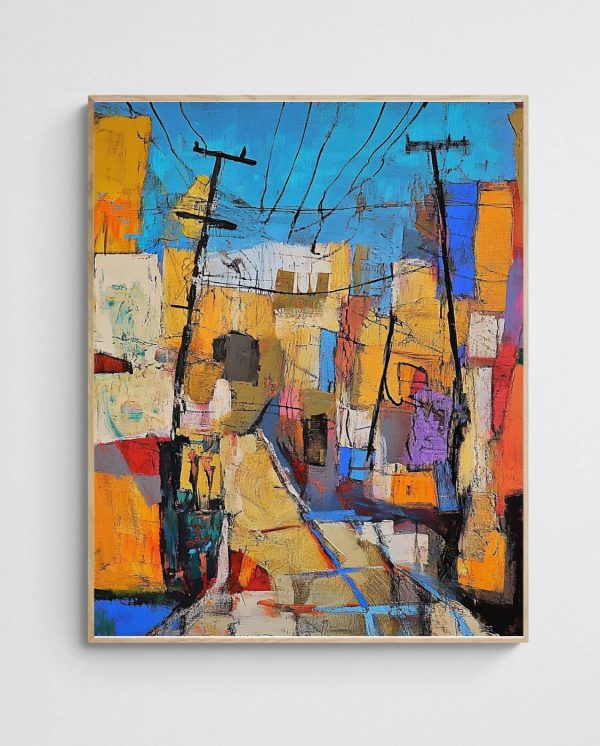
Neutral abstract art—featuring blacks, whites, greys, and earth tones—offers versatility and sophistication. These palettes work particularly well in home offices where the space transitions between professional and personal use. Neutral artwork provides visual interest without competing with other design elements, and it accommodates changing furniture or decor without requiring replacement. The “Warm Modern Abstract Portrait – Dusk and Dawn” exemplifies this approach, offering subtle colour variation that adds warmth without overwhelming compact spaces.
| Colour Group | Psychological Effect | Best For | Small Office Consideration |
|---|---|---|---|
| Cool Blues & Greens | Calm, focus, reduced stress | Analytical work, client-facing spaces | Recedes visually, making spaces feel larger |
| Warm Reds & Oranges | Energy, creativity, urgency | Creative work, brainstorming areas | Use sparingly—can overwhelm small spaces |
| Yellows & Golds | Optimism, mental stimulation | Innovation-focused work, writing | Best in muted tones to avoid visual fatigue |
| Neutrals & Earth Tones | Grounding, sophistication, versatility | Professional services, multi-use spaces | Maximises flexibility, coordinates easily |
| Black & White | Clarity, formality, contrast | Legal, financial, architectural fields | Creates strong focal points without colour competition |
Coordinating Art With Existing Office Colours
Your abstract art doesn’t need to match your office colours exactly—in fact, too-perfect matching can look contrived and dated. Instead, aim for coordination through complementary relationships or shared undertones. If your office features grey walls and dark wood furniture, abstract prints incorporating warm neutrals, soft blues, or muted greens will harmonise naturally while adding visual interest.
A practical approach involves identifying the dominant, secondary, and accent colours in your existing space, then selecting artwork that echoes at least one of these. For instance, if you have a navy office chair as an accent piece, abstract art featuring blue elements creates subtle visual connections that make the space feel intentionally designed. Colour balance techniques can help you develop cohesive palettes that work across your entire office environment.


Placement Strategies That Maximise Impact
Where you position abstract art dramatically affects both its visual impact and your office’s functionality. The most common placement is centred on the wall directly in your sight line when seated at your desk. This position makes the artwork a natural focal point during work breaks, providing visual rest opportunities without requiring you to turn away from your workspace entirely.
However, this conventional placement isn’t always optimal. If you conduct video calls regularly, consider what appears in your camera frame. Artwork positioned directly behind you becomes part of your professional presentation, so select pieces that project the image you want to convey. Geometric abstracts communicate structure and professionalism, while softer organic abstracts suggest approachability and creativity. The “Traffic Lights Abstract Art Print – Colourful Fauvism” offers vibrant visual interest that reads well on camera while maintaining professional credibility.
Hanging height significantly affects viewing comfort. The standard guideline suggests positioning artwork so its centre sits at eye level when standing—typically 145-150cm from the floor. However, in office environments where you’re primarily seated, dropping this slightly lower (centre at 135-140cm) often provides more comfortable viewing angles from your desk chair. The exception is artwork positioned above furniture, which should relate to the furniture piece rather than standard eye level.
Creating Visual Balance in Asymmetrical Spaces
Small offices frequently feature awkward architectural elements—off-centre windows, corner desk positions, or uneven wall lengths. Strategic art placement can counterbalance these asymmetries. If your desk sits in a corner, hanging abstract art on the adjacent wall creates a visual anchor that makes the corner positioning feel intentional rather than cramped.
For offices with a single dominant window, consider placing abstract art on the opposite wall. This draws the eye around the room, encouraging visual movement that makes small spaces feel more dynamic. Additionally, artwork opposite windows benefits from natural light throughout the day, with changing light conditions revealing different aspects of the print at various times.
Vertical surfaces aren’t your only option. Leaning larger abstract prints on shelving units or credenzas creates a more casual, layered aesthetic that works particularly well in home offices where you want to soften corporate formality. This approach also offers flexibility—you can easily rotate artwork seasonally or as your preferences evolve without putting additional holes in walls.


Selecting the Right Abstract Style
Abstract art encompasses tremendous stylistic variety, and matching style to your professional context creates cohesion between your work identity and physical environment. For client-facing offices where you need to project authority and competence—accounting firms, legal practices, financial advisors—geometric abstracts with clear structure communicate precision and reliability. These styles feature defined shapes, calculated compositions, and controlled colour palettes that reinforce professional credibility.
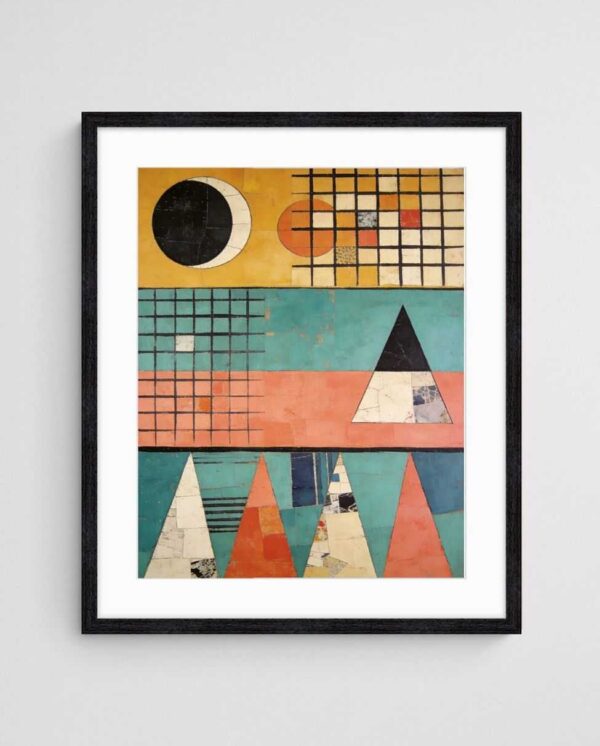
Creative professionals often benefit from more expressive abstract styles. Graphic designers, architects, and marketing consultants might select abstract expressionist pieces featuring gestural brushwork and dynamic energy. These styles signal creative thinking and innovation, aligning your physical space with the services you provide. The “Star Party Abstract Expressionist Art Print” demonstrates how energetic abstract compositions can invigorate workspaces without becoming chaotic.
For therapeutic or wellness-oriented professions—counselors, physiotherapists, wellness coaches—organic abstracts with flowing forms and nature-inspired palettes create calming environments. These styles avoid the hard edges and stark contrasts that might increase client anxiety, instead offering visual softness that supports the work being done. Medical and healing spaces provide excellent examples of how abstract art selections can directly support professional objectives.
Minimalism Versus Maximalism in Compact Spaces
A persistent design question in small offices is whether to embrace minimalist simplicity or incorporate more visually complex abstract pieces. The answer depends partly on your working style and partly on existing visual complexity in your space. If your desk typically holds multiple monitors, stacks of papers, and various equipment, adding visually complex artwork can create sensory overload. Minimalist abstract prints with simple compositions and restrained palettes provide visual relief in already-busy environments.
Conversely, if you maintain a highly organised, minimal desk setup with clean surfaces and hidden storage, your walls can accommodate more complex abstract compositions without overwhelming the space. In these contexts, a vibrant, detailed abstract print becomes an intentional focal point rather than contributing to clutter. The key is maintaining overall visual balance—complexity in one area should be balanced with simplicity in another.
You’ll also want to consider how abstract styles age in your perception. Highly trendy styles might feel dated within a few years, requiring replacement to maintain a current professional image. Classic abstract approaches—mid-century modern geometric prints, timeless colour field compositions, or enduring expressionist pieces—tend to remain visually relevant across decades, making them smarter long-term investments for professional spaces.
Common Mistakes to Avoid
The most frequent error in small office art selection is choosing prints that are too small for the available wall space. This creates a disconnected, unfinished appearance that diminishes rather than enhances your workspace. When in doubt, size up rather than down—a slightly-too-large print commands appropriate visual presence, while undersized artwork looks like an afterthought.
Another common pitfall is hanging artwork too high. The impulse to position prints near the ceiling line stems from a mistaken assumption that this maximises wall space or makes ceilings appear higher. In practice, artwork hung too high loses connection with the room’s functional elements, appearing to float without purpose. Proper positioning at or slightly below eye level creates cohesive visual relationships with furniture and architectural features.
Overlooking lighting represents a significant missed opportunity. Abstract art requires adequate illumination to read properly, yet many small offices lack focused picture lighting. Poor lighting flattens colours, obscures compositional details, and prevents artwork from serving as an effective focal point. If overhead lighting doesn’t adequately illuminate your wall art, consider adding a simple picture light or adjusting your desk lamp positioning to cast light across nearby prints.
Avoiding Thematic Clichés
Certain abstract art themes have become clichéd in professional settings through overuse. Motivational word art, overly literal interpretations of business concepts (arrows pointing upward, puzzle pieces connecting), and generic sunset abstracts communicate a lack of thoughtful design consideration. These choices can undermine professional credibility, particularly in creative or design-oriented fields where aesthetic judgment is part of your professional value proposition.
Instead, select abstract pieces based on genuine aesthetic appreciation and alignment with your workspace needs. Authentic art choices—even unconventional ones—communicate personality and intentionality, while safe, clichéd selections suggest you’re simply filling wall space without meaningful consideration. Your office artwork contributes to clients’ and colleagues’ perception of your professional identity, so ensure it accurately represents who you are and the quality you deliver.
Finally, resist the temptation to crowd small office walls with multiple unrelated prints. A single well-chosen abstract piece creates more impact than several mediocre ones competing for attention. If you want to display multiple artworks, ensure they share visual connections—similar colour palettes, complementary styles, or coordinated framing—that create intentional unity rather than accidental clutter. Display strategies used in residential settings often translate effectively to small professional spaces.


Creating Cohesion in Your Office Space
Abstract art doesn’t exist in isolation—it interacts with every other element in your office environment. Creating cohesion means considering how your artwork relates to furniture finishes, flooring materials, window treatments, and architectural details. In small spaces where everything remains visible simultaneously, these relationships become particularly important. Cohesion doesn’t require matching everything precisely; rather, it involves creating visual harmony through repeated elements or complementary contrasts.
Framing choices significantly impact cohesion. In modern offices with clean-lined furniture and minimal ornamentation, simple frames in black, white, or natural wood maintain stylistic consistency. More traditional office environments with detailed woodwork and classic furniture might accommodate frames with slightly more elaboration. However, ornate frames typically conflict with abstract art’s inherent modernity—even in traditional spaces, cleaner frame profiles usually work better.
Consider the visual weight distribution throughout your office. If one wall features a large abstract print, balance this with substantial furniture pieces or shelving on opposite walls. Unbalanced visual weight makes small rooms feel lopsided and uncomfortable. Similarly, distribute colour intentionally—if your abstract art features prominent red accents, echoing red in a desk accessory or throw pillow creates cohesive colour flow that ties the space together.
Incorporating Abstract Art Into Existing Office Layouts
Adding abstract art to an established office requires working with existing constraints while identifying improvement opportunities. Start by photographing your current space from multiple angles. These photos reveal design elements you might overlook in daily use—awkward blank walls, colour clashes, or areas lacking visual interest. Identify the wall that feels most prominent or visible, whether that’s the wall behind your desk, in your sight line while working, or visible from the doorway.
This primary wall deserves your strongest artwork—the piece with the most visual impact or personal meaning. Secondary walls can accommodate smaller or more subtle prints that support rather than compete with your focal piece. If your office layout includes distinct functional zones—a desk area, a meeting space, a filing area—abstract art can help define these zones visually while maintaining overall aesthetic unity.
When working with abstract art prints, you gain flexibility that original paintings don’t offer. Prints are easily replaced as your aesthetic preferences evolve or as you refresh your office design. This adaptability is particularly valuable in rented spaces where you might relocate periodically, allowing you to adjust artwork to suit different room configurations without significant reinvestment.
Remember that your office space should ultimately support your work rather than distract from it. Abstract art succeeds in small offices when it creates an environment that energises, calms, or inspires you as needed throughout your workday. The right pieces make you genuinely happy to enter your workspace each morning, transforming a functional necessity into a space you actively enjoy inhabiting. That psychological shift—from tolerating to appreciating your work environment—represents the true value of thoughtfully selected abstract art in small professional spaces.
Building Your Collection Over Time
You don’t need to complete your office art installation all at once. In fact, gradual acquisition allows you to live with pieces, understand how they function in your specific space, and make more informed subsequent choices. Start with a single statement piece for your primary wall, ensuring you select something with genuine staying power that you’ll appreciate over years rather than months.
As you work in your newly art-enhanced space, you’ll notice which areas still feel incomplete or which walls would benefit from additional visual interest. This lived experience provides invaluable guidance for future selections. You might discover that you need energising artwork on the wall you face during afternoon energy slumps, or that calming prints work better near your video call background than you initially expected.
Building a collection over time also distributes financial investment, making higher-quality pieces more accessible. Rather than purchasing multiple budget prints simultaneously, investing in fewer premium pieces spaced over months or years typically yields better long-term satisfaction. Quality abstract art maintains visual appeal through years of daily viewing, while budget pieces often lose their appeal relatively quickly, requiring replacement that ultimately costs more than a single quality selection would have initially.
Consider seasonal or periodic rotation if you’re drawn to multiple styles or themes. Changing artwork seasonally keeps your office feeling fresh and prevents visual stagnation. This approach works particularly well in home offices where you have more flexibility and storage options. New abstract artworks provide ongoing opportunities to refresh your space as your collection and preferences evolve.


Small offices present unique design challenges, but they also offer opportunities for highly intentional, personally meaningful spaces. Every element carries more visual weight in compact environments, making each choice—including abstract art selection—more impactful. By understanding scale relationships, colour psychology, placement strategies, and stylistic considerations, you can transform even the most modest office into a space that feels both professionally credible and personally inspiring. The abstract prints you select become more than mere decoration; they’re daily visual companions that subtly influence your mood, energy, and professional effectiveness throughout countless hours at your desk. Investing time in thoughtful selection and placement pays dividends in work satisfaction and environmental quality that far exceed the initial effort required.
 | Joseph Russell Joseph is an Australian abstract artists and curator of the Inomaly art collection. |