Neutral walls create the perfect blank canvas for interior design, but which art style truly makes them shine? Abstract art—particularly pieces with bold colours, organic patterns, and dynamic compositions—transforms neutral spaces from bland to breathtaking by introducing focal points that anchor the room’s aesthetic and draw the eye naturally through the space.
For homeowners and decorators working with beige, grey, white, or taupe walls, the real challenge is choosing the right style that complements rather than competes. Abstract art excels in neutral environments because it introduces colour and movement while maintaining design flexibility. Whether you prefer coastal-inspired pieces, botanical motifs, or geometric designs, understanding how different abstract styles interact with neutral palettes creates cohesive, inviting spaces that reflect your personal style.
Why Abstract Art Works Brilliantly on Neutral Walls
Neutral walls provide the ideal foundation for abstract art because they don’t compete for visual attention. Unlike boldly coloured walls that can clash with certain artwork, neutral tones—including whites, greys, beiges, and taupes—allow the art to become the room’s star attraction. This relationship between subdued backgrounds and dynamic artwork creates a sophisticated contrast that professional interior designers consistently exploit.
Abstract art thrives in these environments because its non-representational nature gives viewers freedom to interpret meaning while adding colour, texture, and energy. The organic shapes, unexpected colour combinations, and varied brushwork found in abstract pieces introduce visual complexity that neutral walls simply cannot provide on their own. This pairing prevents spaces from feeling clinical or sterile, which commonly happens in all-neutral design schemes without thoughtful art selection.
Furthermore, abstract art offers unmatched versatility when decorating with neutral walls. You can rotate pieces seasonally, experiment with different colour stories, or adjust the mood of a room without repainting. A vibrant coastal abstract brings summery freshness, whilst darker, moodier pieces create cosy intimacy—all within the same neutral framework. This adaptability makes abstract art a smart investment for homeowners who want design flexibility.
The Psychology of Colour Against Neutral Backgrounds
Neutral backgrounds amplify the emotional impact of colours introduced through art. When a bold red or calming blue appears against a beige or grey wall, the eye perceives that colour as more saturated and impactful. This phenomenon, called simultaneous contrast, means your abstract art will appear more vibrant and engaging in neutral spaces than it would against coloured walls.
Neutral walls also create a visual rest period for the eye, making the transition to colourful artwork feel intentional and curated rather than chaotic. This breathing room is essential in modern interior design, where overstimulation can disrupt the sense of home. The neutral-abstract pairing achieves balance between visual interest and restful simplicity, creating spaces that feel both dynamic and calming—particularly valuable in living areas and bedrooms.
Coastal and Beach-Inspired Abstract Styles
Coastal abstract art brings the tranquillity of beaches and oceans into neutral spaces with exceptional grace. These pieces typically feature blues, aquas, sandy beiges, and coral tones that echo natural seashore palettes. The organic, flowing compositions found in coastal abstracts complement neutral walls by introducing movement and fluidity without jarring colour contrasts, creating relaxed, breathable atmospheres.
The beauty of coastal abstract art lies in its ability to evoke seaside serenity whilst maintaining artistic sophistication. Unlike literal beach photography or representational seascapes, abstract coastal pieces suggest the essence of water, sand, and sky through colour, texture, and form. This subtlety prevents them from feeling theme-y or overdone, which matters in sophisticated adult spaces where you want coastal influences without beach-house clichés.
For those seeking to capture that effortlessly chic Hamptons-style aesthetic, coastal abstracts in blues and whites work beautifully. They pair exceptionally well with natural materials like rattan, linen, and whitewashed timber, creating cohesive looks that feel both curated and comfortable. The “Linoleum Beach 3 – Colourful Coral Abstract Coastal Art Print” exemplifies this approach with its vibrant coral tones and textured appearance, bringing warmth and energy to cool neutral spaces.


Selecting the Right Coastal Palette
When choosing coastal abstracts for neutral walls, consider the undertones in your neutral paint colour. Cool greys pair beautifully with crisp blues and whites, creating fresh, contemporary spaces. Warmer beiges and taupes harmonise with coastal pieces featuring sandy tones, soft corals, and aqua greens for a more organic, earthy aesthetic. Understanding these relationships prevents colour clashes and ensures your artwork enhances rather than fights your existing palette.
The intensity of colour in your coastal abstracts also matters. Softer, muted coastal pieces create serene, spa-like environments perfect for bedrooms and bathrooms. Coastal abstracts with saturated colours and bold contrasts energise living rooms and dining areas. The “Sea of Clouds – Abstract Coastal Wall Art Print” demonstrates how ethereal blues and whites can create atmospheric depth whilst maintaining that coveted coastal tranquillity.


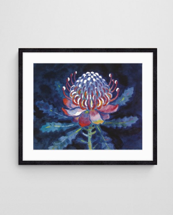
Bold Botanical and Floral Abstract Pieces
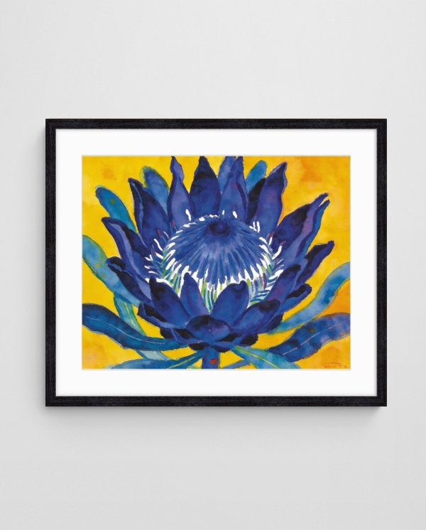
Botanical and floral abstract art introduces organic shapes and nature-inspired colours that soften the sometimes stark appearance of neutral walls. These pieces range from recognisable plant forms rendered abstractly to completely non-representational works that capture the essence of growth, life, and natural beauty. The versatility of botanical abstracts makes them suitable for nearly any room, from formal living areas to casual breakfast nooks.
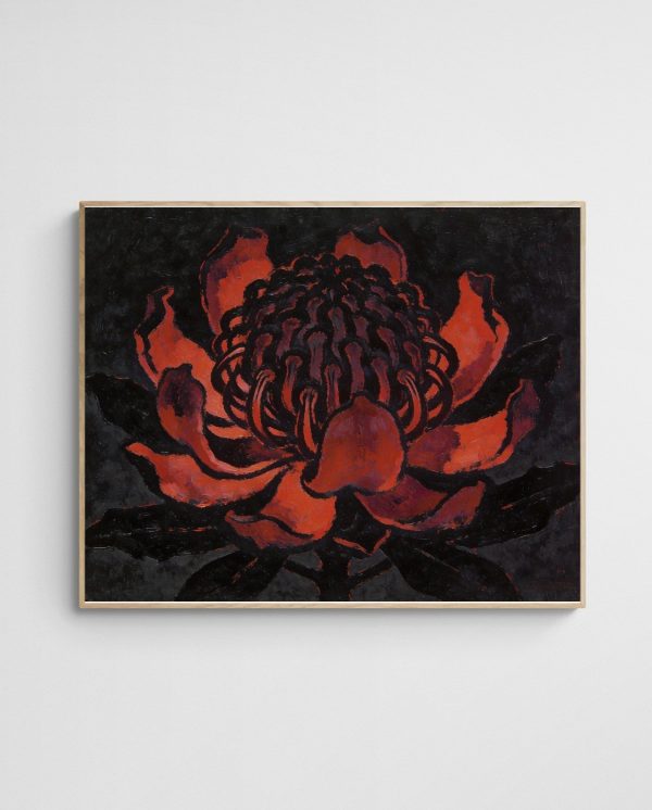
Australian native flora provides particularly striking subject matter for abstract botanical art. Waratahs, proteas, wattle, and eucalyptus possess dramatic forms and rich colours that translate beautifully into abstract compositions. These pieces connect Australian homes to their natural heritage whilst introducing bold pops of colour—deep reds, golden yellows, and vibrant greens—that stand out magnificently against neutral backgrounds.
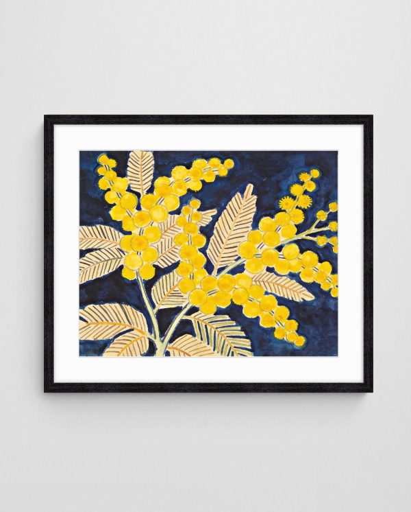
The “Golden Wattle on Blue – Australian Native Floral Wall Art Print” showcases how native botanicals can be reimagined through an abstract lens. Its striking contrast between golden florals and deep blue backgrounds creates visual drama that transforms neutral walls into gallery-worthy focal points. This approach to botanical art feels contemporary rather than traditional, appealing to modern sensibilities whilst celebrating Australian natural beauty.

Balancing Organic Forms with Interior Architecture
When incorporating botanical abstracts into neutral spaces, consider your room’s architectural features. Spaces with strong linear elements—such as exposed beams, modern window frames, or geometric furniture—benefit from the softness of organic botanical forms. This contrast between structured architecture and flowing natural shapes creates dynamic visual tension that keeps spaces interesting.
Rooms with already-organic architecture—curved doorways, arched windows, or flowing floor plans—can handle bolder, more graphic botanical abstracts without feeling overly busy. The key is achieving balance between your space’s permanent features and the artwork you introduce. Botanical abstracts excel at this balancing act because they can lean either architectural (through graphic compositions) or organic (through flowing forms) depending on the artist’s approach.
| Art Style | Best Room Types | Ideal Neutral Tones | Mood Created |
|---|---|---|---|
| Coastal Abstract | Living rooms, bathrooms, bedrooms | Cool greys, soft whites | Calm, refreshing, serene |
| Botanical Abstract | Dining rooms, entryways, studies | Warm beiges, taupes | Organic, welcoming, grounded |
| Geometric Abstract | Home offices, modern living spaces | Pure whites, charcoal greys | Structured, sophisticated, clean |
| Colourful Expressionism | Living rooms, creative studios | Any neutral works well | Energetic, bold, expressive |
| Minimalist Abstract | Bedrooms, meditation spaces | Soft greys, warm whites | Peaceful, contemplative, spacious |


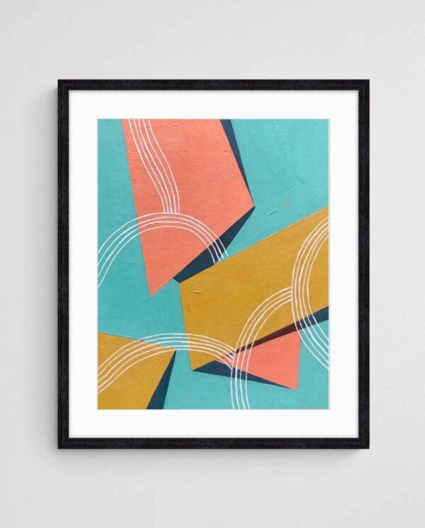
Geometric and Minimalist Abstract Designs
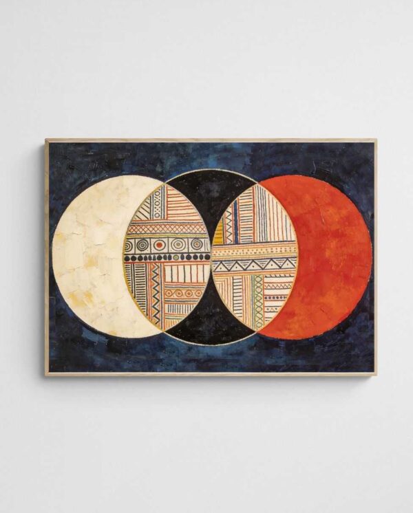
Geometric abstract art offers clean lines, structured compositions, and mathematical precision that resonates with contemporary interior design. These pieces feature shapes like circles, triangles, rectangles, and hexagons arranged in deliberate patterns that create visual rhythm. Against neutral walls, geometric abstracts provide striking focal points that feel intentional and curated, appealing to those who appreciate order and structure in their spaces.
The minimalist approach to abstract art strips away unnecessary elements, focusing on essential forms and colours. This restraint creates powerful impact through simplicity, making minimalist abstracts perfect for neutral environments where every element must earn its place. By embracing negative space and limited colour palettes, minimalist pieces prevent visual overwhelm whilst commanding attention—a delicate balance that works beautifully in modern homes.
Geometric and minimalist styles suit office spaces and professional environments where sophistication and clarity matter. However, they translate equally well into residential settings, especially in urban apartments and modern homes with architectural features that emphasise clean lines. The “Tropical Ties – Mid-Century Geometric Abstract Painting” demonstrates how geometric forms can incorporate warmth and colour whilst maintaining that structured, intentional aesthetic.


Mid-Century Modern Influences
The mid-century modern movement heavily influences contemporary geometric abstract art. Those classic design principles—organic modernism, clean lines, and bold colour choices—remain timelessly appealing. Mid-century-inspired geometric abstracts featuring circles, overlapping forms, and retro colour palettes bring nostalgic charm without feeling dated, especially when paired with neutral walls that ground their boldness.
Scale matters when selecting geometric pieces. Large-scale geometric abstracts make dramatic statements in spacious rooms with high ceilings, whilst smaller geometric works suit intimate spaces or gallery wall arrangements. The “Circles or Civilisation 1 – Mid Century Geometric Abstract Circle Art Print” exemplifies how repeated circular forms create mesmerising patterns that draw the eye and add sophistication to neutral spaces.
Colourful Abstract Expressionism for Maximum Impact
Abstract expressionism embraces spontaneity, emotion, and bold colour application, creating pieces that pulse with energy and life. These works often feature gestural brushstrokes, colour field techniques, and layered compositions that reveal depth upon closer inspection. Against neutral walls, colourful abstract expressionist pieces become room-defining focal points that anchor entire design schemes and inject personality into otherwise understated spaces.
The appeal of abstract expressionism lies in its emotional authenticity. Unlike more calculated styles, expressionist pieces communicate feeling directly, making them ideal for homeowners who want their spaces to reflect passion, creativity, and individuality. A single large-scale expressionist piece can transform a neutral room from bland to breathtaking, providing all the colour and visual interest the space needs.
Colourful expressionist abstracts work particularly well in social spaces—living rooms, dining areas, and entertaining zones—where energy and conversation flow. They can also create compelling contrasts in bedrooms when you want to balance neutral, calming walls with artwork that expresses boldness and confidence. Understanding colour balance principles helps you select expressionist pieces that energise rather than overwhelm.
Layering Techniques and Visual Depth
Many abstract expressionist works employ layering techniques where multiple colours and textures build upon each other. This creates remarkable depth that rewards extended viewing—you notice new details each time you look. Against flat neutral walls, this dimensional quality becomes even more pronounced, as the eye has a restful background from which to appreciate the artwork’s complexity.
Lighting significantly affects how expressionist pieces perform. These works often contain subtle colour variations and textural elements that reveal themselves differently under various lighting conditions. Natural light brings out true colours and highlights texture, whilst warm artificial light can enhance certain hues whilst softening others. Strategic lighting transforms good expressionist art into extraordinary focal points.

Australian-Inspired Abstract Art for Local Flavour
Australian abstract art captures the unique qualities of the Australian landscape, light, and culture through non-representational forms. These pieces often feature colour palettes inspired by Australia’s distinctive geology—rusty reds, burnt oranges, dusty pinks, and deep ochres—that feel simultaneously bold and natural. Against neutral walls, these earthy yet vibrant hues create connections to place whilst maintaining sophisticated, contemporary aesthetics.
Australian light differs notably from northern hemisphere luminosity, possessing a brilliant, direct quality that influences how local artists perceive and render colour. Abstract art created by Australian artists often reflects this intense, clear light through high-contrast compositions and saturated colours that perfectly capture the Australian visual experience. This authenticity resonates particularly strongly in Australian homes, where art can celebrate local identity.
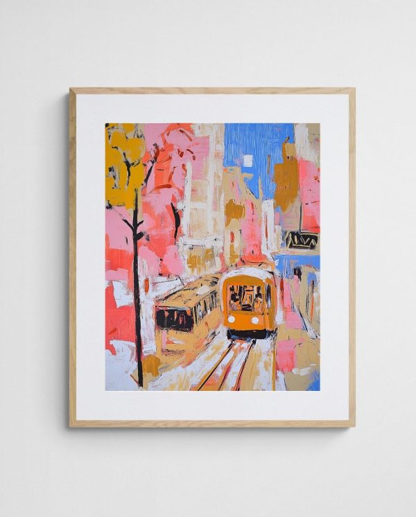
Australian abstract art frequently incorporates indigenous art traditions, coastal culture, and urban experiences unique to Australian cities. From reimagined bush motifs to abstract interpretations of city life, these pieces tell distinctly Australian stories through universal abstract language. The “Trams in Autumn – Vibrant Melbourne Abstract Art Print” captures urban Australian energy through dynamic colour and movement, bringing local character to neutral walls.


Supporting Local Artists and Communities
Choosing Australian abstract art supports local creative communities and ensures your home features unique pieces unlikely to appear in mass-produced international collections. Australian artists bring perspectives shaped by this continent’s unique environment, culture, and experiences, resulting in work that feels authentic rather than derivative. This authenticity adds intangible value that mass-produced art cannot match.
Australian-made prints also support sustainable practices by reducing shipping distances and carbon footprints associated with importing artwork. Many Australian art studios employ environmentally conscious printing methods and materials, aligning art purchases with broader sustainability values. This consideration matters increasingly to homeowners who want their decorating choices to reflect their values beyond mere aesthetics.

Sizing and Placement Strategies for Neutral Spaces
Proper sizing dramatically affects how artwork impacts neutral spaces. Undersized pieces get lost against expansive neutral walls, failing to provide the visual anchor the room needs. Artwork should occupy roughly 60-75% of the available wall space it’s meant to fill. For spaces above sofas, select pieces that span approximately two-thirds of the sofa’s width, creating balanced proportions that feel intentional rather than accidental.
In rooms with high ceilings, vertical pieces or multiple vertically-arranged works draw the eye upward, making spaces feel cohesive rather than top-heavy. Conversely, horizontal pieces suit walls above low furniture like credenzas or beds, creating visual stability. The “Sailboats 002 – Geometric Abstract Ocean Landscape Art” works beautifully in horizontal placements, its elongated composition naturally suiting wide wall spaces whilst its geometric sailboat forms add interest without requiring excessive height.
Position artwork at eye level (typically 145-155cm to the centre point) in most spaces, but adjust for viewing circumstances. In dining rooms where people sit, lower placement ensures artwork remains visible and engaging during meals. In hallways where people walk past, standard eye-level height works perfectly. These practical adjustments prevent beautiful art from ending up in visually awkward positions.
Creating Gallery Walls on Neutral Backgrounds
Gallery walls—curated collections of multiple artworks—shine against neutral backgrounds because the understated wall colour unifies diverse pieces into cohesive displays. When creating gallery walls, maintain consistent spacing between pieces (typically 5-8cm) and establish a unifying element—matching frames, complementary colour palettes, or consistent artistic styles—to prevent the arrangement from feeling chaotic.
Plan gallery walls on the floor first, arranging pieces until you achieve pleasing balance before committing to nail holes. Consider visual weight—darker or busier pieces feel heavier than light, minimalist ones—and distribute weight evenly across the arrangement. Anchor corners and centre with substantial pieces, filling gaps with smaller works. This methodical approach ensures your gallery wall looks intentional rather than haphazard, maximising impact against those versatile neutral walls.


Creating Visual Balance with Multiple Pieces
Balance differs from symmetry in interior design—balanced rooms feel harmonious even when asymmetrical. When working with multiple abstract pieces on neutral walls, distribute visual weight throughout the space rather than concentrating all artwork on one wall. This approach creates visual flow that guides the eye naturally around the room, making spaces feel cohesive and deliberately designed.
Consider colour relationships between multiple pieces. Repeating certain colours across different artworks creates visual connections that tie a room together beautifully. You needn’t match colours exactly—variations in shade, saturation, and tone add interest whilst maintaining relationships. Pairing coastal blues with botanical teals creates colour harmony without monotony, perfect for neutral backgrounds that allow these colour stories to shine.
Scale variation adds visual interest when displaying multiple pieces. Combine large statement works with smaller supporting pieces to create hierarchy and prevent monotony. The “Paperbark Textures – Abstract Melaleuca Nature Print – Modern Botanical Wall Art” could serve as a substantial focal point, with smaller geometric or coastal abstracts nearby providing complementary visual accents. This varied approach feels dynamic and curated rather than formulaic.
Seasonal Rotation and Flexibility
One significant advantage of pairing abstract art with neutral walls is rotation flexibility. Unlike coloured walls that lock you into specific colour schemes, neutral backgrounds accommodate artwork changes without requiring repainting. This allows seasonal rotations—lighter, brighter pieces for spring and summer, deeper, moodier works for autumn and winter—that refresh your space regularly without major renovations.
Build an art collection that allows this flexibility. Invest in pieces across different colour stories and moods, rotating them as seasons change or as your preferences evolve. This approach keeps your space feeling fresh whilst maximising your art investment. Rotating artwork prevents visual fatigue, keeping spaces exciting and personally meaningful year-round. Exploring diverse abstract art approaches helps build versatile collections suitable for various moods and seasons.


Start with one statement piece that speaks to you—something that makes you stop and look each time you pass it. Once you’ve found that anchor artwork, build around it with complementary pieces that enhance rather than compete. Whether you gravitate toward coastal serenity, botanical warmth, geometric precision, or expressionist energy, your abstract art will gradually transform neutral walls into spaces that feel uniquely yours.
The relationship between neutral walls and abstract art represents one of interior design’s most successful partnerships because it respects the power of both elements. Trust your instincts alongside design principles—the best abstract art speaks to you personally, evoking emotions or memories that make your house feel like home. Balance technical considerations with emotional responses to create spaces that function beautifully whilst reflecting your unique personality.

 | Joseph Russell Joseph is an Australian abstract artists and curator of the Inomaly art collection. |