
A console table represents one of those fascinating interior challenges where form meets function in a compact space. Whether nestled in your entryway, positioned behind a sofa, or anchoring a hallway, how you dress the wall above this slender piece of furniture can dramatically transform the entire area from forgettable to unforgettable. The key lies in understanding that you’re not simply hanging art—you’re creating a vertical story that draws the eye upward while maintaining balance with the furniture below.
The most effective approach involves treating the console and its accompanying wall art as a single design element. Your prints should complement the console’s proportions, enhance the room’s colour palette, and establish a visual anchor that commands attention without overwhelming the space. This means considering scale, composition, colour relationships, and the interplay between positive and negative space. When executed properly, statement prints above a console create an artistic focal point that elevates your entire interior aesthetic.
Understanding Console Proportions and Print Scale
The relationship between your console width and your artwork dimensions determines whether your styling feels intentional or haphazard. Your print or arrangement of prints should span approximately two-thirds to three-quarters of the console’s width. This creates visual harmony without appearing either cramped or lost on the wall. A console measuring 120 centimetres wide, for instance, works beautifully with artwork spanning 80 to 90 centimetres across.
Breaking this rule strategically can produce stunning results. Oversized statement pieces that extend beyond the console edges create drama and contemporary flair, particularly in minimalist spaces where fewer decorative elements compete for attention. Conversely, a smaller print centred above the console gains impact when surrounded by generous negative space and flanked by symmetrical accessories like table lamps or sculptural objects.
Consider the vertical dimension equally carefully. Taller prints draw the eye upward, making ceilings appear higher—an advantage in compact entryways or hallways. Horizontal orientations emphasise width and create a grounding effect that works exceptionally well in open-plan living areas where the console backs onto a sofa. Understanding these spatial relationships allows you to manipulate perception and enhance your room’s best architectural features.


Frame thickness and matting also influence perceived scale. Thin, minimal frames maintain a light, contemporary feel whilst allowing the artwork itself to dominate. Substantial frames with generous matting add formality and presence, making even modestly sized prints feel more significant. Your choice should align with both your interior style and the visual weight you want the console area to carry within the broader room context.
Creating Visual Balance Through Composition
Achieving balance above a console extends beyond simply centring a single piece. Consider whether a symmetrical or asymmetrical arrangement better serves your space and aesthetic preferences. Symmetrical compositions—a single large print flanked by matching accessories—convey formality, order, and traditional elegance. This approach works particularly well in classic interiors or formal entryways where you want to project sophistication.
Asymmetrical arrangements offer contemporary dynamism and visual interest. A large print positioned slightly off-centre, balanced by a sculptural vase or stack of design books on the console below, creates tension that feels modern and curated. This technique requires a more discerning eye, as you’re balancing visual weight rather than creating mirror images. Heavier, darker elements need to be counterbalanced by lighter forms or negative space to prevent the composition from feeling lopsided.
Gallery wall arrangements above consoles demand particular attention to composition. When clustering multiple prints, establish a visual anchor—typically the largest piece—and build around it. Maintain consistent spacing between frames (typically 5 to 8 centimetres) to create cohesion. Map your arrangement on the floor before committing to nail holes, photographing different configurations until you achieve a balanced composition that feels neither too rigid nor chaotic.
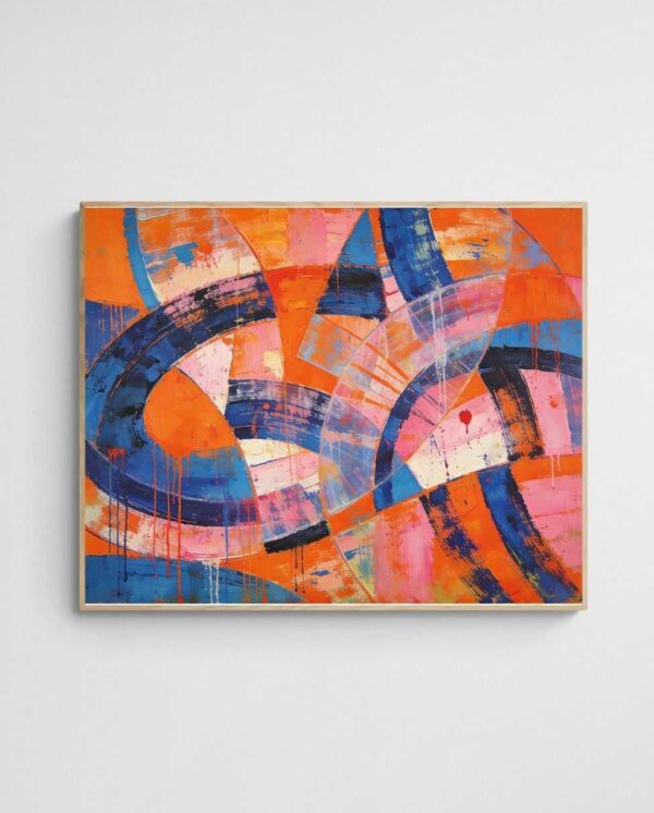

The relationship between your artwork and console styling creates a vertical composition that should read as unified. If your print features bold, dense imagery, keep console accessories minimal and sculptural. Conversely, simpler artwork can support more elaborate tablescapes with layered objects, books, and botanical elements. This balance between simplicity and complexity prevents visual overwhelm whilst maintaining interest throughout the vignette.
Selecting Prints That Complement Your Colour Scheme
Colour coordination between your console artwork and surrounding interior represents perhaps the most impactful styling decision you’ll make. Your approach might involve harmonious blending, where print colours echo existing palette tones, or strategic contrast that introduces accent colours for visual pop. Both methods prove effective when executed with intention and understanding of colour temperature and intensity.
For spaces dominated by neutral tones, statement prints provide the perfect opportunity to inject personality through colour. Consider whether you want to maintain the serene, understated quality of neutrals or introduce vibrant hues that energise the space. Cool blues and greens bring calming coastal influences, whilst warm corals, terracottas, and ochres create inviting warmth. The “Linoleum Beach 3 – Colourful Coral Abstract Coastal Art Print” exemplifies how coastal-inspired coral tones can add warmth and visual interest to neutral schemes whilst maintaining a sophisticated, contemporary feel.
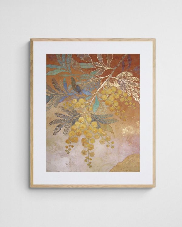

In already colourful interiors, your console artwork can either amplify the existing palette or provide visual relief through neutrality. A room with jewel-toned furnishings might benefit from black and white abstract prints that offer sophisticated contrast without competing. Alternatively, you might select artwork that pulls together disparate colours already present in soft furnishings, rugs, and accessories, creating a more cohesive overall scheme.
Colour choices carry psychological weight in specific spaces. Entryway consoles benefit from welcoming, optimistic hues that set a positive tone for your home. Hallway consoles might embrace richer, moodier palettes since these transitional spaces can handle more dramatic treatment. Living room consoles behind sofas should consider the room’s primary function—relaxation suggests cooler tones, whilst entertaining spaces can embrace energising warmth.
Mastering Height and Placement
Determining the precise height for hanging prints above your console follows principles similar to other wall art placement, with specific considerations for the furniture relationship. When hanging above furniture, position your print so the bottom edge sits 15 to 20 centimetres above the console surface. This spacing creates clear visual separation between furniture and art whilst maintaining their relationship as a unified vignette. Too little space makes the arrangement feel cramped, as though the artwork is merely resting against the wall. Excessive spacing creates disconnect, with art and furniture reading as unrelated elements that happen to occupy the same wall.
Consider ceiling height when determining placement. Standard 2.4-metre ceilings leave limited wall space above properly positioned artwork, making the 15 to 20 centimetre guideline essential for balance. Higher ceilings offer more flexibility—you might increase the gap slightly or use this vertical real estate for taller prints or multi-tier gallery arrangements that draw the eye upward, as explored in hallway gallery wall strategies.


For console tables of varying heights, adjust accordingly. Lower consoles (around 70 centimetres) might require only 12 to 15 centimetres of clearance, whilst taller pieces (approaching 90 centimetres) need the full 20 centimetres to prevent the space from feeling cramped. Always step back and assess from multiple viewing angles—what works straight-on might feel too high or low when approaching from the side.
Layering Accessories with Your Art
The magic of console styling emerges when artwork and accessories create a cohesive, layered composition. Your print provides the vertical backdrop, whilst carefully selected objects on the console surface build depth and interest. This layering transforms a flat wall into a three-dimensional vignette that rewards closer inspection whilst making strong visual impact from across the room.
Establish visual rhythm through varied heights amongst your console accessories. Pair your artwork with elements that create a gentle up-and-down movement—perhaps a tall ceramic vase, a medium-height stack of design books, and a low sculptural bowl. This variation prevents the monotonous horizontal line that occurs when all objects sit at similar heights. Each piece should earn its place through either functional purpose, aesthetic beauty, or ideally, both.
Maintain breathing room between objects. Overcrowding your console surface creates visual chaos that detracts from your carefully chosen artwork. Group items in odd numbers—three or five objects typically create more dynamic compositions than even numbers. Leave generous negative space, particularly if your artwork features dense pattern or intense colour that already provides significant visual weight.


Accessory colours and materials should relate to your print. If your artwork features metallic accents, brass or copper accessories create cohesion. Botanical prints pair naturally with organic elements—dried flowers, wooden bowls, or stone objects. The goal isn’t perfect matching but rather establishing subtle connections that make the overall vignette feel curated rather than coincidental. This approach to coordinating art with surrounding elements creates sophisticated, professional-looking results.
Functional items deserve consideration too. If your console serves as an entryway landing spot, incorporate practical elements like a decorative tray for keys, a beautiful bowl for mail, or an elegant lamp for ambient lighting. These everyday objects should complement rather than compete with your artwork, maintaining the balance between aesthetic appeal and practical living.
Lighting Your Console Artwork
Proper lighting transforms good console styling into exceptional interior design. Artwork that disappears into shadow fails to deliver its full impact, regardless of how carefully you’ve selected and positioned it. Strategic lighting not only illuminates your prints but creates ambience, highlights textures, and establishes the console area as a genuine focal point within your space.
Picture lights mounted directly above your artwork provide focused illumination that showcases colours and details whilst creating gallery-quality presentation. Modern LED picture lights offer adjustable colour temperatures and minimal heat output, protecting your prints whilst providing flattering illumination. Position these approximately 30 centimetres above your frame’s top edge, angling downward to wash light evenly across the artwork surface without creating glare.
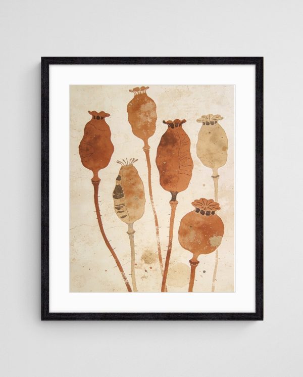

Table lamps on the console itself serve dual purposes—providing ambient lighting for the space whilst indirectly highlighting your artwork. Choose lamp heights that complement your composition without blocking the print’s lower portions. Translucent or white shades diffuse light beautifully, creating a soft glow that enhances rather than competes with your artwork. Position lamps symmetrically for formal arrangements or asymmetrically for contemporary styling, ensuring they contribute to your overall composition’s visual balance.
Natural light throughout the day affects your display significantly. Consoles positioned opposite windows benefit from reflected daylight that illuminates artwork naturally. However, direct sunlight causes fading over time, particularly with certain printing methods and papers. If your console receives strong direct light, consider UV-protective glazing for framed prints or position particularly precious pieces elsewhere. Understanding ultraviolet light’s effects on materials helps protect your investment whilst maintaining beautiful display.
Layered lighting creates depth and flexibility. Combine picture lights or table lamps with overhead lighting and perhaps subtle wall sconces nearby. This approach allows you to adjust ambience for different times of day or occasions—brighter for morning routines in an entryway console, softer and more atmospheric for evening entertaining in a living room setting. Dimmer switches offer even greater control, fine-tuning illumination to perfectly showcase your artwork.
Adapting Your Style Approach
Console styling isn’t static—it should evolve with seasons, occasions, and your developing aesthetic preferences. Statement prints provide the permanent foundation, whilst accessories and styling elements offer flexibility for refreshing the look without major investment. This adaptability keeps your interior feeling current and personally meaningful whilst maintaining the sophisticated base established by quality artwork.
Seasonal styling proves surprisingly impactful. Spring might introduce fresh botanicals and lighter accessories around coastal prints, whilst autumn embraces richer textures and warmer metallic accents. These subtle shifts don’t require changing your artwork—the prints remain constant whilst surrounding elements evolve. This approach delivers visual refresh without the expense and effort of completely restoring your console area each season.
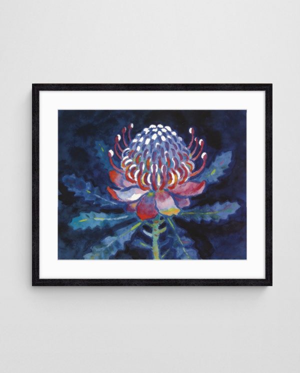
Different interior styles approach console art differently. Scandinavian aesthetics favour minimal styling with maximum negative space, allowing artwork to breathe against white or pale walls. Minimalist approaches feature a single stunning print with just one or two carefully selected accessories. Maximalist interiors embrace abundance—layered artworks, collections of objects, and rich pattern mixing create exuberant displays that celebrate personality.
Contemporary styling often plays with scale and proportion in unexpected ways. Oversized prints extending well beyond console edges make bold statements, whilst tiny prints in vast expanses of negative space create intriguing tension. Traditional approaches favour proportion and symmetry, with artwork sized appropriately to furniture and balanced accessory arrangements. Understanding these style vocabularies helps you articulate your personal aesthetic through thoughtful console styling.
Experiment with your console area—it offers relatively low-risk opportunities to test new styling ideas since changing accessories requires minimal commitment. Try different print orientations, swap accessories between rooms, adjust heights slightly, or introduce unexpected colour accents. Sometimes the most compelling arrangements emerge from playful exploration rather than rigid adherence to design rules. Your console area should ultimately reflect your personality and enhance your daily living experience.

Maintaining Your Console Display
Once you’ve created your perfect console styling, minimal maintenance keeps it looking fresh and intentional. Dust accumulates on both artwork and accessories, dulling colours and finishes. Weekly dusting with a soft microfibre cloth maintains vibrancy, whilst monthly deeper cleaning addresses frames, glass, and decorative objects. This regular attention prevents buildup that makes spaces feel neglected despite beautiful styling.
Rotate accessories periodically to prevent the eye from becoming too accustomed to the arrangement. Swapping just one or two elements—perhaps introducing a new vase or switching out books—creates subtle freshness that re-engages your attention and appreciation. This rotation also distributes wear patterns if certain areas of your console receive heavier use from keys, mail, or other functional items.
Monitor your prints for signs of fading, particularly if positioned in naturally lit areas. Slight colour shifts over months or years indicate UV damage that, whilst largely unavoidable, can be minimised through protective glazing or positioning adjustments. Quality prints from professional art print collections utilise archival inks and papers designed for longevity, but all artwork benefits from thoughtful placement and care.


Troubleshooting Common Console Styling Challenges
Narrow consoles in tight hallways limit accessory options—a single statement print and minimal styling prevents overcrowding whilst maintaining impact. Wide consoles spanning 150 centimetres or more might require multiple artworks or a substantial single piece to avoid the print appearing lost on the wall.
Low ceilings present particular challenges, compressing the vertical space available for artwork. In these situations, horizontal print orientations work better than vertical, emphasising width rather than drawing attention to limited height. Keep accessories low and streamlined to maintain proportion within the compressed space. Conversely, soaring ceilings in contemporary homes benefit from tall artworks or vertically arranged gallery walls that celebrate rather than fight the generous vertical dimension.
Awkward console positions—tucked into corners, positioned beneath stairways, or flanked by doorways—require creative problem-solving. Corner consoles might feature artwork angled slightly to face the primary viewing direction rather than mounted strictly perpendicular to the wall. Consoles beneath stairs benefit from prints sized to fit comfortably within the descending ceiling line, perhaps creating an intentionally asymmetric composition that acknowledges rather than fights the architectural constraint.

Evolving Your Console Styling Over Time
Your relationship with your console styling should evolve as your confidence and aesthetic understanding develop. Initial attempts might follow rules closely, creating safe, balanced arrangements. As you gain experience and trust your instincts, you’ll feel empowered to take creative risks—perhaps that unexpectedly small print in vast negative space, or the bold oversized piece that extends well beyond the console edges.
Document your styling evolution through photographs. This visual record reveals your developing eye and helps identify what works in your specific space. You’ll notice patterns in your preferences—perhaps you consistently gravitate toward symmetry or invariably choose blue-toned artwork. This self-awareness informs future decisions and helps articulate your personal style when selecting new pieces or refreshing existing displays.
Interior design serves your life rather than existing as museum installation. If your carefully styled console accumulates daily mail, keys, and family detritus, embrace this reality rather than fighting it. Select accessories that accommodate practical items—beautiful trays, attractive bowls, elegant letter holders—that maintain aesthetic appeal whilst serving everyday needs. The most successful console styling balances artistic expression with liveable functionality, creating spaces that are both beautiful and authentically yours.

Transform any console area into a captivating focal point by understanding proportion, balance, and the relationship between art and surrounding elements. Your console and its accompanying artwork create a complete composition that anchors a room and expresses your aesthetic sensibility. Whether you favour minimal Scandinavian restraint, maximalist abundance, or something uniquely your own, start by selecting quality prints from curated abstract art collections, then apply the principles of scale, colour coordination, proper placement, and thoughtful lighting. With attention to detail and willingness to experiment, you’ll create genuinely impactful displays that elevate your entire interior.
 | Joseph Russell Joseph is an Australian abstract artists and curator of the Inomaly art collection. |