Australia’s diverse terrain—from sun-bleached dunes to eucalypt-crowned ridges—has shaped a unique visual language that translates beautifully into landscape art prints. These works capture not just the contours of the land, but the emotional resonance of wide-open skies, coastal horizons, and native flora that define the Australian aesthetic. Whether you’re drawn to abstracted interpretations or stylised natural scenes, the right landscape print can anchor a room, introduce colour harmony, and create a focal point that feels both grounded and expansive.
Landscape prints offer more than decorative appeal; they reshape your space by bringing the outdoors in, establishing mood through colour temperature, and anchoring design schemes with natural motifs. In practice, a well-chosen landscape piece can visually widen narrow hallways, soften hard-edged minimalist interiors, or balance busy patterns in eclectic rooms. The key is matching the print’s palette, scale, and style to your room’s function and existing finishes, creating cohesion rather than clutter.
Key Takeaways
- Landscape prints visually expand small rooms by introducing depth and horizon lines
- Australian motifs—coastal scenes, native flora, urban landmarks—create local authenticity and connection
- Colour temperature in landscapes (warm ochres vs cool blues) directly influences room mood and perceived warmth
- Proper scale matching prevents prints from appearing lost on large walls or overwhelming intimate spaces
- Combining landscape prints with complementary abstract pieces layers visual interest without clashing styles
Understanding Landscape Art Styles and Their Impact
Landscape art prints span a broad stylistic range, from hyper-realistic depictions to heavily abstracted compositions where only colour fields and gestural marks suggest terrain. Traditional representational landscapes offer immediate recognition—viewers instantly identify beaches, mountains, or forests—making them accessible anchors for living rooms and hallways. Abstract landscape prints, by contrast, distill scenery into essential elements: horizon lines, colour transitions, textural passages that evoke earth, sky, and water without literal detail.
The choice between representational and abstract influences how a room feels. Detailed, realistic landscapes can ground eclectic or maximalist interiors by providing a clear visual focus, whereas abstracted landscapes integrate more seamlessly into minimalist or Scandinavian schemes where suggestion trumps description. Consider how much visual “activity” your space already contains—busy patterned rugs, bold furniture, or architectural features—and select a landscape style that complements rather than competes.
Impressionistic landscapes occupy a middle ground, capturing light and atmosphere through loose brushwork or digital texture. These prints feel dynamic without demanding attention, making them ideal for spaces where you want movement and colour without overwhelming quiet moments. They pair particularly well with natural timber finishes and linen textiles, reinforcing an organic aesthetic that feels relaxed yet curated.
Stylised or graphic landscape prints—often characterised by simplified forms, limited palettes, or linocut-inspired linework—add a contemporary edge to traditional subject matter. These works suit modern interiors where clean lines and geometric balance dominate. Furthermore, they often feature flatter colour application, which helps them coexist with other wall art without creating depth competition across a gallery wall.
Choosing the Right Palette for Your Space
Colour temperature fundamentally alters how a landscape print interacts with your interior. Warm-toned landscapes—featuring ochres, terracottas, golden yellows, and burnt oranges—inject energy and cosiness, making them excellent choices for south-facing rooms in cooler climates or spaces where you want to amplify warmth. These palettes echo Australian outback vistas, sun-baked earth, and native grasses at sunset, creating an immediate visual connection to the land.
Cool-toned landscapes dominated by blues, greens, and greys evoke calm and spaciousness. They work particularly well in bedrooms, bathrooms, or home offices where focus and relaxation take priority. Coastal prints featuring deep ocean blues or soft seafoam hues visually “lower the temperature” of a room, making it feel airier and less confined—a valuable trick in compact apartments or rooms with limited natural light.
Neutral landscapes—those built around whites, creams, taupes, and soft greys—provide maximum versatility. They anchor minimalist schemes without adding chromatic weight, allowing bold furniture or textiles to take centre stage. Neutral doesn’t mean bland; subtle tonal shifts and textural variation within a monochromatic palette create depth and sophistication. These prints serve as visual breathing room, particularly in open-plan spaces where multiple zones demand cohesion without sameness.
Multicoloured landscapes require careful balancing. If your print features a vibrant sunset or richly varied flora, ensure at least two colours from the artwork appear elsewhere in the room—in cushions, throws, or decorative objects. This repetition creates visual harmony and prevents the print from feeling disconnected or “dropped in” without consideration. Colour balance strategies help ensure your landscape print enhances rather than dominates your space.


Scale and Placement: Making Every Print Count
Print size directly influences visual impact and spatial perception. Oversized landscape prints (90cm wide or larger) command attention and can visually expand small rooms by drawing the eye across a broad horizon line. They work best on uninterrupted walls—above sofas, beds, or console tables—where they serve as singular focal points without competing elements crowding their perimeter.
Medium-sized prints (50–80cm) offer flexibility, functioning equally well as standalone pieces or as part of gallery walls. When displayed alone, they suit intimate spaces like reading nooks, powder rooms, or hallway alcoves. As gallery wall components, they anchor collections of smaller works, providing visual weight that prevents the arrangement from appearing scattered or lightweight.
Small landscape prints (under 50cm) excel in unexpected placements: above light switches, within built-in shelving, or flanking mirrors. Grouping several small prints in a grid formation creates impact through repetition and rhythm, particularly effective when the prints share a common palette or stylistic approach but depict varied scenes. This technique works brilliantly in staircases, where incremental viewing as you ascend creates a narrative sequence.
Vertical versus horizontal orientation matters significantly. Horizontal landscapes (the traditional format) emphasise width and openness, ideal for rooms where you want to visually stretch walls or counterbalance tall, narrow furniture. Vertical landscape prints—often depicting trees, cliffs, or upward-sweeping vistas—draw the eye upward, making ceilings feel higher and rooms more spacious vertically. Consequently, they suit rooms with ample floor space but lower ceilings, creating balance through opposing visual forces.
Placement height follows the “eye-level rule”: the centre of your print should sit approximately 145–155cm from the floor, mimicking gallery standards and ensuring comfortable viewing whether seated or standing. However, context trumps rules—prints above furniture should sit 15–25cm above the piece’s top edge, maintaining visual connection without awkward gaps. In hallways or areas where viewers primarily stand, slightly higher placement (centre at 160–165cm) accommodates average standing sightlines better.
Australian Landscape Motifs That Define Local Identity
Australian landscapes possess distinctive characteristics—vast skies, intense light quality, unique geology, and endemic flora—that differentiate them from European or American counterparts. Prints capturing these elements resonate with local viewers through familiarity while offering international audiences a window into Australia’s visual identity. The red earth of the interior, the burnt-orange escarpments, the silver-grey foliage of eucalypts—these motifs carry cultural weight and immediate recognition.
Outback-inspired landscapes featuring ochre plains, scattered scrub, and expansive skies tap into the archetypal Australian “wide brown land” imagery. These prints suit contemporary country homes, urban spaces seeking to balance modern minimalism with cultural roots, or interiors with earthy, organic design schemes. The horizontal emphasis of outback vistas visually extends walls, making them particularly effective in narrow living rooms or open-plan areas where flow matters more than enclosure.
Coastal landscapes—arguably Australia’s most celebrated motif—range from dramatic cliffside vistas to tranquil beach scenes. These prints introduce marine blues, sandy neutrals, and sun-bleached whites that coordinate effortlessly with linen upholstery, rattan furniture, and whitewashed timber. Beyond colour, coastal landscapes evoke psychological associations with relaxation, holiday experiences, and the Australian lifestyle centred around outdoor living and beach culture.
Rainforest and temperate landscape prints showcase Australia’s lesser-known ecosystems: the fern-filled gullies of Victoria’s Dandenongs, the moss-draped forests of Tasmania, the subtropical lushness of Queensland’s hinterlands. These greener, more densely vegetated scenes suit bathrooms, bedrooms, or shaded rooms where you want to reinforce coolness and tranquility. They also provide visual contrast in sun-drenched spaces where all other elements lean warm and bright.
Seasonal landscapes—depicting autumn foliage in cool-climate regions or the dramatic transformation of arid areas after rain—capture temporal beauty and change. These prints work well in spaces where you want visual interest that sparks conversation or contemplation, offering layers of detail that reveal themselves over time. Moreover, they suit interiors where you rotate decor seasonally, complementing your current styling without requiring permanent commitment.


Coastal Themes: Bringing the Beach Home
Coastal landscape prints operate on multiple registers: literal representations of specific beaches, abstracted interpretations of ocean and shore, or graphic treatments that distill coastal elements into shapes and colours. Each approach offers distinct advantages depending on your interior goals and personal connection to the subject matter. Literal beach scenes work beautifully in holiday homes or for residents with strong ties to particular coastal locations, creating visual anchors to cherished memories and places.
Abstract coastal works—where surf becomes gestural white strokes, sand transforms into textured beige fields, and water reads as graduated blue washes—integrate more universally. They avoid the specificity that can sometimes limit decorative flexibility, instead offering mood and atmosphere that complement varied interior styles. These prints suit modern coastal schemes that reject literal nautical clichés in favour of sophisticated colour palettes and contemporary composition.
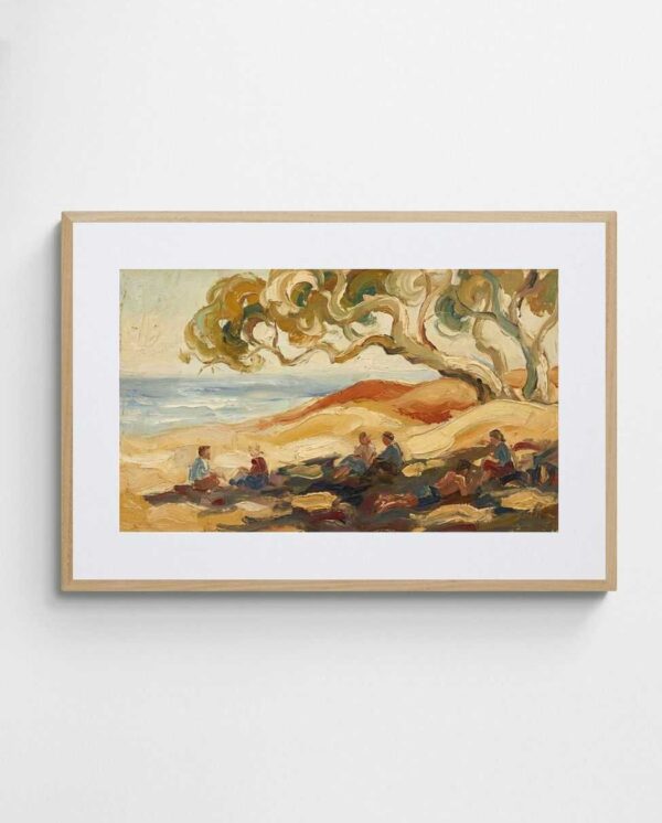
The “Sydney Opera House – Australian Art Print” exemplifies how iconic coastal landmarks can anchor a room while celebrating local identity, blending architectural form with harbour setting in a way that feels both specific and stylistically versatile. Similarly, “Shady Beach Dunes – Abstract Australian Coastal Wall Art” captures the organic curves and sun-dappled shadows of dune systems, translating coastal topography into gentle abstract forms that introduce movement without distraction.


Coral and reef-inspired prints extend coastal themes into underwater terrain, featuring vibrant pinks, corals, and turquoises that reference the Great Barrier Reef and tropical marine ecosystems. These brighter, more saturated works inject energy into neutral spaces and pair beautifully with natural fibres, raw timber, and organic textures that reinforce the connection between land and sea. They particularly suit sunrooms, conservatories, or rooms with abundant natural light where colours can fully express themselves.
When styling coastal landscapes, avoid overloading spaces with literal beach paraphernalia—driftwood, shells, rope—which can veer into thematic overload. Instead, let the print carry the coastal reference while surrounding elements remain understated. A single landscape print above a natural linen sofa with white oak floors delivers sophisticated coastal calm, whereas the same print surrounded by nautical accessories risks appearing contrived. The print should suggest the coast; the room should breathe like it.
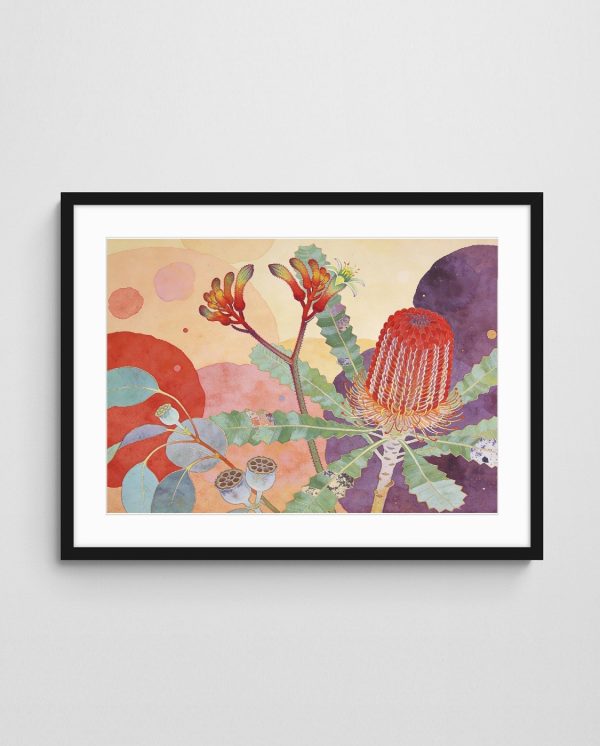
Native Flora in Landscape Prints
Australian native flora—eucalypts, banksias, grevilleas, wattles, billy buttons—feature prominently in landscape prints that celebrate botanical beauty within broader environmental contexts. Unlike tightly cropped botanical illustrations, these works position plants within their natural settings: eucalypts against blue skies, wattles dotting hillsides, coastal banksias framing ocean views. This contextual approach creates more dynamic compositions while anchoring plant life in recognisable Australian terrains.
Eucalyptus-focused landscapes leverage the distinctive grey-green foliage, peeling bark textures, and dramatic branching patterns that characterise these iconic trees. Prints featuring eucalypts in landscape settings suit contemporary and transitional interiors, offering organic forms without the sweetness sometimes associated with floral art. The muted colour palettes—silvery greens, soft greys, warm tans—coordinate effortlessly with neutral design schemes while introducing natural motifs that soften hard edges and manufactured materials.
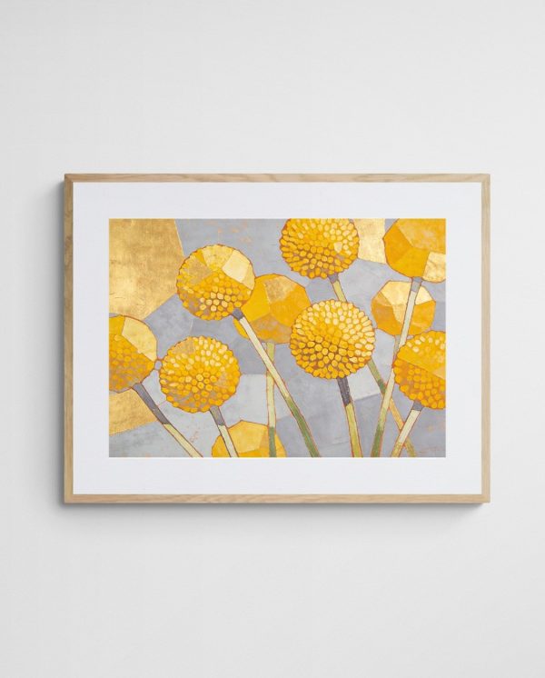
Golden wattle landscapes capture Australia’s national floral emblem in its natural habitat, introducing bright yellows and acid greens that energise spaces without overwhelming them. These prints work particularly well in kitchens, breakfast nooks, or east-facing rooms where morning light enhances their sunny disposition. The “Golden Billy Buttons – Playful Abstract Floral Print” demonstrates how native flora can be abstracted into playful compositions that retain botanical character while embracing artistic interpretation.
Banksia and grevillea prints showcase the sculptural qualities and rich textures of these distinctive natives. Their complex forms—spiky flower heads, serrated leaves, bold silhouettes—translate into visually engaging compositions that reward close viewing. These prints suit study areas, home offices, or reading nooks where contemplative engagement with artwork enhances the space’s intended function. Additionally, their often-muted palettes (dusty pinks, sage greens, terracotta browns) align beautifully with modern Australian design’s embrace of earthy, organic colour schemes.
Seasonal native landscapes—depicting spring wildflower blooms across desert regions or autumn foliage in cooler zones—capture ephemeral beauty and the cyclical nature of Australian ecosystems. These prints bring temporal awareness into interiors, reminding occupants of the land’s rhythms and transformations. They particularly suit dining rooms or gathering spaces where conversation and connection happen, offering visual prompts for discussion about place, season, and environment. For more context on how native flora inspires contemporary Australian art, explore the symbolic and aesthetic roles these plants play.


Urban Landscapes: Celebrating Australian Cities
Urban landscape prints capture the distinctive character of Australian cities—Melbourne’s laneways, Sydney’s harbour icons, Brisbane’s subtropical architecture, Adelaide’s heritage buildings. These works offer cultural specificity and local pride, making them particularly effective in spaces where you want to celebrate connection to place or acknowledge urban identity. They suit contemporary apartments, loft conversions, or any interior where architectural appreciation and city living intersect.
Abstracted urban landscapes avoid literal tourist-postcard aesthetics in favour of mood, colour, and atmospheric qualities. The “Melbourne Abstract Art Print – Morning at the Queen Victoria Market” translates the bustling energy and vibrant commerce of the iconic market into gestural marks and layered colours, capturing experience rather than precise topography. These interpretive approaches suit sophisticated urban interiors where overt literalism might feel too casual or touristy.
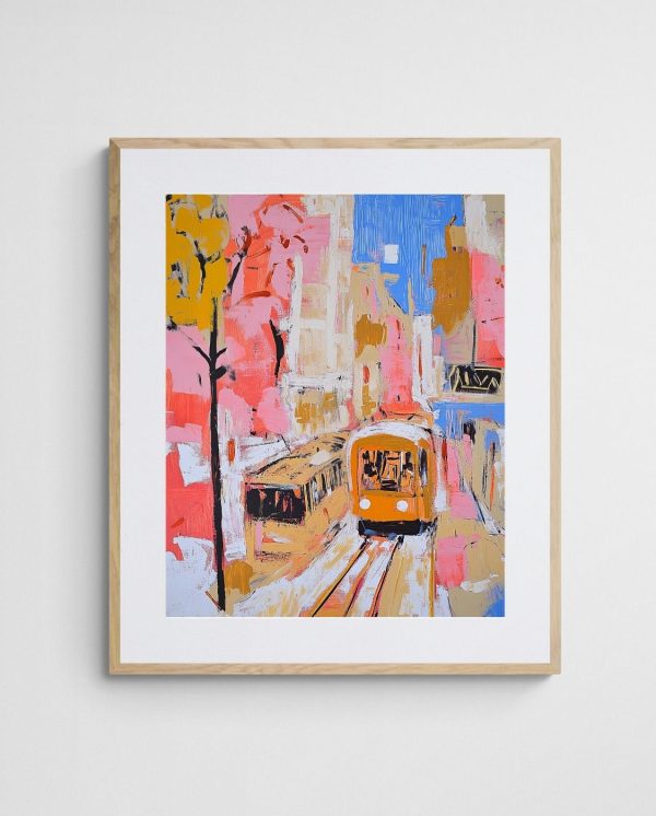
Streetscape prints featuring trams, pedestrians, cafes, and shopfronts document everyday urban life with warmth and humanity. The “Trams in Autumn – Vibrant Melbourne Abstract Art Print” exemplifies how transport infrastructure and seasonal change can combine into compelling compositions that feel both specific and universally relatable. These prints work beautifully in hallways, entryways, or transitional spaces where movement and passage mirror the street scenes depicted.
Urban parks and public gardens within landscape prints—Melbourne’s Royal Botanic Gardens, Sydney’s Centennial Park—bridge natural and built environments. These hybrid landscapes suit rooms where you want greenery’s calming influence without full pastoral retreat, acknowledging that urban nature offers its own distinctive beauty. They particularly resonate with apartment dwellers seeking to bring outdoor elements inside without abandoning their urban context.
Architectural landmarks captured within broader landscape contexts—harbour bridges, opera houses, modern skylines—function as cultural touchstones and conversation pieces. These prints suit dining rooms, living areas, or office spaces where guests and visitors benefit from visually engaging focal points that prompt discussion. When selecting urban landscapes, consider your emotional relationship to the depicted city: nostalgia for a former home, celebration of your current location, or aspiration toward future destinations all influence how the work resonates within your daily environment.
Framing and Materials for Longevity
Print quality and framing directly impact both visual presentation and longevity. Giclée prints on archival-grade paper or canvas offer superior colour reproduction, fade resistance, and detail retention compared to standard digital prints. These museum-quality reproductions ensure your landscape print maintains its vibrancy for decades, particularly important for works featuring subtle colour gradations or complex textures where print quality profoundly affects visual impact.
Paper choice influences the final appearance significantly. Smooth, bright white papers enhance colour saturation and work well for contemporary, graphic landscape styles. Textured papers (often described as fine art or watercolour papers) add tactile interest and suit impressionistic or painterly landscapes where texture reinforces the artistic approach. Canvas prints introduce additional texture and typically suit larger formats where stretched canvas creates a substantial, gallery-like presence.
Frame selection should complement rather than compete with the artwork. Natural timber frames—oak, ash, walnut—align beautifully with landscape subjects, reinforcing organic connections and warmth. Lighter timbers suit contemporary and Scandinavian schemes, while darker timber frames add gravitas and work well in traditional or heritage interiors. Black frames provide crisp, modern definition and ensure maximum focus remains on the artwork rather than its surround.
White and off-white frames create breathing room around prints, particularly effective for landscapes featuring busy compositions or strong colours that benefit from neutral containment. These frames suit coastal, Hamptons, and minimalist interiors where lightness and airiness take priority. Additionally, white frames recede visually, making them excellent choices for gallery walls where multiple frame colours might create visual chaos.
Matting (or mounting) provides several benefits: it creates physical separation between artwork and glass (preventing moisture damage and sticking), introduces additional colour coordination opportunities, and adds perceived value through increased visual weight. Landscape prints often benefit from generous mat borders—5–8cm minimum—that create formal presentation and draw the eye inward toward the composition. Mat colour should either echo a subtle colour within the print or remain neutral (white, cream, grey) to avoid introducing competing chromatic elements.
Glazing options include standard glass, non-reflective glass, and UV-protective acrylic. Non-reflective glass eliminates distracting glare, crucial for prints hung opposite windows or under direct lighting. UV-protective glazing prevents fading and colour shift, essential for prints in sun-exposed locations. Acrylic offers lighter weight and shatter resistance, making it preferable for large formats or homes with children, though it scratches more easily than glass and requires careful cleaning.
| Frame Material | Best Suited For | Visual Effect |
|---|---|---|
| Natural Oak | Scandinavian, contemporary, organic interiors | Warm, approachable, reinforces natural themes |
| Black Timber | Modern, minimalist, bold statement walls | Crisp definition, maximum contrast, formal |
| White/Off-White | Coastal, Hamptons, light-filled spaces | Airy, recedes visually, brightens artwork |
| Walnut/Dark Timber | Traditional, heritage, rich-toned interiors | Gravitas, warmth, anchors lighter artworks |
| Brushed Metal | Industrial, urban, contemporary commercial | Sleek, modern, adds subtle metallic accent |


Styling Tips for Cohesive Interiors
Integrating landscape prints into existing interiors requires considering colour relationships, stylistic consistency, and functional zoning. Start by identifying your room’s dominant colours and finishes, then select prints that either complement (adjacent colours on the colour wheel) or thoughtfully contrast (opposite colours) these elements. Complementary relationships create harmony and flow; contrasting relationships introduce dynamic tension and visual interest—both approaches work, but they produce different spatial feels.
Layering landscape prints with other art forms—abstract works, line drawings, photography—creates visual depth and prevents single-note monotony. However, successful layering requires connecting threads: shared colour palettes, consistent framing styles, or thematic relationships. For instance, pairing an abstract coastal landscape with complementary abstract works that echo its blue tones creates cohesion through colour repetition even when styles differ.
Room function should inform landscape print selection. Bedrooms benefit from calming, horizontal landscapes that promote restfulness—gentle coastal scenes, misty eucalypt forests, soft twilight skies. Home offices perform better with energising landscapes that stimulate focus without overwhelming—crisp morning light, vibrant native flora, dynamic urban scenes. Living areas accommodate broader ranges, but consider traffic patterns and sightlines—prints positioned opposite seating areas receive more sustained viewing and warrant greater compositional complexity.
Lighting dramatically affects how landscape prints present. Natural daylight reveals true colours and subtle details, making north-facing walls (in Australia’s southern hemisphere context, receiving indirect light throughout the day) ideal for prints where colour accuracy matters. Artificial lighting requires more planning: warm LED or halogen lights enhance warm-toned landscapes (ochres, terracottas, golds) but can muddy cool blues and greens. Conversely, cool LED lights preserve blues and greens but can make warm-toned prints appear flat or washed out. Adjustable colour-temperature lighting offers flexibility for spaces where you want control over mood and presentation.
Texture coordination strengthens landscape print integration. If your print depicts rough outback terrain, echo that tactility with woven textiles, natural jute, or raw linen. Smooth, coastal landscapes pair beautifully with polished surfaces, glass accents, and sleek finishes that mirror water’s reflective quality. This textural call-and-response creates subconscious coherence, making spaces feel intentionally designed rather than arbitrarily decorated.
Consider architectural features when positioning landscape prints. Horizontal landscapes naturally align with long, low furniture pieces (sofas, sideboards, beds), reinforcing linear flow. Vertical landscapes suit narrow wall sections between windows, beside doorways, or flanking built-in shelving. Awkward spaces—those odd wall sections that resist furniture placement—often benefit from landscape prints that transform empty space into intentional design moments. For additional strategies on creating visual interest through art placement, explore compositional techniques that maximise impact.
Seasonal rotation keeps interiors feeling fresh without major investment. Swapping landscape prints seasonally—vibrant spring florals in September, warm autumnal tones in March, cool coastal scenes during summer heat—allows you to respond to changing light conditions, temperatures, and moods. This approach works particularly well if you invest in versatile frames that accommodate multiple prints, reducing setup time and hardware requirements. Moreover, rotating prints prevents visual habituation, that phenomenon where familiar objects become invisible through constant exposure.


Creating Gallery Walls with Landscape Prints
Gallery walls allow you to display multiple landscape prints together, creating visual impact through collective arrangement rather than singular presence. Successful gallery walls balance repetition (which creates cohesion) with variety (which maintains interest). Repeating elements might include consistent frame colours, similar print sizes, or shared colour palettes, while variety emerges through different landscape subjects, compositional orientations, or stylistic approaches within those parameters.
Grid layouts—where prints align in neat rows and columns with equal spacing—suit modern, minimalist interiors and work particularly well with same-sized prints. The precision and order create calm and predictability, making grid galleries ideal for offices, studies, or formal dining rooms. Conversely, salon-style arrangements—where prints of varied sizes cluster organically with tighter spacing—feel more eclectic and relaxed, suiting living rooms, family areas, or creative workspaces.
Before committing nail holes to walls, map your gallery arrangement on the floor or use kraft paper templates taped to the wall. This planning phase prevents costly mistakes and allows you to experiment with spacing, orientation, and relationships between prints. As a general rule, maintain 5–8cm between framed edges for breathing room that prevents visual crowding while keeping the grouping cohesive rather than scattered.
Anchor your gallery wall with your largest or most visually dominant print, typically positioned at or slightly above eye level in a central location. Arrange additional prints around this anchor, working outward while maintaining roughly balanced visual weight between left and right sides. “Balanced” doesn’t mean symmetrical—a large print on one side can be balanced by several smaller prints on the opposite side, creating dynamic equilibrium rather than mirror-image repetition.
Combining Landscape Prints with Three-Dimensional Elements
Landscape prints gain additional dimensionality when paired with three-dimensional wall elements—floating shelves, sculptural objects, or living plants. A landscape print depicting native flora becomes more immersive when a floating shelf below holds potted specimens or sculptural ceramic forms that echo botanical shapes. This layering creates visual conversation between two-dimensional representation and tangible objects, enriching both elements through proximity and comparison.
Shelving positioned above or beside landscape prints provides opportunities for styling vignettes that reinforce colour themes or subject matter. A coastal landscape print pairs beautifully with coral fragments, driftwood pieces, or ceramic vessels in complementary blues and whites arranged on adjacent shelving. However, restraint prevents clutter—select three to five thoughtfully chosen objects rather than crowding shelves with every thematically appropriate item you own.
Living plants introduce organic movement and growth that complements static landscape imagery. A eucalyptus landscape print hung above a console table holding fresh or preserved eucalyptus branches creates literal and artistic dialogue, with the three-dimensional plant material lending fragrance, texture, and biological presence to the two-dimensional representation. This approach works particularly well in entryways, where multi-sensory welcome experiences set positive tones for entire homes.
Sculptural wall sconces or decorative lighting positioned near landscape prints add evening drama and highlight textures within the artwork. Adjustable picture lights mounted above frames provide museum-quality illumination that reveals subtle details lost under ambient room lighting. Meanwhile, architectural spotlights or track lighting allows you to highlight prints as focal points during evening hours, transforming walls into dynamic features rather than passive backgrounds.


Landscape Prints in Unexpected Spaces
Bathrooms, often overlooked for serious art, benefit enormously from landscape prints that introduce calm and beauty into functional spaces. Coastal scenes feel particularly appropriate given water’s functional prominence, while lush rainforest landscapes enhance the spa-like atmosphere many homeowners seek. Ensure prints receive appropriate protection—sealed frames, moisture-resistant materials—and position them away from direct shower spray and steam concentration points.
Laundries and mudrooms transform from purely utilitarian zones into pleasant environments when landscape prints introduce visual interest. These spaces often feature hard surfaces, bright task lighting, and minimal decorative elements, making them ideal candidates for softening through artwork. Small to medium prints positioned above washing machines, dryers, or storage benches create moments of beauty within everyday routines, elevating mundane tasks through environmental enhancement.
Stairwells provide unique vertical display opportunities where multiple landscape prints can progress up the wall, viewed sequentially as you climb. This serial presentation allows for narrative progression—perhaps moving from coastal to inland scenes, or depicting the same location across different seasons. The sequential viewing experience suits prints with thematic or stylistic connections, creating cohesive journeys rather than random collections.
Walk-in wardrobes and dressing rooms, private spaces dedicated to personal preparation and self-care, become more inviting with carefully selected landscape prints. These intimate environments suit smaller, more personal selections—perhaps landscapes depicting meaningful locations or scenes that evoke positive memories and emotional connections. The artwork needn’t impress guests; it should enhance your daily rituals and reinforce the sanctuary quality of personal spaces.
Home gyms and exercise areas benefit from landscape prints that inspire movement and outdoor connection, compensating for time spent indoors engaged in physical activity. Mountain vistas, coastal running paths, or forest trails visually suggest outdoor exertion while providing focal points during stationary exercises. Choose prints with strong horizons or clear depth to give eyes somewhere to rest during cardio activities, reducing visual monotony that can make indoor exercise feel confined.
Investment and Collection Building
Building a landscape print collection over time allows for thoughtful curation and budget management while creating opportunities to respond to evolving tastes and interior changes. Start with anchor pieces—those larger, more prominent works that define colour palettes and stylistic directions—then add complementary smaller works that expand themes or introduce variations. This incremental approach prevents rushed decisions and allows each addition to enhance existing pieces rather than compete with them.
Limited edition prints offer collectability and potential value appreciation that open-edition reproductions typically don’t provide. Numbered and signed editions, particularly from emerging or established Australian artists, create connections between owners and makers while supporting artistic practice. Moreover, limited editions often feature higher production standards—superior papers, more careful colour calibration, artist oversight—that enhance both immediate visual impact and long-term preservation. To explore options, browse abstract landscape print collections that feature quality Australian work.
Artist relationships and direct purchases support creative communities while often providing access to works before they reach broader markets. Following Australian landscape artists through social media, gallery exhibitions, or artist-run initiatives creates opportunities to acquire works with personal meaning and authentic provenance. These direct connections often yield insights into artistic processes, inspirations, and techniques that deepen appreciation and understanding.
Documentation and care extend your collection’s lifespan and maintain value. Photograph your prints professionally or with high-quality smartphone cameras, noting dimensions, artist information, edition numbers, and purchase details. Store these records digitally and physically, creating easily accessible references for insurance, future sales, or simple personal enjoyment. Regular maintenance—dusting frames, checking hanging hardware, monitoring for environmental damage—prevents small issues from becoming major problems.
For those interested in how Australian artists approach landscape themes, understanding artistic inspiration sources provides context for the works themselves, revealing how geography, culture, and individual experience shape creative output. This knowledge transforms prints from mere decoration into cultural artefacts that connect viewers to broader artistic conversations and environmental awareness.
Psychological and Emotional Impacts
Landscape prints influence mood and psychological wellbeing through colour psychology, compositional dynamics, and associative memories. Blue-dominated coastal landscapes promote calm and reduce perceived stress, making them valuable additions to high-pressure environments—home offices facing deadlines, family areas managing daily chaos, or bedrooms struggling with sleep quality. The association between blue tones and water’s calming qualities operates both consciously and subconsciously, creating measurable effects on heart rate and cortisol levels according to colour psychology research.
Green-heavy landscapes featuring forests, gardens, or lush vegetation tap into biophilic responses—our innate attraction to living systems and natural environments. These works can partially satisfy our biological need for nature contact, particularly valuable for urban residents with limited outdoor access. Positioning landscape prints depicting greenery in rooms where you spend extended periods effectively brings outdoor psychological benefits inside, supporting mental restoration and attention recovery.
Warm-toned landscapes featuring sunsets, golden hour light, or autumnal palettes create feelings of comfort, security, and optimism. These prints suit spaces dedicated to social connection—dining rooms, living areas, entertainment zones—where warm, welcoming atmospheres encourage relaxation and interaction. The emotional warmth of these colour palettes literally makes rooms feel warmer, potentially reducing reliance on artificial heating through psychological rather than physical mechanisms.
Nostalgic or personally meaningful landscapes—depicting childhood homes, wedding venues, or beloved holiday destinations—serve as visual anchors to important memories and life experiences. These highly personal selections transform prints from generic decoration into meaningful objects that carry emotional weight and narrative significance. While such pieces may not suit every interior style perfectly, their psychological value often outweighs minor aesthetic compromises, particularly in private spaces like bedrooms or personal studies.
Dynamic, energetic landscapes featuring dramatic weather, powerful surf, or sweeping vistas stimulate rather than calm, making them appropriate for spaces requiring focus, creativity, or physical energy. Home offices, creative studios, or exercise areas benefit from these more activating visual environments that promote alertness and engagement. The key lies in matching landscape energy levels to room functions, ensuring artwork supports rather than undermines intended activities.
Sustainability and Ethical Considerations
Print production methods vary significantly in environmental impact. Digital printing technologies, particularly those using water-based archival inks, offer lower environmental footprints than traditional solvent-based processes. When purchasing landscape prints, inquire about ink types, paper sourcing (FSC-certified papers indicate responsible forestry), and shipping practices (consolidated shipping, recyclable packaging, carbon-offset programs). These considerations align art purchases with broader environmental values, particularly appropriate when selecting works depicting natural landscapes you wish to help preserve.
Supporting Australian artists and local printmakers reduces transportation emissions while strengthening domestic creative economies. Purchasing from local sources often provides opportunities to see works in person before committing, reducing returns and associated shipping waste. Moreover, local purchases typically involve smaller businesses with more transparent practices and greater accountability than large-scale international operations. For those prioritising sustainability, sustainable art practices offer frameworks for ethical purchasing decisions.
Frame materials carry environmental considerations beyond aesthetics. FSC-certified timber frames ensure responsible forest management, while recycled metal frames reduce resource extraction. Avoid frames made from unsustainable materials or those treated with harmful chemicals that off-gas volatile organic compounds into your interior environment. Many framers now offer eco-conscious options that maintain quality and beauty while minimising environmental harm.
Longevity itself represents a sustainability strategy—purchasing fewer, higher-quality prints that endure both physically and aesthetically reduces consumption cycles and waste. Archival-quality materials, proper framing, and classic rather than trendy subject matter create lasting value that transcends temporary decorating fashions. This approach aligns with slow decorating philosophies that prioritise thoughtful curation over rapid turnover, resulting in more meaningful interiors and reduced environmental impact.
Frequently Asked Questions
What size landscape print works best for a small living room?
For small living rooms (under 20 square metres), choose prints between 60–90cm wide positioned above sofas or on feature walls. Horizontal orientations visually widen narrow spaces, while a single larger print creates more impact than multiple small ones that can make compact rooms feel cluttered. Ensure the print’s width doesn’t exceed two-thirds of the furniture width beneath it for proper visual balance.
How do I choose between abstract and realistic landscape prints?
Abstract landscape prints integrate more seamlessly into minimalist or modern interiors where suggestion and mood matter more than literal representation, while realistic prints suit traditional spaces or rooms where you want immediate recognition of specific locations. Consider your existing decor complexity—busy interiors benefit from simplified abstract approaches, whereas neutral schemes can accommodate detailed realistic works without visual overload.
Can landscape prints work in modern minimalist apartments?
Absolutely—choose landscape prints with simplified compositions, limited colour palettes (two to four colours maximum), and clean framing in natural timber or black to maintain minimalist principles. Abstract interpretations of landscapes work particularly well, offering natural motifs without the visual complexity that might conflict with minimalist restraint. Position them as singular focal points rather than grouping multiple works together.
What’s the best way to light landscape prints for maximum impact?
Install adjustable picture lights mounted 30–40cm above the frame’s top edge, angled at approximately 30 degrees to evenly illuminate the print without creating glare on protective glass. Choose LED lights with colour temperatures between 2700K–3000K for warm-toned landscapes or 3500K–4000K for cool coastal scenes. Dimmer switches allow you to adjust intensity based on time of day and ambient room lighting conditions.
How often should I rotate or change my landscape prints?
Seasonal rotation (four times yearly) keeps interiors feeling fresh and allows you to respond to changing light conditions and temperatures—lighter, cooler landscapes for summer, warmer tones for winter. However, there’s no mandatory schedule; change prints when they no longer resonate emotionally or when your interior undergoes style evolution. Quality pieces in well-chosen locations can remain for years without feeling stale if they genuinely connect with your aesthetic and emotional needs.
 | Joseph Russell Joseph is an Australian abstract artists and curator of the Inomaly art collection. |