Choosing the perfect art for your kitchen can feel overwhelming, especially when you’re unsure which prints will actually enhance the space rather than clash with cooking chaos. Unlike other rooms in your home, kitchens demand art that can withstand humidity, temperature fluctuations, and the occasional splatter whilst still bringing personality to a room that’s often the heart of family life. The secret lies in understanding which styles, colours, and subjects work harmoniously with your kitchen’s unique atmosphere and functional demands.
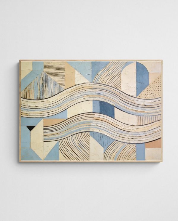
The prints that truly transform kitchen spaces share several key characteristics: they embrace colour palettes that complement or contrast beautifully with cabinetry and benchtops, feature subjects that feel natural in a culinary environment, and maintain visual interest without overwhelming the room’s primary function. Coastal abstracts bring refreshing energy to modern kitchens, botanical prints create organic warmth in traditional spaces, and geometric designs add sophisticated structure to minimalist aesthetics. The ideal kitchen print balances durability concerns—opting for quality giclée prints behind glass—with artistic expression that makes you smile every time you brew your morning coffee.
Understanding Your Kitchen’s Unique Environment
Kitchens present distinctive challenges that don’t exist in living rooms or bedrooms. The constant temperature shifts from cooking, steam from boiling water, and airborne grease particles mean your artwork needs to be more resilient than decorative pieces elsewhere in your home. Moreover, lighting in kitchens often combines harsh overhead fixtures with natural light from windows, creating viewing conditions that can either enhance or diminish your chosen prints.
Glass creates a barrier that prevents moisture absorption and makes cleaning straightforward—essential when cooking splatters inevitably occur. UV-protective glass helps prevent colour fading, particularly important if your kitchen receives strong afternoon sun. Whilst canvas prints offer texture and depth, framed prints behind glass provide superior protection against kitchen elements.
Your kitchen’s layout also shapes artwork choices. Open-plan kitchens that flow into dining or living areas require artwork that transitions smoothly between spaces, whilst galley kitchens benefit from pieces that don’t visually crowd the narrow walls. The colour temperature of your lighting—whether warm or cool—will influence how print colours appear, so test prints in your actual kitchen environment before committing to large pieces.
Colour Strategies That Actually Work in Kitchens
Colour selection for kitchen prints requires balancing visual appeal with practical psychology. Warm tones like terracotta, coral, and golden yellows work beautifully in kitchens, evoking comfort and encouraging social interaction. Cool tones shouldn’t be dismissed—coastal blues and greens bring refreshing energy that counterbalances the warmth generated by cooking, particularly effective in kitchens that face north and receive limited natural light. The current trends in interior art colours show increasing preference for unexpected combinations—sage greens paired with dusty pinks, or navy blues contrasted against warm ochres.
One practical approach involves identifying your kitchen’s dominant colour—typically your cabinetry or splashback—and selecting prints that either harmonise or create intentional contrast. White or light-coloured kitchens offer maximum flexibility, allowing you to introduce bold, saturated colours through artwork. Conversely, dark or richly-coloured kitchens benefit from prints that lighten the space, introducing visual breathing room through softer palettes or strategic white space within the composition.


| Kitchen Colour Scheme | Recommended Print Colours | Effect Created |
|---|---|---|
| White/Neutral | Bold blues, vibrant corals, deep greens | Focal point and personality injection |
| Dark/Navy | Soft pastels, warm golds, light abstracts | Brightening and visual balance |
| Warm Wood Tones | Eucalyptus greens, ocean blues, terracotta | Natural harmony and organic flow |
| Grey/Cool Tones | Mustard yellows, warm abstracts, coral accents | Warmth and inviting atmosphere |
Complementary Versus Contrasting Approaches
The complementary approach involves selecting prints with colours that already exist in your kitchen—matching your splashback tiles, echoing your cabinet hardware finish, or picking up accent colours from your kitchen textiles. This creates a harmonious, designed-together appearance that feels intentional and cohesive. In smaller kitchens, this prevents too much visual variety from creating visual chaos.
The contrasting approach deliberately introduces colours absent from your existing palette, creating visual excitement and preventing the space from feeling monotonous. This strategy works brilliantly in minimalist white or grey kitchens where artwork becomes the primary source of colour and personality. Understanding colour balance principles for modern spaces helps ensure your contrasting choices enhance rather than clash.


Subject Matter That Suits Kitchen Spaces
Whilst personal preference should guide your choices, certain subjects naturally complement kitchen environments better than others. Food-related imagery might seem obvious, but it can quickly feel clichéd unless executed with artistic sophistication. Abstract interpretations of culinary themes—gestural marks suggesting movement and energy, or organic shapes reminiscent of natural ingredients—often work better than literal representations.
Botanical and floral subjects create immediate visual connections to the fresh ingredients central to cooking. Abstract florals particularly excel here, bringing organic energy without the saccharine quality that traditional flower prints sometimes carry. The “Call of the Wild 7 – Colourful Abstract Floral Art Print” demonstrates how vibrant botanical abstraction can inject life into kitchen walls whilst maintaining artistic credibility, making it suitable for contemporary spaces that value both nature and modern aesthetics.


Landscape abstracts, particularly those evoking Australian coastal scenes or natural environments, transport viewers beyond the functional kitchen space. They create visual escape whilst preparing meals, introducing elements of biophilic design principles that connect indoor spaces with nature. Native Australian flora—eucalyptus, banksias, wattles—resonates particularly well in kitchens, celebrating local botanical heritage whilst adding textural interest.
Abstract Patterns and Textures
Geometric patterns and abstract textures offer versatility that figurative subjects sometimes lack. They complement rather than compete with your kitchen’s design elements, working harmoniously alongside cabinetry lines, tile patterns, and appliance forms. Minimalist geometric prints suit contemporary kitchens with clean lines, whilst more complex, layered abstracts can warm industrial or transitional spaces. Pattern-based prints also offer the advantage of not demanding focused attention—they enhance peripheral vision whilst you work, adding visual interest without distraction, which makes them ideal for kitchens where functionality must remain paramount.
The key is selecting patterns with appropriate scale: large-scale patterns for spacious kitchens with high ceilings, smaller intricate patterns for cosier spaces.
Size and Placement Considerations
Determining the right print size for your kitchen involves assessing available wall space whilst considering sight lines and functional clearances. The most common mistake is selecting prints too small for the wall, creating a disconnected, afterthought appearance. Artwork should occupy roughly two-thirds to three-quarters of the available wall width to achieve proper visual weight.
Kitchens often present interrupted wall spaces—sections between windows, above door frames, or flanking range hoods. These areas require different approaches than the continuous walls found in living rooms. Gallery walls comprising multiple smaller prints can elegantly fill awkward spaces, whilst single statement pieces work best on uninterrupted walls opposite your primary work triangle.
In dining areas within kitchens, hang prints at traditional gallery height—centre point at approximately 145-150cm from the floor—to ensure comfortable viewing whilst seated. Above benchtops or buffets, leave 15-20cm clearance between the surface and the frame’s bottom edge to prevent the artwork feeling cramped whilst maintaining visual connection between the two elements.
Multi-Print Arrangements
Creating a cohesive multi-print arrangement requires planning to avoid the scattered, unintentional appearance that undermines your kitchen’s design. Start by selecting prints that share a common element—perhaps similar colour palettes, complementary subjects, or coordinating frame styles. Lay arrangements on the floor before hanging to experiment with configurations that balance visual weight.
For kitchen environments, symmetrical arrangements often work better than organic salon-style walls. The kitchen’s inherent functionality—with its appliances, cabinetry, and fixtures creating strong geometric lines—pairs naturally with orderly print arrangements. Consider diptychs or triptychs for creating impact across longer walls, particularly in open-plan spaces where the kitchen flows into dining areas.


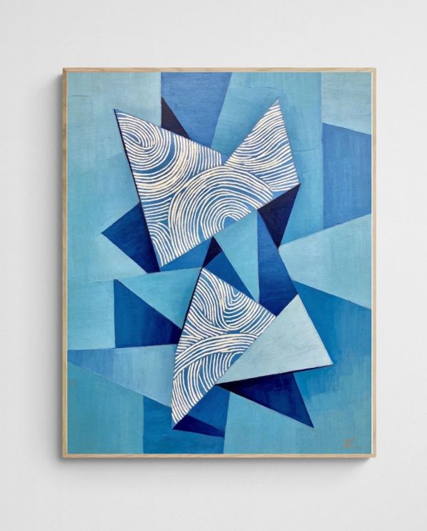
Coastal and Botanical Themes for Kitchen Walls
Coastal-inspired prints bring refreshing energy that counterbalances the warmth and intensity of cooking environments. The association between water, freshness, and cleanliness makes beach and ocean themes psychologically appropriate for kitchen spaces. Abstract coastal interpretations avoid the literal beach-house aesthetic, instead capturing the essence of seaside environments through colour, form, and movement.
The “Linoleum Beach 3 – Colourful Coral Abstract Coastal Art Print” exemplifies how coastal themes can feel sophisticated rather than themed, using abstract coral-inspired patterns and ocean-adjacent colours to evoke seaside atmospheres without resorting to literal seashells or beach scenes. This approach suits kitchens across various interior styles, from Hamptons-inspired coastal elegance to contemporary minimalist spaces.


Australian botanical subjects offer particular relevance for local homeowners, celebrating native flora whilst introducing organic shapes and natural colour palettes. Eucalyptus-themed prints work exceptionally well in kitchens, their silvery greens and dusty blues creating calming environments. These prints connect your cooking space to the Australian landscape beyond your windows, fostering the indoor-outdoor flow that characterises Australian design sensibilities.
Seasonal Versatility
Botanical and coastal abstracts remain appropriate year-round. Unlike some decorative choices that feel seasonally limited, ocean-inspired blues and botanical greens transition seamlessly through summer’s heat and winter’s coolness. This versatility proves particularly valuable in kitchens, where changing artwork frequently isn’t practical due to placement above fixed appliances or within challenging-to-reach spaces.
North-facing kitchens in Australia receive consistent bright light, making them suitable for deeper, more saturated coastal blues. South-facing spaces benefit from warmer botanical tones—golden eucalyptus shades or warm florals—that compensate for cooler natural light. Exploring Australian abstract art collections reveals how local artists interpret these themes with regional authenticity.


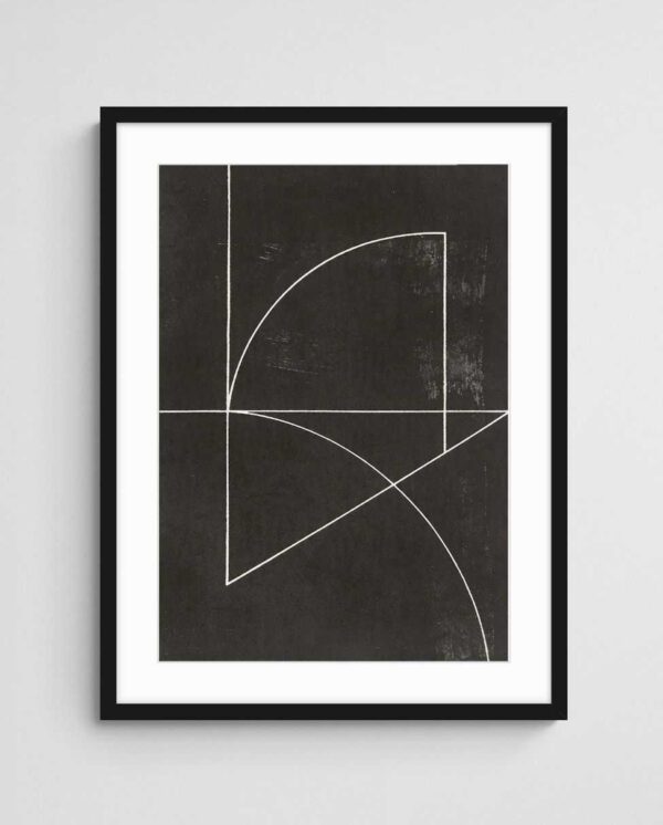
Geometric and Minimalist Options
Geometric abstracts offer clean sophistication that complements modern kitchen design without adding visual clutter. The structured nature of geometric compositions creates dialogue with the architectural lines inherent in cabinetry, benchtops, and tiled surfaces. This style particularly suits contemporary kitchens featuring handleless cabinetry, integrated appliances, and minimalist fixtures where soft, organic artwork might feel incongruous.
Minimalist prints excel in smaller kitchens where visual breathing room matters. By incorporating significant negative space and restrained colour palettes, these works prevent walls from overwhelming limited square footage. Black and white geometric prints offer timeless versatility, coordinating effortlessly with changing kitchen accessories and textiles as your preferences evolve. Unlike trend-driven designs that date quickly, well-executed geometric compositions maintain relevance across decades, proving particularly valuable since major kitchen renovations occur less frequently than in other rooms.
Balancing Hard and Soft Elements
Despite their structured nature, geometric prints can soften hard-surfaced kitchens dominated by stone, glass, and metal. The introduction of colour through geometric forms humanises these clinical materials, creating warmth without sacrificing the clean aesthetic. In traditional kitchens with timber cabinetry and softer finishes, geometric prints introduce contemporary edge that prevents the space feeling dated.
Understanding various abstract art movements and their characteristics helps inform selection. Geometric abstracts draw from constructivism and minimalism, movements that prioritised clarity, structure, and essential forms—principles that align naturally with functional kitchen design.

Protecting Your Investment: Practical Considerations
Kitchen artwork faces harsher conditions than pieces in other rooms, making protective measures essential. Quality giclée art prints use archival inks and papers designed for longevity, but even these materials benefit from proper framing. Select frames with glazing—either standard glass or acrylic—to create barriers against moisture, grease, and temperature fluctuations.
UV-protective glazing deserves serious consideration if your kitchen receives direct sunlight. Whilst it increases framing costs, it substantially extends your print’s lifespan by preventing colour fading and paper degradation. Museum-quality UV glass blocks up to 99% of harmful rays whilst maintaining clarity, essentially invisible once installed. For valuable prints or those with sentimental significance, this investment protects both aesthetic and financial value.
Avoid hanging prints directly above cooktops or sinks where they’ll receive maximum exposure to steam and splatter. Instead, position artwork on walls perpendicular to your primary cooking area, or above dining spaces within kitchen zones. If you’re determined to place art directly behind your cooktop, maintain generous clearance—minimum 60cm above the cooking surface—and clean the glass regularly to prevent grease accumulation.
Maintenance and Cleaning
Dust frames monthly using microfibre cloths that won’t scratch glass surfaces. For deeper cleaning, use glass cleaner applied to your cloth rather than directly on the frame to prevent liquid seeping behind glazing. Avoid harsh chemicals or abrasive materials that might damage frame finishes.
Periodically inspect your prints for signs of moisture damage, particularly if they’re positioned near windows or in steamy areas. Early detection of issues—slight paper buckling, colour shifting, or condensation behind glass—allows for remedial action before damage becomes irreversible. If problems develop, consult professional framers who can assess whether reframing with better sealing or different materials might solve the issue.

Creating a Cohesive Look Throughout Your Home
Whilst your kitchen artwork should suit its specific environment, considering how it relates to adjacent spaces creates a more sophisticated overall aesthetic. In open-plan homes where kitchens flow into living or dining areas, artwork should transition smoothly between zones. This doesn’t require identical pieces, but rather a considered approach to how colours, styles, or themes connect across visible sight lines.
One effective strategy involves selecting a consistent frame style or colour palette that threads through multiple spaces. Your kitchen might feature coastal abstracts in natural timber frames, your adjacent dining area could display botanical prints in matching frames, and your living room might showcase landscapes continuing the timber and nature theme. Alternatively, focus on colour threads rather than subject consistency. Perhaps your kitchen features predominantly blue abstract prints, your hallway introduces those blues alongside complementary corals, and your living room emphasises the coral tones with blue accents. This colour journey guides movement through your home whilst preventing monotony. Understanding how to coordinate artwork with existing furniture and decor helps achieve this balanced approach.
Adapting to Evolving Tastes
Your relationship with your kitchen is intimate and daily, making it essential that your artwork choices feel personally meaningful rather than simply trendy. Select prints that resonate with your experiences—perhaps coastal themes that recall favourite beaches, or botanical subjects reflecting your garden. This emotional connection ensures your choices remain satisfying long after installation.
Build flexibility into your approach by investing in quality frames that accommodate standard print sizes. This allows you to swap prints as your preferences evolve without replacing entire framing systems. Consider your kitchen artwork as a curated collection that develops over time rather than a single decorating decision. Starting with one or two key pieces and gradually adding complementary works creates an organic, collected aesthetic that feels more authentic than buying matching sets.
The right print creates instant visual impact the moment it’s hung, but its true value emerges through daily encounters—the way morning light catches certain colours, how it sparks conversations with guests, or simply how it makes you feel whilst preparing meals. These sustained interactions justify careful selection of prints that genuinely work for your specific kitchen space. Begin with a single piece that speaks to you, frame it properly, and notice how your relationship with your kitchen shifts.
 | Joseph Russell Joseph is an Australian abstract artists and curator of the Inomaly art collection. |