Hanging abstract paintings in your home might seem straightforward, but finding the best ways to display them transforms a simple decoration decision into an intentional design statement. Unlike figurative artwork that relies on recognisable subject matter, abstract art demands strategic placement, proper framing, and thoughtful consideration of your space’s architecture and existing décor. When executed well, abstract paintings become focal points that anchor rooms, influence mood, and create visual harmony—or they can feel misplaced and jarring. Understanding how to display abstract art properly ensures your investment shines and genuinely enhances your home’s aesthetic.
The key to successful abstract art display lies in balancing scale, lighting, wall placement, and the artwork’s relationship to surrounding furniture and finishes. Most people overlook these technical details, focusing only on whether they like the painting aesthetically. However, a stunning piece hung at the wrong height, without proper lighting, or clashing with your room’s colour palette can lose its impact entirely. This guide walks you through proven display methods that work across different home styles, room types, and abstract art categories—giving you the confidence to display your art in ways that maximise its visual power and emotional resonance.
Understanding Wall Placement and Height
Where you hang your abstract painting on the wall fundamentally affects how viewers experience it. The standard rule recommends hanging artwork so its centre sits at eye level—approximately 57 to 60 inches from the floor. However, this guideline serves as a starting point rather than an absolute rule, especially with abstract art where composition and visual weight differ dramatically from traditional representational paintings.
Consider the architecture of your room when deciding placement. A large abstract canvas above a sofa creates an anchoring effect that defines the seating area and draws the eye toward the room’s heart. Conversely, hanging the same piece above a console table or dresser emphasises the furniture underneath and creates a more intimate focal point. The wall itself matters too—a busy wall with windows, doors, or built-ins competes for attention, so abstract art works best on uninterrupted walls where it commands visual space.
For pieces in hallways or passages, consider lowering the hanging height slightly to account for how people move through the space. A painting hung at standard eye level in a hallway may feel isolated; lowering it by 3-6 inches creates a more integrated, welcoming presence. In staircases, follow the slope of the stairs rather than adhering strictly to the 57-inch rule—the art should feel proportional to the architectural flow.


Spacing from adjacent walls and corners affects perception too. A piece hung too close to a corner can feel cramped; ideally, allow at least 12-18 inches between the edge of the frame and any corner. This breathing room prevents the artwork from appearing squeezed and allows the abstract composition to expand visually within the space. When hanging multiple pieces, ensure consistent spacing between frames—typically 2-4 inches—to create cohesion rather than a scattered appearance.
Lighting Your Abstract Paintings Properly
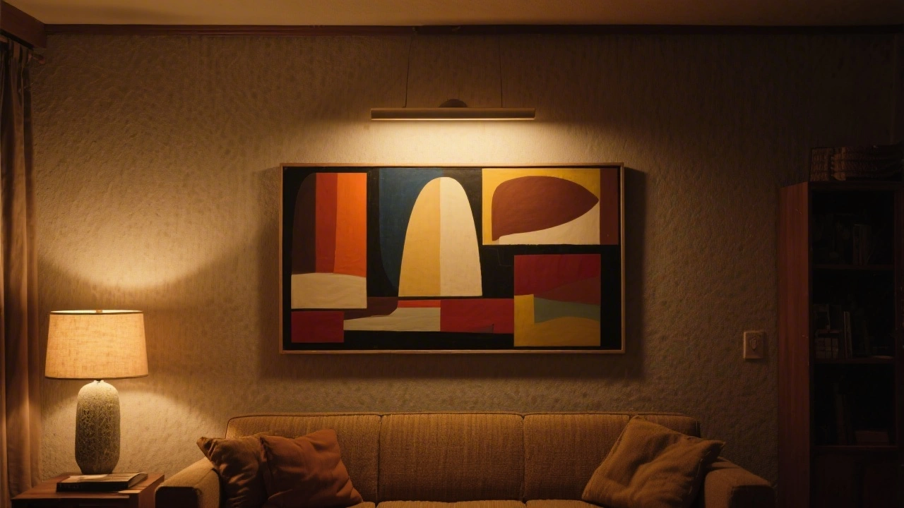
Lighting transforms how colours, textures, and composition appear in abstract art. Poor lighting can mute vibrant hues, flatten dimensional brushwork, and make the piece feel lifeless. Natural light works beautifully for many abstract paintings, but it changes throughout the day, casting different moods on your art at different hours. The best approach combines ambient room lighting with strategic accent lighting that highlights the artwork without creating glare or hot spots.
Picture lights and track lighting are traditional solutions, but contemporary art lighting solutions offer more flexibility and aesthetics. LED strip lighting mounted above or below a canvas provides warm, directional light that emphasises the piece without overpowering the room. Adjustable spotlights allow you to angle light across the painting’s surface, revealing texture and depth. Avoid pointing light directly at the art’s centre, which can create harsh shadows; instead, light from a slight angle to encourage viewers’ eyes to travel across the entire composition.
Room ambiance affects how your abstract art appears to viewers. In spaces with dimmer controls, setting lighting to 70-80 per cent of maximum brightness often flatters abstract paintings by creating enough illumination to see detail without appearing clinical. Morning light from east-facing windows brings cooler tones to the fore, while afternoon western light emphasises warmer hues. If your room receives strong direct sunlight, consider UV-protective glass or acrylic for your framed prints to prevent colour fading over time.
Choosing the Right Frame and Format
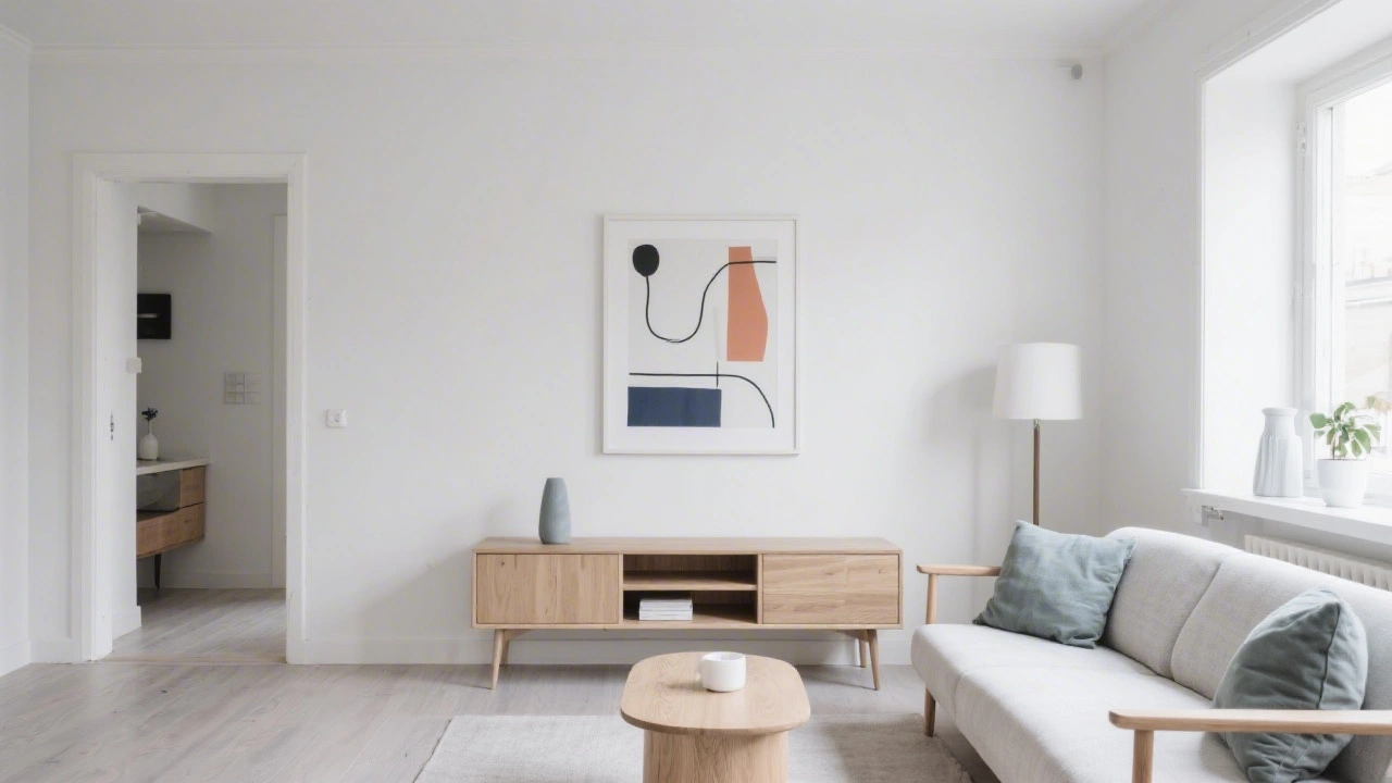
The decision between framed prints, canvas prints, and unframed options significantly influences how abstract art reads in your space. Framed prints work exceptionally well in eclectic, traditional, or gallery-style homes where matting and frame colour add sophistication. Canvas prints suit contemporary, minimalist, or bohemian interiors where the artwork feels like a continuation of the wall rather than a separate object. The format choice should align with your existing décor and the room’s overall style.
Frame colour matters more than many people realise. A white or natural wood frame makes abstract art feel modern and accessible, letting the composition command attention. Darker frames—black, charcoal, or deep wood tones—add formality and sophistication, working beautifully in contemporary or moody spaces. Gold or metallic frames suit warm-toned abstract art and pair well with golden era abstract collections that echo vintage sensibilities. The frame’s width matters too; thinner frames (0.5-1 inch) feel contemporary, while wider frames (1.5-3 inches) suggest gallery-quality presentation.
Matting—the border between artwork and frame—influences perception of scale and importance. A generous mat (2-4 inches) makes artwork feel more precious and creates visual breathing room. Minimal or no matting makes the piece feel bolder and more immediate. When matting abstract art, consider the dominant colours in the composition; a neutral mat (white, cream, or soft grey) lets the art stand alone, while a coloured mat echoing a secondary tone in the painting can enhance cohesion with your room’s palette.


Canvas prints eliminate framing entirely, presenting art as a continuous surface that extends to the edges. They work particularly well for large abstract pieces where the composition demands visual dominance without visual interruption. Canvas also creates texture on the wall—light bounces differently off canvas than off glass, giving the piece a living quality that changes throughout the day. For smaller spaces or gallery-style walls with multiple pieces, consider art prints in uniform frames, which create visual coherence and prevent the wall from feeling chaotic.
Creating Gallery Walls and Multi-Piece Arrangements
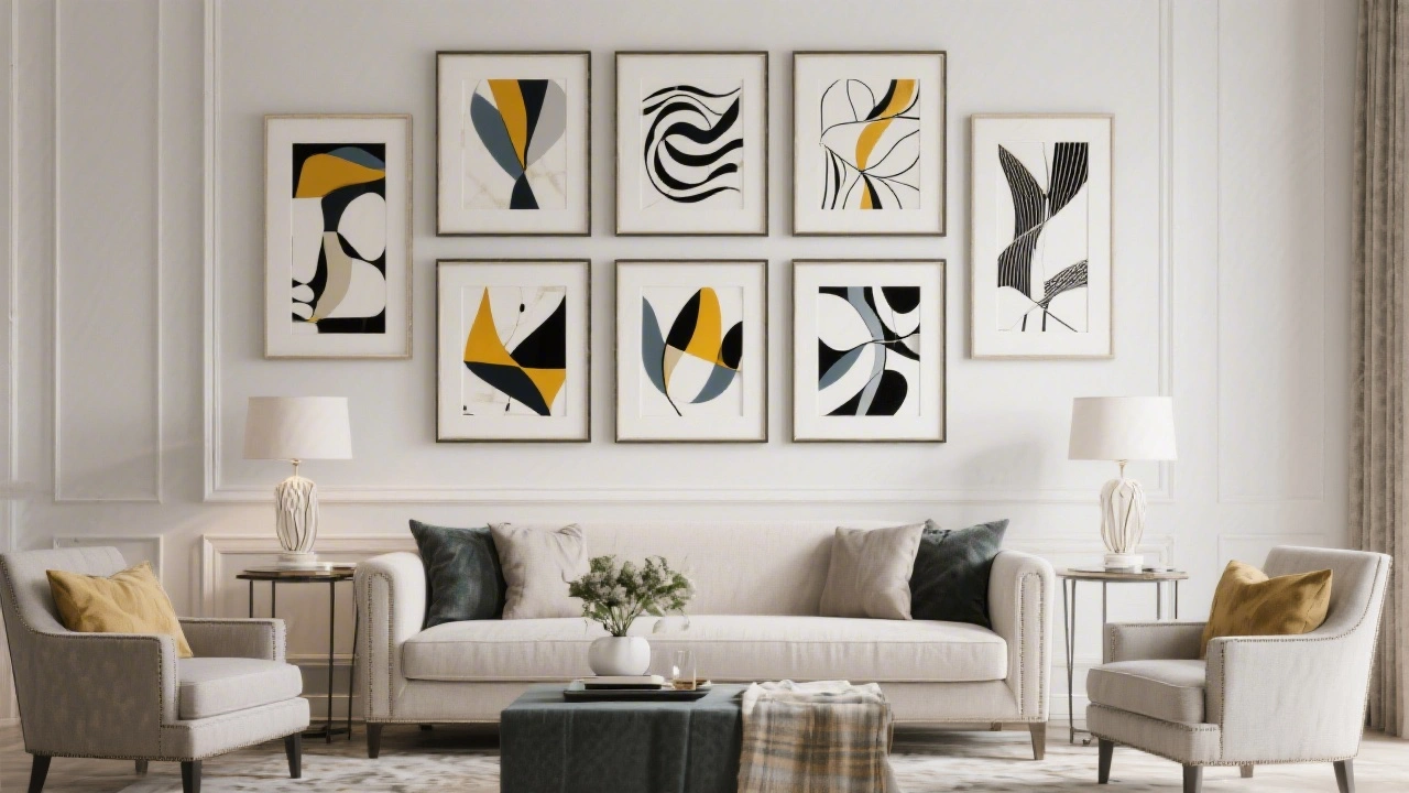
Gallery walls—collections of multiple artworks arranged together—create dramatic focal points and showcase abstract art’s diversity. The beauty of abstract painting is that wildly different styles, colours, and scales can coexist harmoniously because viewers don’t expect visual consistency the way they might with figurative pieces. A gallery wall might feature bold geometric abstracts next to lyrical expressionist pieces, unified by thoughtful spacing and frame consistency.
There are two primary approaches to gallery wall arrangement: symmetrical and salon-style. Symmetrical galleries feature pieces arranged in neat rows or grids, working beautifully with uniform frame sizes and creating a structured, contemporary feel. Salon-style galleries mix frame sizes, scales, and spacing in an organic, curated arrangement that feels collected and personal. Both work with abstract art, but the salon style often feels more dynamic and emotionally engaging.
Before hanging, map your gallery wall on paper or use painter’s tape to outline each piece’s position. This prevents mistakes and lets you experiment with different arrangements. Maintain consistent spacing—typically 2-3 inches between frames—to create visual flow rather than fragmentation. Consider colour balance across the wall; distribute bold, warm-toned pieces and cool, subtle works so no single area feels weighted or dull. The gallery wall’s overall shape matters too—create a cohesive boundary (rectangular, square, or organic) rather than allowing pieces to scatter randomly.
Coordinating Art With Furniture and Décor
Abstract art doesn’t need to match your furniture literally, but it should dialogue with existing colours, textures, and styles. Coordinating abstract art with furniture creates visual harmony rather than competition. If your sofa is a neutral beige, abstract art with warm earth tones and geometric patterns will complement it without feeling forced. If your room features bold primary colours, abstract pieces that echo or contrast with those tones will feel intentional rather than random.
Look for colour connections between your art and textiles—cushions, throws, curtains, and rugs. Repeating one or two colours from your abstract painting in your soft furnishings creates a visual thread that ties the room together. This doesn’t mean exact colour matching; instead, look for tonal relationships. If your painting features rich blues and warm oranges, perhaps your rug introduces a muted blue-grey and your cushions bring in warm terracotta. These subtle echoes feel sophisticated and considered.
Texture interaction enhances display quality too. A rough, expressionistic abstract painting with visible brushstrokes complements textured elements like woven wall hangings or rustic wood furniture. Smooth, geometrically precise abstract work pairs beautifully with polished furniture, glass accents, and sleek finishes. These textural conversations create depth and interest beyond the artwork itself.

The artwork’s scale should relate to your furniture. A small abstract print above a large sectional sofa disappears; the art should occupy approximately 50-75 per cent of the wall space above furniture. Conversely, a massive canvas above a delicate accent chair overwhelms the space. When hanging art above furniture, ensure adequate clearance—at least 6-12 inches between the top of the furniture and the bottom of the frame prevents the piece from feeling cramped or visually heavy.
Room-Specific Display Strategies
Living Rooms and Lounges
Living rooms demand statement pieces because they’re where guests form their first impressions. Large-scale abstract paintings above sofas create architectural interest and define the seating area. Consider works with moderate colour saturation that won’t overwhelm a relaxation space—bold is good, but chaotic energy can feel overstimulating in spaces meant for comfort. Wall art for living room décor should encourage conversation and visual interest without demanding constant attention.
Positioning art at a slight angle above console tables or mantels creates intimate focal points that guests naturally gravitate toward. This informal arrangement feels collected and personal, suggesting the artwork holds meaning beyond mere decoration. Gallery walls work beautifully in living rooms, allowing you to tell a visual story through multiple pieces.
Bedrooms
Bedrooms benefit from calming abstract art that soothes rather than stimulates. Softer colour palettes—muted blues, warm greys, gentle pastels—promote relaxation. Positioning the artwork where you see it when lying down creates a meditative quality. Bedroom abstract art should enhance tranquillity, so avoid pieces with jarring colour contrasts or aggressive energy. A single large piece often works better than gallery walls, which can feel too visually complex for a restful space.
Home Offices and Studies
Offices require art that stimulates focus and creativity without causing distraction. Geometric abstracts and structured compositions work well because they create visual interest while maintaining intellectual clarity. Abstract prints for office walls should inspire rather than overwhelm, positioned where you can glance at them during creative blocks without becoming a source of procrastination. Warm colour tones often boost productivity, while cool tones can aid concentration depending on your working style.
Kitchens and Dining Spaces
Kitchens and dining areas deserve vibrant abstract art that energises social gathering. Bold colour, energetic composition, and pieces that spark conversation work beautifully here. Ensure artwork hangs safely away from cooking zones where steam and heat might damage framed pieces. Canvas prints often work better than framed pieces in these moisture-prone areas, as they’re less vulnerable to humidity damage.
Hallways and Passages
Hallways offer opportunities for unexpected art discoveries. Because people move through hallways relatively quickly, pieces can be bolder and more dramatic than in spaces where you linger. Gallery walls in hallways create visual interest during transit and encourage reflection. Lower hanging heights (54-56 inches) work better in passages because viewers experience the art while walking, not standing still.


Common Mistakes and How to Avoid Them
One frequent error is hanging art too high on the wall. Pieces mounted near the ceiling feel disconnected from the room and furniture, creating awkward visual relationships. Always measure carefully and adjust from the standard 57-inch centre height rather than estimating by eye.
Another common mistake is selecting artwork that’s too small for the wall or furniture beneath it. Abstract art’s power diminishes when it feels dwarfed by surrounding space. Choose pieces that occupy meaningful wall real estate—if you’re hanging above a sofa, the art should span at least 50-75 per cent of the sofa’s width.
Mismatched framing in gallery walls can create visual chaos rather than intentional curation. If you’re using multiple frames, limit yourself to 2-3 frame styles maximum. Mixing too many frame widths, colours, and materials makes the wall feel haphazard rather than thoughtfully collected. Understanding different abstract styles helps you choose pieces that work together visually.
Poor lighting is perhaps the most underestimated mistake. Adequate lighting transforms abstract art from flat decoration into living artwork. Invest in proper lighting solutions—whether picture lights, track systems, or LED strips—rather than relying solely on ambient room light.
Finally, avoid clashing colour relationships between art and walls. While contrast can work, extreme clashes (bright fuchsia abstract on bright green walls) feel chaotic rather than intentional. Consider your wall colour when selecting artwork. Colour’s transformative power in rooms extends to how it affects artwork perception.
Quick Reference: Display Methods Comparison
| Display Method | Best For | Advantages | Considerations |
|---|---|---|---|
| Framed Prints | Eclectic, traditional, gallery-style spaces | Versatile styling, protects artwork, upgradeable | Glass reflects light, frame adds cost |
| Canvas Prints | Contemporary, minimalist, bohemian rooms | Seamless wall integration, textured appearance, contemporary feel | Limited styling options, mounting hardware visible |
| Gallery Walls | Any room needing visual drama and curation | Showcases art diversity, creates focal points, tells visual story | Requires careful planning, complex arrangement |
| Single Statement Piece | Bedrooms, offices, minimalist interiors | Creates dramatic focal point, allows fine art appreciation, uncluttered | Limited visual interest if art is unsuccessful |
| Leaning Display | Temporary arrangements, rental properties, eclectic styling | Non-permanent, versatile positioning, flexible arrangement | Less stable, takes up surface space, less formal presentation |
Creating visual interest through display method diversity keeps your home environment fresh and engaging. Creating visual interest with abstract art involves understanding not just the artwork itself, but how presentation amplifies its impact. When you combine proper placement, thoughtful lighting, and careful colour coordination, even modest abstract pieces become transformative design elements that elevate your entire home’s aesthetic and emotional atmosphere.
The journey to mastering abstract art display is iterative. Your first arrangement may feel imperfect—that’s normal and valuable. Adjust heights, try different frames, experiment with lighting angles, and observe how different arrangements make you feel. Abstract art thrives on personal interpretation, so your display should reflect what resonates with you, not arbitrary design rules. Start with the fundamentals—correct height, adequate lighting, thoughtful coordination—then trust your eye as you refine the presentation over time.
- New!
Vanilla Harvest 1 – Neutral Geometric Abstract Art Print
- Sale!

Aquatic Garden – Vibrant Under Water Abstract Art Print
Price range: $799.00 through $1,299.00 Select options This product has multiple variants. The options may be chosen on the product page
Frequently Asked Questions
What’s the ideal height to hang an abstract painting above a sofa?
The standard rule places the artwork’s centre at 57-60 inches from the floor, roughly eye level when standing. However, when hanging above a sofa, consider lowering it slightly (54-56 inches) so viewers experience the piece while seated. Ensure at least 6-12 inches of clearance between the sofa’s top edge and the artwork’s bottom frame to prevent the piece from feeling cramped or visually heavy.
Should abstract art be framed or displayed as canvas?
Both work beautifully—the choice depends on your room’s style and personal preference. Framed prints suit eclectic, traditional, or gallery-style homes and offer styling versatility through frame colour and matting choices. Canvas prints work better in contemporary, minimalist, and bohemian spaces where seamless wall integration matters. Consider your room’s existing aesthetic and the artwork’s characteristics when deciding between formats.
How do I light abstract art without creating glare?
Use directional lighting positioned at a slight angle (45 degrees) to the artwork rather than pointing directly at it. Picture lights mounted above framed pieces, LED strips above canvas, or adjustable spotlights work well. Avoid pointing light at the artwork’s centre, which creates harsh shadows. If using glass-fronted frames, angle lighting to minimise reflection, or consider UV-protective glass options that reduce glare.
Can I create a gallery wall with abstract art in different styles and colours?
Yes—abstract art’s beauty is that wildly different styles and colours coexist harmoniously. Create cohesion through consistent frame styling (limit yourself to 2-3 frame styles), maintain uniform spacing (2-3 inches between pieces), and distribute bold and subtle works evenly across the wall to achieve colour balance. Plan your layout on paper or with painter’s tape before hanging to avoid mistakes and experiment with different arrangements.
What size abstract painting should I hang above different furniture pieces?
Artwork should occupy 50-75 per cent of the wall space above furniture for visual harmony. For a standard sofa (72-84 inches), a painting of 36-48 inches wide works well. Above a smaller accent chair, aim for 24-36 inches. Above a console table or dresser (36-48 inches), select artwork 24-36 inches wide. Too-small pieces disappear visually, while oversized artwork overwhelms the furniture and space beneath it. Measure your furniture width before selecting artwork.
 | Joseph Russell Joseph is an Australian abstract artist and curator of the Inomaly art collection. |