Coordinating abstract art with your existing furniture is one of the most satisfying aspects of interior decorating. When done thoughtfully, the right piece of wall art can anchor a room, elevate your entire design scheme, and tie together colours, textures, and styles that might otherwise feel disconnected. Whether you’re working with modern minimalist furnishings, vintage pieces, or a eclectic blend of styles, understanding how to coordinate art with existing furniture ensures your space feels intentional rather than haphazard.
The fundamental principle behind successful art coordination is balance. Your abstract artwork should either complement your furniture through colour harmony, create visual interest through contrast, or establish a cohesive design narrative that makes sense within your space. This doesn’t mean everything needs to match perfectly—in fact, some of the most stunning interiors feature thoughtful tension between different design elements. The key is making deliberate choices rather than simply hanging a piece because you love it in isolation. By understanding colour theory, composition, scale, and style compatibility, you’ll develop the confidence to select and position artwork that genuinely enhances your home.
Assessing Your Furniture and Style Foundation
Before you even begin shopping for abstract art, take time to evaluate what you’re working with. Examine your existing furniture carefully: What colours dominate? Are your pieces contemporary, traditional, or mixed? Do they feature clean lines or ornate details? What’s the overall mood—calm and minimalist, warm and eclectic, bold and dramatic?
Document these elements. Take photos of your room from multiple angles in natural light. Note the predominant colours in your upholstery, wood tones, and any accent pieces. This visual reference becomes invaluable when you’re browsing artwork—you can literally hold images up to your photos to see how they might work together. Consider the texture of your furnishings as well. A leather sofa might pair differently with abstract art than a soft linen sectional. Similarly, modern abstract art decor styling approaches differ significantly depending on whether your furniture features minimalist or maximalist characteristics.
Understanding your style category helps tremendously. Are you drawn to Scandinavian simplicity, industrial aesthetics, bohemian eclecticism, or contemporary sophistication? Your furniture probably already reveals your natural style preference. Abstract art should either reinforce this existing direction or intentionally challenge it if you’re aiming for an eclectic look. There’s a significant difference between accidental visual chaos and curated eclecticism, and recognising your style foundation helps you land on the right side of that equation.
Understanding Colour Coordination Principles
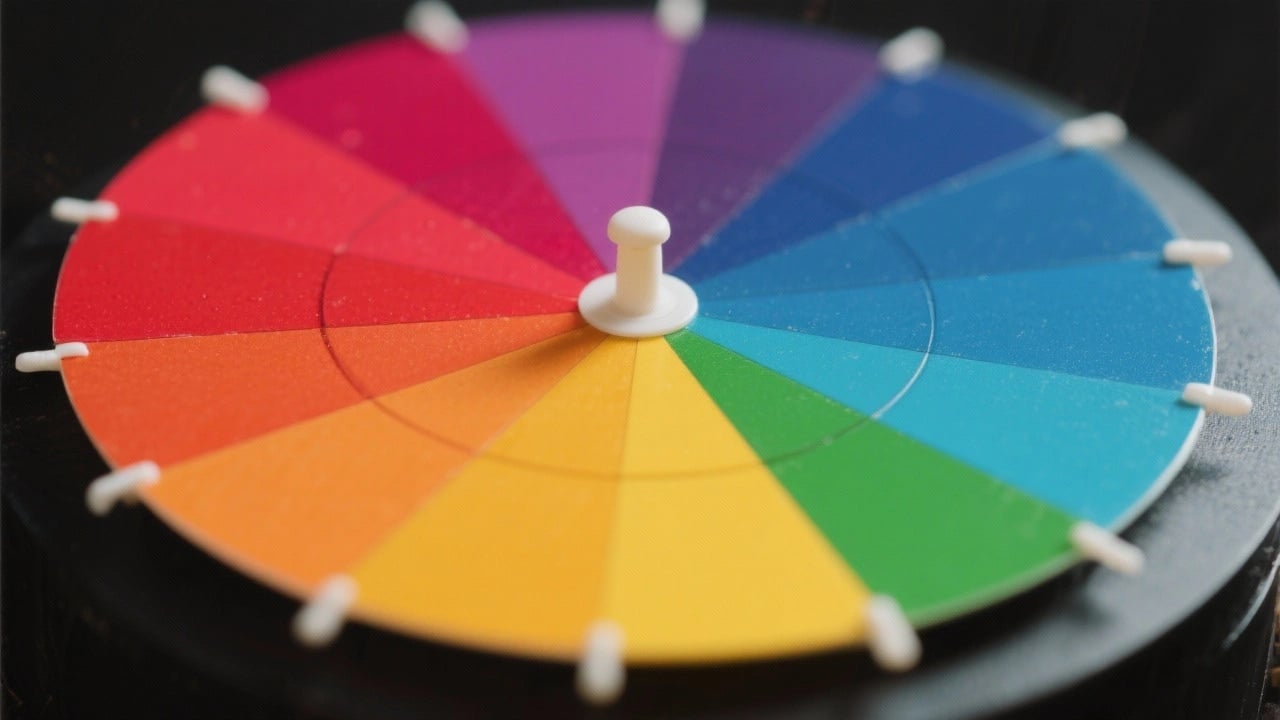
Colour is where most interior decorating decisions live, and it’s where many people struggle with coordinating art and furniture. Fortunately, some fundamental principles make this process straightforward. artwork and room colour matching guides can provide deeper insight, but let’s cover the essentials here.
The most harmonious approach is colour continuation. You select artwork that features colours already present in your room. If your sofa is grey with burnt orange accent pillows, choosing an abstract piece that echoes those same warm tones creates immediate visual coherence. Your eye travels smoothly from furniture to art because they’re “speaking the same language” colourwise. This approach feels sophisticated and intentional.


Complementary contrast offers another powerful strategy. Rather than repeating colours, you introduce complementary hues—colours opposite each other on the colour wheel. A room dominated by cool blues might feature abstract artwork with warm oranges or yellows. Done thoughtfully, this creates visual dynamism without feeling chaotic. The key is ensuring one palette remains dominant while the other serves as accent. If your furniture is predominantly neutral (grey, beige, white), abstract art becomes your opportunity to inject colour personality while remaining coordinated.
Monochromatic coordination involves working within a single colour family. Various shades of blue, grey, or green create a sophisticated, cohesive aesthetic. This approach works exceptionally well in minimalist spaces where understated elegance is the goal. Monochromatic abstract art options provide endless variation within this framework. The mood might be calm and spa-like, or dramatic and moody, depending on whether you’re using light or dark tones.
Temperature harmony matters more than most people realise. Warm colour families (reds, oranges, yellows, warm browns) create cosy, energetic spaces. Cool colour families (blues, purples, greens, cool greys) feel serene and spacious. Mixing warm and cool tones isn’t wrong, but do it intentionally rather than accidentally. If your furniture leans warm, pairing it with predominantly cool abstract artwork creates visual tension that might feel uncomfortable rather than interesting.
Scale, Placement, and Room Composition
Even perfectly coloured artwork won’t coordinate well if it’s the wrong size or in the wrong location. Scale represents one of the most frequently overlooked coordination elements, yet it dramatically affects how artwork relates to your furniture arrangement.
A petite abstract print above a grand sofa looks lonely and creates awkward visual proportion. The furniture dominates, and the art becomes an afterthought. Conversely, an enormous canvas in a small nook with modest furniture can feel overwhelming and out of place. The ideal approach uses art that commands appropriate visual weight relative to the furniture it accompanies. A good rule: artwork should occupy approximately 50-75% of the wall space above major furniture pieces.
Consider also how artwork interacts with other elements. Above a console table with lamps and decorative objects, artwork should relate proportionally to the entire vignette, not just the furniture. In gallery wall arrangements, individual pieces coordinate with each other through consistent matting, framing, or spacing rather than trying to match every single work to your furniture.


Sightline placement matters significantly. Art hung too high feels disconnected from your seated viewing perspective. Ideally, the centre of your artwork should be at approximately 57 inches from the floor—roughly at eye level when standing. From a seated position on your sofa, artwork should remain visually engaging, which means not mounting it so high that you’re craning your neck to appreciate it. When coordinating with furniture, think about how people will naturally interact with both elements together.
Matching Abstract Art to Different Interior Styles
Different interior styles have different abstract art affinities. Understanding these natural pairings helps you make coordination choices that feel harmonious rather than forced.
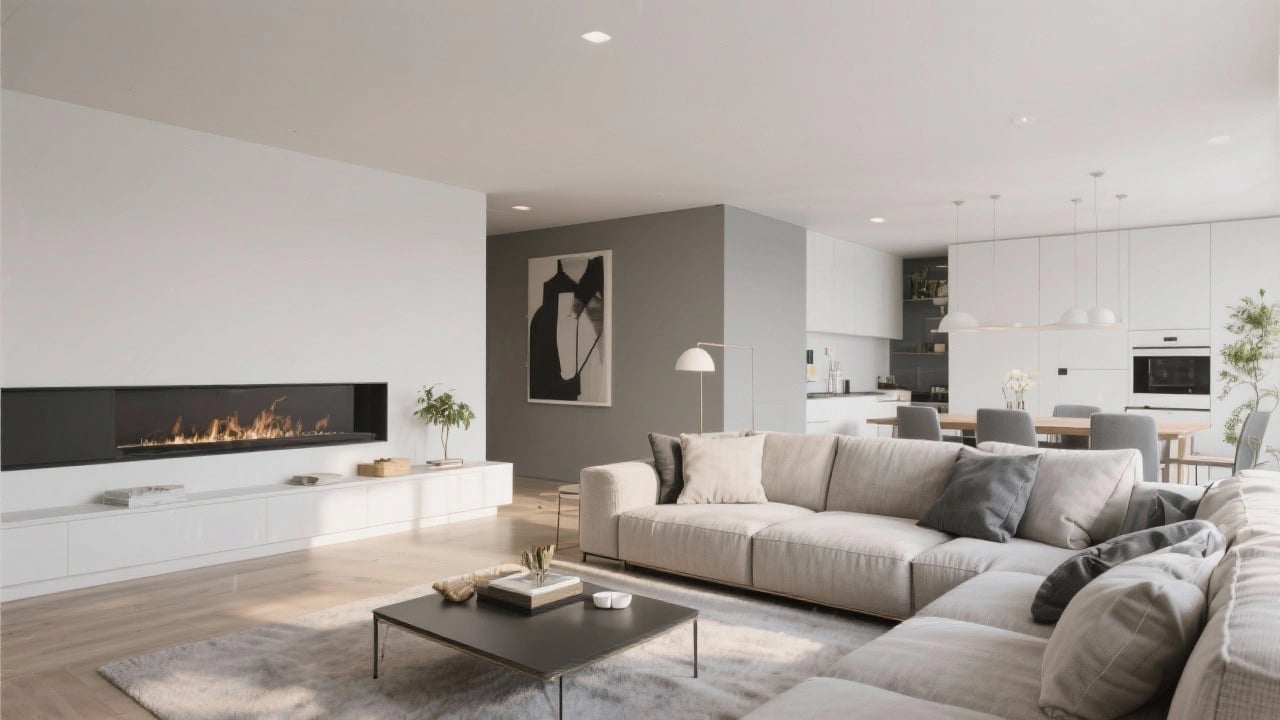
Minimalist and contemporary spaces pair beautifully with geometric abstracts or bold, large-scale pieces with clear colour separation. The simplicity of your furniture deserves equally strong, uncluttered artwork. Negative space in both the art and furniture arrangement creates visual breathing room. A single commanding abstract canvas often works better than multiple smaller pieces in these environments.
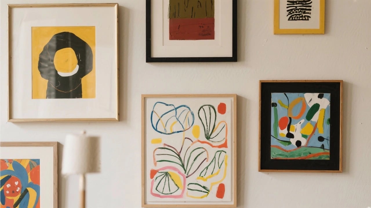
Warm, eclectic, bohemian spaces accommodate more expressive, organic abstract forms. Layered, textural pieces with multiple colours feel right at home alongside mismatched vintage furniture and global textiles. Gallery walls work exceptionally well here because eclecticism is intentional. The coordination comes from creating an overall narrative of creative abundance rather than strict colour matching.
Industrial spaces suit abstract artwork with raw energy and strong graphic elements. Monochromatic or limited-palette abstracts feel at home alongside exposed brick, metal furnishings, and concrete elements. Consider pieces with geometric undertones or urban inspiration—something that echoes the architectural language already present.
Transitional spaces (blending traditional and contemporary) need abstract art that bridges both worlds. Pieces with some representational reference points, gentle colour palettes, or balanced composition feel more accessible than purely non-objective work. This approach respects the classical restraint of traditional furniture whilst incorporating contemporary art’s visual interest.
Australian interior design aesthetics deserve particular attention. Contemporary Australian abstract artists often draw inspiration from landscape, natural light, and the unique colour palette of the Australian environment. If your furniture reflects coastal, desert, or bush-inspired aesthetics, exploring what inspires Australian artists can lead you toward naturally coordinated pieces that feel authentic to your space’s intended personality.


Creating Focal Points and Visual Flow
Strategic art placement creates focal points that actually improve how your entire room coordinates. Rather than distributing art randomly, identify where you want viewers’ eyes to travel naturally. In a living room, this might be the wall opposite the entry or above the primary seating arrangement. In a bedroom, the wall behind your bed makes an obvious focal point.
Once you establish your primary focal point, secondary pieces should relate to it harmoniously. If your main artwork features bold colours and dynamic composition, supporting pieces should echo rather than contradict its energy. Alternatively, if your primary art is calm and serene, surrounding pieces should maintain that tranquil mood.
Visual flow describes how the eye moves through your space. Coordinated art contributes to flow by creating intentional sight-lines and groupings. A curated art wall that includes varied sizes but consistent framing or spacing guides the eye smoothly. Colours that appear in your furniture and repeat in your artwork create a subtle visual thread that ties spaces together.
Transition spaces—hallways, entryways, spaces between rooms—deserve thoughtful art consideration too. Artwork here should echo colours from adjacent rooms, creating a visual connection that makes your home feel deliberately designed rather than randomly furnished. A hallway can feature a more dramatic piece than surrounding rooms, but it should still reference their colour families to maintain overall coordination.
Common Coordination Mistakes to Avoid
Learning from others’ coordination missteps helps you avoid similar pitfalls. The first common error: choosing artwork you love without considering your existing furniture. Yes, love the piece—but does it actually work in your space? A stunning abstract print might look entirely different on your walls than it did on an artist’s website. This is why photo documentation of your furniture is essential.
Second mistake: underestimating the importance of frame selection. Even perfectly coloured artwork can feel disconnected if framed inappropriately. A sleek black frame feels modern; a natural wood frame feels warm; a coloured frame can bridge your art and furniture. Your frame choice actually becomes part of the coordination equation. Quality framing also protects your artwork and makes even modest prints look gallery-worthy.
Third: ignoring lighting conditions. Artwork appears dramatically different in natural daylight versus artificial light. If your space receives mostly cool, blue-toned northern light, warm-coloured artwork might appear slightly off. Evening viewing under yellow-toned artificial light changes colour perception further. View artwork samples under your actual lighting conditions before committing.
Fourth: creating visual chaos through eclecticism without purpose. There’s a significant difference between intentionally eclectic and accidentally chaotic. If you’re mixing multiple abstract styles, colours, and scales, ensure you have a unifying principle—perhaps consistent framing, a colour thread throughout, or thematic connection. Otherwise, your coordinated furniture will feel disconnected from uncoordinated art.


Fifth: forgetting that coordination works both directions. You might choose perfect artwork, but then rearrange your furniture in ways that disconnect them. Periodically reassess how your furniture arrangement relates to your artwork. Sometimes moving a chair or side table dramatically improves overall room coordination.
Finally, many people hesitate to make bold coordination choices. If you love colour, don’t settle for neutral art simply because your furniture is neutral. Your artwork is where personality lives. Coordinating doesn’t mean matching monotonously—it means making thoughtful choices that create harmony within intentional contrast.
Practical Steps to Coordinate Your Space
Let’s translate these principles into actionable steps. Start by photographing your space from multiple angles in various lighting conditions. Create a mood board—digital or physical—featuring furniture colours, textures, and your desired aesthetic direction. Research artwork that appeals to you, saving images that resonate.
Next, analyse your saved artwork selections. What colours appear repeatedly? What styles and moods dominate your choices? This reveals your natural aesthetic preferences. Does your selection align with your furniture and the atmosphere you want to create? If not, adjust your search parameters.
When you’ve narrowed options, print or display candidates alongside photos of your furniture. Live with these images for a few days. Does the pairing still feel right after multiple viewings? Or does something feel off upon reflection?
Consider visiting professional room design services if you’re struggling. Many art retailers, including Inomaly, offer design consultation to help you make coordinated choices specific to your space. Sometimes an outside perspective clarifies decisions that feel overwhelming when made independently.
Finally, trust your instincts whilst remaining open to learning. Coordination is partially technical (colour theory, scale, proportion) and partially intuitive (what feels right emotionally). When technical principles and emotional response align, you’ve found genuine coordination success.
Remember that trending art colours reshaping interiors offer inspiration, but timeless coordination principles matter more than following trends. Choose artwork that you’ll love for years, positioned thoughtfully relative to furniture you genuinely enjoy. This approach yields spaces that feel authentically yours rather than stylistically dated.
Colour theory fundamentals (Wikipedia) provide deeper scientific understanding if you want to explore the psychology and science behind why certain colour combinations feel harmonious or jarring. Understanding the “why” behind coordination principles builds your confidence in making future design decisions.
Your home reflects your personality and values. When you coordinate abstract art thoughtfully with your furniture, you’re creating an environment that feels intentional, cohesive, and deeply personal. Whether you prefer bold statement pieces, serene minimalism, or eclectic abundance, coordinating art with existing furniture ensures every element works in visual harmony toward your desired aesthetic. Start with assessment, move through careful selection, and trust your developing design instincts. The result will be a space where art and furniture dance together beautifully.
 | Joseph Russell Joseph is an Australian abstract artist and curator of the Inomaly art collection. |