Creative agencies thrive on innovation, energy, and visual storytelling. Your office space should mirror these values, starting with walls that inspire rather than intimidate. Abstract art offers the perfect solution: it sparks conversation, fuels creative thinking, and transforms sterile workspaces into environments where ideas flourish. This comprehensive guide walks you through the process of selecting and integrating abstract art that enhances your agency’s culture whilst reinforcing your brand identity.
The right abstract art in a creative agency office does more than fill blank walls. It establishes mood, defines zones within open-plan spaces, and communicates your agency’s aesthetic sensibility to clients and talent alike. Moreover, strategic art placement can influence productivity, reduce stress, and encourage the lateral thinking that distinguishes exceptional creative work from the ordinary. By following a methodical approach to art selection and installation, you’ll create an environment that supports your team’s best work whilst making a memorable impression on everyone who walks through your doors.
Step 1: Assess Your Space and Define Zones
Before purchasing a single piece, conduct a thorough audit of your office layout. Walk through your space with fresh eyes, noting wall dimensions, lighting conditions, and existing furniture placement. Creative agency offices typically include distinct functional zones: client meeting areas, collaborative workspaces, individual workstations, breakout zones, and reception areas. Each zone serves a different purpose and consequently requires a tailored approach to art selection.
Document the specific dimensions of available wall space in each zone. Measure both width and height, accounting for obstacles like light switches, thermostats, or architectural features. Furthermore, observe how natural and artificial light interacts with different walls throughout the day. South-facing walls receive consistent, warm light that can intensify colours, whilst north-facing walls provide cooler, more consistent illumination that shows subtle tones accurately.
Consider the psychological function of each area when planning your art strategy. Reception areas benefit from bold, memorable pieces that establish your creative credentials immediately. Conference rooms need art that stimulates discussion without overwhelming presentations. Meanwhile, individual workspaces require pieces that support focus and sustained concentration. The specific challenges of open-plan offices demand strategic art placement to create visual separation between zones without physical barriers.
Create a simple floor plan marking high-priority walls where art will have maximum impact. Prioritise areas with high foot traffic, client-facing zones, and spaces where your team spends the most time. Additionally, identify secondary locations that could benefit from smaller accent pieces to create visual rhythm throughout the entire office.
Step 2: Establish Your Aesthetic Direction
Your art collection should reflect your agency’s creative philosophy and brand identity. Begin by articulating the visual language that defines your work. Are you known for minimalist elegance, maximalist boldness, or something between these poles? Your office art should communicate these values consistently to clients, collaborators, and potential hires.
Gather inspiration from your agency’s portfolio. Extract colour palettes, compositional approaches, and stylistic elements that appear repeatedly in your best work. This exercise reveals your authentic aesthetic preferences rather than simply following current design trends. For agencies working across diverse client sectors, consider selecting abstract pieces that demonstrate versatility and range whilst maintaining a cohesive visual thread.
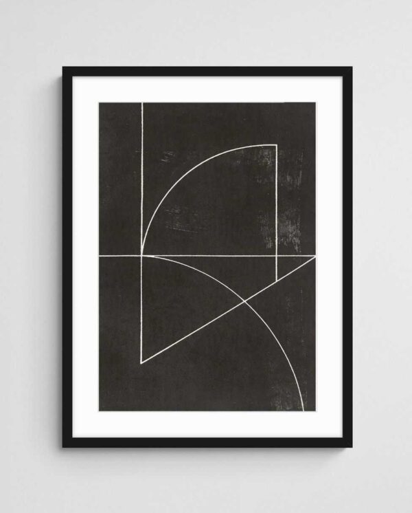


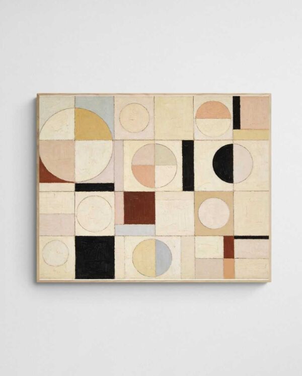
Examine how different abstract styles align with your agency personality. Geometric abstracts communicate precision, structure, and methodical thinking. Gestural abstracts suggest spontaneity, emotional intelligence, and intuitive problem-solving. Colour field works create atmospheric mood and contemplative spaces. Meanwhile, abstract expressionist pieces convey raw energy and uninhibited creativity.
Create a mood board combining your agency’s best work with potential art directions. Share this with key team members to ensure the final direction resonates with those who use the space daily. In practice, involving your team in aesthetic decisions builds ownership and ensures the art genuinely supports rather than merely decorates your workspace.
Defining Your Brand Through Art Selection
Consider how visiting clients will interpret your art choices. A property development agency might favour architectural abstracts with strong lines and spatial depth. A digital marketing agency could embrace vibrant, contemporary pieces that signal innovation and forward thinking. Fashion and lifestyle brands often gravitate toward art with sophisticated colour relationships and tactile visual qualities.
Consistency matters, but so does personality. Whilst maintaining a cohesive aesthetic throughout your office, allow individual zones to express distinct aspects of your creative identity. Your reception might showcase bold statement pieces, whilst breakout areas feature more playful, experimental works that encourage relaxation and lateral thinking.
Step 3: Develop a Colour Strategy
Colour profoundly influences mood, energy levels, and cognitive function. Strategic colour selection in your art programme can enhance specific behaviours and emotional states throughout your office. However, this doesn’t mean matching art to existing wall colours or furniture—in fact, creative tension between art and environment often produces more dynamic, memorable spaces.
Begin by understanding basic colour psychology within workplace contexts. Blue tones promote focus, calm, and analytical thinking—valuable in zones requiring sustained concentration. Warm colours like coral, terracotta, and gold generate energy, enthusiasm, and social connection in collaborative areas. Neutral palettes with strategic colour accents offer versatility and longevity, adapting as your brand evolves.


Evaluate your existing office palette, including wall colours, furniture, flooring, and architectural finishes. Rather than matching these elements exactly, look for complementary or analogous relationships that create harmony without monotony. A common mistake is selecting art that simply repeats existing colours, resulting in spaces that feel flat and one-dimensional. Instead, introduce colours that appear in your space but in different proportions or intensities.
Consider implementing a zoned colour strategy where different areas feature distinct but related palettes. Your primary client-facing areas might showcase sophisticated neutrals with bold accent colours, establishing professionalism and creative confidence. Collaborative zones could embrace more saturated, energising palettes that stimulate brainstorming and team interaction. Individual workspaces benefit from calmer, less visually demanding colour schemes that support extended focus periods.
Balancing Bold and Subtle Colour Choices
Not every wall requires maximum colour saturation. Strategic deployment of both bold and subtle pieces creates visual rhythm and prevents sensory overwhelm. Place your most colour-intensive pieces in areas where people gather briefly—reception, circulation zones, and meeting room entrances. Reserve more subdued palettes for spaces requiring sustained attention and complex cognitive tasks.
Understanding how colour transforms rooms helps you make informed decisions about which pieces to place where. Warm colours advance visually, making walls feel closer and spaces more intimate. Cool colours recede, creating perceived spaciousness and airiness. Use these principles to adjust the apparent proportions of irregularly shaped or awkwardly sized offices.
Step 4: Determine Scale and Placement
Scale mistakes undermine even the most carefully selected art. Too-small pieces disappear against large walls, whilst oversized works overwhelm intimate spaces. The relationship between art size and wall dimensions follows reliable principles that ensure visual balance and appropriate impact.
For standalone pieces on a single wall, aim for art that occupies between 60-75% of the available width. This proportion creates presence without overwhelming the space or making the piece feel cramped. In practice, measure your wall width and multiply by 0.65 to find an ideal starting point. For example, a 2-metre wall section works well with art approximately 130cm wide.
Vertical scale matters equally. The centre of your artwork should hang at approximately 145-150cm from the floor—standard gallery height that aligns with average eye level whether people stand or sit nearby. Adjust this guideline based on your space’s specific viewing conditions. Art hung in circulation zones where people predominantly stand can go slightly higher, whilst pieces in seated areas should drop correspondingly lower.

Gallery walls and multi-piece installations follow different rules. When creating arrangements with multiple pieces, treat the entire grouping as a single compositional unit. The overall arrangement should still occupy 60-75% of the wall width, with individual pieces spaced 5-10cm apart. Map out your arrangement on the floor before installing anything to test different configurations and ensure balanced visual weight distribution.
Creating Visual Flow Between Spaces
Art placement should guide movement through your office and create visual connections between distinct zones. Position key pieces to draw the eye through doorways and along circulation paths. This technique transforms disjointed spaces into cohesive environments with clear visual narrative.
Consider sightlines from multiple vantage points. An artwork visible from your entrance, through your main workspace, and into a conference room creates spatial depth and interest. Conversely, some pieces work best as discoveries—artworks that reveal themselves only when entering specific rooms, rewarding exploration and creating moments of delight throughout your office.
Step 5: Select Individual Pieces
With your strategy established, begin selecting specific artworks that fulfil your spatial, aesthetic, and functional requirements. Start with anchor pieces for your highest-impact locations—typically your reception area and primary conference room. These signature pieces establish your visual identity and set the tone for your entire collection.
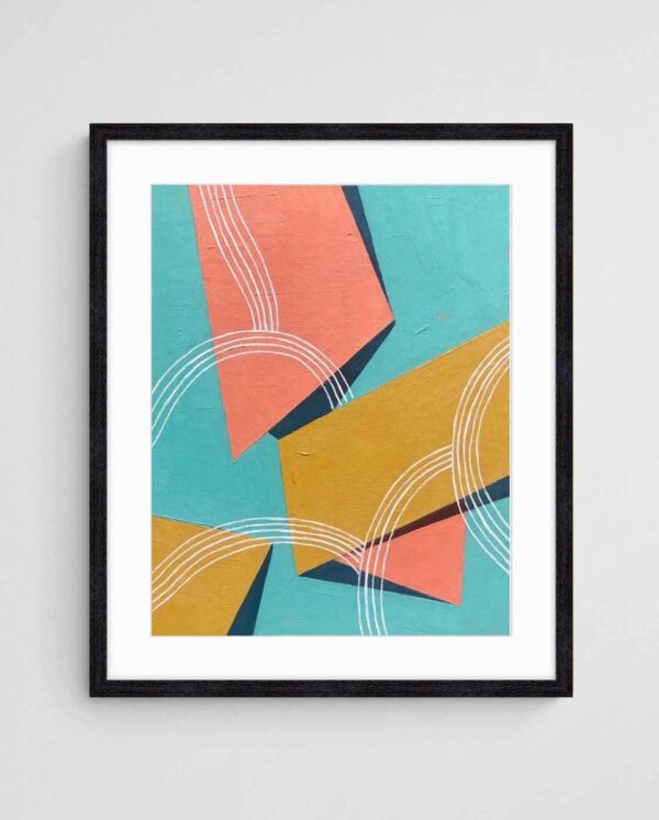
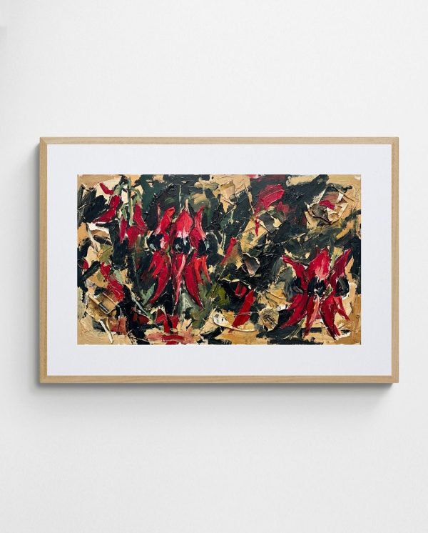
For reception areas, seek pieces with strong compositional presence and immediate visual appeal. Bold geometric abstracts like “Tropical Ties – Mid-Century Geometric Abstract Painting” command attention with structured forms and confident colour relationships, making them ideal for creating memorable first impressions. These works demonstrate creative sophistication whilst remaining accessible to diverse audiences.

Conference rooms benefit from pieces that stimulate thinking without distracting from discussions and presentations. Abstract landscapes offer this balance beautifully—they provide visual interest and atmospheric quality whilst avoiding the literal narrative content that might compete with your work presentations. The spatial qualities of landscape abstracts can make conference rooms feel more expansive and inspiring.
Build your collection gradually rather than furnishing your entire office simultaneously. Living with initial pieces reveals how different artworks perform in your actual working environment. You’ll discover which styles genuinely support your team’s creativity and which merely looked appealing in online galleries. This iterative approach prevents costly mistakes and ensures your collection evolves authentically.
Considering Print Quality and Materials
Quality matters enormously in professional environments where art communicates your standards and attention to detail. Giclée prints on archival paper offer gallery-quality reproduction with exceptional colour accuracy and longevity. These museum-grade prints withstand office lighting conditions without fading or deteriorating, protecting your investment over years of daily viewing.
Framing choices profoundly impact how art integrates with your space. Clean, minimal frames in natural timber or matte black suit most contemporary creative offices, allowing the artwork itself to dominate whilst providing necessary protection and finish. However, professional art prints can also work beautifully unframed when mounted on quality backing boards, creating a more casual, studio-like aesthetic appropriate for certain agency personalities.
Building Cohesive Collections
Your art collection should feel curated rather than random. Look for visual threads that connect disparate pieces—recurring colour notes, similar compositional approaches, or complementary stylistic elements. These connections need not be obvious; subtle relationships create sophistication and reward repeated viewing.
Consider working within established collections or series where available. Artists often create bodies of work exploring related themes through variations, providing ready-made cohesion whilst offering enough diversity to prevent monotony. This approach simplifies selection decisions and ensures your office feels thoughtfully composed rather than arbitrarily decorated.
Step 6: Plan Professional Installation
Proper installation ensures your carefully selected art appears at its best whilst remaining secure in commercial environments. Rushed or careless hanging undermines even exceptional pieces, whilst professional installation enhances the impact of modest works through precise placement and levelling.
Gather appropriate hanging hardware before installation day. D-rings and picture wire work well for smaller pieces up to 60cm. Larger artworks require French cleats or heavy-duty gallery hanging systems that distribute weight safely across wall studs. Never rely on adhesive hooks or lightweight hangers for pieces you value—the risk of damage far outweighs any installation convenience.


Use proper tools including a quality laser level, stud finder, and appropriate wall anchors for your specific wall construction. Plasterboard walls require different fixings than concrete or brick surfaces. Taking time to install correctly the first time prevents damage from failed fixings and eliminates the multiplication of unnecessary holes from trial-and-error placement.
For gallery walls and complex multi-piece arrangements, create paper templates matching your artwork dimensions. Tape these templates to the wall, adjusting positions until the composition feels balanced. Mark fixing points through the templates before removing them, ensuring accurate installation without guesswork. This technique is particularly valuable when transforming challenging spaces into gallery walls that showcase multiple pieces cohesively.
Lighting Considerations for Maximum Impact
Proper lighting dramatically enhances art’s visual impact and ensures accurate colour perception. Natural light provides the most flattering illumination but requires careful management to prevent fading and damage. Position artworks perpendicular to windows rather than opposite them to minimise direct sun exposure whilst capitalising on ambient daylight.
Supplement natural light with targeted artificial illumination. Track lighting with adjustable heads allows precise highlighting of individual pieces. LED lighting systems offer energy efficiency and minimal heat generation, protecting artwork whilst providing consistent colour rendering. Aim for lighting that illuminates art at roughly 30-degree angles from above, minimising glare whilst maximising texture and depth perception.
Step 7: Maintain and Refresh Your Collection
An effective art programme requires ongoing attention to maintain its impact and relevance. Dust accumulation, shifting light conditions, and simple visual fatigue can diminish even exceptional pieces over time. Implement straightforward maintenance practices to preserve your investment and keep your office environment fresh and inspiring.
Dust artwork monthly using soft, dry microfibre cloths. Never use cleaning products directly on prints or frames—moisture and chemicals risk permanent damage. For glass-covered pieces, spray minimal glass cleaner onto your cloth rather than the glass itself, preventing liquid from seeping behind the glazing.
Rotate pieces periodically to prevent visual fatigue and extend your collection’s impact. Quarterly or biannual rotation keeps your office feeling current whilst allowing artworks to “rest” in storage, preventing overexposure. This approach also provides opportunities to respond to seasonal changes—lighter, brighter pieces for summer months, richer, more atmospheric works for winter.
Monitor your collection for signs of environmental damage including fading, discolouration, or warping. These issues indicate problems with placement—typically too much direct sunlight or proximity to heating/cooling vents. Address environmental problems promptly by relocating vulnerable pieces or adjusting your lighting and climate control systems.
Evolving Your Collection Over Time
Your agency evolves, and your art collection should evolve with it. Budget for adding 2-4 new pieces annually, replacing works that no longer resonate or expanding into previously bare areas. This gradual refresh keeps your visual environment dynamic whilst avoiding the disruption and expense of complete redesigns.
Consider establishing relationships with Australian abstract artists whose work aligns with your aesthetic direction. Following specific artists allows you to acquire new works as they’re released, building a collection with genuine curatorial vision. Some agencies commission custom pieces for specific spaces, creating unique artworks that cannot appear in competing offices or client spaces.
Document your collection with professional photographs and maintain records of each piece including title, artist, dimensions, and purchase information. This documentation proves valuable for insurance purposes whilst helping you analyse which pieces generate the most positive response from team members and clients. Use these insights to guide future acquisitions, ensuring your collection grows strategically rather than randomly.
Measuring Impact and Adjusting Strategy
Assess your art programme’s effectiveness through both quantitative and qualitative measures. Survey team members about how the office environment affects their creativity, mood, and productivity. Track client comments and reactions during office visits. Monitor whether specific pieces generate conversation, questions, or requests for artist information.
This feedback reveals which aspects of your art strategy succeed and which require adjustment. Perhaps bold, colourful pieces in collaborative areas generate energy as intended, whilst equally vibrant works in individual workspaces prove distracting. Maybe clients respond enthusiastically to Australian landscape abstracts but show little interest in geometric works. Use these insights to refine your acquisition strategy and optimise existing piece placement.


Remember that art’s impact extends beyond immediate visual appeal. Thoughtfully selected office art contributes to talent acquisition and retention by demonstrating your agency values creativity, quality, and attention to cultural details. In competitive creative industries, these environmental factors influence whether top talent chooses your agency over competitors offering similar compensation and opportunities.
Creating an inspiring creative agency office through strategic art selection demands time, attention, and genuine engagement with how visual environments shape human experience. However, the investment pays substantial dividends in team morale, client perception, and the quality of creative work your environment enables. By following this systematic approach—assessing your space, establishing aesthetic direction, developing colour strategy, determining appropriate scale, selecting quality pieces, installing professionally, and maintaining thoughtfully—you’ll transform your office into a space that genuinely works as hard as your team does, supporting exceptional creativity whilst making a powerful statement about your agency’s identity and values.
 | Joseph Russell Joseph is an Australian abstract artists and curator of the Inomaly art collection. |