
A white room with a single bold black artwork can feel more considered than one crowded with colour. Minimalist spaces rely on restraint, so every object has to earn its place. That is why black and white art ideas work so well: the contrast creates focus without adding clutter.
Choose one or two high-contrast prints, scale them generously, and give them room to breathe. Pick artwork with a clear focal point, frame it simply, and repeat black elsewhere in the room—a lamp base, chair legs, or picture ledge. These three moves give a minimalist space depth, rhythm and personality.
Why Monochrome Suits Minimalist Rooms
Minimalist interiors usually rely on a quiet base of white walls, pale timber and simple furniture. Without a strong visual anchor, the result can feel flat. A monochrome print adds tension and structure, and it does so without competing with the architecture.
Contrast also guides the eye. A dark graphic shape on a pale wall becomes the first thing visitors notice, which means you can style the rest of the room very simply. Our guide to minimalist art styles that amplify empty spaces explains how negative space strengthens this effect.
The Role of Negative Space
White areas within a print act as breathing room, much like the empty wall around it. “Black Water 01 – Black and White Abstract Landscape” shows this well. Its dark, flowing forms are balanced by generous pale areas, so it suits a restrained coastal or Scandinavian-style room.


Monochrome Art Styles to Know
Black and white art is far more varied than it first appears. Understanding a few basic styles makes shopping easier, and our art glossary covers more of them.
- Geometric abstraction: clean lines, circles and blocks that suit modern, architectural rooms.
- Lino cuts and lithographs: hand-printed textures with a graphic, tactile quality.
- Landscape abstraction: simplified horizons and water, which soften sharp interiors.
- Portraiture: stylised faces that add a human element to minimal spaces.
Geometric work is the easiest entry point. If that appeals, read about when to use geometric art in your home before you buy.


Quick Reference: Matching Style to Room
| Style | Best Room | Mood |
|---|---|---|
| Geometric | Living room, home office | Structured, confident |
| Landscape | Bedroom, hallway | Calm, spacious |
| Lithograph or portrait | Dining area, study | Characterful, personal |
How to Choose and Place Your First Piece
Start with the wall, not the artwork. Measure the space and aim for a print that fills roughly two-thirds of the width of the furniture beneath it. A common mistake is buying too small, which makes a minimalist room feel unfinished. Our advice on large art prints that fit your walls shows how to size correctly.
Next, follow these steps:
- Hold paper templates against the wall to test scale.
- Hang the centre of the artwork about 145 cm from the floor.
- View it from the sofa or bed, not just standing.
- Check the lighting at morning and evening.
You can browse the full range of black and white art prints to compare compositions at different scales.

Framing, Layering and Styling
Frames change how a print reads. A thin black frame sharpens graphic work, while natural oak softens it. White frames with a wide mount make a print feel lighter, which suits smaller rooms. For practical hanging advice, see this guide to framing and hanging giclée prints.
Repeating Black Around the Room
Echo the artwork with small accents. A black picture ledge, matte lamp or slim metal shelf ties the print into the room. Limit yourself to three repeats so the scheme stays calm.
Texture matters too. Linen, raw timber and ceramic soften the starkness of monochrome. For more on balancing neutrals, our post on art styles for neutral walls is a useful companion.

Adding a Single Accent Colour
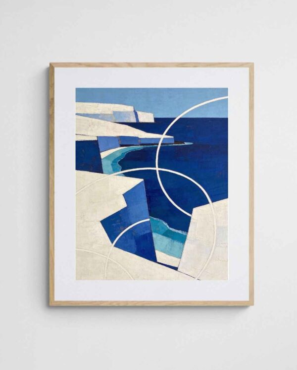
Strict monochrome is not compulsory. A print with one soft accent, such as the blue in “White Cliffs on Blue – Blue Coastal Geometric Abstract Art”, can bridge black and white with a cool coastal palette. It works best when the blue appears again in a cushion or throw.

Common Beginner Mistakes
The first error is crowding the wall. Minimalism depends on space, so resist adding extra frames just because the wall looks bare. One large print often outperforms a cluster of five small ones.
The second is ignoring light. Glossy glass can reflect windows and wash out fine black detail, so consider non-reflective glazing. Additionally, avoid placing dark artwork in a windowless corner, where it may disappear.
Finally, many buyers forget the wider palette. The history of monochrome painting (Wikipedia) shows how artists have long used limited colour to heighten form, and the same principle applies at home. Our overview of black and white prints goes further on pairing them with other colours.


If you are unsure where to begin, a free room design service can help you match scale and style to your space.


Frequently Asked Questions
Will black art make a small room feel smaller?
Not if the print has plenty of white space. Choose a design with open areas and hang it on a pale wall.
How many prints should a minimalist room have?
One to three per wall is plenty. A single large piece or a tidy pair usually works best.
Measure your main wall this weekend, choose one statement print, and test it with a paper template before ordering. Small, deliberate choices are what make a minimalist space feel complete.
 | Joseph Russell Joseph is an Australian abstract artists and curator of the Inomaly art collection. |