When we think of Australian Impressionism, most minds drift to the sun-drenched canvases of Arthur Streeton or Tom Roberts, capturing the golden light of the bush and the heroism of pioneer life. Yet that late 19th-century movement, revolutionary as it was, represents merely one chapter in a far more complex narrative. Today, the spirit of Australian Impressionism lives on—not as a dusty relic confined to gallery walls, but as a dynamic aesthetic philosophy reshaping how we understand colour, light, and place in contemporary visual culture. This evolution demands we reconsider what “Impressionism” actually means within an Australian context, especially when translated into modern abstract prints and home décor.
Australian Impressionism beyond the canvas isn’t about abandoning the principles established by the Heidelberg School; it’s about recognising that those principles—capturing fleeting light, expressing emotional truth through colour, and celebrating the unique character of Australian landscapes—have transcended their original medium. Contemporary artists working in abstraction, printmaking, and digital media continue this legacy, translating impressionistic sensibilities into forms that resonate with today’s design-conscious audiences. Moreover, the accessibility of high-quality art prints means these reimagined impressions of Australia can inhabit living rooms, offices, and public spaces far removed from traditional gallery settings, democratising an aesthetic once reserved for the elite.
Key Takeaways
- Australian Impressionism’s core principles—capturing light, expressing place, and emotional authenticity—remain vital in contemporary abstract art.
- Modern artists translate impressionistic sensibilities through abstraction, printmaking, and digital techniques, making the movement relevant for today’s interiors.
- Native Australian subjects like eucalyptus, coastal scenes, and desert landscapes continue to inspire impressionistic approaches across multiple media.
- High-quality art prints democratise access to impressionistic aesthetics, bringing museum-quality design into everyday living spaces.
- Understanding this evolution helps collectors make informed choices that honour Australian artistic heritage while embracing contemporary design.
The Heidelberg School Didn’t Define All Australian Art
We’ve canonised the Heidelberg School to such an extent that “Australian Impressionism” has become almost synonymous with plein-air painting from the 1880s and 1890s. This narrow definition does a profound disservice to the breadth of impressionistic practice that has flourished across this continent. The Heidelberg artists were undeniably important—their break from European academic tradition and embrace of Australian light revolutionised local art—but their specific approach wasn’t the only valid interpretation of impressionistic principles.
Consider the work of artists who operated outside Melbourne’s genteel painting camps. Grace Cossington Smith, working well into the 20th century, applied post-impressionist colour theory to distinctly Australian subjects with a vibrancy that made Streeton’s palette seem conservative. Her treatment of light wasn’t about capturing a specific moment but about expressing the cumulative emotional impact of living under Australian skies. This distinction matters because it shows impressionism as a flexible philosophy rather than a rigid style.
Furthermore, Indigenous Australian art has always operated on impressionistic principles that predate European arrival by tens of thousands of years. The use of dot painting to suggest movement, the abstraction of landscape into symbolic elements, and the layering of meaning through colour—these techniques share far more with Monet’s approach to perception than with academic realism. Yet we’ve rarely acknowledged these connections, preferring to keep Aboriginal art in a separate category rather than recognising it as part of a broader Australian impressionistic tradition.
Australian Impressionism wasn’t a single movement but a recurring impulse to capture the unique quality of Australian light and landscape through colour and emotion rather than strict representation.
The fixation on the Heidelberg School has also obscured regional variations in impressionistic practice. Queensland artists developed their own responses to subtropical light, with colour palettes reflecting humid atmospheres and lush vegetation. Western Australian artists grappled with desert luminosity and coastal intensity quite different from Victoria’s softer, more European-like climate. These regional impressionisms deserve recognition as equally valid expressions of the movement’s core principles. When we expand our definition this way, contemporary abstract works that capture the essence of specific Australian places without literal representation become clear descendants of impressionistic tradition.


Light and Colour as Emotional Language
At its heart, Impressionism was never about accurate representation—it was about capturing subjective experience. The French Impressionists understood that human perception doesn’t work like a camera; we experience light and colour emotionally, not just visually. Australian Impressionists inherited this insight but applied it to a landscape with dramatically different optical properties. Our light is harsher, more revealing, with less atmospheric diffusion than European climates. This demanded new colour relationships and tonal strategies.
Contemporary abstract artists working in the impressionistic tradition have taken this principle further, stripping away representational elements entirely to focus on pure colour relationships. When you encounter a piece like “Reef Shadows – Coastal Abstract Painting Print,” you’re experiencing impressionism distilled to its essence—the emotional impact of coastal light translated into fields of colour that evoke sensation without depicting specific forms. This isn’t a rejection of impressionism but its logical evolution.
The technical demands of capturing Australian light have always pushed artists toward innovative colour use. Our skies aren’t Constable’s gentle greys but intense blues that shift toward violet at the horizon. Our foliage isn’t the deep greens of European forests but silvery, grey-green eucalyptus that seems to shimmer in heat. These unique optical conditions forced Australian Impressionists to develop colour theories independent of European precedents, and contemporary artists continue this experimentation. When abstract painters use unexpected colour combinations to suggest place—perhaps pairing burnt orange with cool lavender to evoke late afternoon in the outback—they’re following the same experimental spirit that animated the Heidelberg School.
Moreover, the emotional language of colour operates differently in Australian contexts. Our cultural associations—red earth with the interior, golden light with national identity, deep blue with coastal lifestyle—carry symbolic weight that abstract artists can deploy without literal imagery. This allows for a kind of visual shorthand where a carefully chosen palette can evoke “Australianness” more powerfully than any detailed landscape painting. It’s impressionism freed from the burden of representation, speaking directly to shared cultural memory and emotional association.
Colour Theory in Practice
Understanding how contemporary artists apply impressionistic colour theory helps explain why certain abstract pieces resonate so strongly with Australian viewers. The technique involves several key approaches:
- Complementary contrast: Using opposing colours to create visual vibration that mimics the intensity of Australian light
- Temperature shifts: Juxtaposing warm and cool tones to suggest atmospheric perspective without horizon lines
- Value compression: Working within narrow tonal ranges to evoke the bleached-out quality of midday or the compressed values of twilight
- Chromatic grey: Creating neutral tones through colour mixing rather than black-and-white, producing the silvery quality characteristic of Australian vegetation
These aren’t merely technical exercises but methods for translating sensory experience into visual form. When applied thoughtfully, they create abstract works that feel authentically Australian without resorting to clichéd imagery. This sophistication in colour use distinguishes genuinely impressionistic abstraction from generic decorative art, offering viewers intellectual and emotional engagement alongside aesthetic pleasure.


From Eucalyptus to Abstraction: Native Flora Reimagined
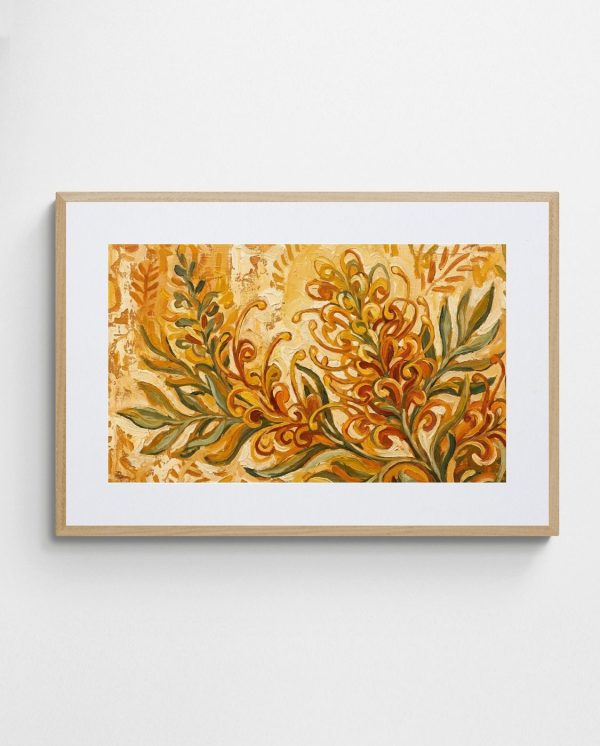
Australian Impressionists were among the first European-descended artists to truly see native flora as worthy subjects rather than curious exotica. The way eucalyptus leaves filter light, how banksias create sculptural negative space, the texture of wattle blooms—these became central to Australian visual identity through impressionistic treatment. Contemporary artists continue this exploration but often push beyond representation into abstraction, isolating formal qualities like pattern, rhythm, and colour relationships.
The eucalyptus, in particular, has proved endlessly fascinating to artists working in impressionistic modes. Its silver-grey foliage creates unique lighting effects, scattering rather than absorbing light. Its peeling bark provides textural interest that translates beautifully into printmaking techniques. Its sinuous forms suggest movement even in stillness. When contemporary artists abstract these qualities—perhaps reducing a eucalyptus grove to rhythmic vertical elements with dappled colour fields—they’re not abandoning the subject but distilling its essential visual character. Works in the Eucalyptus High Collection exemplify this approach, translating specific botanical observations into abstract compositions that retain the emotional truth of the original subject.
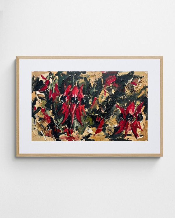
Native florals offer even richer possibilities for abstraction. The complex geometry of waratahs, the radiating patterns of bottlebrush, the fractal-like repetition of grevillea flowers—these forms naturally lend themselves to abstract interpretation. Early impressionists recognised this, often simplifying native flowers into bold colour shapes rather than attempting botanical accuracy. Contemporary artists extend this impulse, sometimes treating native flora as pure pattern and colour rhythm divorced from recognisable form. The result is work that feels inherently Australian without being literally representational, speaking to deep-seated cultural associations with place and identity.
Additionally, the seasonal changes in native vegetation provide ongoing inspiration for impressionistic interpretation. The flowering of desert peas after rain, the colour shifts in eucalyptus during drought stress, the cycle of banksia cones—these temporal patterns create opportunities for artists to explore change and impermanence, core concerns of impressionism since its inception. Abstract works capturing these seasonal rhythms through colour and compositional changes honour the impressionist tradition while embracing contemporary aesthetic sensibilities. This connection between traditional subjects and contemporary interpretation keeps Australian art vital and relevant.
Printmaking as Impressionistic Medium
Linocut and lithography have emerged as particularly effective media for translating native flora into impressionistic abstraction. These techniques naturally simplify forms into essential shapes while retaining textural richness. The printing process itself introduces controlled variation—each pull from the block differs slightly, creating the sense of multiplicity and change central to impressionism. Contemporary printmakers exploiting these qualities produce works that capture botanical subjects with spontaneity and directness that rivals plein-air painting.
The “Australian Landscape Art Print – Palms and Sugar” demonstrates how printmaking can distill botanical subjects into pattern and colour relationships while maintaining connection to specific species and places. The reduction of complex palm fronds into rhythmic linear elements, the way negative space functions compositionally, the limited palette that somehow suggests full tropical colour—these choices reflect impressionistic principles applied through print media. This cross-pollination between historical painting approaches and contemporary printmaking keeps the impressionistic tradition evolving.


Coastal Impressions in Contemporary Practice
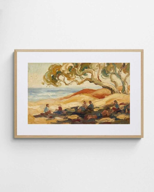
Australia’s relationship with its coastline runs deep, shaping national identity in ways that demand artistic expression. The Heidelberg School touched on coastal subjects—Streeton’s Coogee Beach series being notable examples—but the full potential of coastal impressionism has only been realised in recent decades. Contemporary artists working with beach and ocean subjects bring impressionistic principles to bear on subjects central to Australian lifestyle and self-conception, creating work that resonates powerfully with local and international audiences alike.
The unique qualities of Australian coastal light provide rich material for impressionistic interpretation. The way light penetrates shallow tropical waters creates colour fields of impossible turquoise. The reflective quality of wet sand at low tide produces mirror effects and tonal subtleties. The salt haze over breaking waves diffuses light in ways reminiscent of Monet’s fog studies. Contemporary abstract artists capturing these phenomena without literal representation demonstrate impressionism’s continued relevance. Works like “The Deep Blue – Abstract Coastal Wall Art Print” translate the experience of coastal light into pure colour and form, evoking sensation and memory without depicting recognisable beach scenes.
Furthermore, Australia’s reef systems present unique challenges and opportunities for impressionistic treatment. The visual complexity of coral formations, the play of light through water, the unexpected colour relationships of tropical fish and marine plants—these subjects push artists toward abstraction simply because literal representation can’t capture their sensory impact. The French Impressionists never encountered such subjects, so Australian artists developing visual languages to address them extend impressionism into genuinely new territory. This isn’t derivative work but original contribution to a living tradition.
The cultural significance of beaches in Australian life adds another layer to coastal impressionism. Beaches represent leisure, physical culture, democratic public space, and connection with nature—themes that infuse contemporary coastal abstraction with meanings beyond pure aesthetics. When abstract artists evoke coastal experiences through colour and composition, they’re tapping into collective cultural memory and shared values. This social dimension elevates coastal impressionism from mere decoration to genuine cultural expression, much as the Heidelberg School’s bush paintings articulated emerging national identity in their era.
Translating Wave Action into Abstract Form
The movement of water presents particular challenges for visual artists. Traditional representation can seem static, failing to capture the kinetic energy of surf and tide. Impressionistic abstraction offers solutions by focusing on pattern, rhythm, and colour flux rather than frozen moments. Contemporary artists employ several strategies to evoke wave motion through abstract means:
- Layering translucent colour fields to suggest water depth and light penetration
- Using directional mark-making to imply water movement without depicting individual waves
- Deploying repetitive elements with subtle variations to create visual rhythm analogous to wave patterns
- Exploiting colour temperature shifts to suggest the interplay of reflected sky and water depth
These techniques allow abstract works to capture something essential about coastal experience that realistic beach scenes often miss. The emotional impact of standing at the water’s edge, the hypnotic rhythm of breaking waves, the sense of vast horizons—these can be distilled into abstract compositions that function as visual poetry rather than literal description. This represents impressionism at its most sophisticated, using purely formal means to transmit complex sensory and emotional information. Collectors responding to such works intuitively understand what contemporary coastal impressionism offers: a way to bring the experience of Australian shores into interior spaces without resorting to predictable beach photography or literal seascapes.


The Desert as Abstract Subject
The Australian interior presents challenges that early Impressionists barely addressed. Its vast scale, extreme light conditions, and sparse vegetation resist the compositional strategies developed in European landscapes. Yet the desert’s visual qualities—saturated earth colours, intense atmospheric effects, stark formal simplicity—align perfectly with abstract expressionism and colour-field painting. Contemporary artists treating desert subjects through impressionistic abstraction have discovered that the outback becomes more viscerally present when reduced to essential colour and form than when rendered literally.
Desert light operates at extremes that push colour to maximum intensity. The red earth against cobalt sky creates complementary contrast of almost painful vibrancy. Midday heat creates shimmer effects that blur solid forms into atmospheric phenomena. The absolute clarity of desert air eliminates atmospheric perspective, making distance difficult to judge and rendering traditional landscape composition strategies ineffective. These extreme conditions demand abstract approaches. When artists translate desert experience into saturated colour fields and simplified forms, they’re not avoiding difficulty but embracing the only visual language adequate to the subject.
Indigenous artistic traditions have always understood this, treating country through abstraction, symbolism, and pattern rather than Western landscape conventions. Contemporary non-Indigenous artists working with desert subjects must navigate the ethics of this territory carefully, but there’s legitimate space for impressionistic interpretation that honours the land’s visual character without appropriating Indigenous symbolic systems. The focus on personal sensory response to place—colour, light, atmosphere, emotional resonance—keeps work grounded in individual experience rather than claiming cultural authority. This approach aligns with impressionism’s foundational premise: articulating subjective perception rather than objective reality.
The seasonal transformations of desert landscapes provide compelling subject matter for impressionistic exploration. The sudden blooming after rare rains, when the centre explodes into unexpected colour, offers dramatic contrast with the prevailing ochres and umbers. Dust storms that turn the sky orange and blur all definition create atmospheric effects as dramatic as any Turner sunset. The subtle colour shifts in rock formations as sunlight changes throughout the day rival the best of Monet’s haystacks or Rouen Cathedral series. Contemporary artists capturing these phenomena through abstract colour relationships and formal strategies continue impressionism’s project of documenting lived experience of place. For those interested in how these themes manifest across different styles, exploring various abstract approaches reveals the breadth of possibilities.
Texture as Desert Language
Beyond colour and light, the desert speaks through texture—cracked clay, wind-sculpted sand, weathered rock. Contemporary printmakers and mixed-media artists incorporate actual and implied texture to evoke desert surfaces in ways smooth painting cannot. The physicality of relief printing, the granular quality of certain pigments, the layering of translucent media over textured grounds—these techniques create tactile surfaces that reference desert materiality without literal representation. This textural dimension adds another sensory layer to impressionistic interpretation, engaging viewers’ haptic imagination alongside visual response. It demonstrates how contemporary materials and techniques expand impressionism’s expressive range while remaining true to its core principle: transmitting embodied experience of place.


Urban Impressionism: Melbourne and Sydney Through New Eyes
Australian Impressionism typically conjures bush and beach, not urban environments. Yet our cities possess distinctive visual characters that deserve impressionistic treatment. The way Melbourne’s Victorian architecture creates particular lighting effects in narrow lanes, how Sydney Harbour’s water reflects and multiplies the city skyline, the colour palette of suburbia’s terracotta roofs and cream weatherboard—these urban qualities are as uniquely Australian as any gum tree, and contemporary artists are increasingly treating them with impressionistic sensibility.
The “Sydney Opera House – Australian Art Print” exemplifies how iconic urban subjects can receive impressionistic interpretation that goes beyond postcard imagery. By reducing Utzon’s architecture to essential linear elements and treating the harbour as colour field rather than detailed water, the artist captures the structure’s sculptural impact and its relationship with the harbour more effectively than literal representation could. This demonstrates impressionism’s continued utility for expressing contemporary Australian experience, much of which unfolds in urban rather than natural settings.
Melbourne’s artistic identity has always involved urban subjects, from the Heidelberg School’s Collins Street studies to contemporary street art. The city’s changeable weather creates atmospheric conditions perfect for impressionistic treatment—morning fog in the Yarra Valley, the quality of light after sudden rain, the way gallery interiors contrast with bright exteriors. Works like “Melbourne Abstract Art Print – Morning at the Queen Victoria Market” translate these urban experiences into abstract compositions that feel authentically local. This urban impressionism acknowledges that Australian identity now encompasses cosmopolitan culture alongside bushland and beach, demanding artistic languages adequate to contemporary experience. The integration of these themes into interior design reflects broader trends in Melbourne art aesthetics.
Suburban landscapes present another underexplored area for impressionistic treatment. The repetitive geometry of housing developments, the colour relationships of native gardens against brick veneer, the patterns created by Hills hoists and garage doors—these vernacular subjects carry as much cultural significance as any historical Australian motif. Contemporary artists treating suburban subjects through impressionistic abstraction validate everyday Australian experience as worthy of artistic attention. This democratisation of subject matter aligns with impressionism’s original impulse to paint contemporary life rather than historical or mythological scenes.
Infrastructure as Visual Subject
Bridges, harbours, railways, and other urban infrastructure offer rich formal possibilities for impressionistic abstraction. These structures create geometric patterns, frame views, and interact with light in ways that pure landscape doesn’t. The way sunlight strikes the Sydney Harbour Bridge’s grey steel, creating complex shadow patterns on the water below, provides material as compelling as any Monet haystack. Contemporary artists recognising this extend impressionism’s subject matter while maintaining its focus on light, colour, and atmospheric effect. This expansion of acceptable subjects keeps the movement relevant to contemporary life rather than confining it to historical precedent. It also acknowledges that Australian identity now includes our built environment as much as natural landscape, requiring artistic languages that embrace this complexity.


Why This Evolution Matters for Your Walls
Understanding Australian Impressionism’s evolution from 19th-century plein-air painting to contemporary abstraction isn’t merely academic exercise—it has practical implications for how we approach art in domestic and commercial spaces. When you recognise that abstract works employing impressionistic principles of colour, light, and place carry forward genuine artistic tradition rather than being arbitrary decoration, you’re empowered to make more informed and meaningful choices about art prints for your environment.
Contemporary impressionistic abstraction offers several advantages over traditional representational Australian landscape art. First, it tends to work more flexibly across diverse interior design schemes. A literal gum tree painting demands a certain context; an abstract work capturing eucalyptus light and colour through pure form can integrate with minimalist, industrial, or contemporary traditional interiors alike. This flexibility doesn’t represent compromise but sophistication—the work operates at a level of visual refinement that transcends literal subject matter. Consequently, when exploring options like abstract landscape prints, you gain access to Australian content that enhances rather than dictates interior aesthetic.
Second, abstract impressionism tends to age better aesthetically. Literal representations can feel dated as visual culture evolves, but work operating through fundamental relationships of colour and form maintains relevance. A well-executed colour-field piece evoking coastal light will feel as fresh in twenty years as today because it engages perennial human responses to colour and light rather than temporary stylistic conventions. This makes contemporary impressionistic abstraction a sound investment for those considering art’s long-term presence in their spaces.
Third, these works create opportunities for personal interpretation that literal imagery forecloses. Where a detailed beach scene tells viewers what to see, an abstract coastal piece invites individual response. One person might see reef colours, another ocean depths, a third simply pleasurable colour relationships. This interpretive openness means the work grows with viewers rather than becoming overly familiar, maintaining engagement over time. It also makes such pieces more universally appealing in shared spaces like offices or hospitality environments, where diverse viewers bring different perspectives.
The best contemporary Australian abstract art doesn’t abandon place but distills it into pure visual experience, offering walls that breathe with the same light and colour that define this continent.
Collecting with Intention
Approaching contemporary impressionistic abstraction requires slightly different evaluation criteria than traditional Australian landscape painting. Rather than asking “Is this an accurate depiction?” consider questions like:
- Does the colour palette evoke a genuine sense of Australian light or landscape?
- Is there evidence of considered composition, or does the piece feel arbitrary?
- Do the formal elements—line, shape, colour relationships—create visual interest that will sustain long-term viewing?
- Does the work demonstrate technical competence in its chosen medium?
- Can you articulate what the piece expresses emotionally, even if you can’t identify specific subjects?
These questions help distinguish genuinely accomplished impressionistic abstraction from generic decorative art. They focus attention on the qualities that make such work effective: its ability to evoke place and sensation through purely formal means, its technical execution, and its capacity for sustained aesthetic and emotional engagement. Applying these criteria, whether selecting pieces for living room walls or professional environments, ensures choices that honour both artistic tradition and contemporary design needs.
Moreover, understanding this lineage allows collectors to articulate why they’re drawn to particular works. Rather than vaguely describing preference for “modern art” or “abstract stuff,” you can explain appreciation for how certain pieces translate Australian light into colour relationships or distill coastal experience into form. This intellectual engagement deepens aesthetic pleasure, transforming passive decoration into active collection. It also supports conversations with artists and gallerists that move beyond superficial transactions to genuine exchange about artistic intention and cultural meaning. For those seeking guidance in creating coherent collections, resources on displaying abstract paintings effectively prove invaluable.
The Role of Quality Reproduction
The accessibility of high-quality giclée printing has democratised access to sophisticated contemporary impressionistic abstraction. Where original works might command prices beyond most collectors’ reach, limited-edition prints maintain artistic integrity while remaining affordable. This isn’t compromise but appropriate use of contemporary technology to serve impressionism’s original democratic impulse—making art accessible beyond aristocratic patronage.
Quality reproduction preserves the colour relationships and tonal subtleties essential to impressionistic effect. Inferior printing flattens these nuances, reducing complex colour interactions to crude approximations. When selecting fine art prints, attention to printing standards ensures the work you bring into your space genuinely represents the artist’s intention. This matters particularly for impressionistic abstraction, where the entire point is subtle colour relationships and atmospheric effect—qualities that demand high-fidelity reproduction to register properly.
The evolution of Australian Impressionism beyond traditional canvas paintings into contemporary abstraction and accessible print media represents not decline but vitality. It demonstrates living tradition adapting to contemporary life while maintaining connection to foundational principles. For those furnishing spaces with intention, this evolution offers opportunities to engage with genuine Australian artistic heritage through works suited to modern interiors and lifestyles. The “Centre” might be geographic, but it’s also conceptual—that essential Australianness captured through colour, light, and form rather than literal imagery. Understanding this allows more sophisticated engagement with contemporary Australian abstract art, transforming walls from blank spaces into expressions of place, identity, and aesthetic discernment.


The conversation about Australian Impressionism typically ends with Streeton, Roberts, and their cohort, as though artistic exploration of Australian light and landscape concluded a century ago. This perspective misses the vibrant continuation of impressionistic principles in contemporary practice. By recognising abstraction not as rejection but evolution of impressionism’s core concerns—capturing subjective experience of place through colour and form—we gain access to work that honours tradition while speaking to contemporary sensibility. This isn’t about choosing between old and new but understanding continuity within apparent change.
The artists creating abstract works inspired by eucalyptus groves, coastal light, desert colours, and urban atmospheres aren’t abandoning Australian Impressionism but extending it. They’re applying its fundamental insights—that art should capture emotional truth rather than literal appearance, that colour relationships convey meaning, that our unique light demands unique visual languages—to contemporary subjects and media. This keeps Australian art vital rather than merely retrospective, creating living tradition rather than museum artefact. It also ensures that future generations inherit not just historical masterworks but active artistic practices rooted in genuine observation and response to this continent’s distinctive character.
For those considering art for their spaces, whether residential or commercial, understanding this continuity opens possibilities beyond tired coastal photography and clichéd bush scenes. Contemporary impressionistic abstraction offers authentically Australian content that integrates with modern design sensibilities, providing visual and emotional richness without aesthetic compromise. It represents sophisticated engagement with both artistic tradition and contemporary life—exactly what walls deserve when they’re going to hold our attention for years to come. The question isn’t whether to embrace this evolution but how to engage with it thoughtfully, selecting works that genuinely embody impressionistic principles rather than merely decorative abstraction wearing Australian themes as superficial costume.
This matters because our visual environment shapes experience profoundly. Living with art that authentically captures Australian light, colour, and atmosphere—even through abstraction—creates daily connection with place that literal imagery often fails to achieve. It’s the difference between photograph of a beach and that ineffable quality of coastal light translated into colour relationships that make your heart respond without quite knowing why. That’s impressionism working at its highest level: sensation and emotion transmitted through purely visual means. That it now exists in forms accessible beyond traditional gallery paintings, available as high-quality prints for everyday spaces, represents not dumbing down but genuine cultural achievement. Australian Impressionism beyond the canvas isn’t lesser; it’s impressionism finally fulfilling its democratic promise while maintaining artistic integrity. Your walls, and your daily experience, deserve nothing less.
Frequently Asked Questions
What defines Australian Impressionism in contemporary art?
Contemporary Australian Impressionism focuses on capturing the emotional and sensory experience of Australian light, landscape, and atmosphere through colour relationships and form rather than literal representation. It maintains the original movement’s core principles—subjective perception, plein-air immediacy, and expression of place—while embracing abstraction and modern media like printmaking and digital techniques.
How do abstract prints relate to traditional Australian Impressionism?
Abstract prints continue impressionism’s project of translating sensory experience into visual form, but do so through pure colour, line, and composition rather than recognisable subjects. They distill the essence of Australian landscapes—coastal light, eucalyptus groves, desert colours—into formal elements that evoke emotional response without literal depiction, making them suitable for contemporary interiors while maintaining artistic authenticity.
Why does Australian light require different artistic approaches than European impressionism?
Australian light is typically harsher and more direct than European atmospheric conditions, with less diffusion and more intense colour saturation. This demands different colour relationships, higher contrast, and adaptation of techniques developed for softer northern hemisphere light. Australian artists have consequently developed unique approaches to capturing local light conditions, often pushing toward abstraction because literal representation can’t convey the intensity of the experience.
Can contemporary abstract art be considered genuinely Australian in character?
Yes, when abstract art engages meaningfully with Australian colour palettes, light qualities, and landscape characteristics, it can be distinctly Australian even without literal imagery. The use of specific colour relationships that evoke red desert earth, silvery eucalyptus, or coastal blues creates work that resonates with local experience and cultural memory, making it authentically Australian through formal means rather than representational content.
What should I look for when choosing impressionistic abstract art for my space?
Focus on whether the colour palette genuinely evokes Australian light or landscape, whether the composition demonstrates intentional design rather than arbitrary arrangement, and whether the work sustains visual interest over time. Quality printing matters significantly—look for giclée prints on archival paper that preserve subtle colour relationships. Most importantly, the piece should evoke an emotional response that connects you to place or memory, even if you can’t identify specific subjects.
 | Joseph Russell Joseph is an Australian abstract artists and curator of the Inomaly art collection. |