
Your colourful furniture doesn’t have to compete with your wall art—it can work in harmony with it. The question of what art complements colourful furniture is less about matching and more about understanding balance, contrast, and visual flow. When you’ve invested in bold sofas, vibrant armchairs, or statement dining chairs, selecting the right artwork becomes crucial to creating a cohesive, polished interior that feels intentional rather than chaotic.
The key is to think of your furniture and art as conversation partners, not competitors. Art that complements colourful furniture typically falls into three approaches: neutral pieces that provide breathing room, tonal works that echo existing colours without overwhelming them, or strategic contrasts that add depth without creating discord. The right choice depends on your furniture’s colour intensity, the room’s overall palette, and the mood you want to achieve.
Assess Your Furniture’s Colour Saturation
Before selecting any artwork, you need to understand the intensity level of your existing furniture. Highly saturated pieces—think jewel-toned velvet sofas in emerald, sapphire, or ruby—require a different approach than pastel or mid-tone furniture. Take photos of your room in natural light and examine them critically to identify whether your furniture leans warm or cool, and whether the colours are pure or muted.
High-saturation furniture typically benefits from art with significant negative space or muted tones. This prevents your room from feeling visually congested. Moreover, consider the undertones: a teal sofa with blue undertones pairs differently than one with green undertones. Understanding these nuances helps you make informed decisions about complementary artwork.
If your furniture features multiple bold colours—perhaps a patterned armchair with reds, oranges, and yellows—you’ll want to identify the dominant hue. This becomes your anchor point when selecting art. Alternatively, you might choose to complement the accent colours instead, which creates a more subtle connection between furniture and walls.
Identify Your Dominant Colour Temperature
Colour temperature significantly affects how art and furniture interact. Warm furniture in reds, oranges, and yellows creates energy and vibrancy, while cool blues, greens, and purples establish calm and sophistication. Your artwork should acknowledge this temperature, either by echoing it for harmony or contrasting it for dynamic tension. For instance, if you’ve decorated with warm colours that energise your space, you might soften the intensity with cooler art tones.
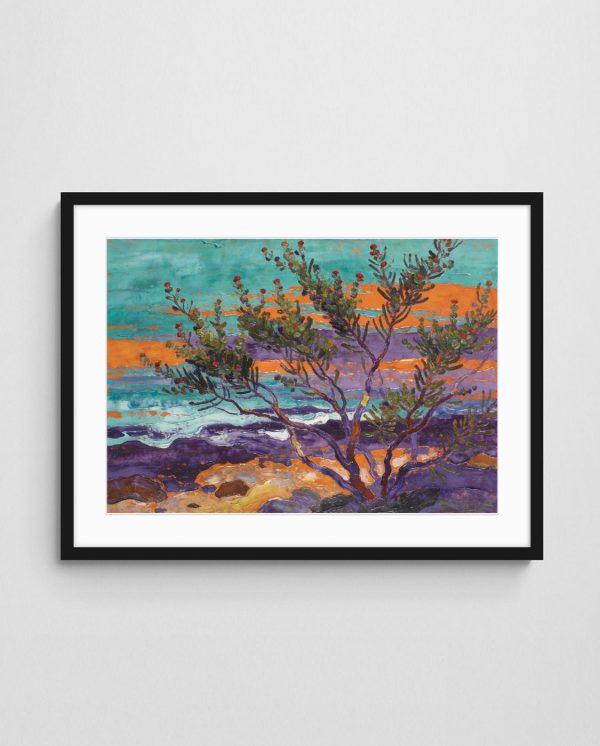

Once you’ve mapped your furniture’s colour temperature, you can decide whether to stay within the same temperature family or deliberately cross over. Staying within the same temperature creates cohesion and predictability, whilst crossing temperatures adds visual interest and prevents monotony. Both approaches work—the choice depends on your personal style and the room’s purpose.
Choose the Neutral Approach for Maximum Versatility
Neutral abstract art serves as a visual rest point in rooms dominated by colourful furniture. Black and white prints, beige abstracts, and greyscale compositions allow your furniture to remain the focal point whilst providing sophisticated wall coverage. This approach particularly suits maximalist furniture arrangements where multiple bold pieces coexist in one space.
The beauty of neutral art lies in its flexibility. When you update your furniture or rotate cushions and throws, neutral artwork adapts seamlessly without requiring replacement. Furthermore, neutral pieces often feature compelling textures and forms that reward closer inspection, adding depth without adding chromatic complexity.
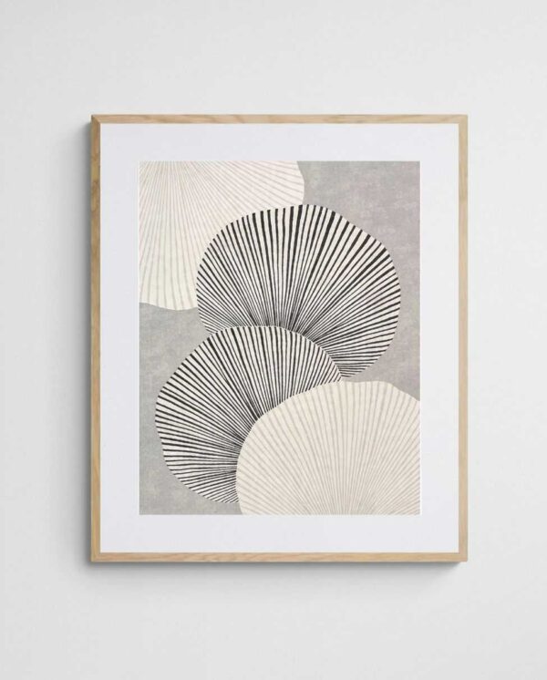
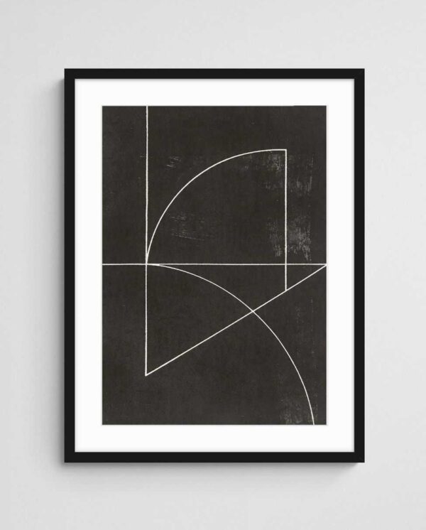
Neutral doesn’t mean boring. Look for pieces with interesting compositions, varied textures, or subtle tonal shifts. A black and white abstract with bold gestural marks can hold its own against vibrant furniture, whilst a soft beige piece with delicate linework provides gentle contrast. The key is selecting neutrals with enough visual weight to command attention without competing for colour dominance. If you’re working within minimalist design principles, neutral abstracts become essential anchoring elements.
Consider Monochromatic Neutrals
Monochromatic neutral artwork—pieces that explore variations of a single neutral colour—creates sophisticated depth. A print featuring multiple shades of grey, from charcoal to dove, adds dimension without introducing new colours to your palette. This technique works exceptionally well in rooms where furniture already provides ample chromatic interest.
Create Tonal Harmony Without Matching Exactly
Exact colour matching between furniture and art often produces flat, uninspiring results. Instead, aim for tonal harmony—selecting artwork that shares colour families with your furniture but in different saturations or values. If you have a mustard yellow sofa, consider art featuring pale gold, ochre, or amber tones rather than an identical mustard shade.
This approach creates visual conversation between furniture and walls. The colours reference each other without creating a monotonous colour story. Additionally, tonal harmony allows for more flexibility when adding accessories like cushions, rugs, and throws, as you’ve left room for bridging colours and accents. Understanding colour balance principles will help you achieve this harmony effectively.
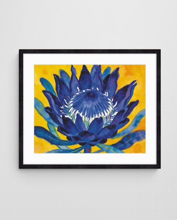

When working with tonal harmony, the 60-30-10 rule proves invaluable. Your colourful furniture might occupy the 30 or 10 percent (accent) portion of this formula, with your artwork either echoing those tones in the background (60 percent) or adding complementary accents (10 percent). This mathematical approach to colour distribution creates naturally balanced spaces.
Layer Multiple Tonal Values
Rather than selecting a single tonal value, consider artwork that incorporates a range of values within your chosen colour family. A piece featuring light, medium, and dark blues creates more visual interest than one uniform blue tone, and it offers more connection points to furniture in various blue shades throughout your room.

Use Strategic Contrast to Add Depth
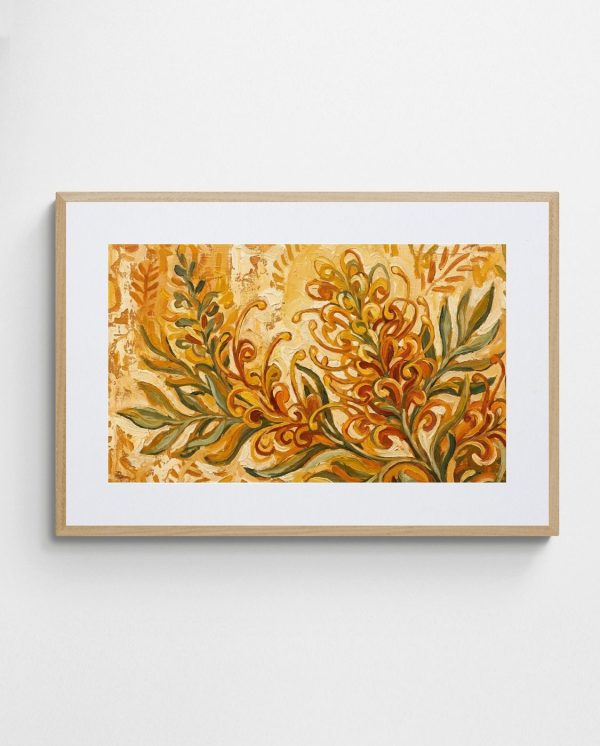
Contrasting colours can elevate your interior when applied thoughtfully. If your furniture skews warm, cool-toned artwork creates refreshing balance. Conversely, warm artwork can bring energy to spaces dominated by cool furniture. The key word here is “strategic”—contrast should feel intentional, not random. According to colour theory principles, complementary colours sit opposite each other on the colour wheel and create the strongest contrast.
Consider the psychological impact of your contrast choices. A room with energetic red furniture might benefit from calming green or blue artwork, whilst a space with serene blue furniture could gain vitality from coral or terracotta prints. This emotional balance proves just as important as visual balance, particularly in rooms where you spend significant time.
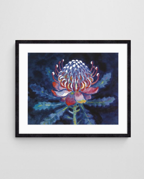

Contrast doesn’t require dramatic colour leaps. Even subtle shifts—pairing salmon furniture with soft mint art, or lavender furniture with pale yellow prints—create gentle contrast that adds sophistication without shock value. Test your contrast choices by placing samples near your furniture and observing them at different times of day, as natural light shifts can dramatically affect colour relationships. For additional inspiration, explore modern colour combinations that work particularly well in contemporary homes.
Apply the Complement-Split Strategy
Rather than using direct complementary colours, try the split-complementary approach. If you have orange furniture, instead of choosing pure blue art (the direct complement), select pieces featuring blue-green and blue-violet tones. This creates contrast with less intensity and more nuance, particularly suitable for residential spaces where comfort matters.
Balance Pattern and Texture
Colourful furniture often features prominent patterns—florals, geometrics, or abstract designs. Your artwork should account for this visual complexity. If your furniture is heavily patterned, opt for art with cleaner compositions and less visual busyness. Conversely, if your colourful furniture presents solid blocks of colour, patterned or textured artwork adds welcome complexity.
Texture creates visual interest without adding colour. A heavily textured abstract print in neutral or analogous colours complements bold furniture by adding dimension rather than competition. This proves especially effective with smooth, modern furniture upholstery, where textured art provides sensory contrast that enriches the overall design scheme.
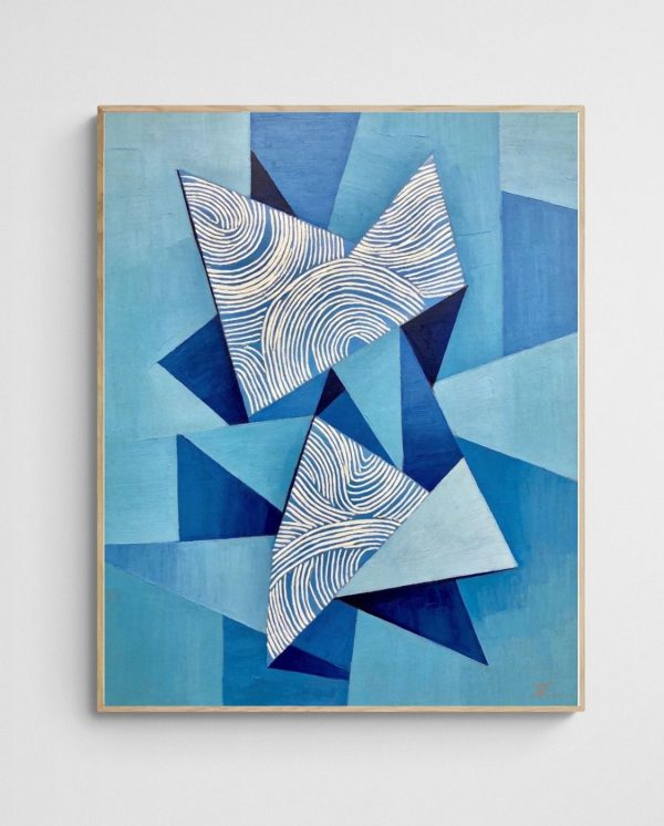

Consider the scale of patterns as well. Small, intricate patterns in furniture pair well with large, bold forms in artwork, and vice versa. This principle of pattern variation prevents visual fatigue and creates rhythm throughout your space. When patterns compete at similar scales, rooms feel chaotic rather than curated. If you’re working with coordinating furniture and art, understanding pattern scale becomes essential.
Mix Organic and Geometric Forms
If your furniture features geometric patterns—stripes, chevrons, or architectural forms—balance them with organic, flowing artwork. Alternatively, pair curved, organic furniture with geometric abstracts for complementary contrast. This interplay between structured and free-form elements creates visual harmony through opposition.


Consider Scale and Proportion
The size of your artwork relative to your furniture affects how successfully they complement each other. Large, bold furniture pieces require artwork with sufficient visual weight to balance them. Undersized art above a substantial sofa looks apologetic and creates awkward proportions. A common guideline suggests artwork should span approximately two-thirds to three-quarters of the furniture width below it.
However, scale isn’t solely about physical dimensions—it’s also about visual weight. A small piece with intense colour or dramatic composition can balance larger, more subdued furniture. Conversely, a large-scale abstract in soft, muted tones might feel overwhelmed by compact but intensely colourful furniture. Assess both physical and visual weight when making selections.
Multiple smaller pieces can collectively balance a large furniture item. A gallery wall of coordinated abstracts above a colourful sofa distributes visual interest whilst creating flexibility. This approach works particularly well when you want to incorporate several colour connections between furniture and art without relying on a single large piece. For comprehensive guidance on sizing, consult resources about selecting appropriately sized prints for your specific walls.
Establish Visual Breathing Room
Leave adequate space between your furniture and artwork. Overcrowding creates visual tension regardless of how well the colours work together. A minimum of 20-25 centimetres between the furniture top and artwork bottom allows each element to command its own space whilst still relating to each other visually. This breathing room proves essential in rooms with multiple colourful elements.

Avoid Common Mistakes
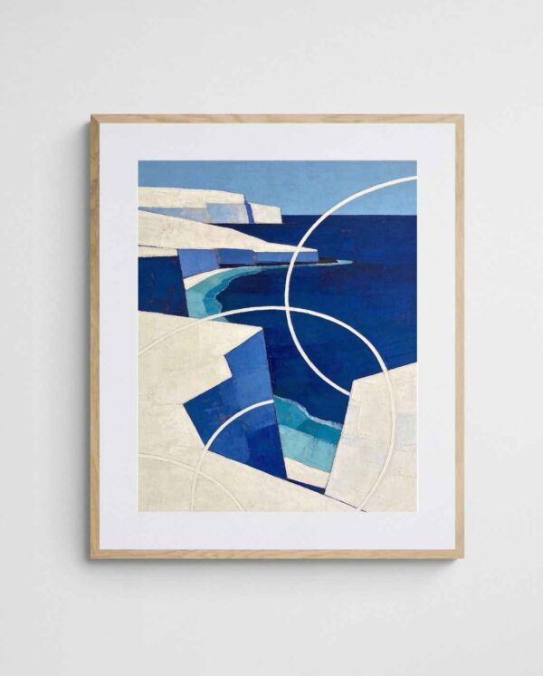
One frequent error involves overthinking colour matching. Many people spend excessive time searching for art that contains the exact furniture colours, creating matchy-matchy interiors that lack sophistication. Instead, focus on how colours relate through temperature, value, and intensity rather than precise matching. Professional designers often intentionally avoid exact matches to create more dynamic, layered spaces.
Another mistake involves ignoring the room’s overall colour story. Your furniture and art don’t exist in isolation—they interact with wall colours, flooring, window treatments, and accessories. Select artwork that considers the entire palette, not just the furniture. A piece that beautifully complements your sofa might clash terribly with your wall colour or rug.
Many people also underestimate the impact of lighting. Art that looks perfect in a showroom or online might read completely differently in your home’s specific lighting conditions. Natural light, artificial lighting temperature, and light direction all affect colour perception. Therefore, whenever possible, view artwork in your actual space before committing, or at minimum, examine it under various lighting conditions. For spaces where lighting varies significantly, explore colour choices that remain stable across different lighting scenarios.
Don’t Forget the Room’s Function
The relationship between furniture and art should support the room’s purpose. Bold contrasts might energise a home office but prove overwhelming in a bedroom. Conversely, extremely subtle tonal relationships might feel underwhelming in social spaces like living rooms or dining areas. Let function guide your boldness or restraint when pairing colourful furniture with artwork. Consider how colour psychology influences workplace productivity and apply similar thinking to your residential spaces.


Successfully pairing art with colourful furniture requires balancing multiple factors: colour relationships, scale, pattern, texture, and overall design intent. By following these principles, you’ll create spaces where furniture and art enhance rather than compete with each other. Remember that rules exist to be thoughtfully broken—once you understand the fundamentals, trust your instincts and personal aesthetic preferences.
The most successful interiors reflect their inhabitants’ personalities whilst demonstrating design awareness. Your colourful furniture represents bold choices; your artwork should match that confidence. Whether you choose harmonious tones, strategic neutrals, or contrasting colours, ensure your selections feel authentic to your style. When art and furniture work together purposefully, they create spaces that feel both professionally designed and genuinely personal. Explore our colourful abstract art collection to discover pieces that will perfectly complement your bold furniture choices.
 | Joseph Russell Joseph is an Australian abstract artists and curator of the Inomaly art collection. |