
Your office walls hold untapped potential to shape how your team thinks, feels, and performs every working day. Choosing the right abstract art isn’t just about filling empty space—it’s about strategically using colour psychology, visual rhythm, and compositional balance to create an environment that actively supports focus, creativity, and well-being. In practice, the difference between a workspace that energises people and one that drains them often comes down to the art you put on the walls.
The connection between workplace aesthetics and productivity is backed by decades of research in environmental psychology. Well-chosen abstract prints can reduce stress markers, improve mood, and even influence cognitive performance through deliberate colour choices and visual patterns. What works well is understanding how different hues and abstract styles interact with the specific tasks your team performs daily, then selecting pieces that reinforce rather than distract from those objectives.
Colour Psychology in the Workplace
Colour affects human physiology in measurable ways. Blue wavelengths suppress melatonin production and increase alertness, while warm reds and oranges stimulate heart rate and energy levels. In workplace environments, these effects compound over hours of exposure, making your colour choices far more consequential than they might first appear.
Research from the field of environmental psychology demonstrates that exposure to certain colours can influence everything from decision-making speed to creative problem-solving capacity. A common mistake is treating office art purely as decoration rather than recognising its role as an environmental factor that shapes cognitive function throughout the workday.
When selecting abstract art for your office, consider the primary activities occurring in each space. Analytical work benefits from cool, calming palettes that support sustained concentration. Creative brainstorming thrives with more dynamic colour relationships that stimulate lateral thinking. Reception areas and client-facing spaces require colours that convey professionalism whilst remaining welcoming.
The intensity and saturation of colours matter as much as the hues themselves. Highly saturated colours demand attention and can energise spaces used for brief periods, but may prove overwhelming in areas where staff spend extended hours. Desaturated or muted abstract pieces offer visual interest without the cognitive load that comes with processing intense colour stimulation throughout an eight-hour workday.
Blue Tones for Focus and Productivity Zones
Blue remains the most universally effective colour for supporting concentration and analytical thinking. Cooler blue tones lower stress responses and create psychological distance that helps with objective decision-making. For offices focused on data analysis, accounting, legal work, or any task requiring sustained attention to detail, blue-dominant abstract art creates an optimal visual environment.
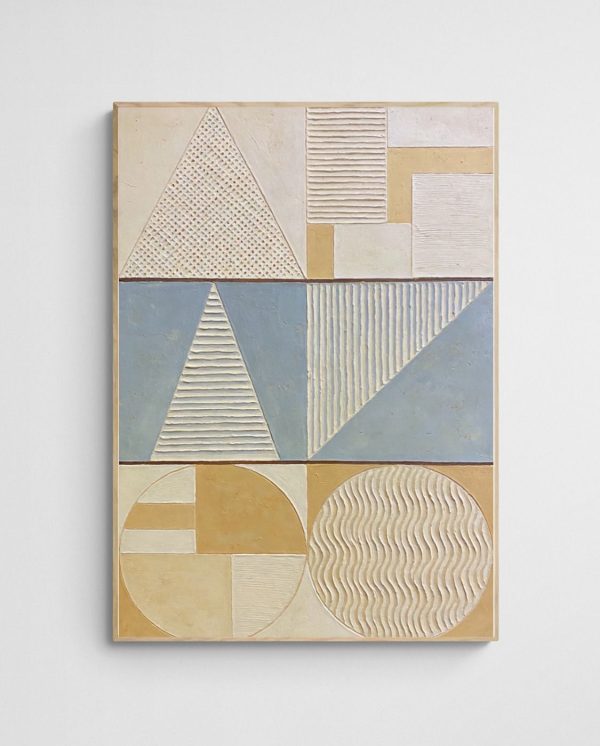
The “Scandi Tide Pools – Modern Abstract Coastal Art Print” exemplifies how blue abstracts can bring calm focus to productivity zones without becoming sterile or clinical. Its layered blue tones create visual depth whilst maintaining the serene quality that supports concentration over long periods.
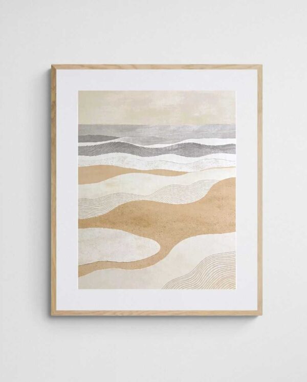
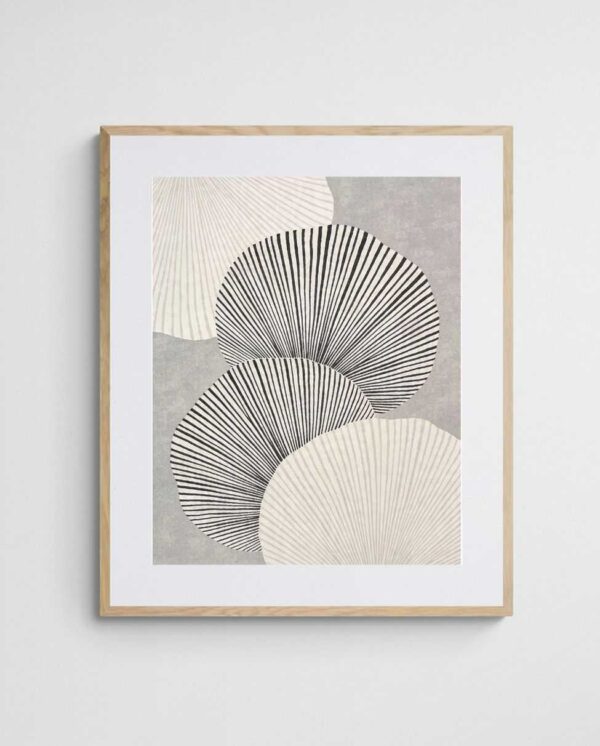
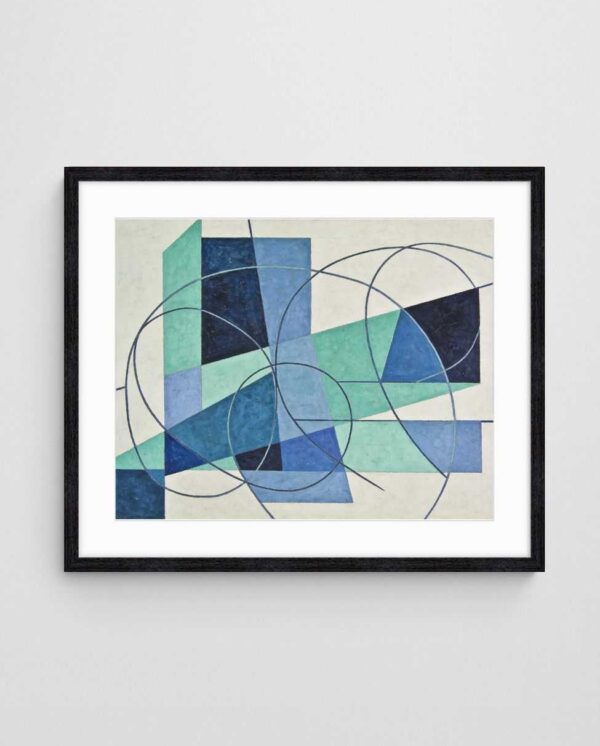

Different blue values serve different purposes. Deeper navy and teal tones convey authority and stability—ideal for executive offices or spaces where gravitas matters. Lighter sky blues and aquas feel more accessible and open, working well in collaborative zones where you want the calming benefits of blue without creating psychological barriers between team members.
A practical approach is layering various blue values across a workspace. Place deeper blues in private offices and meeting rooms where decision-making happens, whilst using lighter blues in open-plan areas to maintain airiness. This creates visual coherence across the office whilst tailoring the psychological impact to each space’s function. Consider exploring cool colour palette strategies for additional inspiration on working with blue-dominant schemes.
Warm Colours for Collaboration Spaces
Warm colours—reds, oranges, corals, and warm yellows—increase physiological arousal and encourage social interaction. These hues elevate energy levels and promote the extroverted engagement that collaborative work demands. For breakout rooms, creative studios, brainstorming zones, and informal meeting spaces, warm-toned abstract art creates an environment conducive to dynamic exchange.
The key with warm colours is balancing stimulation with sustainability. Overwhelming spaces with intense reds can trigger stress responses rather than productive energy. The most effective approach blends warm accent colours with neutral foundations, allowing the energising qualities to emerge without creating visual fatigue.


Coral and terracotta tones offer particularly useful middle ground—warm enough to energise without the aggressive quality of pure reds. These earthy warm hues feel approachable and organic, encouraging people to engage whilst maintaining psychological comfort. They work exceptionally well in creative agency environments where you want to stimulate ideation without inducing the tension that sometimes accompanies deadline-driven work.
Timing matters when deploying warm colours. Spaces used primarily in morning hours can handle more intense warm tones that help shake off early sluggishness. Areas used throughout the day benefit from more moderated warm palettes that energise without exhausting. Additionally, warm colour applications extend beyond collaboration zones to create welcoming reception areas and dynamic presentation spaces.
Neutral Abstract Art for Calm and Balance
Neutral palettes—greys, beiges, taupes, and soft whites—provide visual rest in environments prone to overstimulation. Modern offices often bombard occupants with digital screens, fluorescent lighting, and constant information flow. Neutral abstract art creates visual breathing room that allows cognitive recovery without demanding attention or processing effort.
Neutral doesn’t mean boring. Contemporary abstract artists work with subtle tonal variations, textural contrasts, and sophisticated compositional structures that provide visual interest without chromatic intensity. These pieces reward closer inspection whilst remaining unobtrusive during peripheral awareness—exactly what’s needed in spaces where focus must remain on work rather than décor.
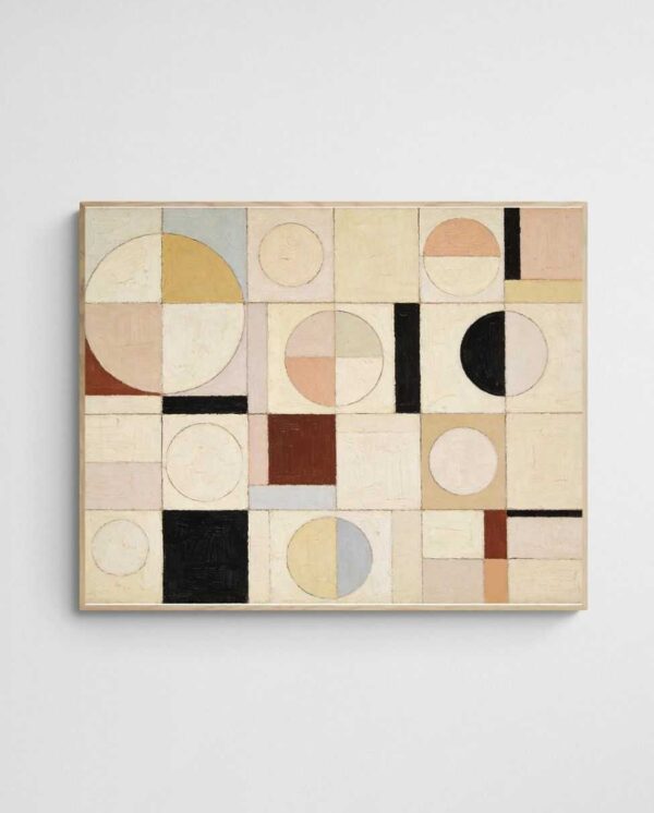
The “Off the Land – Scandinavian Abstract Art Print in Warm Neutral Tones” demonstrates how neutral palettes can convey warmth and sophistication simultaneously. Its subtle colour gradations create depth whilst maintaining the visual calm that makes neutral art so valuable in office environments.
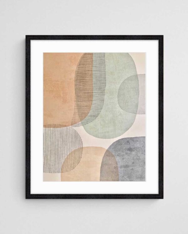
Neutral abstract pieces excel in multi-purpose spaces where no single activity dominates. They provide cohesive visual identity without imposing specific emotional tones that might conflict with varied uses. This versatility makes them particularly valuable for consultancies, professional services firms, and other businesses where the same spaces serve diverse functions throughout the week.
Layering different neutral values creates sophisticated depth. Combining cool greys with warm taupes, or mixing cream tones with charcoal accents, builds visual complexity without colour saturation. This approach works exceptionally well in minimalist or Scandinavian-inspired office designs where restraint and refinement define the aesthetic. For deeper insights, explore how neutral walls benefit from specific abstract styles.
Energising Spaces with Bold Colour Contrasts
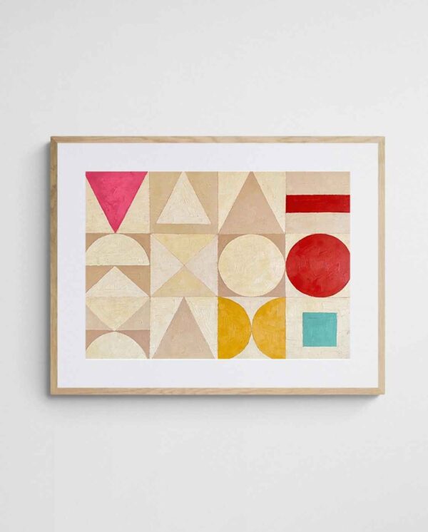
High-contrast abstract compositions create visual dynamism that can invigorate spaces prone to stagnation. Bold colour blocking, strong geometric forms, and unexpected colour pairings demand attention and stimulate cognitive engagement. These energising pieces work best in spaces designed for brief, high-intensity activities rather than sustained concentration.
Reception areas benefit enormously from bold abstract art. First impressions form within seconds, and striking visual statements communicate confidence, creativity, and modernity before any conversation begins. The investment in impactful abstract pieces for client-facing spaces often yields returns through enhanced brand perception and memorable experiences.
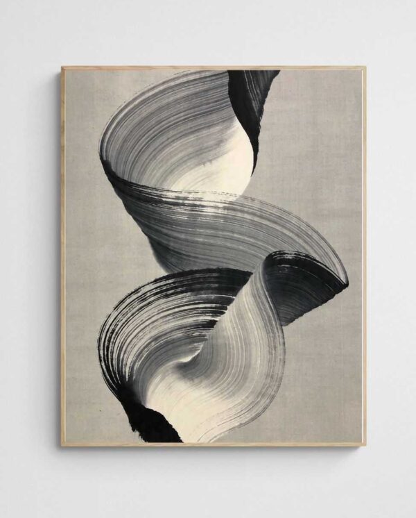


Break rooms and social spaces also thrive with colour-bold abstracts. These areas serve as psychological reset points during the workday. Vibrant, unexpected colour combinations can lift mood and provide mental refreshment that employees carry back to their desks. Unlike the restraint appropriate for focus zones, break spaces should embrace visual playfulness and energy.
However, placement precision matters enormously with bold pieces. A common mistake is scattering high-impact art throughout an office without considering cumulative effect. What energises as a focal point in one area becomes overwhelming when repeated across multiple sightlines. Strategic deployment means treating bold pieces as accents within a broader visual hierarchy that includes calmer supporting elements. Understanding when bold or balanced art serves your space helps refine these placement decisions.
Strategic Placement for Maximum Impact
Where you hang abstract art matters as much as what you hang. Eye-level positioning—typically 145-150cm centre height—ensures comfortable viewing without neck strain. In offices with varied working positions (standing desks, seated collaboration areas), consider the dominant viewing perspective when determining height.
Visual sightlines dictate attention flow throughout office spaces. Art placed directly opposite entrances creates immediate focal points that establish spatial identity. Pieces positioned at corridor endpoints draw movement through spaces whilst providing visual rewards for navigation. Understanding circulation patterns helps you place art where it receives regular engagement rather than becoming invisible through familiarity.
Grouping strategies amplify impact. Gallery walls comprising multiple smaller abstract prints create dynamic visual fields that sustain interest over time. However, gallery arrangements require careful planning—varied frame sizes and mat widths can unify disparate pieces whilst maintaining individual character. A practical rule: maintain consistent spacing (typically 5-8cm) between frames regardless of size variations.
Lighting transforms abstract art from flat decoration to dimensional experience. Track lighting, picture lights, or strategically positioned spotlights add depth and emphasise textural qualities that overhead fluorescents flatten. Natural light creates dynamic viewing experiences as changing daylight reveals different colour relationships throughout the day, though direct sunlight risks fading prints over time.
| Space Type | Recommended Colours | Style Approach | Key Benefit |
|---|---|---|---|
| Private Offices | Deep blues, neutral tones | Calming abstracts, minimal contrast | Sustained focus and decision clarity |
| Collaboration Zones | Warm corals, oranges, yellows | Dynamic compositions, energising | Enhanced social engagement |
| Reception Areas | Bold contrasts, brand colours | Statement pieces, high impact | Memorable first impressions |
| Open-Plan Workspaces | Light blues, soft neutrals | Cohesive series, visual calm | Reduced overstimulation |
| Break Rooms | Vibrant mixed palettes | Playful, unexpected combinations | Mental refreshment and mood lift |
| Meeting Rooms | Balanced neutrals with colour accents | Sophisticated, non-distracting | Professional atmosphere without sterility |
Sizing and Scale Considerations
Undersized art disappears on expansive office walls, whilst oversized pieces overwhelm intimate spaces. The general guideline suggests art should occupy roughly 50-75% of available wall width in primary viewing zones. For walls above furniture (reception desks, credenzas, sofas), the art should span approximately two-thirds to three-quarters of the furniture width below it.
Ceiling height influences vertical proportions. Standard commercial ceiling heights (2.7-3m) accommodate larger vertical formats that might overwhelm residential spaces. Tall, narrow pieces draw eyes upward and create an impression of greater height—useful in spaces where you want to emphasise volume and openness.
Multiple pieces often succeed where single works fail. Three medium prints arranged horizontally can cover wall spans that would require impractically large single pieces. Triptychs and other multi-panel arrangements offer flexibility whilst creating visual cohesion through related colour palettes or compositional themes.
Scale variations across an office create visual rhythm and prevent monotony. Mixing larger statement pieces in key locations with smaller supporting works throughout maintains engagement whilst establishing clear focal hierarchies. This layered approach mirrors how successful interior design uses varied textures, furniture scales, and architectural details to build rich spatial experiences. For specific guidance, review how to match large art prints to your actual wall dimensions.
Coordinating Art with Existing Office Design
Abstract art should dialogue with existing design elements rather than fighting them. In offices with bold architectural features—exposed brick, dramatic lighting fixtures, statement furniture—art can afford to be more restrained, allowing the architecture to lead whilst providing visual harmony. Conversely, minimal or corporate spaces often benefit from bolder artistic statements that inject personality into otherwise neutral environments.
Colour coordination doesn’t mean matching. Pulling one or two accent colours from your art into soft furnishings, feature walls, or accessories creates cohesion without becoming matchy and predictable. Complementary colour relationships (opposite on the colour wheel) create dynamic tension, whilst analogous schemes (neighbouring colours) offer gentler harmony.


Material considerations matter in commercial environments. Framed prints under glass suit professional settings where clean lines and protection matter. Canvas prints offer textural interest and work well in creative industries where a less formal aesthetic aligns with brand identity. For high-traffic areas, durability and cleanability become practical concerns alongside aesthetic preferences.
Brand alignment represents an often-overlooked consideration. Your office art communicates brand values whether you intend it to or not. Tech startups might embrace bold geometric abstracts that signal innovation and forward-thinking. Legal practices often lean toward sophisticated neutrals that convey stability and trustworthiness. Understanding the psychology behind strategic office décor choices helps align aesthetic decisions with broader business objectives.
Practical Implementation Guide
Begin by auditing your existing spaces. Photograph each area from multiple angles and note the activities occurring there, existing colour schemes, lighting conditions, and any architectural features that influence art placement. This documentation creates a reference framework for making coordinated decisions across multiple spaces rather than selecting pieces in isolation.
Create mood boards for each distinct zone within your office. Digital tools make this simple—collect images of abstract pieces that resonate with the intended atmosphere for each space. This visual reference helps identify patterns in your preferences and ensures selections align with functional requirements rather than random aesthetic impulses.
Prioritise high-impact areas first. Reception zones, primary meeting rooms, and open-plan anchor points deliver maximum return on investment because they affect the most people most frequently. Budget allocation should reflect this hierarchy—better to invest in fewer statement pieces for key locations than spread resources thinly across every wall.
Sample before committing, especially for larger installations. Many suppliers provide visualisation tools or sample prints that allow you to evaluate pieces in your actual space under real lighting conditions. Colours shift dramatically between screen representations and physical prints, and what appears vibrant online may read muted in your office—or vice versa.
Implementation Checklist
- Measure wall dimensions and note existing colour schemes in each space
- Identify primary activities and desired psychological effects for each zone
- Select colour strategies aligned with functional requirements
- Determine appropriate sizing based on wall dimensions and viewing distances
- Plan hanging heights based on primary viewing perspectives (seated vs. standing)
- Consider lighting requirements and potential enhancements
- Coordinate frame selections for visual cohesion across spaces
- Schedule installation during off-hours to minimise workplace disruption
- Document final placements for future reference and replication
Professional installation services ensure proper mounting, especially for larger or heavier pieces. Whilst simple hanging seems straightforward, commercial spaces often involve concrete walls, specific weight distribution requirements, or heritage considerations that demand expertise. The modest investment in professional installation protects both your art and your walls whilst ensuring optimal presentation.


Rotation strategies keep visual environments fresh without constant new purchases. Quarterly or bi-annual art rotations allow pieces to migrate between spaces, providing variety whilst maximising the return on your art collection. This approach works particularly well for growing businesses where new spaces emerge as teams expand—existing pieces can populate new areas whilst fresh selections refresh established zones.
Maintenance protocols preserve your investment over time. Regular dusting, cleaning glass or acrylic glazing, and monitoring for fading in high-light areas extends artwork longevity. Establishing simple care routines as part of general office maintenance ensures your carefully selected pieces continue delivering visual and psychological benefits for years.
Consider exploring collections specifically curated for office environments. The abstract prints for office walls collection offers pieces selected with commercial spaces in mind, whilst resources like abstract prints that spark creative flow provide targeted options for innovation-focused workspaces.
Your office walls represent daily touchpoints with everyone who enters your space—employees, clients, partners, and visitors. The cumulative effect of thoughtfully selected abstract art extends far beyond superficial decoration. When colour psychology, strategic placement, and scale considerations align with your specific workspace needs, the result is an environment that actively supports the work happening within it. The difference becomes evident not just in how your office looks, but in how people feel and perform whilst inhabiting those spaces day after day.
 | Joseph Russell Joseph is an Australian abstract artists and curator of the Inomaly art collection. |