
Three prints, one wall, and a tape measure that never seems to agree with your eye. If you have ever asked yourself how to arrange three prints so the result looks designed rather than accidental, you are in good company. Retailers such as Mixtiles, Print Studio and Spud Print all publish layout guides on the subject, and their advice converges with surprising consistency.
The short answer: hang the group so its centre sits about 57 inches (roughly 145 cm) from the floor, leave 2–3 inches (5–8 cm) between frames, and size the trio to about 60–75% of the width of the furniture beneath it. Choose a row, a vertical stack, a pyramid or a staggered trio, then trace each frame on paper and tape the templates up before drilling.
Why the Rule of Three Works
The UK frame retailer Framorey describes the principle plainly: objects grouped in odd numbers, especially three, look more natural and appealing. Rossetti Art makes a similar point, saying odd-numbered groupings feel more dynamic and balanced than even-numbered ones.
Accessories for the Home, another UK retailer, treats gallery walls as a natural fit for the rule. It suggests three prints in a row or a loose triangle, which creates rhythm that is balanced without being rigidly symmetrical. In practice, a trio gives the eye a clear start, middle and end. Two prints can feel like a pair of bookends, while four can drift into a grid.
These are commercial sources rather than independent studies. However, they agree closely, and that agreement matches what works on real walls. For wider context, our guide to creating visual interest with abstract art explains why repetition and variety work together.
Four Layouts Named by Mixtiles, Print Studio and Framorey
Mixtiles lists four main layouts for three frames: a clean row, a vertical stack, a staggered trio and a triptych. Print Studio adds the pyramid and the cascade. Framorey defines the pyramid as two frames side by side below with the third centred above.
The horizontal row
Every Home Art recommends a row on a wide wall. Rossetti Art refines this: use three landscape or square pieces and keep all three the same height. A row suits sofas, sideboards and bed heads.
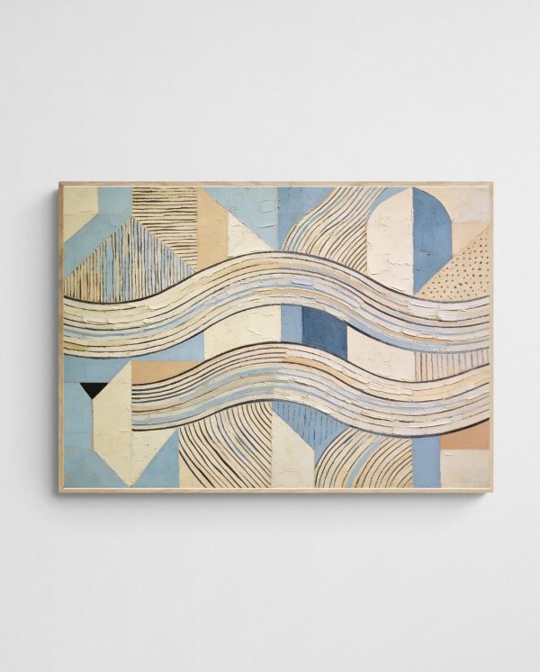
The “Hamptons Art Print – Blue Dynasty 2 – Abstract Art” is a good example. Its calm blue palette repeats easily across a row, so a matching trio reads as one composed statement above a sofa.


The vertical stack
Rossetti Art suggests a vertical stack of portrait pieces for narrow, tall spaces. Hallways and stairwells suit this approach. Our post on turning blank hallways into gallery walls shows how well it works.

The pyramid and the staggered trio
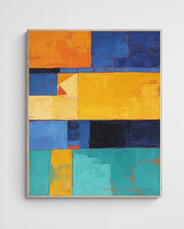
Print Studio describes the pyramid as two prints below and one centred above. Its cascade places prints at slightly different heights. Framorey’s asymmetrical option uses three different sizes, such as one large and two small placed diagonally. Mon Tableau Déco adds a useful tip: for a triangular arrangement, make the largest piece the anchor.

The Numbers: Height, Spacing and Width
Precise figures stop guesswork. Mixtiles and Spud Print both centre the grouping about 57 inches from the floor. Mixtiles allows up to 60 inches in tall rooms.
- Spacing: Print Studio says 2–4 inches, Spud Print says 2–3 inches, and Rossetti Art says 3–4 inches.
- Split images: Mixtiles advises tighter gaps of 1.5 to 2 inches for one panorama divided into three prints.
- Width: Mixtiles and Spud Print both suggest the trio spans 60–75% of the furniture’s width.
- Formula: Every Home Art gives 3 × frame width + 2 × gap.
Mon Tableau Déco shows the formula in action. Three 40 cm frames with two 10 cm gaps make an arrangement 140 cm wide. It also advises centring the overall width on the furniture, not just the middle piece. A common mistake is aligning the middle print and letting the outer two fall wherever they land.
If your wall is large, you may prefer one dramatic piece instead. See large art prints that actually fit your walls for that approach.
Choosing Three Prints That Belong Together
Rossetti Art recommends repeating a colour palette or subject across at least two of the three pieces. That rule keeps variety from tipping into clutter. Our guide to artwork and room colour matching helps you pick that shared palette.
For a coastal trio, “One Summer Abroad 2 – Beach Art Abstract Landscape” pairs well with other works in the same series because the colours and brushwork are consistent. Browse our abstract beach art and coastal wall art range for more.


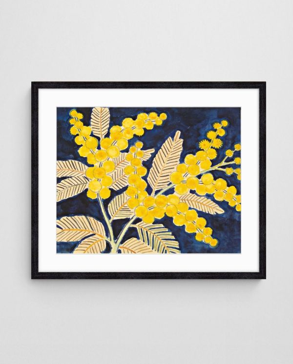
Native flora offers another reliable thread. Three botanical prints with a shared gold or blue tone look cohesive. “Golden Wattle on Blue – Australian Native Floral Wall Art Print” works as the anchor in a pyramid, with two smaller florals beneath it. Our article on native Australian flora in abstract art offers more ideas.


Alternatively, mix subjects and unify by colour. A landscape, a floral and a geometric piece can sit together if all three share warm tones.

How to Test Your Layout Before Drilling
Mixtiles advises marking a centreline with painter’s tape and laying the frames on the floor to confirm order and spacing. Spud Print goes further, suggesting paper templates taped to the wall so you can step back and check. Follow this sequence:
- Measure the furniture width and multiply by 0.6 and 0.75 to find your target range.
- Trace each frame onto paper and cut out the templates.
- Tape a vertical centreline at the middle of the furniture.
- Stick the templates up, centred at about 57 inches, with 2–3 inch gaps.
- Step back, adjust, then mark the hanging points.
Once the layout is settled, our guide to framing and hanging Giclée prints covers the fixings. For background on balance and proportion, the rule of thirds (Wikipedia) is a useful related reference. If you want a second opinion, our free room design service can help.
Quick Answers
What is the best gap between three prints?
Most sources, including Spud Print and Print Studio, land on 2–3 inches. Use 1.5–2 inches for one image split into three.
How high should the trio hang?
Centre the group about 57 inches from the floor, or up to 60 inches in rooms with tall ceilings.
The rule of three is forgiving once you commit to a layout, a consistent gap and a shared palette. Start with your furniture width, tape up the templates this weekend, and then choose prints to fit the space. Explore our abstract art prints to begin your trio.
 | Joseph Russell Joseph is an Australian abstract artists and curator of the Inomaly art collection. |