
When Dulux named a cobalt blue called Free Groove as the lead shade of its 2026 “Rhythm of Blues” palette, it gave homeowners a bold reason to rethink the neutral walls they painted years ago. Meanwhile, the 1stDibs designer survey shows maximalism and eclecticism leading requests, and colour drenching continues to spread through Apartment Therapy’s real-home features.
Saturated colour is returning, but it arrives in layers rather than as one loud shade. Designers pair deep blues, chocolate browns and charcoals with texture and pattern. Wall art then ties these palettes together, so a print can anchor a drenched room or lift a calmer one.
Dulux and the Rhythm of Blues
Dulux, part of AkzoNobel, chose a trio rather than a single hue for 2026. Free Groove is a vibrant cobalt, supported by Mellow Flow, a soft grey-blue, and Slow Swing, a deep navy. Creative Director Marianne Shillingford said the world is changing faster than people can keep up with, which explains the emotional pull of a confident blue.
Dulux suggests the zingy royal blue as a statement colour for a kitchen. In practice, a cobalt wall needs a visual partner. Our guide to blue abstract art and its historic influence shows how artists have long used the hue to create depth.
Blue-led palettes suit works with energy and movement. The “Blue Abstract Expressionist Art Print – Busy Swimming Pool” echoes the cobalt-to-navy range with lively brushwork. The “Colour Patch 1 – Colourful Geometric Abstract Print” adds a playful counterpoint of blocks.

Benjamin Moore, Pantone and a Mixed Picture
Silhouette: charcoal with warmth
Benjamin Moore named Silhouette (AF-655) its 2026 Color of the Year. The luxurious charcoal has espresso-brown undertones, so it feels earthy and inviting. Benjamin Moore announced the broader Color Trends 2026 palette on 16 October 2025, and Silhouette works as a softer alternative to black.
Pantone’s white counterpoint
Pantone took the opposite route with Cloud Dancer (11-4201), a soft white. The company framed the choice as a response to a “frenetic society rediscovering the value of quiet reflection”. After critics objected, one UK commentator noted that through a European lens, white interiors felt stark.
The picture is genuinely mixed. Cloud Dancer, Universal Khaki and Silhouette are calm or warm. The boldest colour comes from Dulux’s blues, from drenching and from maximalist designers. If you are weighing both camps, our piece on bold versus balanced art offers a practical way to decide.
Dark, moody walls pair well with graphic works. The “Colour Patch 6 – Black Abstract Art Print” suits a charcoal room, while “Geometric Abstract Artwork – Geo Contrast 1” gives crisp contrast against a deep wall.


What the 1stDibs Survey Reveals
The ninth annual 1stDibs Interior Designer Trends Survey, published on 17 November 2025, polled 468 design professionals worldwide. Maximalism (39%) and eclecticism (38%) were the most requested styles. Chocolate brown topped the colour rankings at 33%, a figure that has nearly doubled since 2022, when it stood at 17%.
Anthony Barzilay Freund, the company’s Editorial Director, noted that this is the strongest quantitative evidence that richer palettes are replacing neutrals. The percentages reflect survey responses from design professionals, so they represent trends within that field rather than across the general market.
Warm browns and rich pinks sit comfortably together. “Wrapped in Pink” from the Golden Era range brings a warm, vivid portrait to chocolate-toned rooms, and you can browse the full Golden Era Collection for more.


Colour Drenching and Pattern Drenching
Painting every surface
Colour drenching paints walls, doors, ceiling, shelves and trim in one colour. Apartment Therapy surveyed 154 designers and found it dominated 2024 and continued through 2025, with a later survey of 140 designers confirming the trend. The approach featured prominently in real homes like Javier Riostello’s Manhattan rental, where he covered the primary bedroom’s walls and ceiling in Benjamin Moore “Evening Blue”.
Texas designer Shauna Glenn described 2025 interior design as “color drenched maximalism”. Elissa Hall of EDH Interiors in Portland describes drenching as a cozier, more timeless evolution of the accent wall. One 2026 trend report notes that texture now replaces contrast as the main design tool in drenched rooms.
Pattern and commitment
Isabel Ladd of Isabel Ladd Interiors predicted “pattern drenching”, a room covered in a kaleidoscope of varying patterns. Julee Wray of Truss Interiors told House Beautiful that colour on ceilings, walls and trim is a commitment but worth the risk. Siobhan Murphy told Country Living: “For me, maximalism isn’t a trend — it’s a way of life.”
For more on this approach, see maximalist art for modern spaces. Pattern-rich prints such as “Vintage Geometric Abstract – Zigzag Collage 1” suit these layered rooms. “Bold Abstract Art Print – Island Life 11” adds a coastal punch of colour.


Choosing Art for Saturated Rooms
Start with the dominant wall colour, then choose art that either echoes or contrasts with it. The colour theory (Wikipedia) basics of complementary and analogous pairings remain a reliable guide. A common mistake is matching every accent exactly, which flattens the room.
- In a navy or cobalt room, choose warm ochre, pink or cream tones as contrast.
- In a charcoal room, pick graphic black-and-white or high-contrast geometry.
- In a drenched room, use texture and framing to add depth rather than more colour.
Our guide to artwork and room colour matching goes deeper, and the colourful abstract art range is a practical starting point. If you want a second opinion, the free room design service can help.
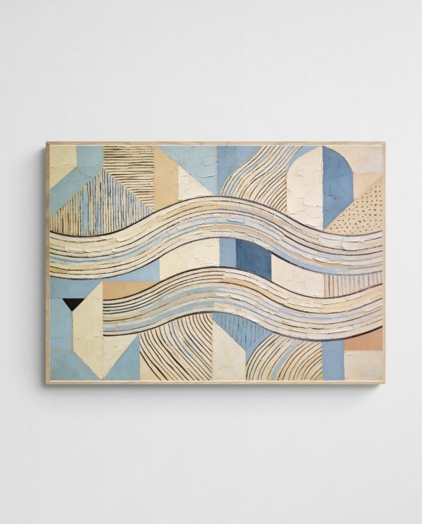
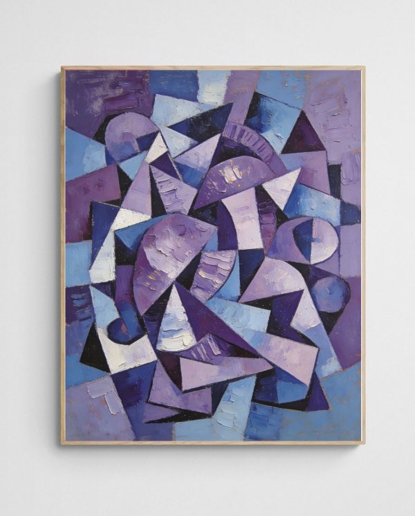
Softer, tonal works also have a place beside saturated walls. “Lavender Chaos – Abstract Purple Geometric Art Print” introduces a cool violet that sits well with deep blues. “Waves of Harmony – Coastal Geometric Abstract Art Print” gives the eye a quieter place to rest.
Pick one wall, test a sample of Dulux’s Free Groove or Benjamin Moore’s Silhouette, and hold a print against it before committing. This small step removes the guesswork and shows whether the colour and art work together in your actual light.
 | Joseph Russell Joseph is an Australian abstract artists and curator of the Inomaly art collection. |