
The average employee spends nearly 90,000 hours at work over a lifetime, yet most office environments treat visual design as an afterthought rather than a strategic imperative. This isn’t just an aesthetic oversight—it’s a fundamental misunderstanding of how human psychology responds to environmental cues. The art you hang (or don’t hang) on your walls is actively shaping employee cognition, client perceptions, and ultimately, your bottom line. Strategic office decor, particularly abstract art, operates as a silent architect of workplace culture, influencing everything from creative output to stress levels without uttering a single word.
My position is unequivocal: office decor deserves the same rigour as hiring decisions or technology investments. The psychological impact of visual stimuli in workspaces is too well-documented to ignore, yet businesses continue to default to generic landscapes or, worse, barren walls. Abstract art specifically offers unique advantages for professional environments—it stimulates cognitive flexibility without prescribing meaning, accommodates diverse interpretations across multicultural teams, and signals innovation without alienating conservative clients. The question isn’t whether to invest in strategic office art; it’s why you’ve waited this long to do so.
The Visual Environment-Cognition Connection
Environmental psychology has established that visual stimuli directly influence cognitive performance, emotional regulation, and social behaviour. The concept of “enriched environments”—spaces with varied, stimulating visual elements—enhances neuroplasticity and problem-solving abilities. In workplace contexts, this translates to measurable differences in productivity, innovation metrics, and employee satisfaction scores. Many organisations persist in creating what researchers call “sensory deprivation” environments, characterised by monotonous colour schemes and minimal visual interest.
The biological mechanism is straightforward. When our visual cortex encounters diverse, complex patterns—particularly the non-representational forms found in abstract art—neural activity increases across multiple brain regions simultaneously. This heightened activation doesn’t produce distraction; rather, it primes the brain for flexible thinking and creative problem-solving. The prefrontal cortex, responsible for executive function, shows enhanced connectivity when exposed to visually engaging environments. Functional MRI studies have documented these patterns repeatedly.
The “aesthetic-usability effect” demonstrates that people perceive aesthetically pleasing environments as more functional, even when objective performance remains constant. An office with thoughtfully curated abstract art isn’t just more pleasant—it’s perceived as more professional, more competent, and more trustworthy by both employees and clients. This perception gap translates directly into tangible business outcomes, from talent retention to client conversion rates.
The Neuroscience of Visual Complexity
Research from neuroaesthetics reveals that the brain processes abstract visual information differently than representational imagery. Abstract patterns activate both hemispheres simultaneously, engaging analytical and creative processing pathways. This bilateral activation correlates with improved divergent thinking—the ability to generate multiple solutions to open-ended problems. For knowledge workers whose primary output is creative or analytical, this environmental effect represents a competitive advantage hiding in plain sight.
The optimal level of visual complexity sits at what researchers call “moderate novelty.” Too little stimulation produces boredom and disengagement; too much creates cognitive overload. Abstract art excels at occupying this middle ground, offering visual interest without narrative demands. Unlike photographs or representational art that command specific interpretations, abstract works allow peripheral engagement—your visual system registers the stimulation without requiring conscious attention. This background activation maintains arousal levels without disrupting focus on primary tasks.


Why Abstract Art Outperforms Literal Imagery
The practical superiority of abstract art in office settings stems from its interpretive flexibility. In diverse workplaces with varying cultural backgrounds, religious beliefs, and aesthetic preferences, representational art inevitably resonates with some while alienating others. A landscape might evoke pleasant memories for one person and traumatic associations for another. Abstract work sidesteps this minefield entirely, providing visual stimulus without prescribing meaning. Each viewer projects their own interpretation, making the experience simultaneously universal and personal.
This interpretive openness also extends the longevity of the work. Representational art, particularly trendy styles or recognisable imagery, dates quickly. What feels contemporary today appears tired within months as visual trends cycle. Abstract work, especially pieces grounded in fundamental design principles like colour theory and compositional balance, maintains relevance across years or decades. From a pure cost-effectiveness perspective, abstract art delivers superior return on investment. As explored in research on abstract prints that spark creative flow, the right pieces continue generating cognitive benefits long after installation.
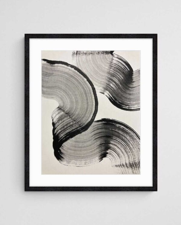
Abstract art in professional spaces functions as a daily invitation to think differently—a visual reminder that problems rarely have single solutions.
Abstract art also signals intellectual sophistication without pretension. It communicates that your organisation values creativity and forward-thinking without resorting to obvious metaphors. A motivational poster with a soaring eagle screams “catalogue purchase.” A carefully selected geometric abstraction whispers “we think about details.” The distinction matters enormously in competitive industries where credibility and cultural fit influence client and talent decisions. This principle applies equally whether you’re designing startup offices that need abstract art or established corporate environments.
The Interpretation Advantage in Diverse Teams
Multicultural workplaces face unique challenges in creating universally appealing environments. Religious imagery, nationalistic symbols, even certain colour combinations carry culturally specific meanings that can inadvertently exclude or offend. Abstract art’s ambiguity becomes its strength in these contexts. A piece featuring bold geometric forms or fluid organic shapes communicates visual interest without cultural baggage. Team members from Sydney to Singapore can engage with the work on their own terms, finding personal meaning without conforming to prescribed narratives.
This interpretive freedom also generates valuable conversation. Unlike representational art where discussions quickly exhaust obvious observations (“yes, that’s a mountain”), abstract work sustains ongoing dialogue. Colleagues discover different elements with repeated viewing, share contrasting interpretations, and find new details as lighting conditions change throughout the day. This sustained engagement transforms static decor into dynamic environmental elements that continue delivering value over time.


Colour Psychology in the Workspace
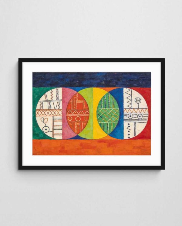
The psychological impact of colour in office environments operates through multiple pathways—biological, cultural, and learned associations. Blue tones have been consistently linked to enhanced focus and productivity, likely due to biological associations with clear skies and calm waters. Cool blues activate the parasympathetic nervous system, promoting concentrated work states. Conversely, warm colours like orange and red increase arousal and energy, making them better suited for collaborative spaces or areas requiring physical activity.
However, office colour psychology isn’t simply about painting everything blue or hanging blue artwork. The saturation, value, and context of colours dramatically alter their psychological effects. A deep navy creates different responses than a bright cyan. Colour psychology operates most powerfully through contrast and relationships rather than isolated hues. Abstract art excels at creating sophisticated colour relationships that generate nuanced psychological effects. For deeper exploration of these principles, understanding how colour transforms spaces provides valuable frameworks.
Strategic colour deployment through abstract art allows you to zone different office areas psychologically without costly architectural interventions. Reception areas benefit from warm, welcoming palettes that put visitors at ease. Individual workspaces might incorporate cooler, more focused colour schemes. Collaborative zones can feature energetic, stimulating combinations. A single well-chosen abstract print provides these colour interventions far more cost-effectively than paint, furniture, or lighting modifications, with the added advantage of flexibility—you can swap pieces seasonally or as organisational needs evolve.
Beyond Basic Colour Theory
The most sophisticated office decor strategies move beyond primary colour psychology into more nuanced territory. Analogous colour schemes—colours adjacent on the colour wheel—create harmony and flow, ideal for spaces where sustained concentration is required. Complementary schemes—opposite colours—generate visual tension and excitement, perfect for innovation hubs or brainstorming areas. Split-complementary palettes offer middle-ground solutions that maintain interest without overwhelming.
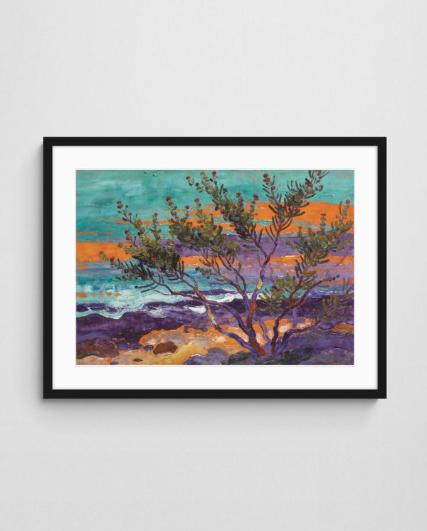
Abstract art allows precise implementation of these colour strategies without the permanence of painted walls. The “Deep Colour 1 Abstract Coral Art Print” demonstrates how sophisticated colour relationships can evoke natural environments while maintaining abstract composition. Its coral and aquatic tones create biophilic connections—linking occupants to natural environments—which reduce stress hormones and improve cognitive function. The piece works particularly well in offices lacking natural views or abundant daylighting, partially compensating for these deficits through colour psychology alone.


Client Perception and Visual Credibility
First impressions form within milliseconds, and visual environment dominates these snap judgements. When potential clients enter your office, they’re unconsciously processing hundreds of environmental cues to assess competence, reliability, and cultural fit. The presence, quality, and style of wall art ranks among the most influential of these signals. Bare walls communicate neglect or financial struggle. Generic stock imagery suggests lack of attention to detail. Thoughtfully curated abstract art signals sophistication, intentionality, and success.
This effect operates across industries and client types, though the specific optimal aesthetic varies by context. Professional services firms—law, accounting, consulting—benefit from geometric abstracts that communicate order, precision, and structured thinking. Creative agencies require bolder, more experimental work that demonstrates innovation and risk tolerance. The principles explored in selecting abstract prints that win over clients provide industry-specific guidance for these strategic choices.
The investment level matters enormously. Clients notice the difference between high-quality prints and cheap posters, even if they can’t articulate why. Colour fidelity, paper quality, framing choices—these details communicate your standards and attention to quality. Skimping on office art sends the message that you cut corners generally. Conversely, visible investment in environmental quality suggests similar commitment to core services. This isn’t about displaying price tags; it’s about the unmistakable difference in visual presence between quality materials and budget substitutes.
The Reception Area Imperative
If budget constraints force prioritisation, invest in reception and client-facing areas first. These spaces disproportionately influence client perception and decision-making. A reception area featuring striking abstract work creates positive associations that carry through subsequent interactions. Even if negotiations stall or complications arise, clients unconsciously reference that positive initial impression, maintaining goodwill and patience. As detailed in why reception areas deserve better art, this investment pays dividends throughout the client relationship lifecycle.
Strategic placement of abstract art in reception areas also manages wait-time perception. Research demonstrates that environments with visual interest make wait times feel shorter. Rather than checking phones or watches, visitors naturally observe and contemplate artwork, transforming idle waiting into engaged observation. This subtle psychological shift reduces frustration and improves mood—powerful advantages before important meetings or presentations commence.


Employee Wellbeing and Visual Engagement
The connection between office environment and employee wellbeing extends far beyond ergonomic chairs and standing desks. Visual environment significantly influences stress levels, job satisfaction, and sense of organisational identity. Employees who report positive feelings about their workspace show measurably higher engagement scores, lower absenteeism, and longer tenure. Workers in visually impoverished environments experience higher stress hormones, reduced creative output, and accelerated burnout.
Abstract art specifically addresses several workplace stressors simultaneously. Its presence communicates organisational investment in employee experience, generating reciprocal commitment. The visual variety breaks monotony, particularly important in open-plan offices where architectural uniformity dominates. The interpretive engagement provides micro-breaks—brief moments of cognitive shift that refresh attention without requiring physical relocation. These accumulated micro-benefits compound over months and years into substantial wellbeing advantages.
Selection matters critically—not all abstract art delivers these benefits equally. Chaotic, aggressive compositions can increase rather than reduce stress. Overly minimal work fails to provide sufficient visual engagement. The optimal range sits between these extremes: visually interesting without being overwhelming, complex without being confusing. Considerations covered in home office art that boosts productivity apply equally to traditional workplaces, emphasising the importance of matching visual complexity to task demands.
Personalisation and Ownership
Allowing employees input into office art selection generates psychological ownership and increases positive associations. Even limited choice—voting between three pre-selected options, for instance—substantially increases satisfaction compared to top-down imposition. This participatory approach also surfaces preferences you might otherwise miss, revealing aesthetic sensibilities across your team. The collaborative process itself becomes a minor team-building exercise, generating conversation and connection around shared space improvement.
However, unlimited democratic selection often produces aesthetic chaos or paralysing indecision. The solution involves curated choice: leadership or design professionals narrow options to aesthetically cohesive selections meeting strategic criteria, then teams vote on final placement. This approach balances professional design principles with employee agency, producing superior outcomes to either pure autocracy or pure democracy. For organisations exploring open-plan office art solutions, this participatory approach proves particularly valuable in managing diverse preferences across large, shared spaces.
The most successful office art programs recognise that employee environment is employer brand made visible.


Strategic Placement Principles
Acquiring quality abstract art represents only half the strategic equation; placement determines whether that investment delivers returns or becomes expensive wallpaper. Sight lines matter enormously. Art positioned where employees naturally glance during brief mental breaks—above monitors, across from desks, at corridor endpoints—provides maximum engagement opportunity. Conversely, pieces hung in peripheral vision or behind viewers waste potential impact.
Scale represents another critical but frequently mishandled variable. Undersized art in large spaces appears tentative and apologetic. Oversized work in confined areas overwhelms and oppresses. The general principle holds that art should occupy roughly two-thirds to three-quarters the width of the furniture beneath it, though wall-only installations require different calculations based on total wall dimensions and viewing distance. Resources like guides to large art prints that fit your walls provide specific dimensional guidance for various office configurations.
Lighting represents the most overlooked aspect of strategic art placement. Even exceptional pieces disappear in inadequate lighting or suffer colour distortion under poor-quality illumination. Natural light creates challenges—direct sunlight causes fading, though quality archival prints mitigate this risk. Artificial lighting requires warm colour temperatures (2700-3000K) to avoid the clinical feel of cool white LEDs. Directional lighting adds dramatic emphasis but requires professional installation to avoid glare. These technical considerations significantly impact the psychological effect of the work, making lighting specification as important as the art itself.
Zoning Through Visual Strategy
Sophisticated office design uses art to reinforce functional zoning without physical barriers. Energetic, colourful abstracts in collaborative areas subconsciously signal “this space encourages interaction.” Calmer, more contemplative pieces in individual work areas communicate “this space supports focus.” This visual zoning operates below conscious awareness but powerfully shapes behaviour and space utilisation. Teams naturally congregate where visual cues suggest social activity is appropriate, while individuals seek quiet zones where visual environment reinforces concentration.
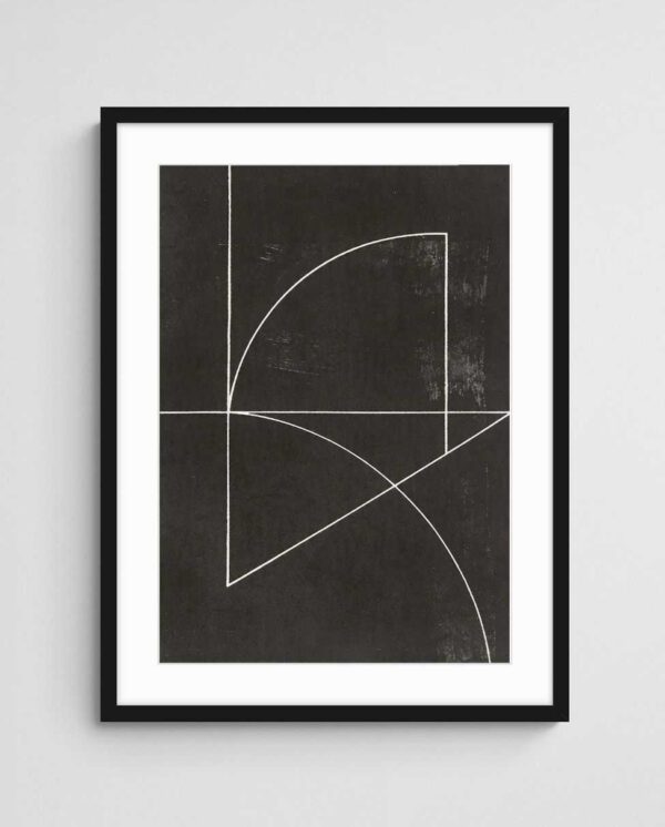
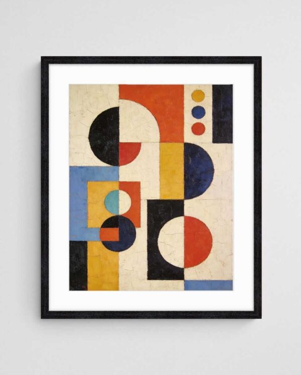
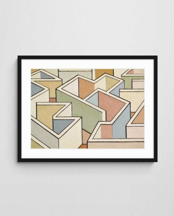
The “Geometric Harmony – Mid Century Pastel Geometric Abstract Art Print” exemplifies work suited to transition spaces—corridors, stairwells, areas between distinct functional zones. Its balanced composition and neutral palette provide visual interest without asserting strong directional energy. Such pieces maintain environmental quality throughout the office without competing with more assertive works in primary spaces. This layered approach—bold statements in key areas, supporting pieces in secondary spaces—creates sophisticated visual narrative throughout the workplace.
Rotation strategies extend the value of your art investment. Rather than permanent static display, consider quarterly or semi-annual rotation of pieces between locations. This approach maintains novelty—the cognitive benefit of “moderate novelty” discussed earlier—while allowing budget-conscious organisations to achieve broad coverage with smaller collections. Storage requirements remain minimal, and the process itself generates positive attention and conversation. When executed consistently, rotation becomes an anticipated event that reinforces organisational attention to environmental quality. The art prints collection offers diverse options enabling effective rotation strategies.

Debunking Common Office Decor Myths
Several counterproductive office decor myths continue to undermine workplace environments across industries. Perhaps the most damaging holds that “art is subjective, therefore any art works equally well.” While aesthetic preference varies individually, psychological impact does not. Decades of environmental psychology research have established clear patterns in how humans respond to various visual stimuli. Dismissing this evidence in favour of pure subjectivity wastes opportunities and resources.
Another pernicious myth claims that minimal, austere environments promote focus by reducing distraction. This confuses visual engagement with visual clutter. Thoughtfully selected abstract art provides beneficial stimulation without creating the chaotic distraction of busy patterns or competing focal points. Moderate visual complexity enhances rather than impairs cognitive function. The “distraction” argument typically masks budget constraints or aesthetic uncertainty rather than reflecting legitimate psychological concerns.
The belief that “employees don’t notice or care about office art” represents perhaps the most dangerous myth. Exit interviews, engagement surveys, and workspace satisfaction studies consistently identify physical environment as a significant factor in job satisfaction and retention decisions. Employees notice art’s presence or absence, consciously or otherwise, and incorporate these observations into overall workplace assessment. Dismissing their environmental awareness insults their intelligence and ignores valuable feedback.
The ROI Question
Sceptics often demand quantifiable return-on-investment calculations for office art expenditure. While direct measurement proves challenging, indirect metrics clearly demonstrate value. Organisations that invest meaningfully in workplace environment, including strategic art programmes, report measurably higher scores in employee engagement, client satisfaction, and talent recruitment success. These metrics directly correlate with revenue performance, client retention, and competitive advantage—all quantifiable business outcomes.
Moreover, the actual cost-per-impact of quality abstract prints compares favourably to alternatives. A well-selected print costing several hundred dollars provides daily psychological benefits to potentially dozens of employees across years of display. Amortised across thousands of employee-exposure days, the per-interaction cost becomes negligible compared to virtually any other workplace intervention. Even the most expensive abstract art represents exceptional value when assessed through this lens. For organisations managing tight budgets, options explored in small office art solutions demonstrate that strategic environmental improvement requires investment, not necessarily extravagance.
The final myth worth addressing claims that digital displays provide superior flexibility and value compared to physical art. While digital art has legitimate applications, particularly in dynamic environments like advertising agencies, it introduces distinct disadvantages. Screen-based art competes for attention with the numerous digital devices already saturating modern offices. The backlit quality of displays creates different psychological effects—often increasing rather than reducing eye strain and mental fatigue. Physical prints offer tactile presence and material quality that digital reproductions cannot match, generating different and generally more positive psychological responses. Both formats have appropriate applications, but digital displays rarely represent simple upgrades over thoughtfully selected physical works.
Conclusion: The Strategic Imperative
The psychological evidence supporting strategic office decor has reached critical mass. Continuing to treat workplace visual environment as optional or purely aesthetic represents organisational malpractice. The relatively modest investment in quality abstract art—particularly when compared to technology, furniture, or architectural expenditures—delivers disproportionate psychological and business returns. The question facing leadership isn’t whether office decor matters, but rather how quickly you can implement strategic improvements before competitors recognise and exploit this advantage.
Start with your reception and primary client-facing areas. Select two to three well-researched abstract pieces that align with your organisational values and industry context. Pay close attention to lighting and placement. Measure the impact through employee engagement surveys and client feedback within three months. Then expand strategically across other spaces. This phased approach costs less than you expect and generates measurable returns faster than most workplace initiatives.
 | Joseph Russell Joseph is an Australian abstract artists and curator of the Inomaly art collection. |