
Choosing wall art for your home isn’t just about picking something pretty—it’s about understanding how colour psychology, spatial dynamics, and personal expression converge to create atmosphere. The debate between vibrant and neutral art placement has moved beyond simple aesthetic preference to become a strategic decision that influences mood, perceived space, and interior cohesion. Whether you’re drawn to explosive colour or subtle sophistication, mastering the interplay between bold and balanced artwork transforms ordinary rooms into curated environments that speak volumes about intention and style.
Both vibrant and neutral art serve distinct purposes in interior design, and the choice between them depends on your room’s function, existing colour scheme, and the emotional response you want to evoke. Vibrant artwork energises spaces and creates focal points that command attention, making it ideal for social areas like living rooms and dining spaces. Neutral art, conversely, offers sophistication and longevity, working harmoniously with evolving décor while providing visual rest in bedrooms and professional environments. The most successful interiors often employ both approaches strategically, using colour intensity as a tool rather than a rigid philosophy.
Understanding Colour Psychology in Art Placement
The colours in your artwork don’t just decorate—they actively shape how occupants feel and behave within a space. Research in environmental psychology demonstrates that warm, saturated colours increase heart rate and stimulate conversation, while cool, desaturated tones promote calm and concentration. This isn’t subjective preference but measurable physiological response, which is why healthcare facilities consistently choose neutral abstract art for patient areas whilst restaurants favour vibrant pieces to stimulate appetite and social interaction.
When evaluating vibrant versus neutral placement, consider the colour relationships already present in your space. A room dominated by neutral furnishings and walls creates a blank canvas where vibrant art becomes the hero element, whilst a space already rich in colour and pattern benefits from neutral artwork that provides visual breathing room. The 60-30-10 rule from interior design applies equally to art selection: 60% dominant colour (usually walls), 30% secondary colour (furniture), and 10% accent colour, which is where your artwork can make a strategic impact.
The Saturation Spectrum
Not all vibrant art screams for attention, and not all neutral art fades into the background. Understanding colour saturation—the intensity or purity of a hue—reveals a spectrum of possibilities between stark white and electric neon. Moderately saturated colours offer a middle path, providing enough interest to engage the eye without overwhelming the senses. This nuanced approach allows you to introduce colour strategically whilst maintaining overall balance.
Desaturated or muted vibrancy represents sophisticated territory often overlooked in the bold-versus-balanced debate. Pieces featuring terracotta, dusty rose, or sage green deliver colour impact without the visual intensity of pure primaries. Moreover, these softer saturations typically age better within interiors, avoiding the dated look that overtly trendy colour choices can acquire within a few years.
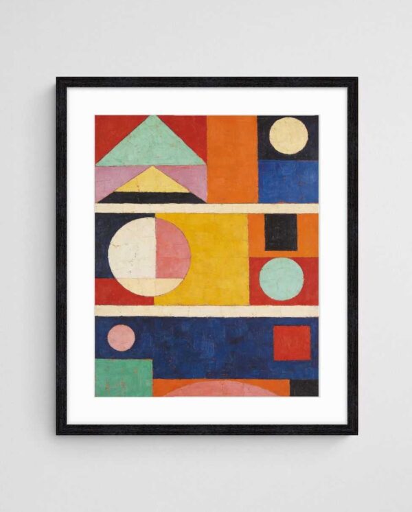

Vibrant Art Strategies: When Bold Makes Sense
Vibrant artwork functions best as an intentional focal point rather than scattered throughout a space. In practice, this means selecting one statement piece per room or gallery wall arrangement that draws the eye immediately upon entry. The impact comes from concentration—a single large-scale vibrant piece commands more presence than several small ones, which can create visual chaos and dilute the intended effect.
Strategic placement amplifies vibrant art’s effectiveness. Position bold pieces where natural light enhances rather than washes out colour intensity, typically on walls perpendicular to windows rather than directly opposite them. Additionally, consider sightlines from adjacent rooms; a vibrant piece visible from multiple vantage points creates visual continuity throughout your home whilst serving as a wayfinding element that subconsciously guides movement through the space.
Colour Temperature Considerations
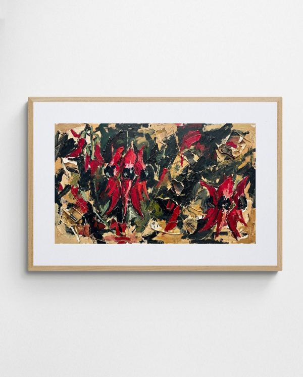
The warm-cool dichotomy within vibrant art significantly impacts spatial perception. Warm vibrancy—reds, oranges, yellows—advances visually, making walls appear closer and creating intimacy in large spaces. The “Desert Pea Chaos – Bold Abstract Floral Art Print” exemplifies this approach, using saturated warm tones that energise without overwhelming. Cool vibrancy—blues, greens, purples—recedes spatially, making rooms feel more expansive and airy, which proves particularly valuable in compact Australian apartments and terraces.
Mixing warm and cool vibrancy within a single piece offers versatility, allowing the artwork to harmonise with various lighting conditions throughout the day. Morning light emphasises cool tones whilst afternoon sun brings forward warm hues, creating a dynamic visual experience. This chromatic complexity keeps the artwork engaging over time, revealing different aspects as natural light shifts seasonally and daily.

Neutral Art Advantages: The Power of Restraint
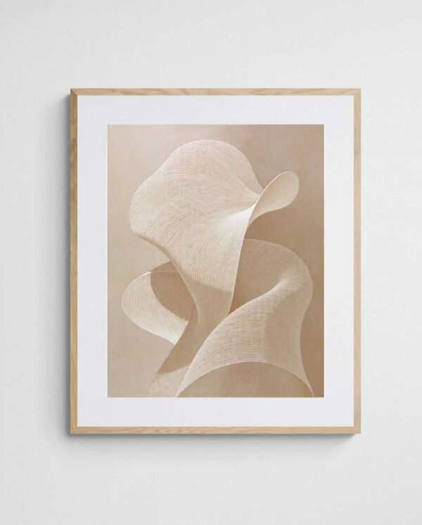
Neutral art provides sophisticated longevity that vibrant pieces struggle to match. When interior trends shift—as they inevitably do—neutral artwork adapts seamlessly to new colour schemes, furniture replacements, and evolving personal taste. This adaptability represents genuine value, particularly for those who enjoy refreshing their spaces without replacing major elements. The “Sand Wave – Neutral Abstract Art Print in Beige and Cream” demonstrates how texture and composition can create interest without relying on colour saturation.
In professional environments and compact office spaces, neutral art offers psychological advantages beyond aesthetics. It reduces visual stimulation that can contribute to cognitive fatigue during extended work sessions, whilst still providing the creativity-enhancing benefits that bare walls cannot deliver. Furthermore, neutral palettes appear more sophisticated and timeless, conveying professionalism without the risk that vibrant choices might appear juvenile or overly casual.
Textural Complexity in Neutral Work
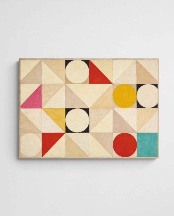
Successful neutral art compensates for limited colour through heightened attention to texture, pattern, and compositional complexity. Look for pieces featuring varied mark-making, layered elements, or dimensional qualities that create visual interest through shadow and light rather than hue contrast. Geometric patterns, organic forms, and linear elements all provide engagement without colour saturation, proving that neutral doesn’t mean boring.
The interplay between warm and cool neutrals introduces subtle sophistication often missed at first glance. Beiges lean warm, greys lean cool, and the tension between them creates depth within ostensibly monochromatic work. This nuanced approach to neutral art rewards prolonged viewing, revealing complexity that more obvious colour statements cannot sustain. Additionally, understanding colour balance principles helps identify neutral pieces with underlying chromatic sophistication.
Room-by-Room Approach to Art Selection
Living areas benefit from vibrant art that encourages interaction and conversation, making bold pieces natural choices for spaces designed around socialising. However, the scale of vibrancy matters—open-plan living requires larger-scale pieces or curated gallery walls that hold their own against expansive architecture. Conversely, intimate sitting rooms risk feeling claustrophobic with excessive vibrancy, where moderately saturated pieces or neutral work maintains comfort whilst providing visual interest.
Bedrooms demand particular attention to colour psychology, as these spaces directly impact sleep quality and morning mood. Whilst conventional wisdom suggests neutral art for bedrooms, the reality proves more nuanced. Cool vibrancy—soft blues, greens, and purples—promotes relaxation without the sterility of pure neutral palettes. Reserve warm vibrancy for spaces where you want energy: home offices, creative studios, and exercise areas respond well to the stimulating qualities of saturated warm hues.
Kitchen and Dining Considerations
Kitchens present unique challenges for art placement due to moisture, temperature fluctuations, and competing visual elements from cabinetry and appliances. Vibrant art works exceptionally well here because it must compete with inherently busy spaces full of functional objects. Choose pieces with clear compositional structure rather than highly detailed work that gets lost amongst visual clutter. The key lies in creating a single strong focal point that draws attention away from utilitarian elements.
Dining spaces thrive on art that stimulates appetite and conversation without creating distraction during meals. Research on restaurant design reveals that warm, moderately saturated colours increase appetite and dining duration, suggesting vibrant warm-toned artwork for formal dining rooms. However, breakfast nooks and casual eating areas may benefit from neutral pieces that maintain calm during morning routines. Moreover, selecting kitchen-appropriate prints requires considering both aesthetic and practical factors like moisture resistance.
| Room Type | Recommended Approach | Colour Temperature | Saturation Level |
|---|---|---|---|
| Living Room | Vibrant focal point | Warm or mixed | Medium to high |
| Bedroom | Neutral or cool vibrant | Cool preferred | Low to medium |
| Home Office | Neutral with accent | Cool or neutral | Low to medium |
| Kitchen/Dining | Vibrant statement | Warm preferred | Medium to high |
| Hallway | Gallery mix | Varied | Low to medium |
| Bathroom | Neutral recommended | Cool or neutral | Low |
Balancing Techniques: Mixing Vibrant and Neutral
The most sophisticated interiors rarely commit entirely to one approach, instead creating dialogue between vibrant and neutral elements. A common mistake involves treating these as opposing forces rather than complementary strategies. In practice, neutral artwork gains impact when positioned adjacent to or opposite vibrant pieces, whilst bold colour appears more intentional when surrounded by visual rest. This dynamic relationship creates rhythm and visual flow throughout connected spaces.
Gallery walls offer ideal opportunities for strategic mixing, allowing you to control proportions whilst creating cohesive collections. A ratio of two neutral pieces to one vibrant work typically achieves balance, though this can shift based on the intensity of your vibrant selections. Alternatively, use neutral pieces as transition elements between rooms with different colour temperatures, creating visual bridges that ease chromatic shifts between adjacent spaces.
The Anchor Piece Principle
Designate one artwork as your anchor—either the most vibrant or the largest neutral piece—and build surrounding selections to support rather than compete with it. This hierarchical approach prevents the visual confusion that occurs when multiple pieces vie for attention simultaneously. Your anchor piece establishes the colour story for the space, whilst supporting works echo, complement, or provide deliberate contrast to reinforce the intended atmosphere.
Successful anchoring requires considering not just the artwork itself but also its relationship to architectural features and furniture placement. Position your anchor piece where it receives both adequate viewing distance and optimal lighting, typically above substantial furniture pieces like sofas or credenzas that provide visual weight to support the composition. Additionally, exploring coordination strategies between art and furniture ensures cohesive rather than competing focal points.

Common Placement Mistakes to Avoid
One prevalent error involves selecting artwork based solely on colour matching existing décor, which creates matchy-matchy interiors lacking depth and personality. Instead, aim for colour relationships—complementary, analogous, or intentionally contrasting—that create visual interest whilst maintaining cohesion. Your artwork should enhance rather than duplicate the colours already present, introducing new hues that expand the palette whilst respecting the established atmosphere.
Scale miscalculations undermine even well-chosen pieces. A common rule suggests artwork should occupy 60-75% of the available wall space above furniture, yet many people select pieces far too small for their intended locations. This timid approach makes rooms feel unfinished and disconnected. Conversely, oversized artwork in compact spaces creates claustrophobia unless deliberately employed in minimalist interiors where a single large piece provides the primary decorative element. When uncertain about scale, guidelines for appropriately sized art prints help avoid proportion mistakes.
Lighting Oversights
Inadequate lighting represents perhaps the most overlooked aspect of art placement. Even the most carefully selected piece fails when poorly lit, whilst mediocre work gains impact with proper illumination. Natural light changes throughout the day and seasons, meaning artwork may appear vibrant in afternoon sun but lifeless in morning light or during winter months. Supplement with adjustable picture lights or track lighting that allows control over intensity and direction, ensuring consistent presentation regardless of external conditions.
Glare poses particular challenges for framed works, where reflections obscure the image entirely from certain viewing angles. Position framed pieces away from direct window opposition, or choose non-reflective glazing options that eliminate this problem. For unframed canvas prints, understand that texture becomes more pronounced with angled lighting, which can either enhance or distract depending on the piece’s intended effect. According to museum lighting principles, optimal art illumination balances visibility with conservation, a consideration even for reproduction prints you intend to keep long-term.
Future-Proofing Your Art Investment
Art purchases represent investments in daily living quality, making longevity a practical consideration beyond aesthetic preference. Vibrant pieces risk appearing dated as colour trends shift, whilst neutral work maintains relevance across decades. However, this doesn’t mean avoiding colour entirely—instead, favour pieces whose vibrancy comes from timeless compositions rather than trendy palettes. Geometric abstracts, for instance, remain current across generations whilst featuring bold colour, whereas pieces explicitly referencing current design trends age rapidly.
Consider your lifestyle trajectory when selecting between vibrant and neutral approaches. Young families with evolving tastes benefit from neutral foundations that accommodate changing preferences, whilst established households with defined aesthetics can confidently commit to vibrant statements. Similarly, rental properties and frequently relocated households favour neutral selections for versatility, whilst permanent residences allow bolder, more personalised choices tailored to specific architectural contexts.
Building Flexible Collections
Rather than committing entirely to vibrant or neutral, develop a rotating collection that allows seasonal or mood-based changes. Store pieces not currently displayed properly—in acid-free sleeves away from humidity and direct sunlight—to preserve them for future use. This approach proves particularly valuable in Australian climates where homes often feature multiple living zones suited to different intensity levels depending on the season.
Digital tools now allow virtual placement before purchasing, eliminating guesswork about how pieces will function in your specific space. Professional room design services offered by specialised galleries provide expert guidance on achieving the vibrant-neutral balance appropriate for your circumstances. Additionally, starting with quality art prints allows experimentation with different approaches before committing to larger original works, providing valuable learning about your genuine preferences versus theoretical ideals.


Making the Choice That Speaks to You
The vibrant versus neutral debate ultimately resolves not through universal rules but through understanding your space’s unique requirements and your authentic aesthetic preferences. Both approaches offer distinct advantages—vibrancy for energy and focal impact, neutrality for versatility and sophistication—and the most successful interiors typically incorporate elements of each strategically positioned throughout the home. The goal isn’t choosing sides but rather deploying colour intensity as a deliberate tool that shapes atmosphere, influences behaviour, and reflects personal identity.
Start by auditing your existing spaces honestly: where do you crave more energy, where do you need visual rest, and where do transitions between these states make sense? Use this assessment to guide placement decisions room by room, remembering that artwork can always be repositioned as your needs and preferences evolve. The beauty of abstract art prints lies in their flexibility—they adapt to changing contexts whilst maintaining their inherent qualities, allowing your walls to grow with you rather than against you.
Whether you ultimately lean toward the bold statements of vibrant work or the enduring elegance of neutral selections, the most important criterion remains genuine personal resonance. Art you love will speak louder than art chosen merely to match a sofa or follow a trend, regardless of its colour intensity. Trust your instincts, understand the principles that guide effective placement, and create spaces that reflect your authentic aesthetic voice rather than prescribed formulas that may work for others but feel hollow in your own home.
 | Joseph Russell Joseph is an Australian abstract artists and curator of the Inomaly art collection. |