
Walking into a law office should inspire confidence, trust, and professionalism from the very first glance. The right abstract wall art achieves this instantly, transforming sterile meeting rooms and reception areas into spaces that communicate competence whilst maintaining an approachable atmosphere. For legal professionals seeking to create environments that reassure clients during stressful times, selecting appropriate artwork becomes a strategic decision rather than an afterthought.
Abstract prints designed for law offices balance sophistication with subtlety. They provide visual interest without distraction, reinforce your firm’s values through careful colour and composition choices, and demonstrate attention to detail that clients notice. This guide covers fundamental concepts for selecting abstract art in legal settings, from colour psychology to placement strategies that enhance rather than overwhelm your professional environment.
Why Abstract Art Works in Law Offices
Abstract artwork avoids literal narratives that might alienate diverse clients. Unlike figurative pieces depicting specific scenes or subjects, abstract compositions allow viewers to project their own interpretations whilst maintaining visual sophistication. This neutrality proves particularly valuable in legal settings where clients arrive with varying backgrounds, concerns, and cultural perspectives.
Thoughtfully selected abstract pieces reduce anxiety and improve focus—two factors directly influencing client meetings and decision-making processes. A well-chosen abstract print establishes visual hierarchy in a space, guiding attention without commanding it, creating focal points that feel intentional rather than arbitrary.
Abstract art also signals progressive thinking whilst respecting tradition. Modern legal practices benefit from appearing current and innovative, yet clients still expect gravitas and stability. Geometric abstracts, subtle colour field paintings, and minimalist compositions bridge this gap effectively. They communicate that your firm values both contemporary approaches and timeless professionalism—a message that resonates across practice areas from family law to corporate litigation.
Abstract prints offer longevity that representational art cannot match. Whilst landscape photographs or classical portraits may feel dated as design trends evolve, well-chosen abstract pieces remain visually relevant for decades. This makes them a sound investment for law offices where consistency and stability form part of the brand identity. Selecting quality abstract works means avoiding the expense and disruption of frequent replacements as aesthetic preferences shift.
Understanding Colour Psychology for Legal Spaces
Colour selection fundamentally shapes how clients perceive your practice. Blue tones dominate legal office design for sound reasons—they’re associated with trust, competence, and calm rationality. However, relying exclusively on blue creates sterile environments that feel cold. The solution lies in layering blue-based abstract prints with warmer accent colours that add approachability without sacrificing professionalism.
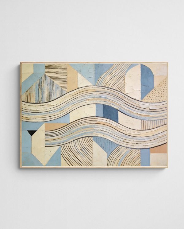
Neutral palettes featuring greys, beiges, and soft earth tones provide versatile foundations for law office art programmes. These colours complement existing furniture and architectural elements whilst offering sophisticated visual interest. A neutral abstract print doesn’t compete with your space; it enhances it. Consider how “Vanilla Harvest 1 – Neutral Geometric Abstract Art Print” demonstrates this principle, bringing structured elegance to professional environments through carefully balanced tones and clean geometric forms.
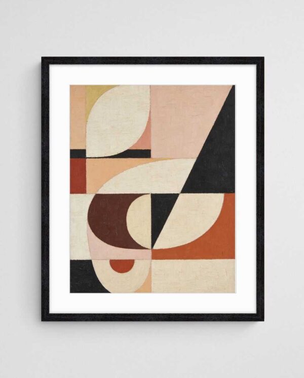
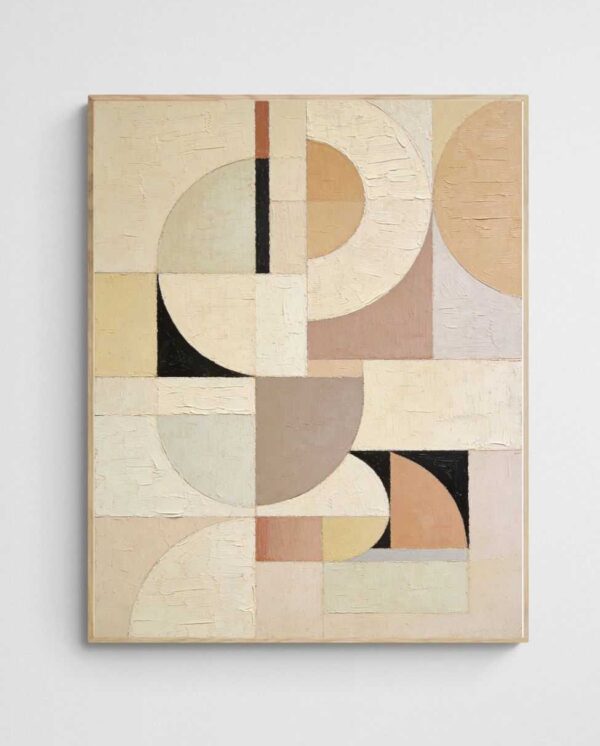
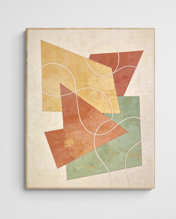
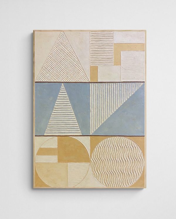
Restraint matters more than boldness when incorporating colour into legal spaces. Whilst vibrant abstracts work brilliantly in creative agency offices, law firms benefit from more measured approaches. Select prints featuring one or two accent colours against predominantly neutral backgrounds. This strategy maintains professional decorum whilst preventing the monotony that characterises many traditional legal offices.
Black and white abstract prints offer timeless sophistication that never feels out of place in legal settings. These high-contrast pieces create striking visual statements without introducing colour variables that might clash with furniture updates or renovation plans. They work equally well in contemporary glass-walled offices and heritage buildings with traditional wood panelling, providing flexibility as your practice evolves and expands over time.
| Colour Family | Psychological Effect | Best Application |
|---|---|---|
| Blues | Trust, calm, competence | Reception areas, conference rooms |
| Neutrals | Balance, sophistication, timelessness | Private offices, hallways |
| Warm Accents | Approachability, energy, confidence | Limited use in waiting areas |
| Black & White | Authority, clarity, timelessness | Executive offices, formal spaces |
Choosing the Right Abstract Styles
Geometric abstracts represent the most popular choice for law offices because they communicate order, precision, and logical thinking—values central to legal practice. Clean lines, balanced compositions, and mathematical precision in geometric works mirror the structured thinking clients expect from their legal representatives. These pieces feel deliberate and considered, never haphazard or chaotic, which reinforces professional credibility in subtle but meaningful ways.
Minimalist abstract prints work particularly well in smaller offices or practices emphasising modern approaches. These compositions rely on negative space, limited colour palettes, and restrained mark-making to create impact through simplicity rather than complexity. The minimalist aesthetic suggests clarity of thought and efficient communication—attributes every client values when navigating legal challenges. Such pieces also photograph well for marketing materials and social media, extending their value beyond physical wall space.
Line art abstracts offer another sophisticated option that balances visual interest with professional restraint. These works use flowing or angular lines to create movement and structure without overwhelming colour or aggressive brushwork. Line-based compositions work beautifully in hallways and transitional spaces where clients move between rooms, providing visual continuity throughout your office whilst maintaining appropriate formality.


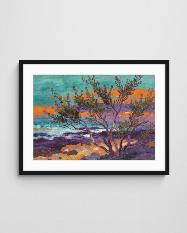
Coastal and landscape-inspired abstracts bring unexpected warmth to legal environments without sacrificing professionalism. These pieces reference natural forms through abstracted shapes and organic colour palettes, creating calming environments that help anxious clients feel more at ease. The key lies in selecting interpretive works rather than literal representations—think suggested horizons and atmospheric colour rather than identifiable beaches or mountains.
For firms wanting to showcase connection to Australian identity, consider works that reference local landscapes or coastal elements through abstract interpretation. This approach demonstrates regional pride and community connection whilst maintaining sophisticated visual presentation. Such pieces often become conversation starters that help establish rapport during initial client meetings, serving both aesthetic and practical purposes in your office environment.
Abstract Expressionism Considerations
Abstract expressionist works require careful evaluation before placement in law offices. Whilst these energetic, emotionally charged pieces can add dynamism to creative environments, they may feel too aggressive or chaotic for conservative legal practices. However, more restrained expressionist works featuring controlled brushwork and sophisticated colour palettes can work beautifully in private partner offices where bold statements align with individual personality and established client relationships.
Sizing and Placement Fundamentals
Proper sizing makes the difference between artwork that enhances your space and pieces that feel awkwardly placed. The general guideline suggests art should occupy 50-75% of available wall width to create appropriate visual weight. In law offices where walls often feature architectural details like chair rails or wainscoting, this calculation becomes more nuanced, requiring careful measurement of the actual display area rather than total wall dimensions.
Reception areas benefit from larger statement pieces or carefully curated groupings that establish immediate visual impact. This prime real estate deserves investment in quality prints that reflect your firm’s positioning and values. A substantial abstract work measuring 90-120cm wide creates the professional gravitas clients expect whilst demonstrating attention to design details that signal competence across all aspects of your practice. For guidance on creating impactful reception area displays, consider how first impressions shape client relationships.
Conference room art requires special consideration because these spaces serve multiple functions. The artwork must be substantial enough to anchor the space without dominating it during sensitive negotiations or emotional client meetings. Position prints at seated eye level (approximately 145-150cm to centre) rather than standing height, since most time in conference rooms is spent sitting. This simple adjustment dramatically improves the viewing experience and spatial harmony.
Private office sizing depends on available wall space and personal preference, but maintaining consistency across similar-sized offices creates cohesive visual language throughout your firm. Partners’ offices might feature slightly larger pieces or multiple coordinated prints, whilst associate offices maintain quality and style with appropriately scaled individual works. This hierarchy feels natural without creating stark disparities that undermine team cohesion.


Vertical Versus Horizontal Orientations
Orientation choices significantly impact spatial perception. Horizontal pieces emphasise width, making rooms feel more expansive—ideal for smaller offices or narrow conference rooms. Vertical orientations draw the eye upward, increasing perceived ceiling height in spaces with lower ceilings or creating elegant statements in narrow wall sections beside doorways or windows. Understanding these effects helps you use art strategically to address architectural limitations or enhance existing strengths.
Client-Facing Areas Versus Private Offices
Different zones within your law office serve distinct purposes, requiring tailored approaches to art selection. Client-facing areas—reception, waiting rooms, conference spaces, and consultation offices—demand universal appeal and sophisticated neutrality. These zones should feature prints that project professional competence whilst avoiding potentially divisive aesthetic choices. Conservative selections don’t mean boring; they mean thoughtfully curated pieces that appeal across demographic and cultural boundaries.
Reception areas function as your firm’s first impression, establishing tone before any verbal interaction occurs. The artwork here should reflect your practice’s core values and positioning. Family law firms might select warmer, more approachable abstracts featuring softer colour palettes, whilst corporate litigation practices benefit from cooler, more structured geometric works that communicate analytical rigor. Either way, quality reproduction and professional framing signal attention to detail that clients subconsciously register and appreciate.
Conference rooms require artwork that doesn’t distract during intense discussions yet prevents the sterile feel that characterises many professional spaces. Medium-scale abstract prints in coordinating tones work beautifully here, providing visual interest without demanding attention. Avoid highly complex compositions with aggressive colour contrasts that might fatigue participants during extended meetings. Instead, select pieces that offer subtle visual texture that enriches the environment without overwhelming it.
Private offices allow more personal expression whilst maintaining professional standards. Partners and senior solicitors might choose pieces that reflect individual taste within the broader aesthetic framework established in client-facing areas. This balance honours personal preference whilst ensuring visual consistency when clients move between different spaces. Coordinating colour families across public and private areas creates cohesion without requiring identical artwork throughout the entire office.
Hallways and transitional spaces often receive minimal attention during office design, yet clients traverse these areas multiple times during visits. Well-placed abstract prints in corridors transform potentially dead space into gallery-like experiences that reinforce your firm’s commitment to quality environments. Consider creating themed groupings or series that provide visual continuity as people move through your office, making the journey between spaces feel intentional rather than incidental.


Practical Considerations for Law Offices
Print quality matters significantly in professional environments where clients scrutinise every detail. Giclée printing on archival paper or canvas provides gallery-quality reproduction that withstands close examination and maintains colour fidelity for decades. Cheaper reproduction methods using standard inkjet printing fade noticeably within years, creating maintenance headaches and undermining the professional image you’ve invested in building. Quality prints represent long-term investments that justify initial cost through longevity and consistent appearance.
Framing decisions impact both presentation quality and maintenance requirements. In law offices, simple frames in neutral finishes—black, white, natural timber, or metallic tones—provide sophisticated settings that don’t compete with the artwork. Avoid ornate or highly decorative frames that feel residential rather than professional. Glass or acrylic glazing protects prints from dust, fingerprints, and UV damage whilst facilitating easy cleaning during routine office maintenance.
Lighting transforms how abstract prints appear and affects their longevity. Natural light creates beautiful viewing conditions but accelerates fading in unprotected artworks. Position valuable pieces away from direct sunlight or use UV-filtering glazing to mitigate damage. Dedicated picture lighting dramatically enhances visual impact, particularly in reception areas where creating impressive first impressions justifies the installation investment. LED picture lights offer energy efficiency and minimal heat output that won’t damage artwork over time.
Installation security requires attention in commercial environments with regular cleaning crews and maintenance staff. Professional hanging systems with appropriate weight ratings prevent accidents and damage. For valuable pieces or high-traffic areas, consider security hanging systems that prevent casual removal. This protection proves particularly important in ground-floor offices or spaces with public access where artwork might be vulnerable to theft or tampering.
Budget allocation for art programmes should reflect strategic importance rather than treating artwork as afterthought decoration. Allocating 1-3% of office fit-out budgets to quality art creates professional environments that enhance client confidence and employee satisfaction. Spreading purchases across fiscal years makes substantial collections achievable whilst maintaining cash flow for operational priorities. Many abstract art prints offer excellent value, delivering gallery-quality aesthetics at accessible price points suitable for professional environments.
Maintenance and Longevity
Proper maintenance extends artwork lifespan significantly. Quarterly dusting using microfibre cloths keeps glass surfaces clean without scratching. Annual professional cleaning for frames and more thorough glass cleaning maintains pristine presentation. Keep maintenance logs noting when pieces were installed and serviced, particularly for larger firms with extensive collections. This systematic approach prevents overlooked artwork developing condition issues that require expensive restoration or replacement.
Common Mistakes to Avoid
Purchasing artwork too small for available wall space ranks among the most common errors in professional environments. Undersized pieces look tentative and unfinished, undermining rather than enhancing your office aesthetic. When uncertain about sizing, err toward larger rather than smaller selections. A substantial piece that commands appropriate visual weight always appears more intentional than multiple small prints scattered across vast walls in failed attempts to fill space.
Hanging artwork too high diminishes viewing experience. The centre of artwork should sit at approximately 145-150cm from floor level in most office contexts—slightly lower than the traditional 155-160cm used in residential settings because professional spaces often feature higher ceilings that distort perception. This adjustment ensures comfortable viewing whether clients stand or sit, maximising the artwork’s positive impact on your environment.
Mixing too many disparate styles creates visual chaos that reads as indecisive rather than eclectic. Whilst diversity prevents monotony, successful office art programmes maintain consistent aesthetic threads—perhaps similar colour palettes, coordinated framing, or related compositional approaches. This cohesion need not mean identical pieces throughout; rather, it suggests thoughtful curation where individual works clearly belong to the same intentional collection rather than random accumulation.


Neglecting lighting when planning art installations wastes the potential impact of carefully selected pieces. Artwork hung in dimly lit corridors or positioned where glare obscures viewing might as well not exist. During office design or renovation, incorporate art lighting into electrical planning rather than treating it as afterthought. This foresight ensures proper infrastructure supports your visual programme without expensive retrofitting or unsightly cord management solutions.
Failing to consider the entire client journey through your office results in inconsistent experiences that undermine professional presentation. Map the typical path clients follow from entry through reception, waiting areas, conference rooms, and consultation offices. Ensure each zone features appropriate artwork that maintains quality standards and aesthetic consistency. This holistic approach creates seamless experiences where every touchpoint reinforces your firm’s professionalism and attention to detail.
Choosing artwork based solely on personal preference without considering client demographics and practice area positioning leads to selections that may alienate rather than reassure. Whilst individual taste matters, professional environments require balancing personal aesthetics with strategic communication goals. A family law practice serving diverse communities benefits from universally accessible abstracts rather than edgy contemporary pieces that might feel exclusionary to certain client groups.
Budget-Related Missteps
Allocating insufficient budget for quality framing after purchasing prints creates false economy that shows. Professional presentation requires investment in proper mounting, matting, and framing that enhances rather than detracts from the artwork. Cheap frames with poor-quality glazing and inconsistent finishes undermine otherwise excellent print selections. Budget holistically for complete presentation rather than prioritising print acquisition whilst neglecting presentation components that determine final appearance.
Building Your Collection Strategically
Developing a cohesive art collection requires planning rather than impulse purchases. Begin by auditing available wall space throughout your office, noting dimensions, lighting conditions, and functional context for each location. This inventory provides foundation for strategic acquisition planning that addresses highest-priority areas first whilst maintaining long-term vision for complete coverage. Photograph walls and create simple floor plans noting where artwork will hang to visualise the complete programme before committing to purchases.
Prioritise client-facing areas when budget constraints require phased implementation. Reception artwork makes immediate impact, followed by conference rooms where clients spend significant time. Private offices can be addressed in subsequent phases without compromising client experience. This staged approach makes quality collections achievable without overwhelming budgets whilst ensuring visible areas receive appropriate attention from day one.
Consider establishing relationships with galleries or Australian abstract art specialists who understand professional environment requirements. These partnerships provide access to curated selections appropriate for law offices, often with consultation services that streamline decision-making. Trade accounts may offer preferred pricing for larger orders, making comprehensive programmes more financially accessible whilst ensuring consistent quality across your collection.
Document your collection systematically, maintaining records of each piece including title, artist, acquisition date, placement location, and maintenance history. This professional approach facilitates insurance claims if needed, simplifies rotating pieces between locations, and provides accountability for valuable assets. Simple spreadsheets or dedicated art management software serve practices of varying sizes, with complexity matching collection scope and value.
Thoughtfully curated visual environments contribute measurably to employee wellbeing and client satisfaction. These benefits extend beyond aesthetics, influencing productivity, stress reduction, and overall workplace culture in ways that justify viewing art programmes as strategic investments rather than discretionary expenses. For further reading on art in professional settings, see Art in the workplace.


Review and refresh your collection periodically without wholesale replacement. Rotating pieces between locations prevents staleness whilst maximising investment value. After several years, consider strategic additions that update your collection’s feel without abandoning successful foundational pieces. This evolutionary approach maintains visual interest whilst respecting budget realities and preserving works that continue serving your practice effectively.
Start by mapping your office and identifying your highest-priority wall spaces. Assess existing lighting conditions and note dimensions. Then select 3-5 foundational pieces in complementary colours and styles that work across your client-facing areas. This focused approach prevents decision paralysis and creates immediate visual impact whilst you develop a longer-term acquisition strategy. Abstract prints for law offices work best when each piece has been deliberately chosen for its specific location rather than selected generically and placed wherever space allows.
 | Joseph Russell Joseph is an Australian abstract artists and curator of the Inomaly art collection. |