
Choosing the best art prints for your living room can feel overwhelming, especially when you’re just starting to understand how wall art transforms a space. Your living room is where you relax, entertain guests, and spend quality time with family, so the artwork you select should reflect your personality while complementing your interior design. The right statement piece can anchor your entire room, creating a focal point that draws the eye and sets the mood for the space. For beginners navigating the world of abstract wall art, understanding the fundamentals of scale, colour harmony, and style coordination will help you make confident choices that elevate your home’s aesthetic.
The best art prints for living rooms combine visual impact with personal resonance, creating a space that feels both curated and authentic. Whether you’re drawn to bold geometric abstracts, serene coastal landscapes, or vibrant Australian botanical prints, the key is selecting pieces that work harmoniously with your existing furniture, wall colours, and lighting conditions. Size matters tremendously—a print that’s too small will disappear on a large wall, while an oversized piece in a compact room can feel overwhelming. Beyond aesthetics, the best prints are produced using archival-quality materials that resist fading, ensuring your investment remains vibrant for years. This comprehensive guide will walk you through everything you need to know about selecting, sizing, and displaying art prints that transform your living room from ordinary to extraordinary.
Understanding Living Room Art Fundamentals
Before diving into specific styles or colours, it’s essential to grasp the foundational role that art plays in living room design. Your living room artwork serves multiple functions simultaneously: it acts as a visual anchor, influences the perceived size and atmosphere of the space, and communicates your aesthetic preferences to visitors. Think of your wall art as the jewellery of your room—it’s the finishing touch that brings together all the other design elements.
The psychology of colour in art directly impacts how people feel in your space. Warm tones like terracotta, coral, and gold create cosy, inviting atmospheres perfect for conversation and relaxation. Cool tones such as blues, greens, and greys promote calmness and can make smaller rooms feel more spacious. Neutral abstract prints offer versatility, working seamlessly with changing décor trends and seasonal updates. Understanding these fundamental connections between colour and mood helps you select prints that support the atmosphere you want to create.
Scale relationships between furniture and artwork determine whether your space feels balanced or disjointed. As a general principle, your art should occupy roughly two-thirds to three-quarters of the width of the furniture piece it sits above. This creates visual harmony rather than leaving your artwork looking lost on a large wall. Additionally, consider the viewing distance—living rooms typically have seating arranged 2-4 metres from walls, so your prints need sufficient visual interest to engage viewers from that distance while also rewarding closer inspection.
Assessing Your Space and Lighting Conditions
Natural lighting dramatically affects how colours appear throughout the day. North-facing rooms in Australia receive cooler, more consistent light, which can make warm-toned prints appear more subdued. South-facing spaces get warmer, more intense light that can wash out delicate pastels but enhances rich, saturated colours. Moreover, artificial lighting choices—whether warm LED, cool fluorescent, or halogen spotlights—further influence colour perception. When possible, view potential prints in lighting conditions similar to your living room before making final selections.
Architectural features like fireplaces, built-in shelving, and prominent windows create natural focal points that your artwork should either complement or intentionally contrast. Rather than competing with these features, position your statement art to work in harmony with your room’s existing focal points. For instance, a striking abstract print can beautifully balance a fireplace on the opposite wall, creating visual equilibrium across the space.


Getting the Sizing Right
One of the most common mistakes beginners make is selecting artwork that’s too small for their space. To determine the appropriate size, measure your wall space and apply the two-thirds rule: if you’re hanging art above a sofa, the print (or arrangement of prints) should span approximately 66-75% of the sofa’s width. For a standard three-seater sofa measuring 210cm wide, you’re looking at artwork spanning 140-160cm across, which might be a single large-format print or a gallery wall arrangement.
Ceiling height significantly influences ideal print proportions. Standard Australian homes with 2.4-2.7m ceilings work well with vertical prints measuring 60-90cm in height, while homes with higher ceilings (3m+) can accommodate more dramatic oversized pieces reaching 120-150cm tall. Horizontal landscapes typically suit wider walls and create a sense of spaciousness, whereas vertical portraits draw the eye upward, making rooms feel taller.
| Wall Space Width | Recommended Art Width | Ideal Print Size | Best For |
|---|---|---|---|
| 150-180cm | 100-120cm | A1 or larger | Above sofas, main walls |
| 100-150cm | 70-100cm | A2 to A1 | Feature walls, hallways |
| 60-100cm | 40-70cm | A3 to A2 | Smaller walls, alcoves |
| Gallery wall | Varies | Mix of A4-A2 | Stairwells, large expanses |
When working with multiple prints, think in terms of the overall arrangement’s dimensions rather than individual pieces. A collection of smaller prints grouped together can create the same visual weight as a single large statement piece. The key is maintaining consistent spacing between pieces—typically 5-8cm works well for cohesive gallery walls—and ensuring the overall shape complements your furniture layout.


Testing Scale Before Committing
Before purchasing, create templates using newspaper, butcher’s paper, or painter’s tape to mock up your intended artwork’s dimensions on the wall. Live with these templates for several days, observing how they look from various seating positions and at different times of day. This simple exercise prevents costly sizing mistakes and helps you visualise exactly how much presence a piece will have in your space. Additionally, many online retailers now offer augmented reality tools that let you preview artwork on your walls using your smartphone camera.
Colour Coordination and Palette Matching
Successful colour coordination doesn’t mean matching your artwork exactly to your throw cushions or curtains. Instead, aim for complementary colour relationships that create visual interest while maintaining harmony. If your living room features predominantly neutral tones—whites, greys, beiges—you have freedom to introduce bold, vibrant prints that become the room’s colour anchor. Conversely, if your furniture and textiles already incorporate strong colours, consider artwork that echoes one or two of these hues while introducing complementary tones for depth.
The 60-30-10 colour rule, widely used by interior designers, applies beautifully to art selection. Your room’s dominant colour should occupy roughly 60% of the space (typically walls and large furniture), secondary colours should make up 30% (sofas, curtains, rugs), and accent colours should comprise 10% (decorative objects, cushions, artwork). Your art prints can either reinforce your existing colour distribution or introduce new accent colours that refresh the entire palette. For a deeper exploration of how colour transforms spaces, refer to our guide on how colour changes room dynamics.
Undertones matter significantly when coordinating artwork with existing décor. Warm greys have brown or pink undertones, while cool greys lean blue or green. Similarly, whites range from creamy warm tones to stark cool whites. When your artwork’s undertones clash with your walls or furniture, the entire space can feel disjointed. Hold potential prints against your wall colour and major furniture pieces to ensure undertones harmonise rather than compete.


Working With Existing Colour Schemes
If you’ve invested in a specific colour scheme, select artwork that enhances rather than disrupts your palette. For coastal-inspired living rooms featuring blues and sandy neutrals, coastal abstract prints extend your theme naturally. Scandinavian-style spaces with their emphasis on whites, pale woods, and occasional black accents benefit from minimalist geometric abstracts that maintain the aesthetic’s clean simplicity. Bohemian interiors with layered textiles and eclectic patterns can handle more complex, multi-coloured abstracts that add to the collected, worldly atmosphere.
For those working with predominantly neutral palettes, artwork presents an opportunity to inject personality and warmth without committing to permanent colour changes. Australian botanical prints featuring native eucalyptus or wattle introduce organic greens and golds that feel fresh yet timeless. Bold colourfield abstracts in terracotta, ochre, or deep teal create striking focal points against neutral backgrounds while remaining sophisticated rather than overwhelming.
Selecting the Right Style for Your Space
Your living room’s architectural style and existing furniture aesthetic should guide your art style selection. Contemporary homes with clean lines, minimal ornamentation, and modern furnishings pair beautifully with geometric abstracts, colourfield paintings, and minimalist compositions. Traditional spaces featuring ornate mouldings, classic furniture silhouettes, and rich textiles benefit from softer abstract landscapes or impressionistic pieces that bridge the gap between classical and contemporary aesthetics.
Mid-century modern interiors, experiencing renewed popularity across Australian homes, work exceptionally well with retro-inspired abstracts featuring organic shapes, warm colour palettes, and playful compositions. The “Reef Shadows – Coastal Abstract Painting Print” exemplifies this perfectly, combining abstract expressionist techniques with coastal influences that suit mid-century aesthetics while bringing ocean-inspired tranquility to living spaces. These types of prints honour the era’s design principles while feeling fresh and current.
Industrial-style living rooms characterised by exposed brick, metal accents, and raw materials require artwork with sufficient visual strength to hold its own against these bold architectural elements. Large-scale abstracts with strong compositional structure, high contrast, or textural interest prevent your art from disappearing against industrial backdrops. Conversely, if your industrial space already feels heavy or masculine, introducing softer abstracts with organic forms and lighter palettes creates welcome balance.

Understanding Abstract Art Categories
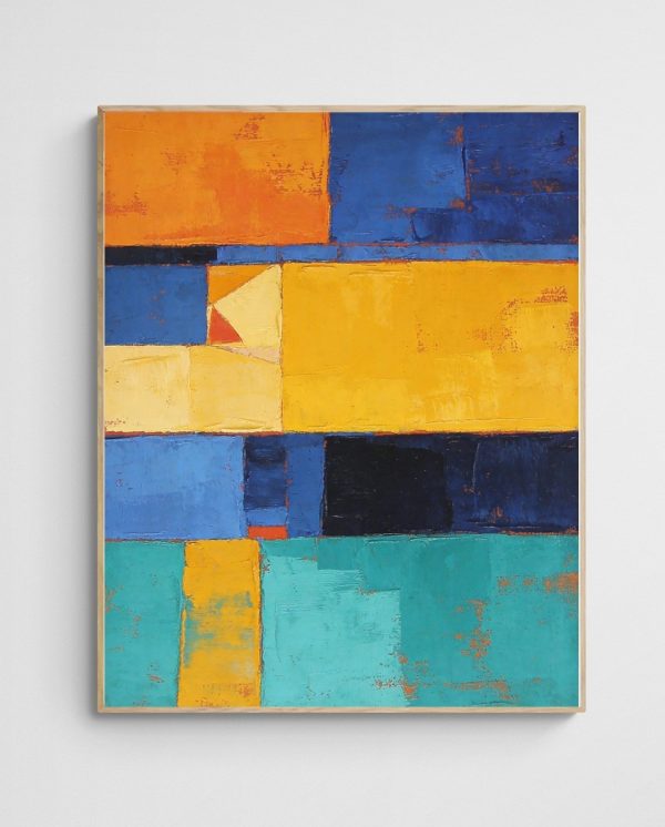
For beginners, navigating abstract art terminology can feel confusing. However, understanding basic categories helps you articulate your preferences and search more effectively. Geometric abstracts feature precise shapes, clean lines, and mathematical precision, appealing to those who appreciate order and structure. Organic abstracts incorporate flowing forms, natural curves, and intuitive compositions that feel more relaxed and spontaneous. Colourfield abstracts emphasise large expanses of colour with minimal compositional complexity, creating meditative, atmospheric effects.
Abstract expressionism, pioneered by artists in the mid-20th century, emphasises gesture, emotion, and spontaneous mark-making. These prints often feel energetic and dynamic, suitable for living rooms where you want to generate conversation and visual interest. In contrast, minimalist abstracts strip away excess, focusing on essential elements with restrained colour palettes and simplified forms—perfect for spaces where calm and clarity are priorities. If you’re interested in learning more about distinguishing between abstract styles, this comprehensive guide to identifying abstract styles provides deeper insight.
Australian abstract art often incorporates references to the unique landscape, light quality, and natural environment of the continent. Ochres, burnt oranges, deep reds, and dusty blues frequently appear, echoing the outback, coastal regions, and native flora. Selecting Australian abstract prints can create a sense of place and connection to the local environment, particularly meaningful in homes that emphasise natural materials and indoor-outdoor living.
Placement and Hanging Techniques
Proper placement transforms good artwork into great room design. The standard rule positions artwork so its centre sits at eye level, typically 145-150cm from the floor. However, this guideline requires adjustment based on your specific circumstances. If most viewing happens while seated, lower the artwork slightly so its centre aligns with the eye level of seated viewers, approximately 120-130cm from the floor. This adjustment prevents your art from feeling awkwardly high when you’re actually using the space.
When hanging art above furniture, maintain consistent spacing. Leave 15-20cm between the furniture’s top edge and the artwork’s bottom edge—enough space to prevent the piece from feeling cramped, but close enough to create visual connection between the two elements. This spacing applies whether you’re working with a sofa, console table, or credenza. If the gap exceeds 25cm, the artwork begins to float independently rather than anchoring to the furniture below, creating a disconnected appearance.
Consider traffic flow and sight lines when selecting placement locations. Your primary statement piece should be visible from the room’s main entrance, creating immediate visual impact when people enter the space. However, avoid positioning artwork directly opposite glass doors or windows where glare will obscure the image during certain times of day. If this placement is unavoidable, consider non-reflective glass or acrylic when framing to minimise glare issues.
- Sale!

Aquatic Garden – Vibrant Under Water Abstract Art Print
Price range: $799.00 through $1,299.00 Select options This product has multiple variants. The options may be chosen on the product page 
Colourful Landscape Art Print – Hills of Gold 7 – Mountains | Flowers
Technical Hanging Methods
Invest in proper hanging hardware suited to your wall type and artwork weight. Plasterboard walls require wall anchors or toggle bolts for anything heavier than 5kg, while brick or concrete walls need masonry anchors and appropriate drill bits. Many Australian homes feature timber studs at 45-60cm intervals—locating and hanging into these studs provides the most secure mounting for heavier framed prints.
Picture hanging wire and D-rings remain the most versatile hanging method for framed prints. Install D-rings approximately one-third down from the frame’s top, thread wire between them with slight slack, and hang from a single wall hook. This method allows minor adjustments to level the artwork and distributes weight evenly across the frame. For large, heavy pieces exceeding 15kg, use two hooks positioned to support the frame at both D-ring locations, preventing excessive stress on the wire.
Before hammering that final nail, create a paper template of your frame and use removable adhesive to position it on the wall. Step back, evaluate from multiple angles, and adjust until the placement feels right. Mark the top centre of your template, remove it, and use this mark to position your hook. This extra step prevents unnecessary holes in your walls and ensures you’re committed to the placement before making it permanent.
Understanding Print Quality and Materials
Not all prints are created equal, and understanding quality indicators helps you make informed purchasing decisions. Giclée printing, considered the gold standard for fine art reproduction, uses archival-quality inks and museum-grade papers or canvas to produce prints with exceptional colour accuracy, tonal range, and longevity. These prints resist fading for 100+ years under proper conditions, making them genuine investments rather than disposable décor. The term “giclée” comes from the French word meaning “to spray,” referring to the inkjet technology that precisely applies millions of microscopic droplets to create smooth, continuous colour.
Paper quality significantly impacts both appearance and durability. Look for acid-free, lignin-free papers with weights of 200gsm or higher. Cotton rag papers, considered archival quality, resist yellowing and deterioration far better than wood-pulp papers. Textured papers add dimension and visual interest, with options ranging from smooth hot-press surfaces to heavily textured cold-press and watercolour papers. The texture choice should complement the artwork’s style—geometric abstracts often suit smooth papers, while painterly abstracts benefit from textured substrates that enhance their organic qualities.
Canvas prints offer a more casual, contemporary aesthetic than framed paper prints. Quality canvas prints use poly-cotton blends or 100% cotton canvas stretched over solid timber frames with gallery-wrapped edges. Gallery wrapping continues the image around the frame’s sides, eliminating the need for traditional framing and creating a modern, floating appearance on your wall. However, canvas typically requires larger sizes to achieve impact—a canvas print under 60cm square often looks insubstantial, whereas the same image on quality paper in a statement frame can work beautifully.

Framing Considerations
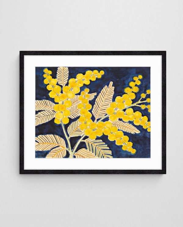
Framing elevates your print from a poster to a polished piece of art. Frame selection should consider both the artwork’s characteristics and your room’s aesthetic. Contemporary abstracts often suit simple frames with clean profiles—thin metal frames in black, white, gold, or silver maintain focus on the artwork without competing for attention. Traditional or softer abstracts may benefit from timber frames in natural oak, walnut, or painted finishes that add warmth and substance.
Matting creates breathing space between your print and frame, drawing the eye inward toward the image. White and off-white mats remain versatile choices that work with most artwork and décor styles. However, coloured mats can enhance specific hues within the artwork—a deep navy mat might amplify blue tones in a coastal abstract, while a warm cream mat can emphasise earth tones. Mat width should increase proportionally with print size; small prints (A4-A3) work with 5-8cm mats, while larger prints (A1+) benefit from 8-15cm mats that provide substantial visual weight.
Glazing protects your print from dust, moisture, and UV damage. Standard glass offers basic protection but adds weight and reflective glare. UV-filtering glass or acrylic blocks 99% of harmful ultraviolet light, significantly extending your print’s lifespan—essential for pieces in sunlit rooms. Museum glass eliminates virtually all reflection while providing UV protection, creating the impression of viewing the unglazed artwork. While more expensive, museum glass is transformative for high-value pieces or rooms with challenging lighting conditions. For more detailed information about protecting and displaying your prints, explore our complete guide to displaying abstract paintings.
Creating Gallery Walls and Multi-Print Displays
Gallery walls allow you to display multiple prints in a cohesive arrangement, creating visual impact through collective presence rather than relying on a single large statement piece. This approach works exceptionally well for large expanses of wall, stairwells, or spaces where you want to showcase various complementary artworks. However, successful gallery walls require thoughtful planning to avoid appearing cluttered or chaotic.
Start by selecting a unifying element that ties your prints together. This might be a consistent colour palette, similar style or medium, complementary subject matter, or uniform framing. You needn’t match every element—in fact, slight variation creates visual interest—but establishing one or two consistent threads prevents the arrangement from feeling random. For instance, you might combine prints of varying sizes and orientations but maintain consistent framing and mat colours throughout.
Layout options for gallery walls include grid arrangements with prints of identical size and spacing, creating structured, orderly displays; salon-style arrangements with varied sizes and organic placement, producing collected, eclectic effects; and linear arrangements featuring prints aligned along a central horizontal axis, establishing order while accommodating size variation. Before hanging anything, arrange your prints on the floor in your intended configuration, adjusting until the composition feels balanced. Photograph your final floor arrangement for reference during installation.


Gallery Wall Installation Process
Template your entire arrangement on the wall using craft paper or newspaper taped in position. This allows you to visualise the complete gallery wall, make adjustments without creating holes, and mark hook positions directly on the templates. Starting from the centre and working outward typically produces better results than beginning at one edge, as it allows you to maintain balance and adjust spacing as you progress.
Maintain consistent spacing between frames—5-8cm works well for most arrangements, creating distinct separation without excessive gaps. Use a level and measuring tape religiously; even slight inconsistencies become glaringly obvious when viewing the completed wall. If your arrangement includes a grid component, ensure all alignments are precise—misaligned edges undermine the entire composition’s polish. For those wanting to transform larger areas, converting hallways into gallery spaces applies similar principles in elongated formats.
Balance visual weight across your arrangement by considering factors beyond physical size. Dark frames and bold, high-contrast prints carry more visual weight than light frames and subtle prints, even when physically smaller. Distribute heavier elements evenly throughout the arrangement rather than clustering them in one area. Step back frequently during installation to assess overall balance from typical viewing distances.

Common Mistakes to Avoid
Learning from others’ mistakes accelerates your journey toward creating beautifully curated living spaces. The single most common error is purchasing artwork that’s too small for the space. When in doubt, size up—artwork that fills the space appropriately commands attention and creates the intended impact, whereas undersized pieces disappear and fail to anchor your design scheme effectively.
Another frequent mistake involves ignoring lighting conditions during selection. A print that looks stunning in bright retail lighting or on a computer screen may appear dramatically different in your living room’s natural light. Additionally, many people forget to account for existing wall colour when selecting prints. Warm-toned artwork can appear muddy against warm beige walls, while cool-toned prints may look washed out on cool grey walls. Contrast between your art and walls creates definition and prevents your prints from blending into the background.
Rushing the decision-making process leads to purchases that don’t truly resonate with your space or personal aesthetic. Take time to live with sample images, consider how different options make you feel, and resist trend-driven purchases that may feel dated quickly. The best art prints for your living room are those you genuinely connect with and will appreciate for years, not just pieces that match this season’s colour trends.
Avoiding Installation Errors
Hanging artwork too high remains perhaps the most pervasive installation mistake. Remember that eye level means average human eye level (145-150cm to the artwork’s centre), not your own eye level if you’re particularly tall or short. Additionally, failing to consider furniture relationships leads to awkward gaps or prints that appear to sit directly on furniture without proper breathing space.
Using inadequate hardware for your wall type and artwork weight creates safety hazards and risks damaging both your walls and valuable prints. Invest in proper picture hooks, anchors, and hanging wire rated for your specific application. Similarly, attempting to hang heavy pieces alone often results in crooked, poorly positioned artwork or accidents. Recruit help for anything over 5kg or larger than 60cm in any dimension.


Purchasing Pitfalls to Sidestep
Buying purely online without understanding print specifications and quality standards frequently results in disappointment. Research the seller’s reputation, read reviews specifically mentioning print quality and colour accuracy, and understand their return policy before committing. Reputable sellers provide detailed specifications including paper type, ink type, sizing options, and framing details, enabling informed decisions. According to Wikipedia’s overview of giclée printing, understanding these technical specifications helps differentiate between true fine art prints and lower-quality reproductions.
Neglecting to measure your space before purchasing leads to sizing disasters that force returns or leave you with prints that simply don’t work in your intended location. Measure your wall space, measure above your furniture, photograph your room from multiple angles, and reference these measurements and images throughout the selection process. This simple preparation prevents costly mistakes and ensures your chosen prints will work beautifully in your specific space.


Bringing It All Together
Transforming your living room with statement art prints is an achievable goal when you understand the fundamentals of scale, colour coordination, style selection, and proper installation. The best approach combines technical knowledge with personal intuition—understanding the rules enables you to apply them thoughtfully while remaining true to your individual aesthetic preferences and the unique characteristics of your space.
Start by thoroughly assessing your living room’s dimensions, lighting conditions, existing colour palette, and architectural style. This foundation informs every subsequent decision, from determining appropriate print sizes to selecting colours and styles that enhance rather than conflict with your space. Remember that successful art placement isn’t about following rigid rules but rather understanding principles that guide you toward harmonious, impactful results.
Quality matters significantly when investing in art for your home. Prioritise archival materials, professional printing methods, and appropriate framing that protects your investment while enhancing its visual appeal. While budget constraints are real, purchasing one museum-quality print you genuinely love creates more satisfaction than acquiring multiple lower-quality pieces that fail to inspire. For those interested in exploring curated collections that maintain high quality standards, browse our complete range of abstract art prints designed specifically for Australian homes.
Take your time with the selection process, living with ideas before committing to purchases and installations. Create mockups using paper templates, test colour relationships by holding samples against your walls and furniture, and consider how different options make you feel when imagining them in your daily life. The artwork that ultimately graces your living room walls should bring you joy every time you enter the space, creating an environment that feels authentically yours while impressing guests with its thoughtful curation.
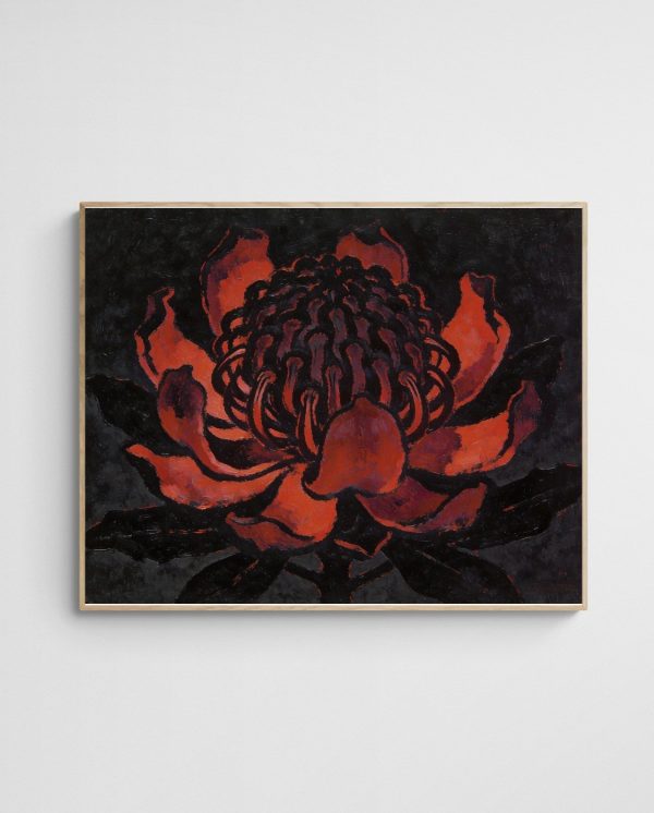

Whether you’re drawn to bold geometric abstracts, serene coastal landscapes, vibrant Australian botanical prints, or contemplative minimalist compositions, the perfect pieces for your living room exist. Trust your instincts, apply the principles outlined in this guide, and remember that creating a beautifully curated space is a journey rather than a destination. Your living room’s artwork can—and should—evolve as your tastes develop, your life changes, and new pieces speak to you. Start with one statement piece that truly resonates, and build from there, allowing your collection to develop organically into a reflection of your unique style and the life you’ve created in your home.


 | Joseph Russell Joseph is an Australian abstract artists and curator of the Inomaly art collection. |