Walking into a room should spark an immediate emotional reaction, and nothing achieves this quite like statement wall art. The right piece doesn’t just fill empty space—it anchors your entire design scheme, creates conversation, and transforms how a room feels the moment you enter. Whether you’re working with a blank canvas or refreshing tired decor, bold artwork offers the fastest route to dramatic transformation without structural changes or major renovations.
Statement wall art works by establishing a visual focal point that draws the eye and sets the tone for everything else in the space. The key is selecting pieces with enough presence to command attention while complementing your existing palette and style. In practice, this means considering scale, colour intensity, and artistic style alongside your room’s proportions and natural light. When executed well, a single striking piece can make a cramped space feel expansive or a cavernous room feel intimate and purposeful.
Assess Your Space and Identify the Focal Wall
Before purchasing any artwork, conduct a thorough assessment of your room’s architecture and existing features. Walk through the space and identify which wall naturally draws your attention when you enter. This is typically the wall you face when entering the room, the one behind a sofa or bed, or the wall opposite the main seating area. These positions offer the highest visual impact because they’re in your direct sightline during daily use.
Measure your focal wall carefully, noting both the total dimensions and any obstacles like windows, doors, light switches, or architectural features. A common mistake is underestimating how much wall space is actually available once furniture is in position. Stand back and use painter’s tape to mark out different size options on the wall—this simple technique helps you visualise scale before committing. Observe how natural light moves across the wall throughout the day, as this affects how colours and textures appear at different times.
Consider the room’s existing colour palette and overall mood. If you’re working with neutral walls and furniture, you have maximum flexibility for bold colour choices. However, if your room already features strong patterns or saturated colours, you’ll need to ensure your statement piece either harmonises or creates intentional contrast. Take photos of your space from multiple angles and review them alongside potential artwork—sometimes what looks perfect in a gallery appears jarring in your actual environment.
Choose the Right Scale for Maximum Impact
Scale is the most critical factor in creating genuine statement art. A piece that’s too small disappears into the wall, while one that’s too large overwhelms the space and makes the room feel cramped. For wall space above a sofa, the artwork should span approximately two-thirds to three-quarters the width of the furniture below it. For a king-size bed, aim for 100-120cm width minimum; queen-size beds work well with 80-100cm pieces.
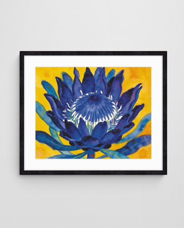
Vertical spaces like narrow walls flanking windows or tall stairwell walls call for different proportions. In these areas, embrace vertical orientation to accentuate the room’s height rather than fighting against it. A vertical piece measuring 120cm tall by 60cm wide can create more impact than a wider horizontal piece in these challenging spots. The Indigo Protea on Gold – Bold Abstract Floral Art Print delivers exceptional presence with its dramatic floral composition that works beautifully in vertical arrangements, particularly for master bedrooms seeking sophisticated botanical elements.
Apply the “three-metre rule” to determine if a piece is large enough to qualify as statement art: stand three metres away from the wall and assess whether the artwork still captures your attention and remains clearly visible. If it fades into the background or feels insignificant from this distance, you need to size up. Remember that online shopping can distort size perception—always reference the actual dimensions in centimetres rather than relying on how artwork appears on your screen.
Creating Impact in Open-Plan Spaces
Open-plan living areas present unique challenges because you’re often viewing the artwork from multiple angles and distances. In these environments, go bigger than you think necessary. A piece that feels appropriately sized from the kitchen counter might disappear when viewed from the dining area across the room. Our comprehensive guide to transforming rooms with abstract art offers detailed strategies for handling these complex layouts where sightlines shift throughout daily activities.
Develop a Colour Strategy That Commands Attention
Colour selection determines whether your statement piece enhances your space or clashes with it. Start by identifying your room’s dominant, secondary, and accent colours. Your artwork should incorporate at least one of these existing colours to create visual cohesion, but it should also introduce new hues that expand your palette in intentional ways. A piece with 60% familiar tones and 40% fresh colours typically achieves the best balance between harmony and visual interest.
For rooms decorated in neutral schemes—whites, greys, beiges, and taupes—you have permission to introduce bold, saturated colours through your artwork. Jewel tones like deep emerald, sapphire, or ruby create luxurious focal points, whilst vibrant corals, teals, and mustards inject contemporary energy. The Reef Shadows – Coastal Abstract Painting Print exemplifies how confident colour application transforms neutral spaces, with its dynamic interplay of oceanic blues and warm undertones that bring coastal energy to any interior.


If your room already features strong colours, consider artwork that introduces contrast through complementary shades or creates calm through analogous colour harmonies. A room dominated by warm terracottas and burnt oranges gains sophistication from artwork featuring cool blues and greens. Understanding basic colour theory principles helps you make confident decisions rather than second-guessing your selections.
Testing Colour Relationships Before Committing
Before purchasing, request colour swatches or digital samples that you can view in your actual space. Lighting drastically affects how colours appear—what looks vibrant in natural daylight might appear muddy under warm incandescent bulbs. Use your phone to take photos of potential artwork displayed on your screen, then view those photos while standing in your room. This technique, though imperfect, helps you assess colour relationships more accurately than viewing artwork in isolation. Exploring colour balance secrets can prevent costly mistakes and ensure your statement piece achieves the intended visual impact.
Select an Artistic Style That Reflects Your Vision
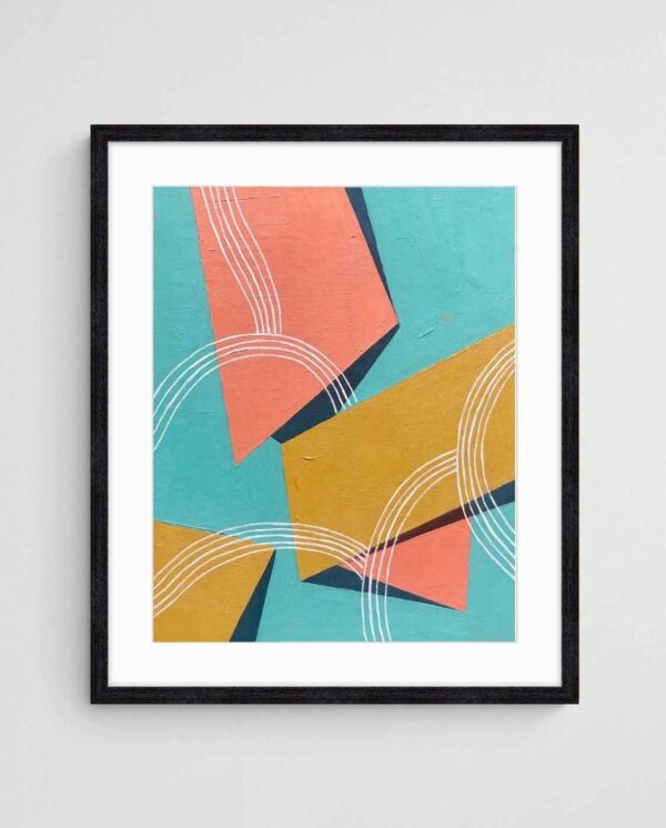
Artistic style must align with both your room’s existing aesthetic and your personal response to the work. Abstract art offers exceptional versatility for statement pieces because it avoids literal representation, allowing viewers to project their own interpretations. Geometric abstracts with clean lines and structured compositions suit modern, minimalist interiors, whilst expressive, gestural abstracts complement eclectic or maximalist schemes. The Tropical Ties – Mid-Century Geometric Abstract Painting demonstrates how geometric precision creates visual order whilst still delivering bold colour impact through its structured composition.

Floral abstracts bridge traditional and contemporary sensibilities, making them ideal for transitional spaces or rooms where you’re gradually shifting from classic to modern styling. Native Australian flora abstracts hold particular appeal for those seeking statement pieces with cultural connection and regional authenticity. These works reference familiar botanical forms whilst translating them through contemporary artistic techniques. Native Australian flora as artistic inspiration explores how local plant species inform abstract compositions that feel both familiar and refreshingly original.
Consider the emotional tone you want the artwork to convey. Fluid, organic shapes create calming, contemplative atmospheres suitable for bedrooms and reading nooks. Angular, dynamic compositions generate energy appropriate for active spaces like kitchens, home offices, or entertainment areas. Layered, complex pieces reward extended viewing and work beautifully in spaces where you spend considerable time, whilst bold, simplified forms deliver immediate impact in transitional areas like hallways and entryways.
Matching Art Style to Architectural Features
Your room’s architectural character should inform style selection. Period homes with ornate mouldings, ceiling roses, and heritage details benefit from statement art that creates intentional contrast—clean, contemporary abstracts prevent the space from feeling like a museum. Conversely, modern builds with minimal architectural detail need artwork that introduces visual complexity and textural interest. Industrial lofts with exposed brick and concrete gain warmth through organic, flowing compositions, whilst sleek apartments with floor-to-ceiling glass showcase geometric precision beautifully.
Master Placement Techniques for Visual Balance
Proper placement transforms good artwork into genuine statement pieces through strategic positioning. The centre of your artwork should hang at eye level, typically 145-150cm from the floor. However, adjust this measurement based on viewing position—artwork above a sofa should align with seated eye level, whilst pieces in hallways follow standing eye level. When hanging artwork above furniture, leave 15-20cm of space between the furniture top and the artwork’s bottom edge; any more creates visual disconnection, whilst any less makes the furniture feel crowded.
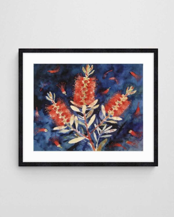
The Desert Pea Chaos – Bold Abstract Floral Art Print exemplifies artwork that demands careful placement consideration due to its expressive energy and layered composition. Position such dynamic pieces where they receive ample breathing room—avoid cluttering surrounding walls with additional small artworks that compete for attention. Statement pieces work best when given visual dominance within their zone.

Consider asymmetrical placement for unexpected visual interest in contemporary spaces. Whilst centring artwork above furniture remains the traditional approach, offsetting a large piece to one side creates dynamic tension that suits modern aesthetics. This technique works particularly well when balanced by furniture, plants, or architectural features on the opposite side. Always step back and assess from multiple viewpoints throughout the room before finalising placement—what appears perfectly positioned from one angle might feel off-centre from the doorway.
Creating Cohesion in Multi-Wall Arrangements
When statement pieces appear on multiple walls within one room, they should relate to each other through shared colour, style, or visual weight. Avoid placing two equally dominant pieces on adjacent walls, as this creates visual competition and fragments attention. Instead, establish one primary statement wall and support it with smaller, complementary pieces on secondary walls. This hierarchy guides the eye through the space in a logical, aesthetically pleasing sequence rather than creating visual chaos.
Create Drama with Multiple Statement Pieces
Gallery walls and multi-piece arrangements offer alternative approaches to statement art, particularly effective when you cannot source a single large enough piece or want to create narrative through sequential viewing. However, these arrangements require careful planning to achieve cohesion rather than confusion. Successful gallery walls share unifying elements—consistent framing, coordinated colour palettes, or thematic connections—that tie individual pieces into a coherent whole.
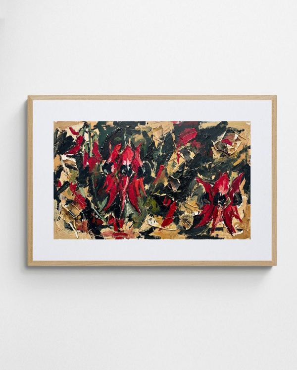
For powerful impact, arrange two or three large-scale pieces in a horizontal row or vertical stack rather than creating complex asymmetrical layouts with numerous small works. This approach delivers gallery-like sophistication whilst remaining accessible to execute. The Bottlebrush on Indigo – Modern Australian Floral Abstract Art Print pairs beautifully with the Blue Gum Abstract Print – Eucalyptus-Inspired Modern Floral Wall Art, as both explore native Australian flora through complementary colour strategies and similar compositional approaches.

When arranging multiple pieces, maintain consistent spacing between works—typically 5-8cm creates visual connection without pieces appearing cramped. Map your arrangement on the floor before committing to wall placement, experimenting with different configurations until you find one that achieves balanced visual weight. Our detailed guide to displaying abstract paintings provides templates for various multi-piece configurations that work across different wall dimensions and ceiling heights.
Diptychs and Triptychs for Expansive Walls
Two-panel or three-panel artworks designed as cohesive sets solve the challenge of extremely wide walls, such as those above king beds or lengthy sofas. These multi-panel works maintain artistic integrity whilst physically dividing into manageable pieces for transport and installation. When hanging diptychs or triptychs, keep spacing between panels minimal—just 2-5cm—so they read as a unified composition rather than separate artworks. Ensure panels hang at identical heights by using a level and measuring carefully from the ceiling rather than the floor, as floors rarely run perfectly flat.
Enhance Impact Through Strategic Lighting
Exceptional artwork fails to achieve statement status without proper lighting. Natural light provides the truest colour rendering but changes dramatically throughout the day and across seasons. Consequently, supplement with dedicated art lighting that maintains consistent illumination regardless of external conditions. Picture lights mounted directly above or below the artwork provide focused illumination, whilst track lighting offers flexibility to adjust direction and intensity as needed.
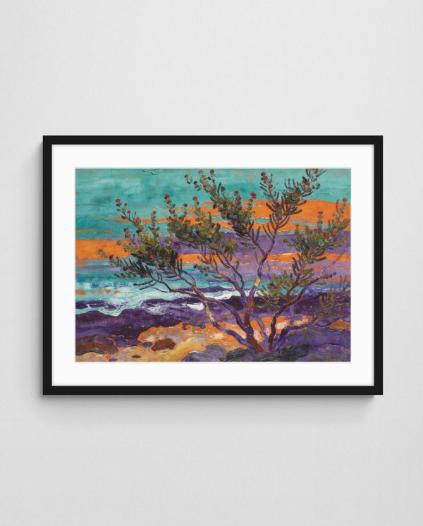
LED track lighting or adjustable spotlights work exceptionally well for statement pieces because you can direct multiple light sources at different angles, eliminating shadows and highlighting textural elements. Aim for colour temperature around 3000K for warm white light that enhances most colour palettes without distortion. Avoid placing artwork opposite windows or bright light sources, as glare obscures details and washes out colours. The Coastal Whispers in Wax – Lush Native Abstract Landscape Wall Art features rich textural elements created through encaustic techniques that become dramatically more apparent under directional lighting, revealing depth invisible under flat overhead illumination.

Consider installing dimmer switches that allow you to adjust lighting levels based on time of day and activity. Bright illumination showcases artwork during daytime and active hours, whilst softened lighting creates ambience during evening relaxation. This flexibility ensures your statement piece adapts to different moods and occasions. Modern LED systems consume minimal power whilst delivering superior illumination compared to older halogen or incandescent options.
Avoiding Damage from Light Exposure
Whilst proper lighting enhances statement art, excessive light exposure causes fading and deterioration over time. Never hang artwork in direct sunlight, particularly pieces featuring watercolours or light-sensitive pigments. If your wall receives strong natural light, install UV-filtering window film or use UV-protective glass in your frames. For high-quality art prints, archival inks and proper framing materials resist fading better than economy printing methods, making them worthwhile investments for pieces you plan to display long-term.
Avoid Common Statement Art Mistakes
Several predictable errors undermine statement wall art installations. The most prevalent mistake is selecting artwork that’s too small for the designated space. When in doubt, size up—artwork that feels slightly oversized in the store often appears perfectly proportioned once installed on your wall. Another frequent error involves matching artwork too literally to existing decor, resulting in predictable, uninspired combinations. Your statement piece should introduce new visual elements whilst complementing your space, not simply duplicate colours already present.
Hanging artwork too high remains remarkably common despite clear guidelines. Remember the eye-level rule, adjusting for seated versus standing viewing positions. Additionally, many people neglect the importance of quality framing, compromising excellent artwork with cheap, inappropriate frames. Your frame should enhance the artwork without overwhelming it—simple, clean frames suit contemporary pieces, whilst ornate frames complement traditional works. The Cricket by the Sea – Beach Art Print demonstrates how minimalist presentation allows the artwork’s inherent strength to dominate, with clean lines and subtle framing that doesn’t compete for attention.

Take time to consider multiple options, view them in your actual environment through samples or digital mockups, and trust your intuitive responses. If a piece doesn’t spark genuine enthusiasm, keep searching. Statement art should delight you every time you enter the room, not feel like a compromise you settled for. Exploring maximalist art approaches might inspire bolder choices than you initially considered, expanding your perspective on what constitutes appropriate statement art for your space.
Balancing Trends with Timelessness
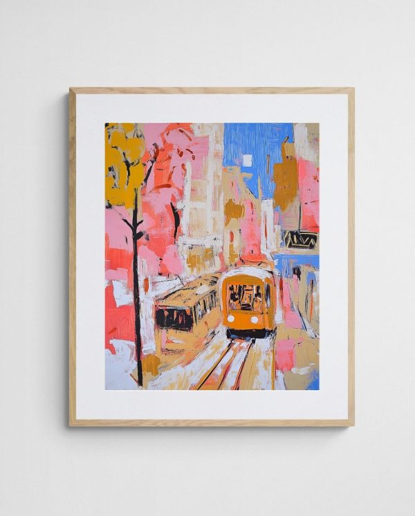
Chasing trends produces spaces that quickly feel dated as design movements shift. Prioritise artwork that speaks to you personally over pieces selected solely because they’re fashionable. Abstract art, particularly pieces exploring timeless themes like natural forms, landscapes, and geometric principles, transcends temporary trends. The Trams in Autumn – Vibrant Melbourne Abstract Art Print celebrates local urban landscapes through a lens that feels simultaneously contemporary and enduring, avoiding the pitfalls of overly trendy approaches that age poorly.

Balance contemporary styling with classic compositional principles—strong focal points, balanced visual weight, and harmonious colour relationships remain aesthetically effective across decades. Select artwork because it enriches your daily experience, not because it might impress visitors. Authentic personal connection to your statement pieces creates spaces that feel genuinely inhabitable rather than styled for social media presentation.
Bringing Your Vision to Life
Transforming any room with bold statement wall art combines practical technique with aesthetic vision. Start by thoroughly assessing your space, identifying the optimal focal wall, and accurately measuring available dimensions. Select artwork at an appropriate scale—larger than feels instinctively comfortable—and develop a colour strategy that introduces fresh hues whilst maintaining connection to your existing palette. Choose artistic styles that reflect your personal aesthetic and complement your room’s architectural character.
Master placement techniques that position artwork at proper heights with appropriate spacing from surrounding elements. Consider whether a single large piece or coordinated multiple pieces best suits your wall dimensions and creative vision. Enhance your statement artwork through strategic lighting that reveals details, maintains consistent illumination, and adapts to different times of day. Finally, avoid common mistakes like undersizing, overly literal colour matching, and trend-chasing that produces quickly dated results.
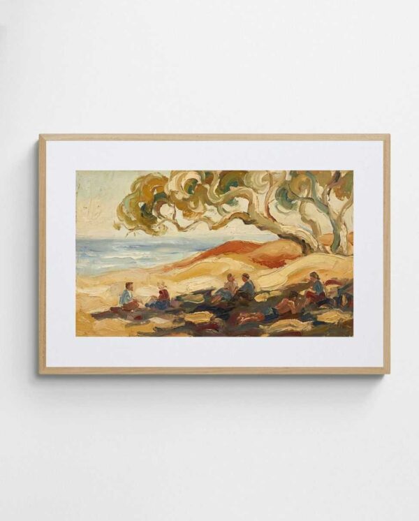
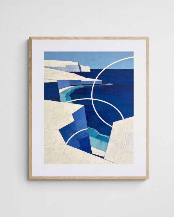
The Shady Beach Dunes – Abstract Australian Coastal Wall Art exemplifies the transformative potential of carefully selected statement pieces, bringing coastal tranquility and sophisticated colour work to interior spaces. Meanwhile, the White Cliffs on Blue – Blue Coastal Geometric Abstract Art demonstrates how geometric precision creates visual structure whilst delivering bold colour impact through clean, contemporary composition.
Start by selecting your focal wall and taking accurate measurements, then browse artwork that genuinely resonates with you. When you discover a piece that triggers an immediate emotional response, you’ve found your statement work. Trust that connection between artwork, space, and viewer—it creates the transformative impact that elevates ordinary rooms into memorable, inspiring environments.
 | Joseph Russell Joseph is an Australian abstract artists and curator of the Inomaly art collection. |