The bohemian aesthetic has long captivated interior design enthusiasts with its eclectic, free-spirited approach to home styling. For years, the palette associated with boho decor has been dominated by earthy terracotta, muted sage greens, and warm neutrals. However, a significant shift is occurring across Australian homes and globally, as designers and homeowners alike explore what lies beyond these traditional tones. This evolution reflects broader cultural changes in how we perceive comfort, authenticity, and personal expression within our living spaces.
The expanded boho colour palette now embraces rich jewel tones, unexpected pastels, and bold geometric contrasts that maintain the style’s characteristic warmth whilst introducing fresh visual energy. Designers from Melbourne to Byron Bay are incorporating deep burgundies, dusty pinks, ochre yellows, and even sophisticated navy blues into bohemian interiors. These colours work harmoniously with boho decor when balanced with natural textures, layered textiles, and the organic forms that define the aesthetic. The key lies in maintaining the relaxed, collected-over-time feeling whilst introducing colours that reflect contemporary tastes and individual personality.
The Cultural Shift Behind Expanded Boho Palettes
Throughout 2023 and into 2024, interior design trade shows across Sydney and Melbourne revealed a notable departure from conventional boho colour schemes. The Decoration + Design trade fair in May 2024 showcased numerous exhibitors presenting bohemian-inspired collections featuring unexpected colour combinations. Melbourne-based textile designer Sarah Ellison unveiled her “New Nomad” collection, incorporating deep plum, burnt orange, and charcoal grey alongside traditional neutral tones. This shift reflects broader consumer demand for personalisation and uniqueness in home interiors.
According to colour trend forecaster Philippa Scrimshaw, who presented at the Australian Interior Design Awards in November 2023, the evolution stems from increased global connectivity and cross-cultural influences. “We’re seeing Moroccan blues meeting Scandinavian greys, Japanese minimalism informing bohemian spaces, and Australian coastal tones blending with desert palettes,” Scrimshaw noted during her keynote address. This hybridisation has expanded what colours are considered authentic to the boho aesthetic, moving beyond prescriptive earth tones to embrace a more intuitive, personal approach.
The influence of social media platforms, particularly Pinterest and Instagram, has accelerated this trend evolution. Data from Pinterest’s 2024 Home Trend Report indicated a 156% increase in searches for “jewel tone boho” and a 203% rise in “modern bohemian colours” between January 2023 and January 2024. These platforms have democratised design inspiration, exposing Australian homeowners to global interpretations of bohemian style that challenge traditional colour boundaries.


Jewel Tones Enter the Bohemian Conversation
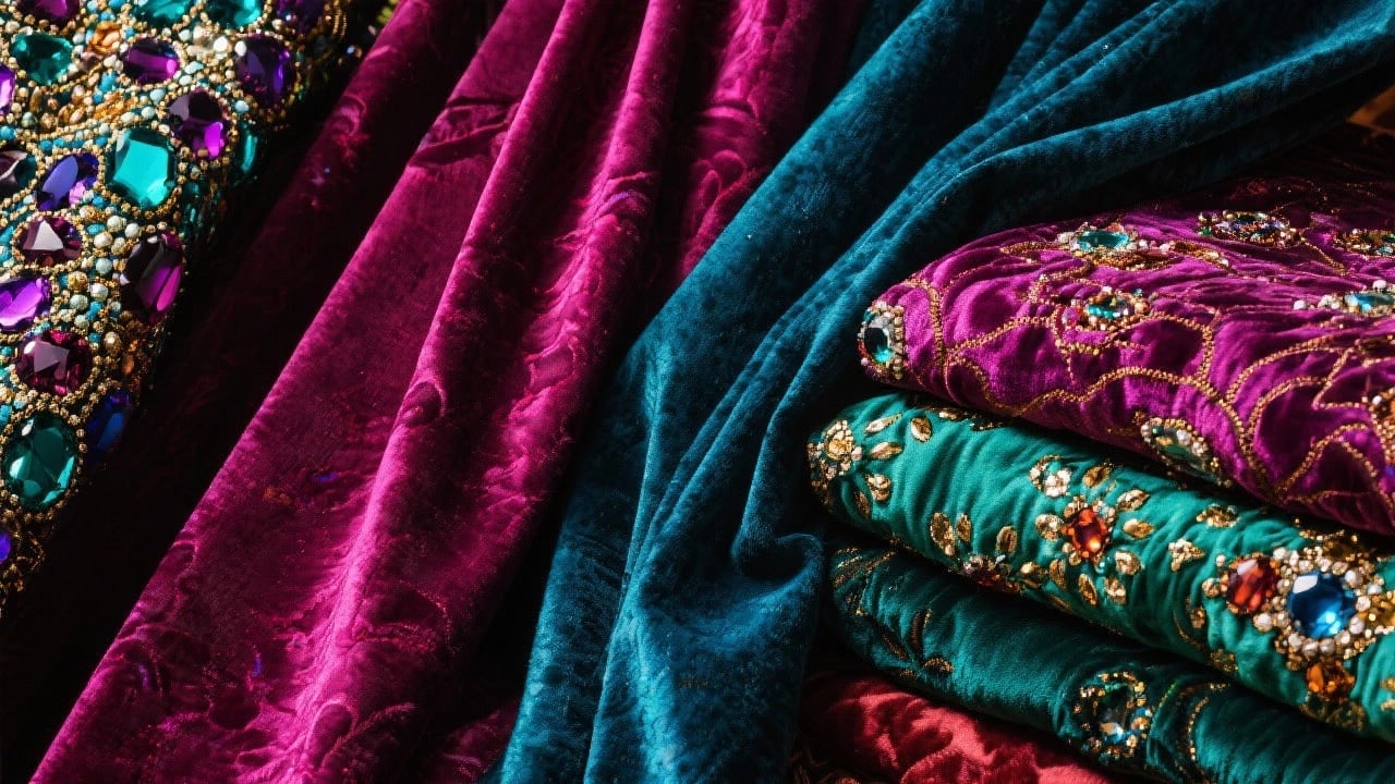
The incorporation of jewel tones represents one of the most dramatic departures from traditional boho palettes. Emerald greens, sapphire blues, ruby reds, and amethyst purples are appearing in bohemian interiors with increasing frequency. Brisbane interior designer Marcus Chen told Inside Out magazine in March 2024 that these saturated hues “bring sophistication and depth whilst maintaining the warmth and intimacy essential to boho spaces.” Chen’s Carlton townhouse project, featured in the magazine’s April issue, demonstrated how deep burgundy velvet cushions and emerald green wall hangings could complement rattan furniture and macramé installations.
The transition to jewel tones aligns with broader movements towards maximalism and bold self-expression in Australian homes. Colourful geometric abstract art serves as an accessible entry point for introducing these richer hues. Pieces like “Colour Patch 7” demonstrate how vibrant tones can coexist with bohemian sensibilities, offering focal points that anchor a room’s colour story whilst maintaining visual interest through geometric forms.

Textile manufacturer Kip&Co, based in Melbourne’s Collingwood, reported a 78% increase in sales of their jewel-toned linen ranges during the 2023 financial year. Creative director Hayley Pannekoecke explained in a September 2023 interview with Vogue Living Australia that customers were increasingly seeking “pieces that make a statement whilst remaining timeless.” This sentiment captures the essence of the new boho palette—colours that feel both adventurous and enduring. For guidance on integrating bold colours into existing schemes, The Hottest Art Colours Reshaping Interiors provides valuable insights into contemporary colour psychology.
Working with Deep Blues and Greens
Deep blues, particularly navy and midnight blue, have emerged as surprisingly compatible with bohemian aesthetics. Sydney-based colour consultant Emma Blomfield advocates for pairing these tones with warm metallics like brass and copper, which traditionally complement boho interiors. Speaking at the Dulux Colour Forecast launch in October 2023, Blomfield demonstrated how navy creates grounding contrast against lighter rattan and natural timber pieces, preventing spaces from feeling overly ethereal or disconnected from contemporary design sensibilities.
Forest greens and hunter greens offer similar grounding effects whilst maintaining stronger connections to nature—a fundamental boho principle. These deeper greens work particularly well in Australian contexts, echoing the dense eucalyptus forests and lush coastal vegetation that characterise the landscape. Perth designer Annabelle Hickson incorporated deep green accent walls in her 2024 House & Garden showcase home, pairing them with woven wall hangings and vintage kilim rugs to create spaces that felt both fresh and rooted in bohemian tradition.
Geometric Abstracts and the New Boho Minimalism
A significant development in contemporary bohemian interiors is the integration of geometric abstract art, representing a convergence between minimalist aesthetics and traditional boho eclecticism. This trend gained prominence following the January 2024 Australian Design Centre exhibition “Geometric Nature,” curated by Adelaide-based designer Tom Kovac. The exhibition explored how geometric forms and patterns connect to natural phenomena—fractals, crystalline structures, and organic symmetries—thereby justifying their presence within nature-focused bohemian spaces.
Geometric abstract pieces introduce clean lines and structured compositions that prevent bohemian interiors from becoming visually overwhelming. The “Sailboats 002” print exemplifies this approach, offering coastal-inspired imagery through geometric abstraction that maintains the relaxed, breezy feeling essential to boho aesthetics whilst providing visual organisation through its structured composition.


Melbourne’s National Gallery of Victoria featured “The Geometry of Feeling” exhibition from February through May 2024, examining how geometric abstraction can convey emotional warmth despite its formal rigour. Curator Dr. Samantha Littleton noted that “geometric forms provide breathing room in layered, textured bohemian environments, offering visual rest points that enhance rather than diminish the overall warmth.” This philosophy has influenced how Australian homeowners integrate colourful abstract art into their boho-inspired rooms, using geometry as an organising principle amid eclectic collections.
Minimalist Line Work in Bohemian Contexts
Simple line drawings and minimalist abstracts have found unexpected homes within bohemian interiors, particularly among younger homeowners seeking to blend vintage bohemian elements with contemporary sensibilities. The “Crossing Paths” series demonstrates this aesthetic bridge, using minimal line work to create movement and visual interest without introducing heavy colour or complex imagery. These pieces work effectively in spaces dominated by textured textiles and organic materials, providing counterbalance without stylistic conflict.
Interior stylist Rachel Castle, speaking at the Sydney Design Week panel “New Bohemian” in August 2023, advocated for what she terms “intentional curation” in modern boho spaces. “Every element should earn its place,” Castle explained. “Minimalist art pieces prevent rooms from tipping into chaos whilst maintaining the collected, personal feeling that defines bohemian style.” This approach has gained traction in Australian coastal homes, where relaxed bohemian vibes meet the clean aesthetics popularised by Scandinavian design influences. Those interested in this intersection can explore Scandinavian art prints that actually work for complementary perspectives.


Unexpected Pastels and Soft Modernism
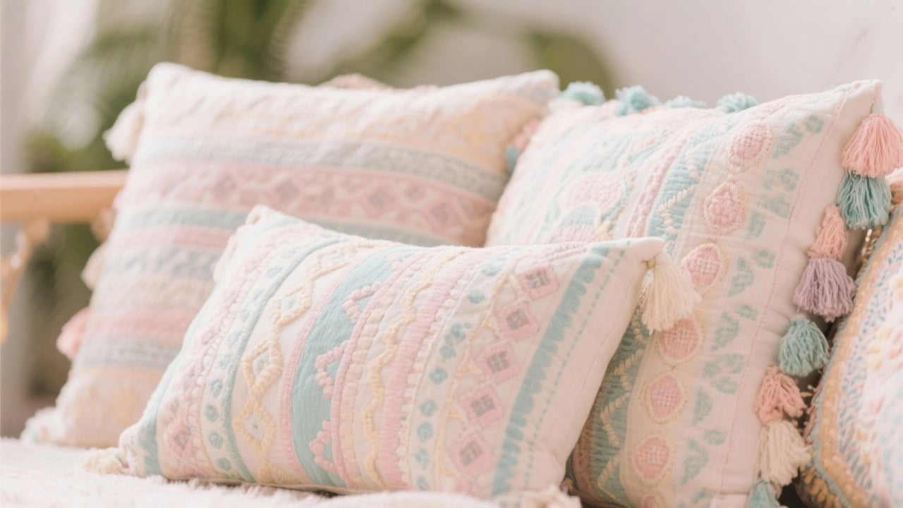
Whilst jewel tones capture one direction of boho palette evolution, soft pastels represent another equally significant trajectory. Dusty pinks, powder blues, lavender, and peachy tones are appearing in bohemian interiors with surprising frequency, particularly in bedrooms and creative studios. The Dulux Colour Trends 2024 report, released in September 2023, identified “Soft Landing” as a key palette featuring muted pastels designed to create sanctuary-like environments—a concept perfectly aligned with bohemian values of comfort and refuge.
Adelaide-based interior designer Charlotte Coote told Real Living magazine in February 2024 that pastels “bring lightness and airiness to boho spaces without sacrificing warmth or personality.” Coote’s Norwood residence renovation, featured in the magazine’s March issue, demonstrated how dusty pink walls could serve as backdrop for woven wall hangings, vintage Turkish rugs, and potted plants, creating cohesion without uniformity. The success of this approach lies in selecting pastels with grey or brown undertones rather than pure, bright versions, maintaining the earthy quality essential to authentic bohemian aesthetics.
The commercial success of pastel-focused boho collections indicates genuine market appetite for these softer palettes. Byron Bay homewares brand Sage x Clare reported that their “Haze” collection, featuring dusty pinks and soft lilacs, outsold their traditional earth-toned ranges by 34% during the 2023 summer season. Founder Phoebe Bell attributed this success to customers “seeking gentleness and calm in their homes following several years of global uncertainty and disruption.”
Balancing Pastels with Natural Elements
Successfully incorporating pastels into bohemian spaces requires careful balancing with natural materials and textures. According to interior design principles, excessive use of soft colours without grounding elements can make spaces feel insubstantial or overly sweet. Melbourne designer James Treble recommends anchoring pastel walls with substantial natural timber furniture, jute rugs, and terracotta planters. “The contrast between soft colours and robust natural materials creates tension that keeps spaces interesting,” Treble explained during his presentation at the 2024 Australian Design Biennale in March.
Abstract floral art provides an effective vehicle for introducing pastels whilst maintaining bohemian authenticity. Pieces like “Pink Flowers on Green” bridge traditional botanical interests common in boho decor with contemporary colour sensibilities, offering familiarity alongside freshness. The geometric simplification of natural forms in such pieces prevents them from reading as overly conventional or traditional, maintaining the edge and contemporary relevance that characterises evolved bohemian style.


Layering Colours in Contemporary Boho Spaces
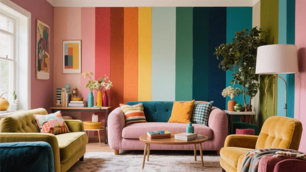
One consistent thread across all emerging boho colour trends is the emphasis on layering—building colour depth through multiple elements rather than relying on single bold statements. This approach reflects bohemian design’s roots in collected, curated spaces that evolve organically over time. Sydney colour therapist Dr. Melissa Zhang, who presented research at the Australian Psychological Society’s 2024 conference in April, noted that layered colour environments “create psychological richness and complexity that supports wellbeing and creativity.”
Practical layering involves introducing colours through various design elements at different scales and intensities. A room might feature a neutral base with soft grey walls, medium-toned natural timber flooring, and cream upholstery, then layer in colour through textiles (cushions, throws, rugs), artwork, plants, and decorative objects. Melbourne styling agency The Design Hunter recommends the 60-30-10 rule adapted for bohemian contexts: 60% neutral base, 30% secondary colour (which might be a soft pastel or muted jewel tone), and 10% accent colour in brighter, more saturated versions of the secondary hue or complementary tones.
Abstract expressionist art supports this layering approach by introducing multiple colours within single pieces, creating visual bridges between different elements in a room. Works like “Deep in Conversation” demonstrate how abstract expressionism can unify diverse colour elements through gestural marks and intuitive colour relationships that echo the organic, unforced feeling central to bohemian aesthetics. For those seeking to understand how abstract art functions within curated spaces, how to create visual interest with abstract art offers detailed guidance.
Seasonal Colour Rotation
An increasingly popular approach among Australian bohemian enthusiasts involves seasonal colour rotation, swapping textiles and smaller decorative elements to refresh spaces without wholesale redesign. Brisbane-based stylist Georgia Cannon advocates for this approach in her 2024 book Evolving Interiors, published by Hardie Grant in February. Cannon suggests maintaining a constant base of natural materials and neutral larger pieces whilst rotating cushion covers, throws, and artwork to reflect seasonal moods—warmer ochres and burgundies for autumn/winter, cooler blues and greens for spring/summer.
This rotation strategy aligns with sustainable design principles increasingly important to environmentally conscious Australian consumers. Rather than discarding pieces when tastes change, seasonal rotation extends the functional life of design elements whilst maintaining visual freshness. Furthermore, this approach acknowledges that colour preferences and psychological colour needs shift with seasons, light quality, and personal circumstances—a nuanced understanding of how colour functions in lived environments rather than static styled photographs.
Australian Influences on Bohemian Colour Evolution
The Australian landscape and cultural context have significantly shaped how bohemian colour palettes evolve locally, creating distinctively Australian interpretations that differ from European or American bohemian aesthetics. The intense quality of Australian light, the distinctive colours of the native landscape, and the coastal lifestyle that influences much of the population’s daily experience all contribute to unique colour preferences and combinations.
Perth-based colour researcher Dr. Anthony Lee from Curtin University published findings in the Journal of Environmental Psychology in December 2023 demonstrating that Australians exposed to coastal environments showed preference for colour palettes that included both warm earth tones and cooler oceanic hues—precisely the expanded palette emerging in contemporary Australian boho interiors. Lee’s research suggests that authentic Australian bohemian style naturally incorporates blues and blue-greens alongside traditional warm tones, reflecting the nation’s coastal geography and lifestyle.
Indigenous Australian art has also influenced contemporary boho colour sensibilities, with ochre yellows, burnt oranges, and deep browns gaining prominence alongside less traditional colours. The 2023 “Songlines” exhibition at the Art Gallery of New South Wales, which ran from July through October, showcased contemporary Indigenous artists working with both traditional and expanded palettes. Several Sydney and Melbourne interior designers interviewed for this article cited the exhibition as influential in their approach to bohemian colour, particularly the sophisticated use of ochre yellows and burnt umber alongside cooler tones.
Coastal bohemian style, sometimes termed “boho beach” or “coastal boho,” represents perhaps the most distinctively Australian contribution to global bohemian design evolution. This aesthetic freely mixes the textiles, patterns, and layered quality of traditional bohemian design with the lighter, breezier palette of coastal interiors. Colours include sandy neutrals, driftwood greys, oceanic blues and teals, and sun-bleached pastels. Gold Coast designer Emma Blomfield’s “Saltwater Bohemian” collection, launched in January 2024, exemplifies this approach, featuring linens in dusty aqua, shell pink, and warm sand tones alongside traditional boho patterns and textures. Those interested in this coastal interpretation can explore abstract beach art and coastal wall art for complementary pieces.
Urban Bohemian Colour Adaptations
Australian urban environments have fostered another colour evolution within bohemian design. Melbourne’s laneway culture, Sydney’s warehouse conversions, and Brisbane’s subtropical urbanism have all influenced how bohemian colour palettes adapt to city living. Urban bohemian style often incorporates more sophisticated neutrals—charcoals, slate greys, and warm blacks—alongside traditional boho elements, creating spaces that feel both relaxed and cosmopolitan.
The “New Bohemia” development in Melbourne’s Fitzroy, completed in August 2023, showcased this urban interpretation across multiple apartments. Interior designer Clare Cousins, responsible for the display suite styling, used deep charcoal walls as backdrop for colourful kilim rugs, brass fixtures, and abundant greenery, demonstrating how darker, more urban colours can ground bohemian eclecticism in contemporary city contexts. Cousins told Architecture AU in September 2023 that urban bohemian style “acknowledges we’re not living in desert tents or beachside shacks, but brings that freedom and warmth into actual urban Australian life.” Understanding how to coordinate these diverse elements benefits from resources like how to coordinate abstract art with furniture, which addresses practical integration challenges.
Abstract expressionist and bold statement pieces particularly suit urban bohemian contexts, providing colour impact and artistic credibility that resonates with city dwellers’ cultural engagement. Works featuring gestural marks, layered colours, and dynamic compositions bring energy and personality that prevent urban boho spaces from feeling too serious or studied, maintaining the spontaneity and individuality central to bohemian philosophy across all its interpretations.
 | Joseph Russell Joseph is an Australian abstract artists and curator of the Inomaly art collection. |