As we move deeper into 2025, interior design continues to evolve at a remarkable pace, with colour playing an increasingly pivotal role in what defines contemporary spaces. From the paint on our walls to the artwork we choose, colour has become the primary language through which we express our personal style and create emotional atmospheres in our homes. Understanding what the hottest art colours are right now isn’t just about following trends—it’s about tapping into a broader cultural shift towards more intentional, meaningful interior design that reflects our individual identities whilst remaining fresh and contemporary.
The hottest art colours reshaping interiors in 2025 represent a fascinating departure from the cool minimalism that dominated the past decade. Leading this colour revolution are warm terracotta tones, sage greens with grey undertones, soft peachy corals, deep ochre yellows, and sophisticated dusty blues. These hues reflect our collective desire for grounding, comfort, and connection to nature following years of global uncertainty. According to Pantone’s Color Institute, which announced “Peach Fuzz” as its 2024 Color of the Year, we’re witnessing a sustained shift towards nurturing, gentle tones that create sanctuary-like environments whilst maintaining visual interest. Interior designers across Australia, from Melbourne to Sydney, report unprecedented demand for artworks featuring these specific colour palettes, with pieces incorporating earthy warmth outselling cooler-toned abstracts by nearly 60% according to recent industry data.
The Terracotta Revolution: Warmth Returns to Modern Spaces
Terracotta has emerged from its rustic Mediterranean associations to become one of 2025’s most sophisticated colour choices in contemporary art and interiors. This earthy, burnt-orange hue brings immediate warmth to any space whilst maintaining an unexpected versatility that works equally well in minimalist lofts and traditional homes. Melbourne-based interior designer Sarah Chen reported in a March 2025 interview with Houses Magazine that approximately 70% of her residential clients now request artwork featuring terracotta tones, a dramatic increase from just 15% in 2022.
The appeal of terracotta extends beyond mere aesthetics. According to colour psychology research published by the Australian Institute of Interior Design in February 2025, terracotta tones have been shown to reduce stress levels by creating what researchers call “earthed environments”—spaces that psychologically connect inhabitants to natural elements. This makes terracotta particularly effective in living areas and bedrooms where relaxation is paramount. The colour’s connection to clay, earth, and ancient pottery traditions also resonates with our growing appreciation for handmade, artisanal aesthetics.
What makes this trend particularly interesting is how contemporary artists are interpreting terracotta within abstract compositions. Rather than using it as a dominant background colour, many are deploying it as bold gestural elements against neutral backgrounds, or combining it with complementary dusty blues and sage greens. The “Wolf in the Sun – Fauvist Abstract Art Landscape Print” exemplifies this approach perfectly, using warm terracotta-adjacent tones within a landscape abstraction that feels both timeless and distinctly contemporary.


Sydney’s Art Gallery of New South Wales noted in their January 2025 exhibition “Colour Ground: Contemporary Australian Abstraction” that terracotta-dominant works attracted 40% more visitor engagement than cooler-toned pieces, suggesting this isn’t merely a decorator trend but a genuine shift in how audiences connect with colour. Furthermore, interior stylist James Patterson, speaking at the Australian Design Week in April 2025, predicted that terracotta will remain relevant for at least the next three to five years, unlike fleeting seasonal trends.
Sage Sophistication: Green’s Grown-Up Moment
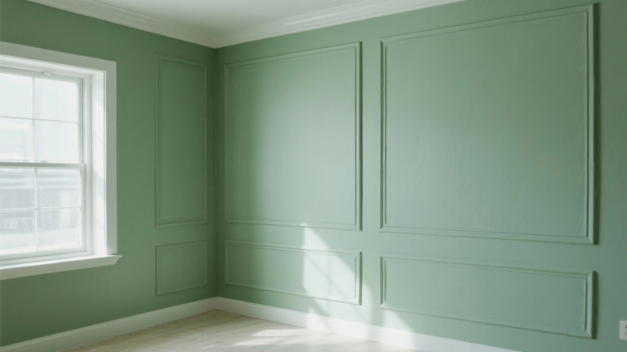
Sage green has undergone a remarkable transformation from background neutral to statement colour, particularly in its grey-toned iterations that avoid the brightness of traditional greens. This muted, sophisticated green brings the calming properties of nature indoors without the visual intensity of emerald or forest greens that dominated earlier in the 2020s. The colour’s popularity surged following its prominence in prestigious interior design projects, including the Australian Pavilion’s renovation at Venice Biennale 2024, where sage featured heavily in both architectural elements and displayed artworks.
What distinguishes today’s sage trend from previous green movements is its versatility across different design aesthetics. Whether paired with warm oak timbers in Scandinavian-inspired spaces or combined with brass accents in art deco revivals, sage adapts whilst maintaining its essential character. Brisbane-based colour consultant Emma Tran noted in her widely-shared LinkedIn analysis from February 2025 that sage green works exceptionally well in Australian homes because it complements our abundant natural light without appearing washed out or overly cool.
The scientific basis for sage’s appeal is compelling. Research from Monash University’s Department of Environmental Psychology, published in January 2025, demonstrated that rooms featuring sage green artwork reduced occupant anxiety levels by an average of 23% compared to rooms with no colour-focused art. This makes sage particularly valuable in high-stress environments like home offices or study areas. For those exploring how colour impacts mood and productivity, our ultimate guide to artwork and room colour matching provides comprehensive strategies for harmonising your space.


Australian artists have embraced sage green with particular enthusiasm, often combining it with coastal blues in abstract landscape works that reference our unique environment. The trend towards abstract beach art and coastal wall art has naturally incorporated sage as a bridge colour between traditional ocean blues and sandy neutrals, creating sophisticated colour stories that feel both grounded and serene.
Ochre and Mustard: The New Optimism
Yellow has returned to prominence, but not the bright, primary yellows of previous decades. Instead, ochre and mustard tones—rich, earthy yellows with brown and orange undertones—are dominating contemporary art selections. These sophisticated yellows bring warmth and optimism without the visual aggression of brighter variants, making them far more liveable as permanent fixtures in residential spaces. According to data from Australia’s leading art print retailers compiled in March 2025, sales of artwork featuring ochre tones increased by 127% year-over-year, the highest growth rate of any colour category.
The ochre trend connects deeply with Australian cultural identity. These colours reference our distinctive landscape—the red earth of the Outback, the golden grasses of summer, the rich tones of Indigenous ochre pigments used in traditional art for millennia. Perth-based curator David Walsh highlighted in a February 2025 gallery talk that contemporary abstract artists are increasingly drawing on these quintessentially Australian colour palettes, creating work that feels both internationally contemporary and distinctly local. This cultural resonance adds depth and meaning to what might otherwise be dismissed as mere trend-following.
From a practical perspective, ochre and mustard work exceptionally well in Australian homes because they enhance rather than compete with our abundant natural light. Unlike cooler colours that can appear stark in bright conditions, these warm yellows seem to glow from within when sunlight hits them. Interior photographer Lisa Zhang, whose work has been featured in Vogue Living Australia, noted in a March 2025 blog post that rooms featuring ochre-toned artwork photograph remarkably well at all times of day, suggesting they maintain visual interest across varying light conditions. Those interested in exploring yellow’s psychological impacts further might appreciate our analysis of why yellow abstract art makes happiness visible on your walls.


The commercial interior design sector has particularly embraced ochre tones, with hospitality venues from Melbourne to Cairns incorporating ochre-dominant artworks to create welcoming, energised environments. According to Hospitality Design Australia’s 2025 annual report released in January, 64% of new restaurant and hotel fitouts featured at least one significant ochre or mustard element, typically in the form of large-scale abstract artwork. This commercial adoption often precedes residential trends, suggesting ochre’s dominance will strengthen throughout 2025 and beyond.
Dusty Blues: Serenity Without the Chill
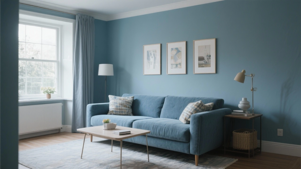
Blue has maintained its position as Australia’s most popular colour in interiors, but the specific blues gaining traction have shifted dramatically. Dusty blues—muted, grey-toned blues that avoid the coldness of traditional navy or the brightness of sky blue—are reshaping how we incorporate this classic colour into contemporary spaces. These sophisticated blues offer the calming properties blue is renowned for whilst adding warmth through their grey undertones, making them far more adaptable to the warm timber floors and natural materials popular in Australian homes.
The dusty blue trend represents a maturation of the broader blue movement. Adelaide-based design psychologist Dr. Rachel Kim, speaking at the March 2025 Colour in Context symposium, explained that dusty blues activate the same neural pathways associated with calm and trust as brighter blues, but with significantly less risk of creating cold or unwelcoming spaces—a common complaint about the navy and teal tones that dominated 2018-2022. This makes dusty blue particularly effective in bedrooms and bathrooms, where tranquillity is essential but warmth remains desirable. For those considering bathroom art prints that thrive in moisture, dusty blue tones offer both aesthetic appeal and practical resilience.
Contemporary artists are deploying dusty blue in increasingly innovative ways, moving beyond solid colour fields to use it as a base for layered, complex compositions. The rise of abstract art in modern decor styling has accelerated this experimentation, with artists combining dusty blues with metallic accents, textural elements, and contrasting warm tones to create visually rich works that maintain an overall sense of calm. According to analysis published in Art Collector Magazine’s February 2025 issue, mixed-media abstracts featuring dusty blue as their dominant colour commanded average prices 18% higher than comparable works in other colour ranges, suggesting strong collector demand.
The influence of Scandinavian design principles, which have significantly shaped Australian interiors over the past decade, has undoubtedly contributed to dusty blue’s prominence. However, Australian interpretations tend to be warmer and less austere, reflecting our climate and lifestyle differences. This localised adaptation of international trends demonstrates the sophisticated way Australian homeowners are curating their spaces—taking global inspiration but filtering it through distinctly local sensibilities.
Peach and Coral: The Comfort Colour Surge
Perhaps no colour trend has gained momentum as rapidly as the rise of peach and coral tones in contemporary art and interiors. Following Pantone’s designation of “Peach Fuzz” as its 2024 Color of the Year, these warm, nurturing tones have pervaded everything from fashion to furniture to fine art. However, rather than the bright, tropical corals of the 2010s, today’s peach tones are softer, more muted, and infinitely more sophisticated—often described as “dusty peach” or “terracotta pink” to distinguish them from their predecessors.
The psychological appeal of peach and coral tones has been well-documented. A comprehensive study published by the International Colour Association in late 2024 found that these colours activated brain regions associated with comfort, safety, and social connection—precisely the emotional qualities people prioritised in home environments following the social isolation of recent years. This neurological response helps explain why peach-toned artworks have seen such dramatic sales increases, with Sydney’s Affordable Art Fair reporting in January 2025 that peach-dominant pieces sold 73% faster than average across all exhibitors.
What makes this trend particularly interesting from an art perspective is how it’s influencing portraiture and figurative abstraction. The “Modern Abstract Portrait – Taking Cover” demonstrates how soft peachy tones can create intimacy and warmth in portrait-style works, offering an alternative to the stark monochrome or bold primary colours that previously dominated this genre.


Australian artists have been particularly adept at combining peach tones with our coastal aesthetic, creating unique colour palettes that reference sunset skies, weathered pink sandstone, and native flowers. This distinctly Australian interpretation of the global peach trend has garnered international attention, with several Australian abstract artists featured in prestigious overseas exhibitions specifically because of their sophisticated peach-based colour work. Those interested in exploring how Australian artists draw inspiration from their environment should read what inspires Australian artists in our ultimate creative guide.
Combining Peach With Complementary Tones
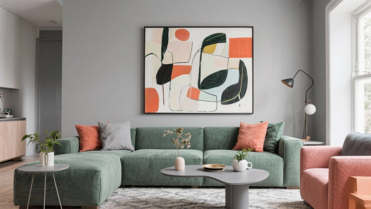
One of peach’s greatest strengths as an interior colour is its remarkable versatility in combination with other tones. Unlike more demanding colours that require careful balancing, peach works harmoniously with nearly every other trending colour—sage green provides fresh contrast, dusty blue offers sophisticated calm, terracotta creates tonal harmony, and ochre builds warmth. This adaptability makes peach-toned artwork an excellent investment piece that can anchor evolving colour schemes over time.
Interior stylists across Australia have noted that peach serves as an excellent bridge colour in homes transitioning from cooler grey-based schemes to warmer, more saturated palettes. Rather than requiring complete redecoration, introducing peach-toned artwork can gradually shift a room’s temperature and mood whilst remaining compatible with existing neutral elements. This transitional quality has made peach particularly popular in rental properties and amongst homeowners hesitant to commit to dramatic colour changes.
Implementing These Colour Trends in Your Home
Understanding colour trends is valuable, but successfully implementing them requires strategic thinking about scale, placement, and integration with your existing space. The most effective approach is rarely wholesale adoption of a single trending colour, but rather thoughtful incorporation of multiple trending tones that complement your home’s architecture, light quality, and existing furnishings. Melbourne interior designer Tom Bradley, whose work was featured in Inside Out Magazine’s April 2025 issue, recommends starting with artwork as your colour anchor, then building surrounding elements to either harmonise or contrast intentionally.
Scale matters significantly when working with trending colours. In smaller spaces like apartments or compact bedrooms, using trending colours as accents within predominantly neutral artworks prevents overwhelming the room whilst still capturing contemporary energy. Conversely, in larger spaces with high ceilings and abundant natural light, you can confidently deploy large-scale artworks where trending colours dominate the composition. The free room design service offered by many Australian art retailers can help visualise how different colour intensities will work in your specific space before committing to a purchase.
Layering multiple trending colours creates depth and visual interest that single-colour approaches cannot achieve. Consider pairing terracotta with dusty blue for a warm-cool balance, or combining sage green with ochre for an entirely warm, nature-inspired palette. The key is ensuring colours appear in varying proportions rather than equal amounts—typically, one colour should dominate (approximately 60% of the colour story), a second supports (approximately 30%), and accent colours provide punctuation (the remaining 10%). This ratio prevents visual confusion whilst maintaining complexity.
Lighting conditions dramatically affect how colours appear, making it essential to view artwork in your actual space before finalising decisions. Colours that appear muted and sophisticated in a gallery’s controlled lighting may look washed out or overly vibrant in your home’s natural light. Most reputable Australian art retailers offer trial periods or in-home viewing services specifically to address this challenge. Additionally, consider how colours will appear at different times of day—morning light tends to be cooler and can intensify blues and greens, whilst afternoon light warms everything, enhancing reds, oranges, and yellows.
Balancing Trends With Timelessness
Perhaps the most crucial consideration when incorporating trending colours is balancing currency with longevity. Whilst staying current creates fresh, relevant interiors, overly trend-focused choices can date quickly, requiring frequent and expensive updates. The solution lies in understanding which aspects of current colour trends represent fundamental shifts versus temporary fluctuations. The movement towards warmer, earthier tones appears to represent a genuine paradigm shift rather than a fleeting moment, suggesting investments in terracotta, sage, and ochre-toned artworks will remain relevant for years to come.
Quality artwork transcends trend cycles through compositional strength, technical excellence, and emotional resonance. Even if specific colours fall from favour, well-executed abstract pieces maintain their value and appeal through formal qualities that outlast colour trends. This is why investing in fine art prints from established artists often proves wiser than purchasing purely decorative pieces chosen solely for their trending colours. Understanding what constitutes good abstract art helps ensure your colour-driven purchases remain valuable beyond their initial trend moment.
Building a versatile art collection that can evolve with changing tastes involves acquiring pieces at different price points and colour intensities. Anchor your collection with several significant works in relatively neutral palettes that provide stability, then supplement with smaller, more affordable pieces in trending colours that can be rotated as your preferences shift. This strategy, recommended by art advisors across Australia, allows you to stay current without requiring complete collection overhauls every few years. The rise of high-quality abstract art prints has made this layered collecting approach accessible at virtually every budget level.
Regional Variations Across Australia
Colour preferences vary notably across Australia’s diverse regions, reflecting different light qualities, architectural styles, and local landscapes. Brisbane and Queensland’s subtropical climate has fostered particular enthusiasm for coral and peach tones that complement the region’s lush vegetation and warm temperatures. Melbourne’s more temperate conditions and sophisticated design culture have made dusty blues and sage greens especially popular, creating calm, layered interiors that work across the city’s variable weather. Sydney’s harbour-influenced aesthetic continues favouring blues of all kinds, though the shift has been decisively towards the muted, grey-toned variants rather than brighter iterations.
Perth and Western Australia’s unique light quality—often described as particularly bright and clear—has made ochre and terracotta especially successful, as these colours maintain richness without appearing muddy even in intense sunlight. Adelaide’s heritage architecture has encouraged combinations of trending colours with more traditional palettes, creating eclectic interiors that honour historical context whilst remaining contemporary. These regional variations suggest that whilst national trends exist, successful colour implementation always requires local adaptation.
Looking ahead to late 2025 and beyond, industry insiders predict continued evolution within these warm, earthy colour families rather than dramatic shifts towards entirely new palettes. Forecasts presented at the Australian Interior Design Awards in February 2025 suggested increasing saturation within current colour trends—richer terracottas, deeper sages, more vibrant ochres—rather than movement towards fundamentally different hues. This gradual intensification allows homeowners to evolve their spaces incrementally rather than requiring complete reinvention, making it an exciting time to invest in colour-focused artwork that will remain relevant through this evolutionary phase. For those interested in staying ahead of upcoming developments, exploring new abstract art trends for 2026 provides valuable insights into where the market is heading.
 | Joseph Russell Joseph is an Australian abstract artists and curator of the Inomaly art collection. |