
Every element in a minimalist home serves a purpose—including your choice of wall art. Empty spaces aren’t failures of decoration; they’re deliberate design decisions that create visual breathing room and mental clarity. The right minimalist art style doesn’t fight against your carefully edited aesthetic but enhances the calm, purposeful feeling that defines minimalist interiors.
The most effective art styles for minimalist homes share three qualities: restraint in composition, intentional use of space, and focus on essential elements. This includes monochromatic abstracts, line art, geometric compositions, colour field works, Japanese-inspired minimalism, textural neutrals, and negative space artworks. Each interprets “less is more” differently, offering distinct ways to improve bare walls without cluttering the balanced aesthetic minimalist homeowners cultivate.
Monochromatic Abstracts: The Power of Single-Hue Sophistication
Monochromatic abstract art represents minimalism’s purest approach—working within a restricted palette to create visual interest through tonal variation rather than colour contrast. Artists like Mark Rothko and Agnes Martin demonstrated that limiting colour choices amplifies emotional impact. In practice, monochromatic works create visual continuity with minimalist interiors, becoming an extension of the architectural environment rather than a separate decorative element.
The strength of monochromatic abstracts lies in their ability to create depth through subtle gradations of a single colour family. A charcoal abstract might shift from deep graphite to soft dove grey, creating layers that reward close observation without demanding immediate attention. These pieces work well in open-plan spaces where visual continuity matters, and they pair seamlessly with natural materials like concrete, timber, and stone that define minimalist architecture.
When selecting monochromatic art, consider how the chosen hue interacts with your existing palette. Cool greys complement industrial minimalism, whilst warm beiges and taupes soften Scandinavian-inspired spaces. The texture within the monochrome becomes crucial—brushstrokes, paper quality, and printing techniques all contribute subtle visual interest that prevents flatness. For guidance on how specific colours influence spatial perception, explore our comprehensive guide on colour transformation.
Line Art: Essential Forms Without Excess
Line art distils visual communication to its most fundamental element: the line itself. This reductive approach aligns perfectly with minimalist philosophy, eliminating everything except what’s absolutely necessary to convey form, movement, or concept. Contemporary line art ranges from continuous single-line drawings to carefully composed arrangements of parallel or intersecting lines that create rhythm across empty wall space.
The power of line art in minimalist homes comes from its graphic clarity and architectural quality. A well-executed line drawing creates visual interest without adding visual weight, making it ideal for smaller spaces or areas where you want to maintain an airy feeling. These works often incorporate significant negative space, allowing the wall colour itself to become part of the composition—a technique that enhances rather than fills empty spaces.
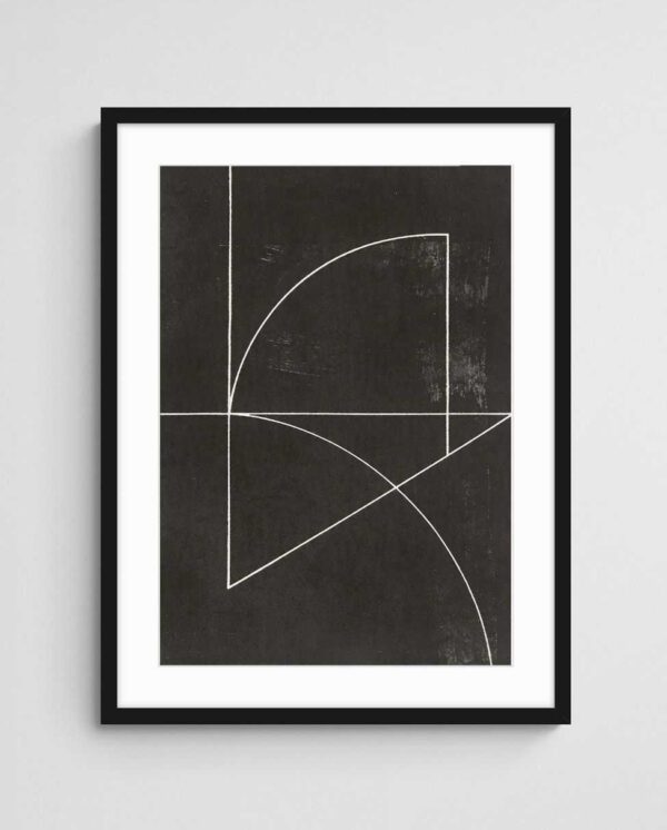

Line art works exceptionally well in monochromatic interiors where you need a focal point without disrupting colour harmony. Black line art on white backgrounds creates maximum contrast whilst maintaining minimalist restraint, particularly effective in entryways or above minimalist furniture where clean lines echo throughout the design. The “Crossing Paths 9” exemplifies this approach, using intersecting linear elements that create movement without clutter, perfect for narrow hallways or compact living spaces.
Geometric Compositions: Structured Simplicity
Geometric abstract art brings mathematical precision and order to minimalist interiors, offering patterns that complement the clean lines typical of minimalist architecture. This style traces its heritage to De Stijl and the Bauhaus movement, where artists reduced visual language to basic shapes—circles, squares, triangles—arranged in balanced compositions that feel both modern and timeless.
Contemporary geometric minimalism has evolved beyond the rigid primary colours of early modernism, embracing muted palettes and softer geometries that feel more liveable. Overlapping circles in neutral tones, stacked rectangles in earth colours, or grid patterns with irregular spacing all maintain geometric discipline whilst introducing warmth and accessibility. These compositions work particularly well in spaces with strong architectural features, where the geometric art reinforces existing structural lines.
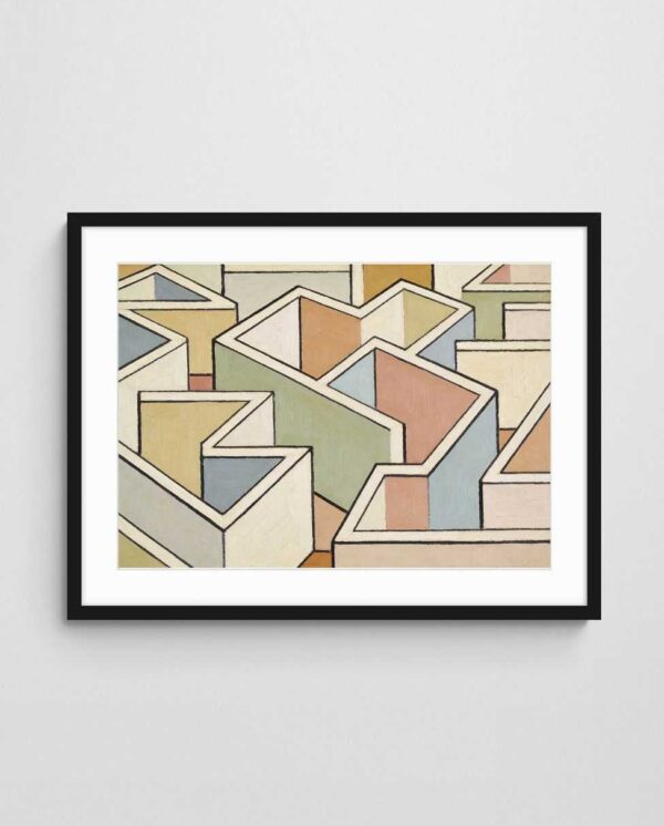
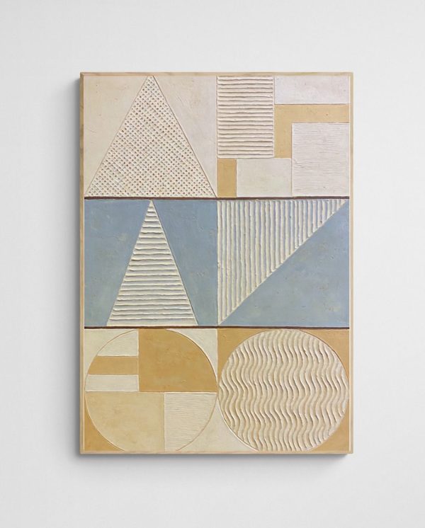
The “Geometric Harmony – Mid Century Pastel Geometric Abstract Art Print” demonstrates how geometric art can remain minimalist whilst incorporating colour, using soft pastels within clearly defined shapes that create visual interest without overwhelming the senses. This approach works brilliantly in minimalist bedrooms or meditation spaces where you want gentle visual stimulation. Geometric art also scales beautifully, maintaining its impact whether displayed as a single large piece or arranged in a grid formation across an empty wall expanse.
Colour Field Minimalism: Meditative Expanses
Colour field painting represents minimalism at its most reductive—large expanses of colour with minimal compositional complexity. This style prioritises emotional and psychological impact over narrative or representation, creating meditative works that transform empty walls into zones of contemplation. The approach works because it doesn’t compete for attention; instead, it provides a consistent visual anchor that grounds a minimalist space.
In minimalist homes, colour field works function almost architecturally, similar to an accent wall but with more nuance. A soft blush field creates warmth in a predominantly white interior, whilst a deep navy field adds gravitas to a neutral palette. The lack of focal points or compositional hierarchy means these works never tire the eye—they simply exist as a harmonious backdrop to daily life, much like the carefully considered wall colours minimalists select.
What makes colour field art particularly suited to minimalist aesthetics is its emphasis on quality of colour over quantity of elements. A single, beautifully rendered expanse of colour demonstrates restraint and confidence—hallmarks of minimalist design. These pieces work especially well in open-plan living areas where the art must remain visible from multiple angles and distances. For insights on coordinating these colour statements with your existing furnishings, our guide on coordinating abstract art with furniture offers practical strategies.
Japanese-Inspired Minimalism: Wabi-Sabi Aesthetics
Japanese minimalism brings philosophical depth to the minimalist art conversation, rooted in concepts like wabi-sabi (finding beauty in imperfection) and ma (the meaningful void). This approach differs from Western minimalism’s often clinical precision, introducing organic irregularity, natural materials, and acceptance of asymmetry. Japanese-inspired minimalist art might feature subtle brush strokes, traditional ink techniques, or compositions that deliberately embrace empty space as an active design element.
The wabi-sabi aesthetic particularly resonates in minimalist homes that want to avoid feeling sterile. Art incorporating natural imperfections—irregular edges, visible brushwork, or hand-drawn elements—adds human warmth whilst maintaining minimalist restraint. These works often feature natural imagery abstracted to essential forms: a suggestion of bamboo rendered in simple brush strokes, mountains reduced to geometric silhouettes, or water represented through flowing lines.
Implementing Japanese-inspired minimalism requires understanding ma—the space between objects that’s considered as important as the objects themselves. In practice, this means choosing art that doesn’t fill the frame edge-to-edge, leaving breathing room within the composition itself. This internal negative space mirrors the external empty spaces you’re maintaining in your minimalist interior, creating a cohesive visual philosophy. For those drawn to coastal minimalism with Japanese sensibilities, exploring Scandinavian art prints reveals complementary approaches to understated elegance.
Textural Neutrals: Subtle Dimension
Textural neutral art brings tactile dimension to minimalist spaces without introducing colour complexity. This style focuses on surface quality—subtle variations in tone, material layering, or printing techniques that create visual interest through texture rather than hue or form. Artworks featuring natural linen textures, paper with visible fibres, or printing techniques that add dimensional quality to otherwise flat surfaces fall into this category.
The appeal of textural neutrals in minimalist interiors comes from their ability to add warmth and sophistication whilst maintaining colour discipline. A cream artwork with visible texture reads as far more interesting than a flat cream print, yet it doesn’t disrupt a carefully curated neutral palette. These pieces work particularly well in spaces dominated by smooth surfaces—polished concrete, glass, or painted walls—where the textural contrast becomes a design feature in itself.
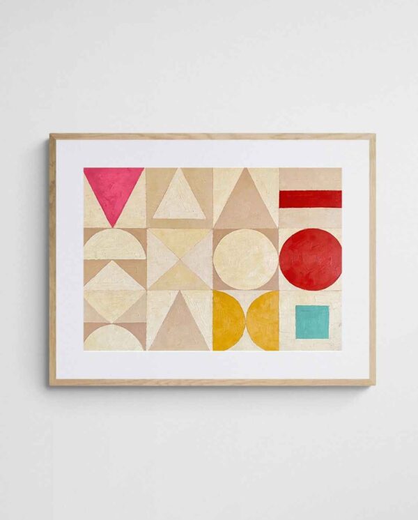

When selecting textural neutral art, consider how natural and artificial lighting interacts with the piece throughout the day. Texture becomes more apparent with angled lighting, creating subtle shadows that change as light moves across the surface. This dynamic quality prevents minimalist spaces from feeling static, introducing gentle variation without clutter. Textural neutrals also pair beautifully with minimalist furniture in natural materials—the visual connection between textured art and timber grain or woven textiles creates cohesion. Our collection of art specifically curated for neutral interiors demonstrates how subtle variation elevates restrained palettes.
Negative Space Artworks: Celebrating Emptiness
Negative space art makes emptiness its primary subject, using unmarked areas as actively as marked ones. This approach aligns philosophically with minimalist design principles, where what you choose to exclude matters as much as what you include. These compositions might feature a small element positioned in vast empty space, or they might use the relationship between positive and negative space to create optical interest.
The power of negative space artworks lies in their ability to make empty wall space feel intentional rather than incomplete. When you hang a piece that itself celebrates emptiness, the surrounding bare wall becomes part of an extended composition rather than an area waiting to be filled. This psychological shift is crucial for minimalists who often face questions about why walls remain unfilled.
Effective negative space art requires confident composition—the artist must make deliberate choices about where to place elements within the frame, understanding that empty areas carry as much visual weight as occupied ones. In minimalist homes, these works function almost like visual punctuation, creating emphasis through restraint. They work particularly well in transition spaces like hallways or staircases, where you want visual interest without congestion. For comprehensive strategies on creating impact in these often-overlooked areas, our guide on transforming blank hallways into gallery walls offers targeted approaches that honour minimalist principles whilst maximising empty wall potential.
Choosing the Right Style for Your Space
Selecting among these minimalist art styles requires understanding your specific space’s characteristics and your personal minimalist philosophy. A clinical, architectural minimalism calls for different art choices than a warm, Scandinavian-inspired minimalism. Consider the existing materials in your space—concrete and steel suggest different art approaches than timber and linen. The room’s function also matters; meditative colour field works suit bedrooms whilst geometric compositions might energise home offices.
Scale considerations become crucial in minimalist interiors where each element receives heightened attention. A single large artwork often serves minimalist spaces better than multiple smaller pieces, maintaining visual simplicity whilst providing adequate impact. However, this depends on your wall dimensions and sight lines. In practice, minimalist art should feel like it belongs in the space naturally, not like it’s been added to fill a void.


Testing potential art choices involves more than aesthetic preference—consider how the piece makes the space feel. Does it enhance the sense of calm and order you’re cultivating? Does it complement your existing colour palette without disrupting it? Can you imagine living with the piece long-term without it feeling trendy? Minimalism’s enduring appeal comes from choosing timeless elements that transcend temporary trends. For specific advice on incorporating abstract art prints into minimalist schemes, our curated collection demonstrates how quality abstract works enhance rather than compromise minimalist integrity.
Room-by-Room Style Recommendations
Different rooms benefit from different minimalist art approaches based on function and atmosphere. Living areas often accommodate slightly more visual interest—geometric compositions or line art that rewards extended viewing. Bedrooms typically benefit from the most serene choices—monochromatic abstracts, colour field works, or textural neutrals that promote relaxation rather than stimulation.
Minimalist kitchens and dining areas present unique challenges because they already contain necessary visual complexity through cabinetry, appliances, and dining furniture. Here, negative space artworks or simple line drawings prevent visual overload whilst maintaining your carefully edited aesthetic. Home offices require consideration of whether you want energising or calming art—geometric compositions can promote focus and productivity, whilst Japanese-inspired minimalism creates contemplative work environments.
Framing and Display Considerations
Framing choices significantly impact how minimalist art functions in your space. Simple frames in natural timber, matte black, or white maintain focus on the artwork itself without adding decorative distraction. In some cases, frameless mounting or float frames create the cleanest presentation, particularly for geometric or colour field works where the frame might compete with internal composition.
Display height and spacing follow minimalist principles of intention and precision. Art hung at consistent heights throughout your home creates visual harmony, whilst thoughtful spacing between pieces (when displaying multiple works) prevents cluttered appearance. A common minimalist mistake is hanging art too small for the wall space—better to have one appropriately scaled piece than several undersized works that disrupt spaciousness. Understanding how to select large-scale art that fits your walls properly ensures your minimalist art choices achieve maximum impact without compromising your aesthetic vision.
Comparison Table: Minimalist Art Styles at a Glance
| Art Style | Key Characteristics | Best Suited Rooms | Visual Impact |
|---|---|---|---|
| Monochromatic Abstracts | Single-colour palette, tonal variation, depth through subtlety | Living rooms, open-plan spaces | Sophisticated, cohesive |
| Line Art | Essential forms, graphic clarity, significant negative space | Entryways, hallways, compact spaces | Clean, architectural |
| Geometric Compositions | Mathematical precision, balanced arrangements, muted palettes | Bedrooms, home offices | Structured, modern |
| Colour Field | Large colour expanses, minimal composition, meditative quality | Open-plan areas, meditation spaces | Calming, architectural |
| Japanese-Inspired | Wabi-sabi imperfection, meaningful voids, organic irregularity | Bedrooms, reading nooks | Warm, philosophical |
| Textural Neutrals | Surface variation, tactile dimension, neutral palettes | Any room with smooth surfaces | Sophisticated, warm |
| Negative Space | Emptiness as subject, intentional composition, visual punctuation | Hallways, staircases, transition spaces | Confident, intentional |
Maintaining Minimalist Integrity Over Time
Successfully implementing minimalist art requires ongoing discipline as your space evolves. Resist the temptation to fill every wall simply because space exists—minimalism’s power comes from restraint. When considering new additions, apply the minimalist principle of “one in, one out” to prevent gradual accumulation that undermines your carefully curated aesthetic. Regular editing ensures your art collection remains purposeful rather than accidental.
Seasonal rotations can refresh minimalist spaces without adding permanent complexity. Swapping between two carefully selected pieces allows you to experience variety whilst maintaining the discipline of having only one artwork per wall at any given time. This approach also extends the psychological lifespan of your art collection—pieces feel new again after months in storage, preventing visual fatigue that can come from seeing the same artwork daily.
Start by selecting one artwork that genuinely resonates with you, then live with it for at least three months before adding another piece. This forces intentional selection rather than impulse decisions, ensuring every artwork truly enhances your minimalist vision. Pay attention to how the piece affects your mood and the room’s atmosphere—the best minimalist art should feel like a natural part of your space by the second week, not something you consciously notice daily.
 | Joseph Russell Joseph is an Australian abstract artists and curator of the Inomaly art collection. |