
Walk into any lobby and you form a judgement within seconds. The art on the wall does much of that talking. So what prints look good in lobbies, and which ones actually leave clients with a confident impression of your business?
The short answer: choose large-scale abstract prints with a clear visual idea, a controlled colour palette and a connection to your brand. Geometric, monochrome, coastal, botanical and urban styles all perform well. Each one suits a different type of business, so match the style to the message you want clients to receive in their first ten seconds.
Seven Lobby Print Styles That Captivate Clients
Each style below carries a different personality. Read them with your own clientele in mind. A law firm and a design studio should not greet visitors with the same wall.
1. Bold Geometric Abstracts
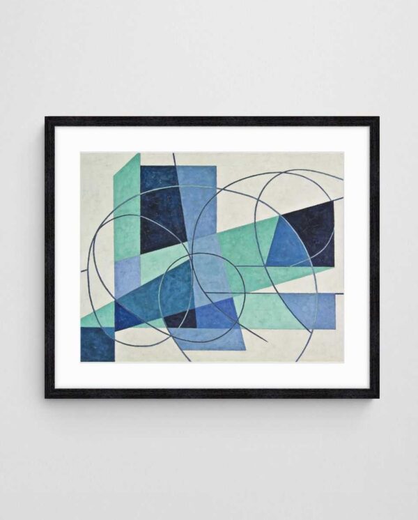
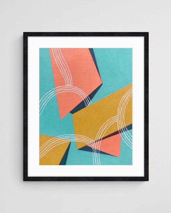
Geometric prints signal order, precision and confidence. They suit accountants, engineers, financial advisers and technology firms. Clean shapes read well from across a room, which matters in a lobby where people rarely stand close to the wall.
“Geo Contrast 1” is a strong example. Its minimalist composition and bold contrast give a reception wall structure without clutter. For the history behind these forms, see our explanation of hard edge painting and bold forms.


2. Monochrome and Black and White Prints
Black and white art is the safest route to a professional lobby. It pairs with almost any flooring, joinery and signage. In practice, it also ages well, so you will not feel pressure to redecorate when brand colours shift.
“Ink Ribbons” brings movement and texture to a neutral palette, which stops monochrome from feeling cold. Explore our black and white art prints or read how monochrome art transforms minimalist spaces.
3. Coastal and Abstract Landscape Prints
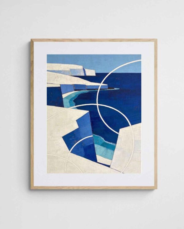
Calm landscapes lower tension for visitors who may be nervous. Health clinics, wellness studios and real estate agencies benefit most. Soft blues, sandy neutrals and open horizons suggest trust and space.
- Choose muted blues and greens for a calming first impression.
- Select horizontal formats to widen narrow lobbies.
- Avoid busy detail that competes with reception staff.
Our abstract beach art and coastal wall art collection offers plenty of calm options. Likewise, landscape prints that reshape your space shows how horizon lines change a room.


4. Native Australian Botanical Prints
Native florals add warmth and local identity. They work well for tourism operators, law firms with regional roots and any business proud of its Australian base. Wattle, banksia and eucalyptus palettes feel fresh without becoming decorative cliché.
“Golden Wattle on Blue” pairs a recognisable national emblem with a strong blue background. As a result, it feels both welcoming and distinctive. Browse our Australian botanical prints for further ideas.
Sizing and Placing Lobby Art for Maximum Impact
5. Colourful Abstract Statement Pieces
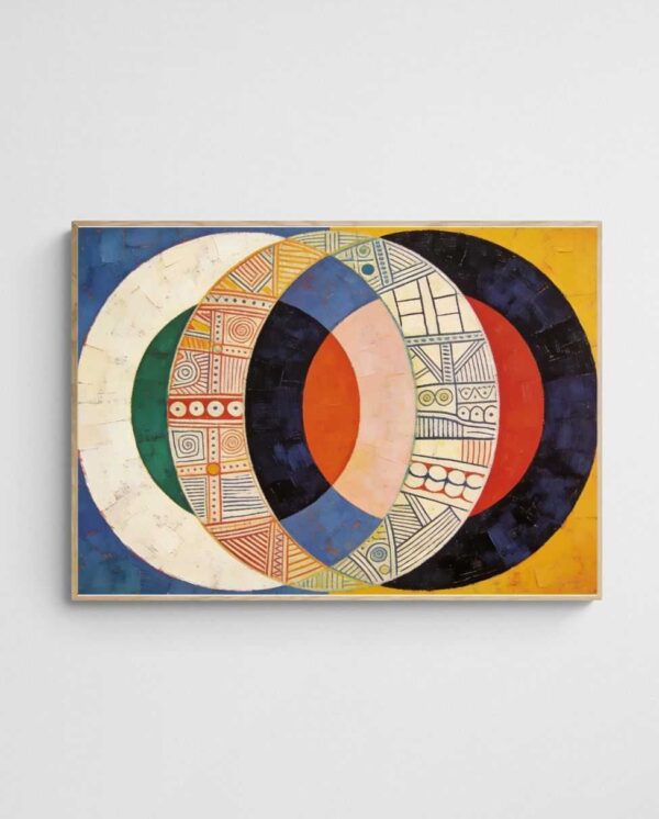
Colour creates energy. Creative agencies, hospitality groups and start-ups use vibrant prints to show personality before anyone speaks. Limit yourself to two or three dominant hues, then repeat one of them in furniture or signage.
Our guide to abstract art for creative agency offices goes deeper on this approach. Meanwhile, colours that boost office productivity explains how hue affects staff mood.

6. Urban and Melbourne-Inspired Prints
City scenes suit professional services, architecture practices and anyone wanting a sense of momentum. Abstracted trams, stations and streets feel contemporary rather than touristy. Our Urban Motion Collection is built around this theme.
“Trams in Autumn” translates a familiar Melbourne scene into warm, rhythmic shapes. Clients recognise the subject, yet the treatment stays sophisticated.
7. Minimalist Line Art
Line art suits small or tightly designed lobbies where restraint matters. Thin strokes and generous white space give the room breathing room. They also keep attention on your reception desk and branding.
Group three related prints for rhythm, following the rule of three for arranging wall prints. For more restrained ideas, read about minimalist art styles that amplify empty spaces.


Scale, Height and Lighting
Lobby walls are usually larger than people expect. A single small print will look lost. Aim for artwork covering roughly two thirds of the width of the furniture or desk beneath it.
- Hang the centre of each piece at about 145 cm from the floor.
- Use warm, indirect lighting to avoid glare on glass.
- Choose framing that echoes your joinery, such as black, oak or white.
For oversized options, see large art prints that actually fit your walls. Our guide to framing and hanging giclée prints covers the practical details. The colour psychology overview on Wikipedia is also a useful background read.
Mistakes to Avoid in Reception Art
A common mistake is choosing art to match the carpet instead of the brand. Carpets change; positioning does not. Another error is hanging prints too high, which disconnects them from the furniture below. Avoid controversial or highly personal imagery as well—abstract work keeps interpretation open, so every visitor can read it comfortably.
For more on first impressions, read why reception art matters and why your reception area deserves better art.
If you’re furnishing several sites, consider buying in volume. Our wholesale and trade program offers bulk pricing. Otherwise, abstract art for office walls offers a good starting point.


Lobby Print Styles Compared at a Glance
| Style | Best For | Mood |
|---|---|---|
| Geometric | Finance, engineering, tech | Precise, confident |
| Monochrome | Law, consulting | Timeless, serious |
| Coastal landscape | Clinics, real estate | Calm, trustworthy |
| Native botanical | Tourism, regional firms | Warm, local |
| Colourful abstract | Agencies, hospitality | Energetic, creative |
| Urban motion | Architecture, services | Dynamic, modern |
| Minimalist line art | Small or sleek lobbies | Refined, airy |
Quick Questions About Lobby Art
How many prints should a lobby have?
One large statement piece or a set of three works well. Crowded walls distract from reception and branding.
Should lobby art match brand colours?
Echo one brand colour rather than matching all of them. This keeps the art cohesive without feeling like advertising.
Measure your main lobby wall and name the single feeling you want clients to have. Then shortlist three prints in one style. If you’d like a second opinion, our free room design service can help you finalise the choice.
 | Joseph Russell Joseph is an Australian abstract artists and curator of the Inomaly art collection. |